
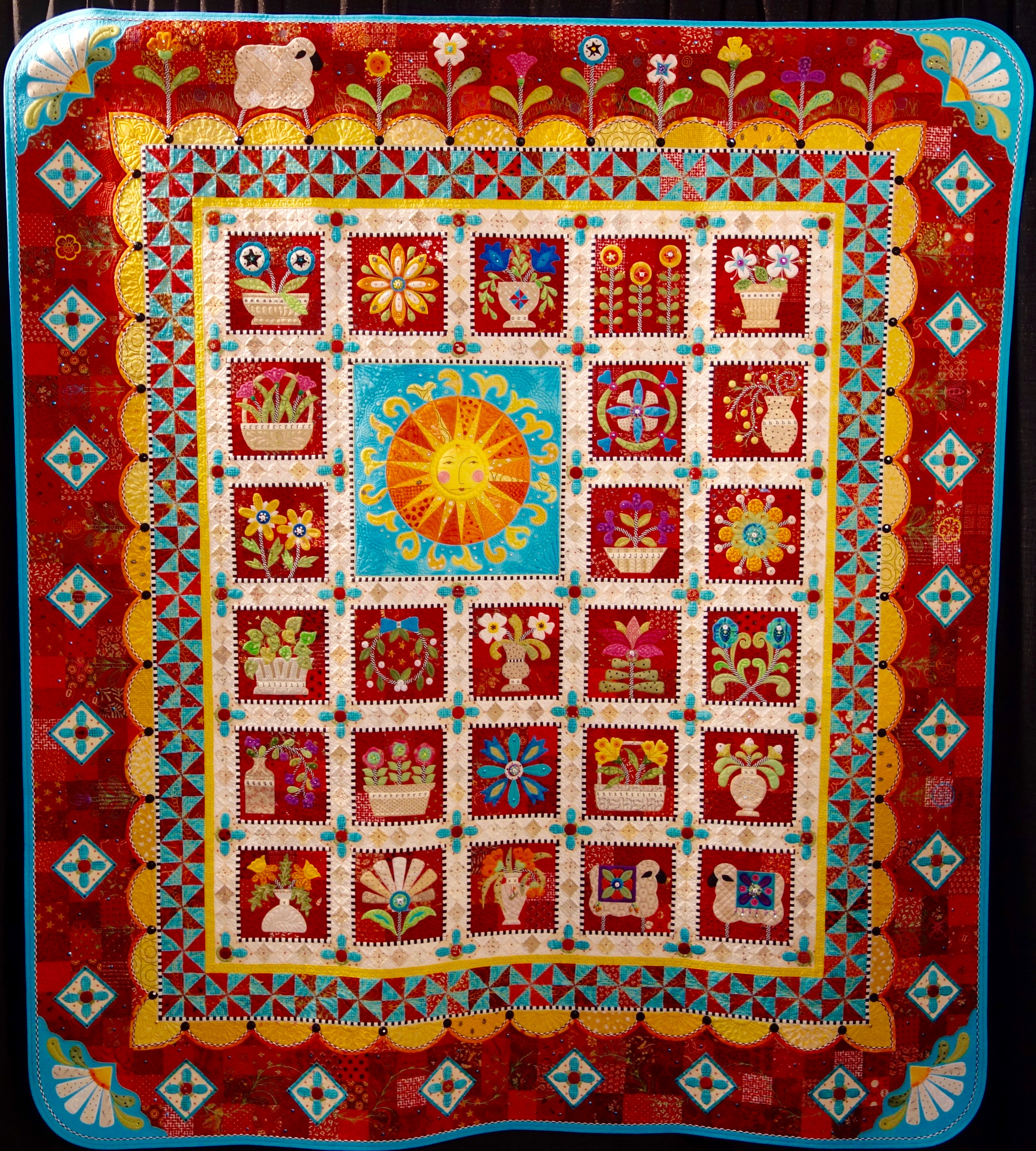
Update April 2017 - Janet Stone's "Ewe are My Sunshine" just won Best of Show at AQS Paducah 2017.
Janet was the creator of our TQS BOM 2014 - "A-Z For Ewe and Me!"
Star Members can watch Janet in Show 1401: From ABC to BOM: Tips and Techniques Just for "Ewe".
---------------------------------------------------------------------------------------
Update July 2016 - Janet Stone has done it again. "Ewe are My Sunshine" just won Best of Show at AQS Syracuse 2016. Congratulations Janet!
----------------------------------------------------------------------------------------
Congratulations to Janet Stone for Winning the Best of Show Award at IQA Houston 2015.
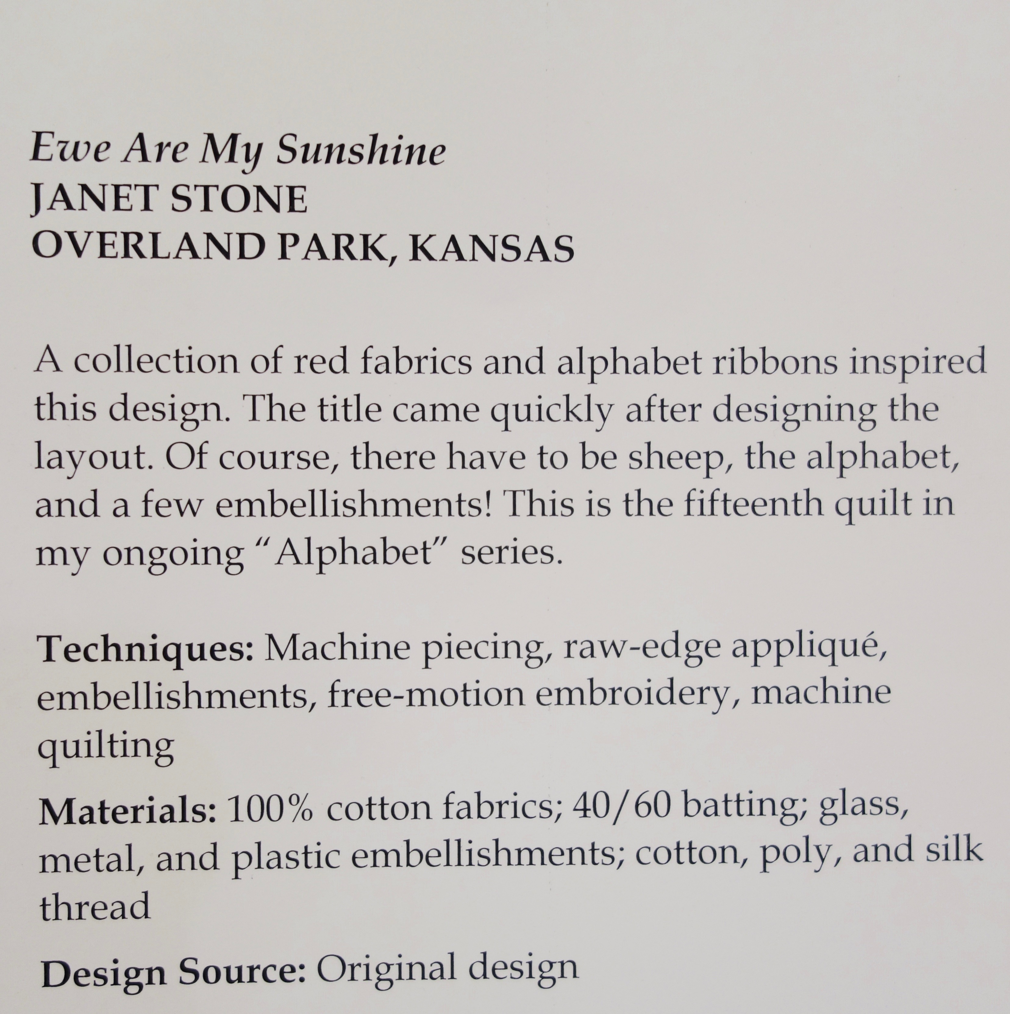
Would you use this color in a quilt? The hot color at the Milan Design Week was Millennial Pink. What do you think?
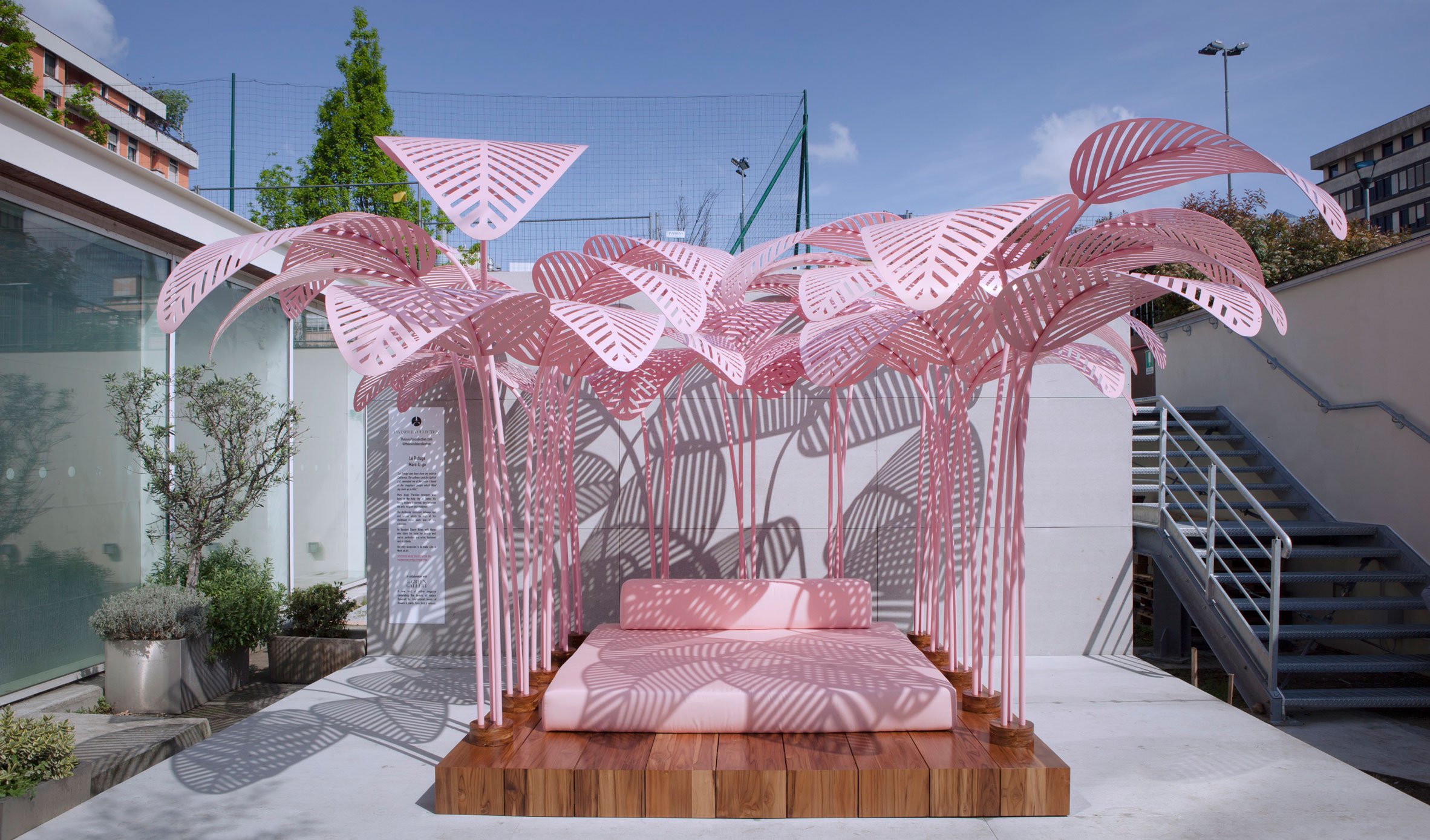
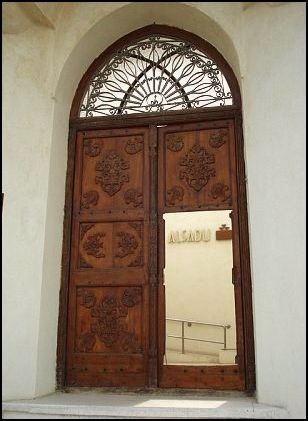
The Textiles of Sadu House
by Lilo Bowman
Quilters hold meetings in all sorts of places: churches, member homes, schools. I even have heard of a group of quilters in Alaska who meet in a local bar/diner! Generally, as long as there is enough light and space, most of us don’t give too much thought to the location itself. In Kuwait, however, when attending the monthly meeting of the KTAA (Kuwait Textile Arts Association) at the Sadu House, one can’t help but take notice of the stunning textiles and other household objects on display around them.
Sadu House (House of Weaving) was founded in 1979 by a small group of Kuwaiti women concerned that the long-standing Bedouin weaving tradition, called al sadu, was being lost. These Kuwaiti women joined forces with a group of Bedouin women to organize regular weaving lessons and demonstrations. The Bedouin women also were asked to produce specifically woven pieces that reflected a link to their tradition of living in harmony with the desert.
Traditional Bedouin Weavings. Photo by Alanna Petrusich
Some background: The Bedouin people have lived up until recently in the desert for hundreds of years (bedu means "inhabitant of the desert"), following the rhythms of the seasons, and their weaving designs directly reflected the elements of nature surrounding them. Weaving was and has been an integral part of Bedouin tribal life, and a skilled weaver was vital to the function and comfort of the household. As with other cultures that make a living from their land and livestock, the women made use of the materials around them--the natural fibers from sheep, camels, and goats, as well as desert plants--to produce utilitarian household items that at the same time demonstrated their personal talents. Their weaving produced almost everything remotely textile related for the household, including cushions, storage bags, rugs, cords for tying up livestock, and elements for tents.
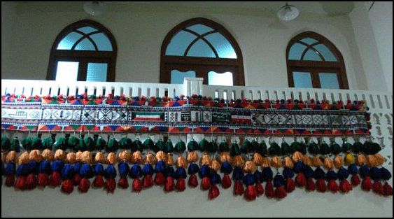
Photo by Alanna Petrusich
Tents were generally divided into two areas: a sitting area for men and visiting guests, called the mag’ad, and the area designated for cooking and female guests, called the maharama. A woven curtain, called the ma’nad, was used to separate these two areas. This curtain would be very elaborate in design, incorporating many colorful patterns, and--again--would showcase the skills of the woman who made it.
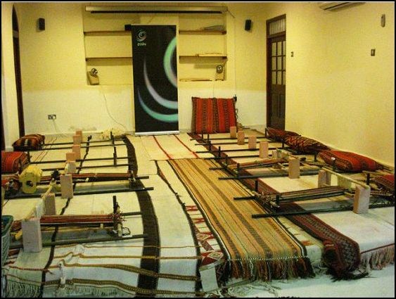
Weaving looms. Photo by Alanna Petrusich
Summer provided the best time to weave, as it was too hot for travel and the diminished humidity protected the wool. After the animals were shorn, the wool was sorted by color, with some set aside for dyeing in bright red and orange. These bright colors gave a bit of punch to the more subtle black, white, brown, and tan of the natural wools. The wool then would be spun and the intricate process of weaving would begin.
Today under the patronage of Sheikha Altaf, Sadu House stands as a testament to the preservation of the rich and colorful tradition practiced by the Bedouin. The house itself was designed to reflect a typical Gulf-style home, that is, it is built around a central courtyard. Usually this central courtyard would be open to the elements. However, in this case, the original courtyard has been covered with a glass roof to admit light while protecting the interior. Inside the house, you will find displays of stunning textiles, tents, ceramics and pottery, and various decorative household objects. There is even a re-created roofed children’s playground.
Traditionally, during the hot summer months, family members would live in the north and east portions of the home. In winter, they would move to the south and west portions of the home. This back-and-forth movement made the space most comfortable in a time without air conditioning.
To see more of Sadu House, watch the slideshow. (Originally part of another series)
 |
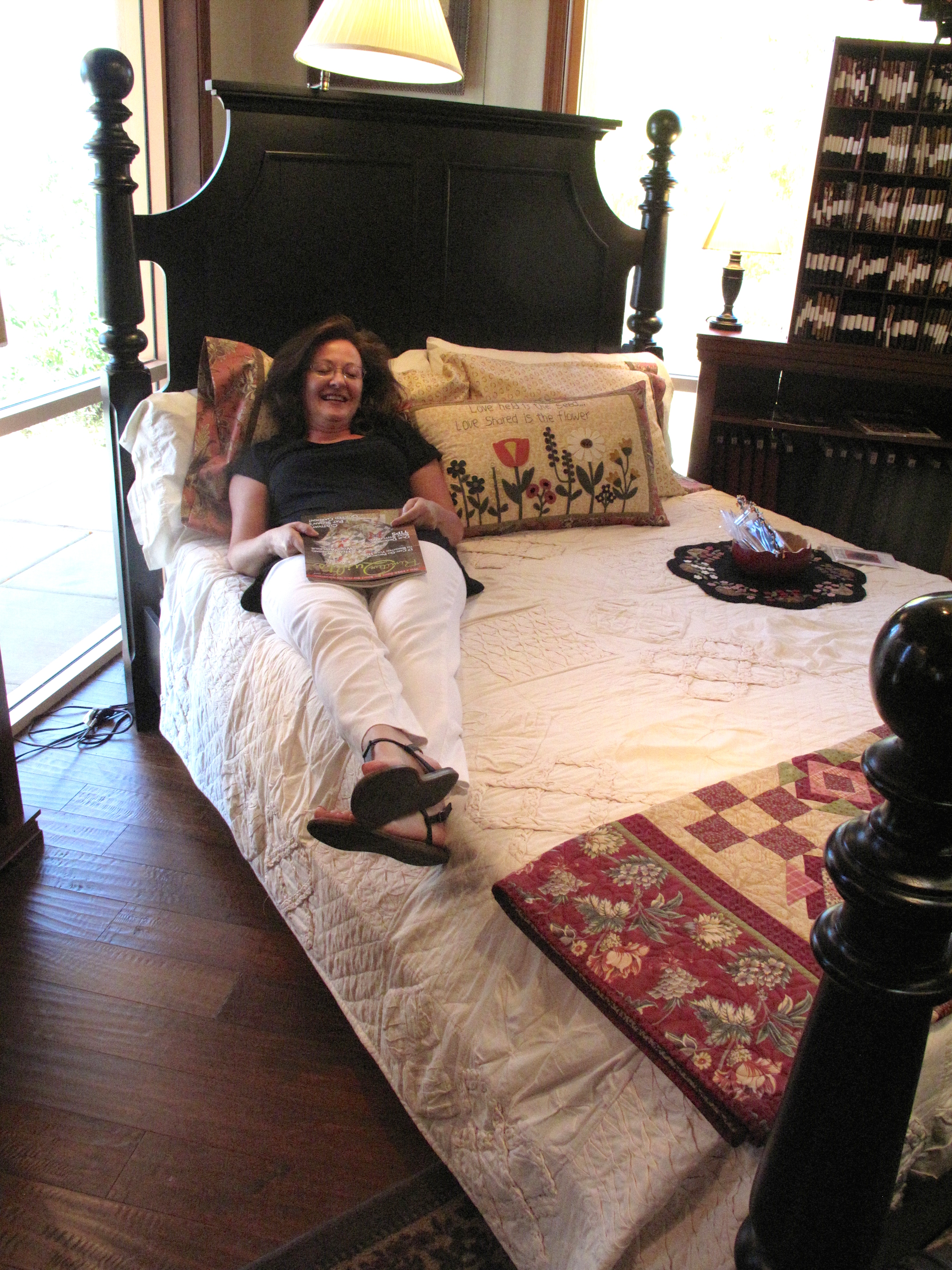
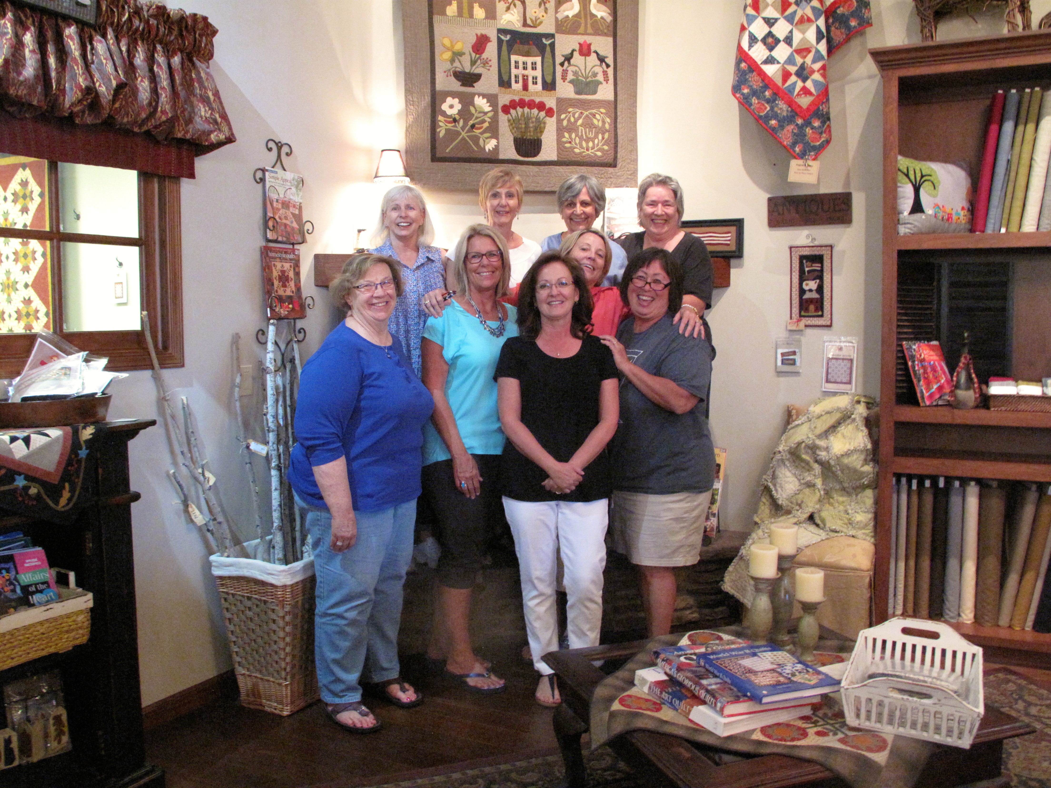
Although I take my stitching, sewing machine, and thread with me on the road, there is a crucial piece of my quilting life I leave behind. Girlfriends!

 |
When Lola came to the taping in Denver, Colorado, the hosts, producers, camera people and technicians all loved her work. She sold a number of her quilts that were featured in the first part of the show. Alex was captivated by "Best Friends" and decided to buy it. She loved the feeling of friendship between the women, as they relax with a cup of coffee on the porch among the flowers. It is hard to tell from the picture, but zoom in and see that there are crystals throughout the quilt, in the jewelry, around the flowers and in the background.

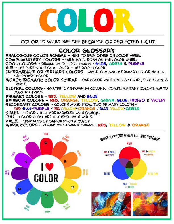
Learning any new language, especially color, can be daunting. There are strange and often misunderstood terms such as tints, shades, tones and value. What in the world do all of these obscure sounding words mean? When approached in manageable units, especially color, understanding can become much easier. Harnessing the language of color can help you gain a deeper understanding and self-confidence when it comes to creating more visual impact with your work.
Most of us are familiar with the basic red, yellow, blue primary color concept. But where did this idea come from? Sir Isaac Newton (1643-1727) discovered that by shining a beam of light through a prism, he could see the colors of the rainbow.
During the mid-twentieth century, Herbert Ives (1882-1953) took Sir Isaac Newton's theory a step further with his scientific testing to determine that it is possible to create hundreds of colors by using a combination of just three basic colors (yellow, magenta, turquoise). With this discovery, he created a wheel that illustrates twenty-four nature true colors.
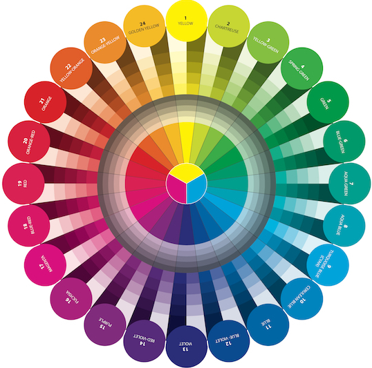
There are several different types of color wheel choices available and each has its uses. But for our lessons we will be using the Herbert Ive's method which is based on physics, the true colors in nature, and is the wheel of choice for all fabric, furniture, clothing, yarn and paper companies. The Herbert Ive's primary colors are Cyan (Turquoise), Magenta, and Yellow. If you have ever gone to purchase ink for your printer, you might have noticed that the colors on the box are also listed in the C, M, Y manner.
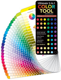
If you do not own a color wheel, this might be a good time to purchase one, as we will be using the Joen Wolfrom (Show 103) Herbert Ives based wheel, during all of our color lessons. Joen also offers an Ultimate 3-in-1 Color Tool, which we will also be using as a reference.
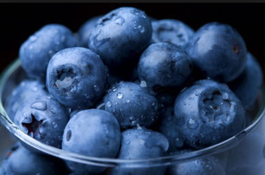
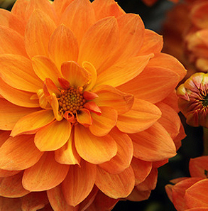
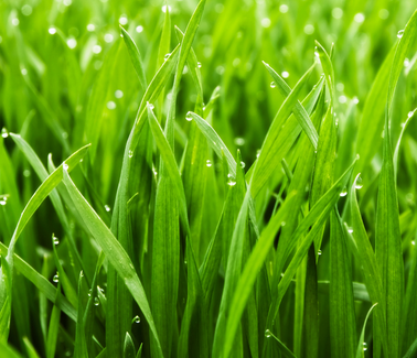
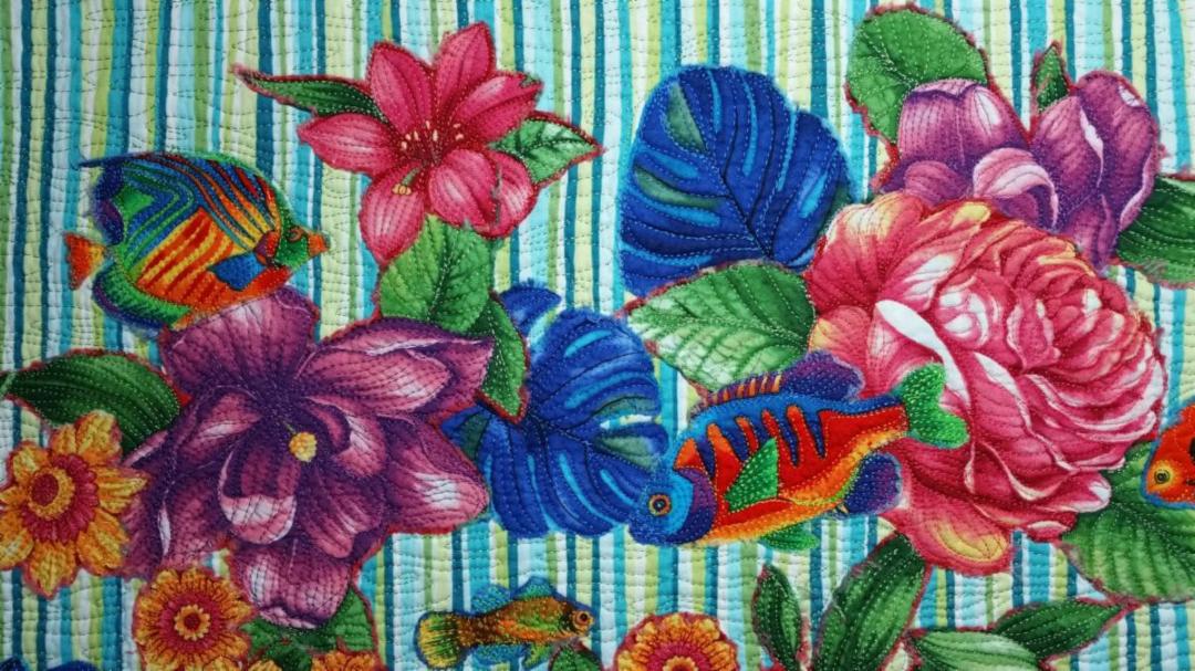
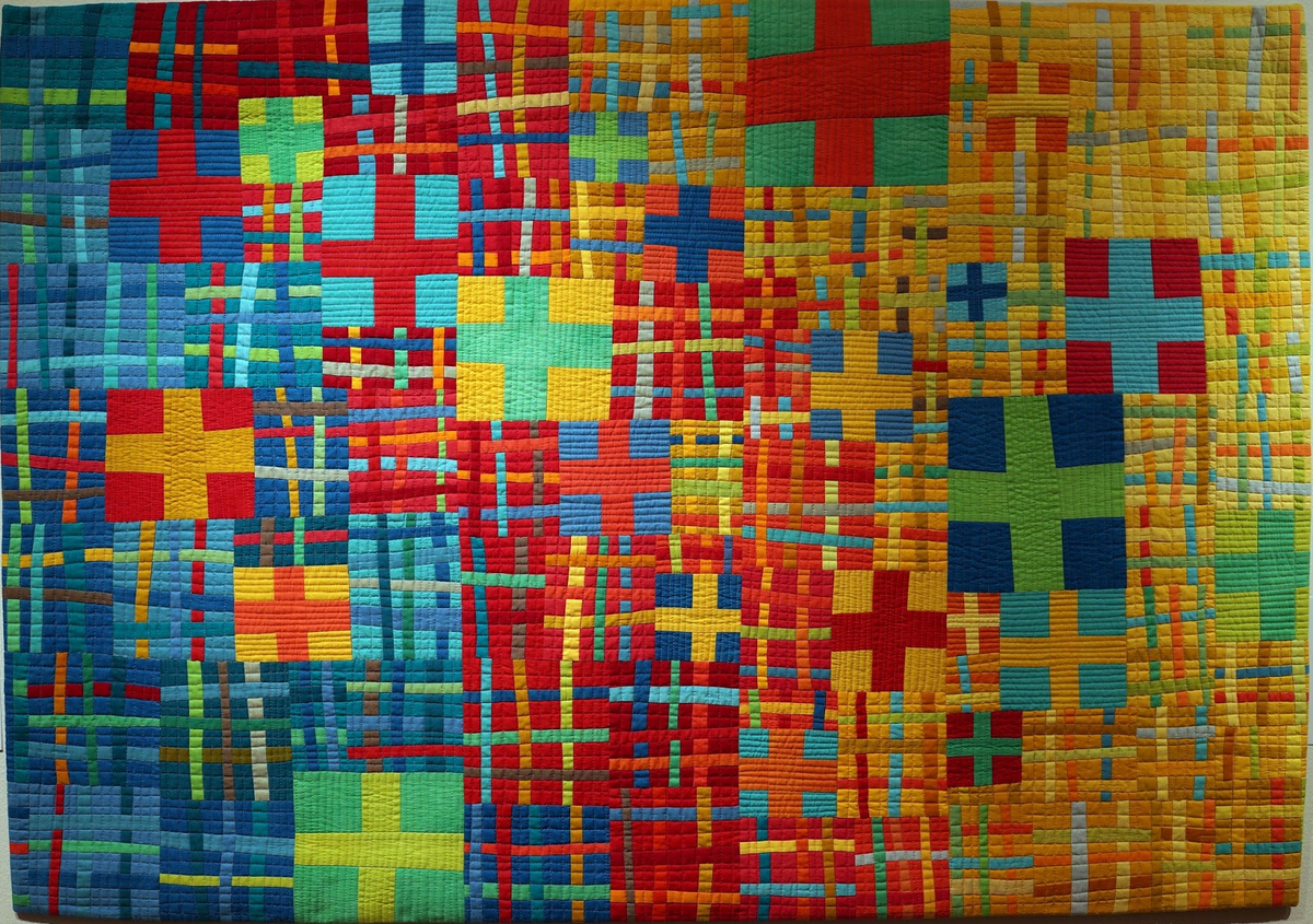
Pure hues/colors are the most vibrant and the head of their color family. The names we generally associate with them include red, green, purple, fuchsia, orange, yellow, aqua blue, cerulean blue, blue-violet, golden yellow, and yellow. Walk through any quilt store and these vibrantly colored fabrics are most likely those that will catch your eye. Pure hues/colors are exciting, powerful and love to the extrovert, however, if too many are used in a quilt, they can overwhelm the viewer. Things associated with pure color include: blueberries, marigolds, and grass.
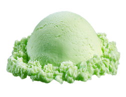
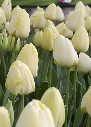
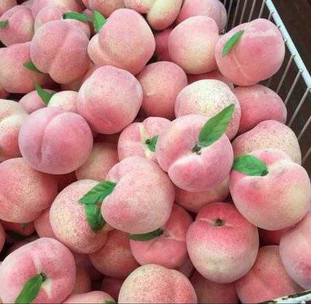
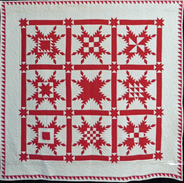
When you add white to a hue/color the result is a tint. The more white that is added, the softer the hue/color becomes. Often the word 'light' is associated with a tint. These hues/colors are considered delicate, springlike, clean, and youthful. Things associated with tints include: lime sherbert, pale yellow tulips, and pale peaches.
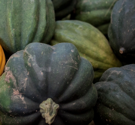


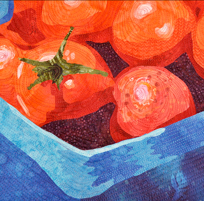
When black is added to a hue/color it becomes darker, just as an umbrella shades us from the sun, it darkens a color/hue. More earthy, these hues/color are associated with the autumn, nightime or darker wooded areas. Think of things you already know: acorn squash, bricks, or red wine.
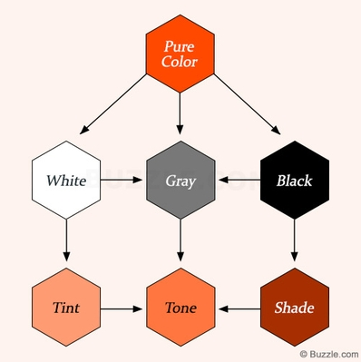
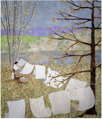
Below are two excellent examples of what happens when a pure hue/color has white, gray or black added to it.

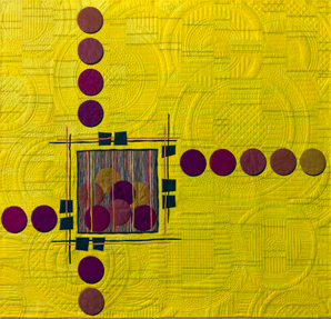
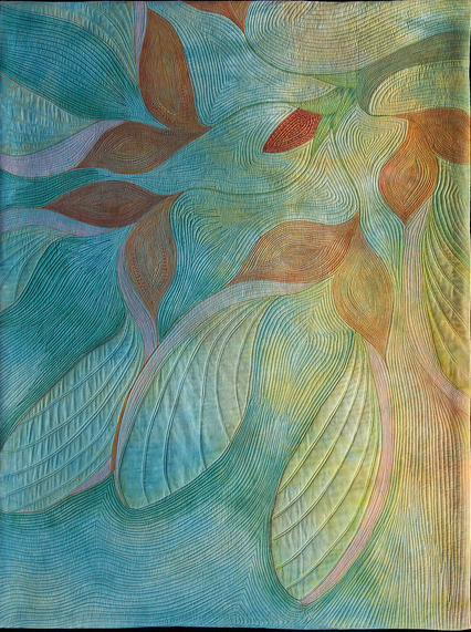
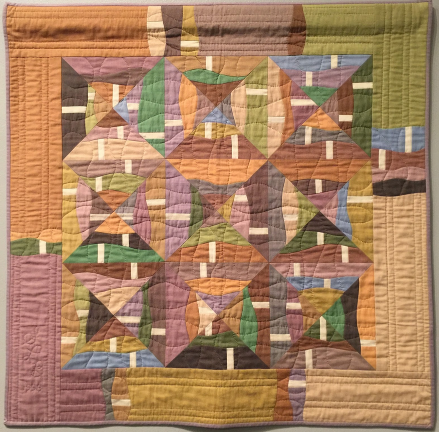
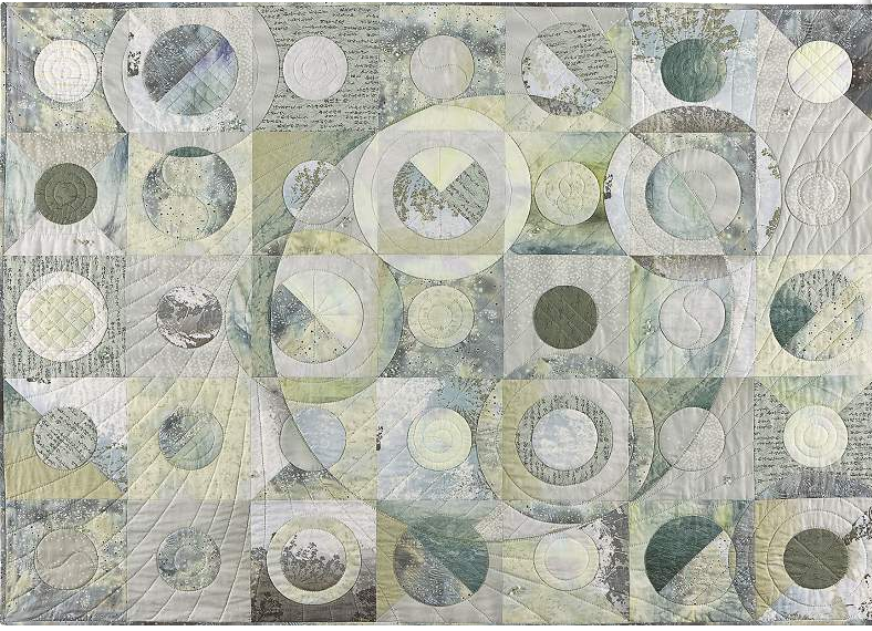
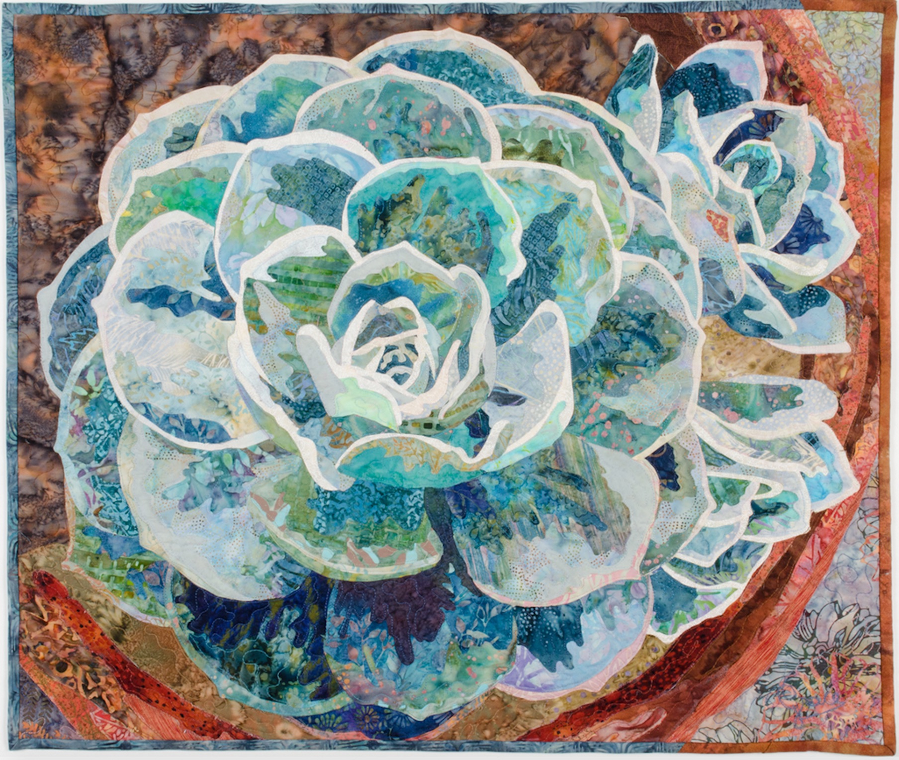
Now Let's look at some examples of quilts that fall under each of these categories:
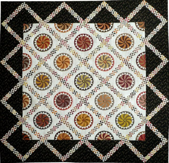
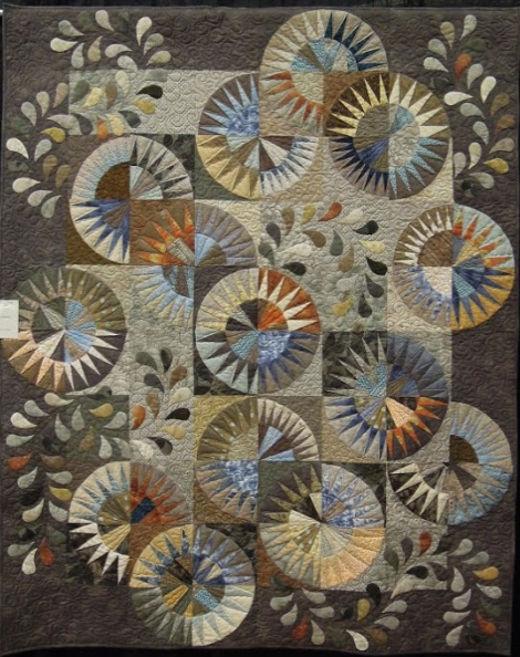
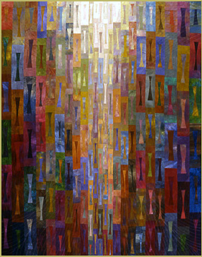
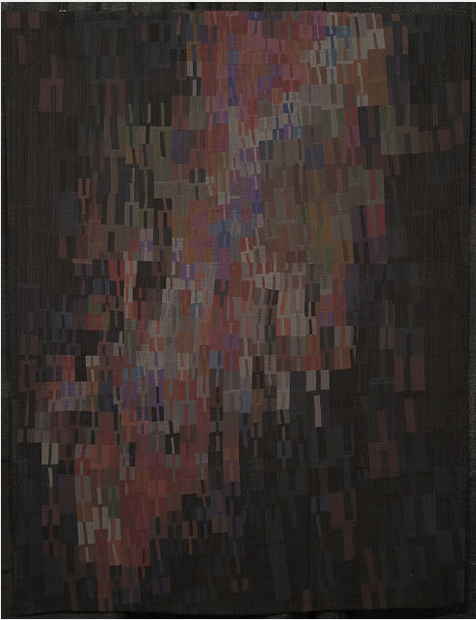
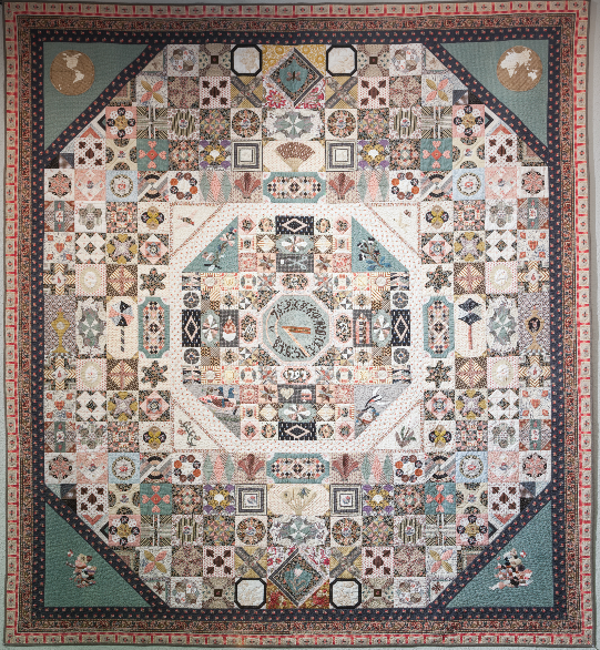
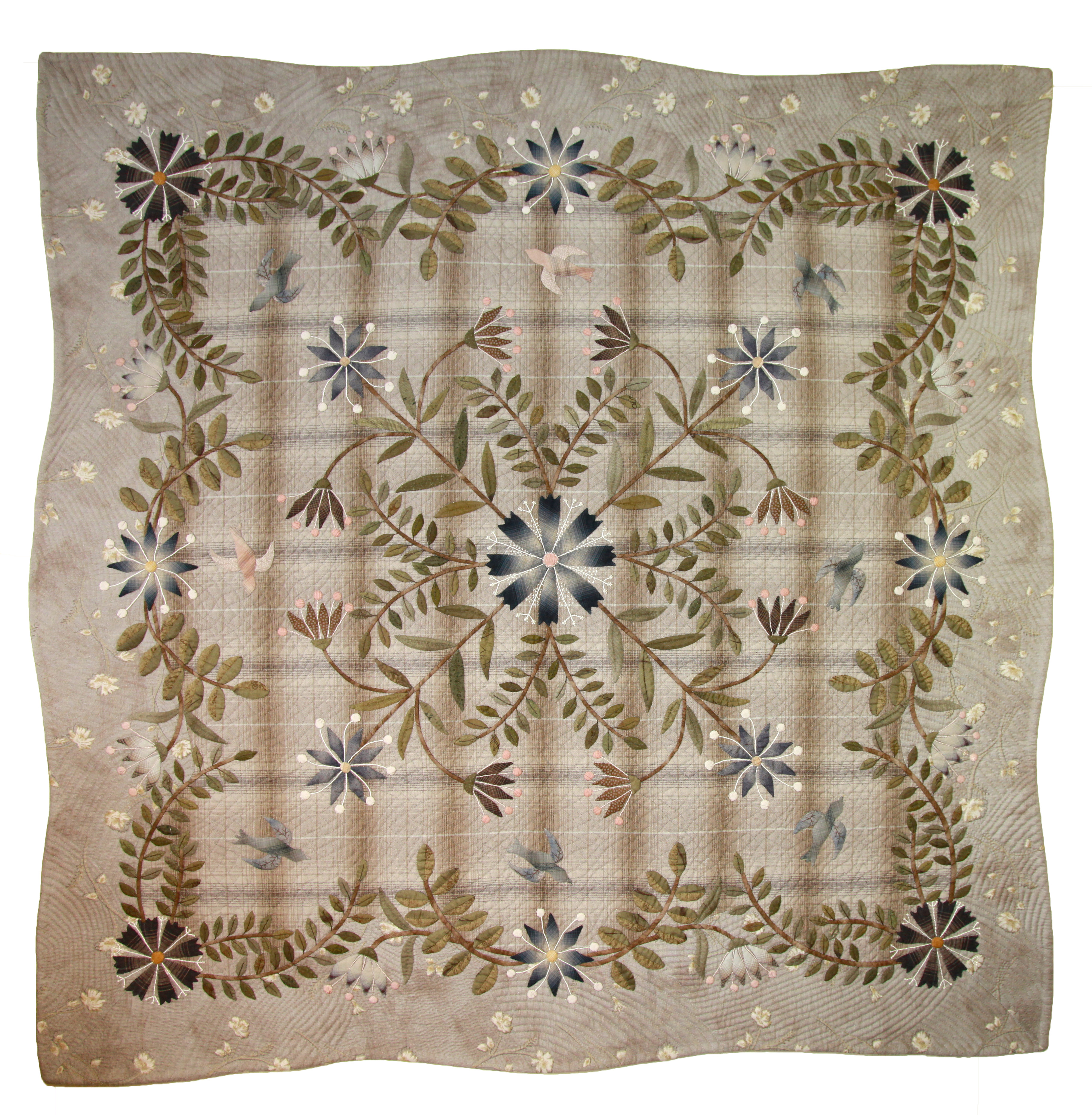
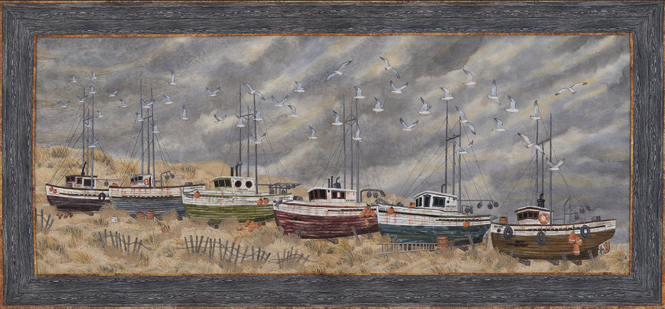
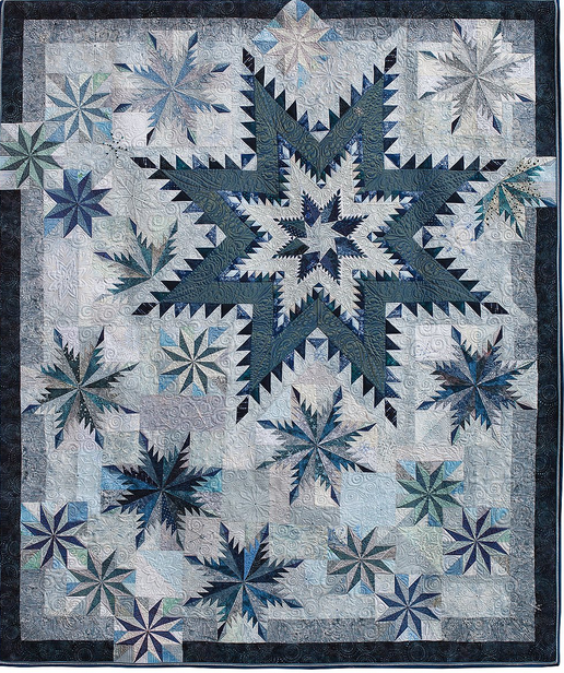
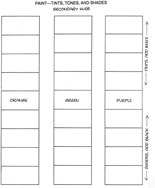
Using the example below, draw a set of boxes on a sheet of white cardstock paper. Give each box a pure color name of your choosing. Label the group of boxes as indicated on the far right box. This will be helpful as a reference.
1. Paint the pure color in the center (where you see the name listed). Wait a few minutes to let this dry.
2. Tints - Add a small amount of white paint to your color. Paint this new tint just above the first color. Let the paint dry a bit. Gradually add a bit more white to the first color and continue filling in the appropriate box. Repeat for the remaining two boxes.
3. Shade - Add a small bit of black paint to your color. Paint the new shade just below the first color. Let the paint dry a bit. Gradually add a bit more black to the first color and continue filling in the appropriate lower boxes. Repeat for the remaining two colors.
You can practice this exercise with as many colors as you desire.
