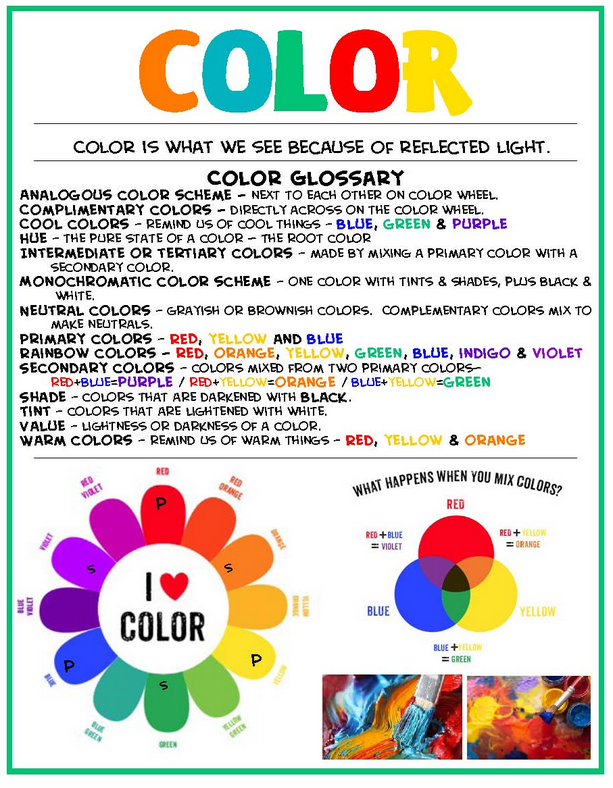
Learning any new language, especially color, can be daunting. There are strange and often misunderstood terms such as tints, shades, tones and value. What in the world do all of these obscure sounding words mean? When approached in manageable units, especially color, understanding can become much easier. Harnessing the language of color can help you gain a deeper understanding and self-confidence when it comes to creating more visual impact with your work.
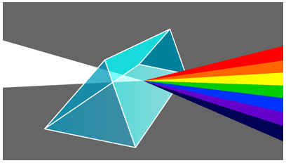
Most of us are familiar with the basic red, yellow, blue primary color concept. But where did this idea come from? Sir Isaac Newton (1643-1727) discovered that by shining a beam of light through a prism, he could see the colors of the rainbow.
During the mid-twentieth century, Herbert Ives (1882-1953) took Sir Isaac Newton's theory a step further with his scientific testing to determine that it is possible to create hundreds of colors by using a combination of just three basic colors (yellow, magenta, turquoise). With this discovery, he created a wheel that illustrates twenty-four nature true colors.
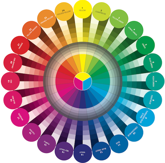
There are several different types of color wheel choices available and each has its uses. But for our lessons we will be using the Herbert Ive's method which is based on physics, the true colors in nature, and is the wheel of choice for all fabric, furniture, clothing, yarn and paper companies. The Herbert Ive's primary colors are Cyan (Turquoise), Magenta, and Yellow. If you have ever gone to purchase ink for your printer, you might have noticed that the colors on the box are also listed in the C, M, Y manner.
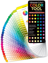
If you do not own a color wheel, this might be a good time to purchase one, as we will be using the Joen Wolfrom (Show 103) Herbert Ives based wheel, during all of our color lessons. Joen also offers an Ultimate 3-in-1 Color Tool, which we will also be using as a reference.
Pure Hues/Colors
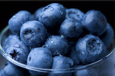
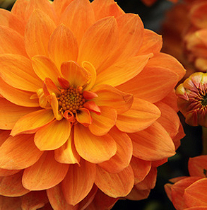
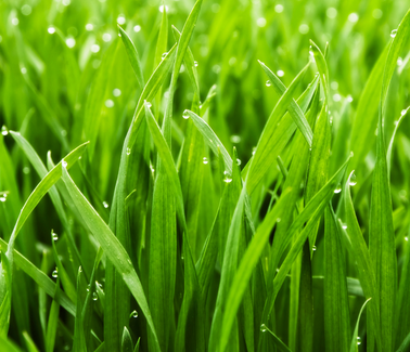
Pure hues/colors are the most vibrant and the head of their color family. The names we generally associate with them include red, green, purple, fuchsia, orange, yellow, aqua blue, cerulean blue, blue-violet, golden yellow, and yellow. Walk through any quilt store and these vibrantly colored fabrics are most likely those that will catch your eye. Pure hues/colors are exciting, powerful and love to the extrovert, however, if too many are used in a quilt, they can overwhelm the viewer. Things associated with pure color include: blueberries, marigolds, and grass.
Tints
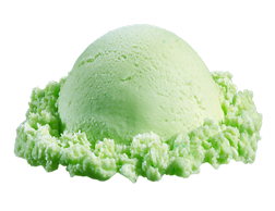
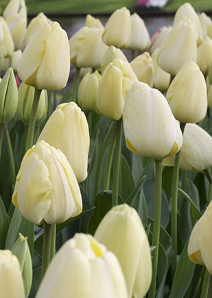
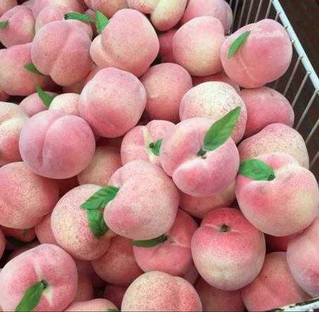
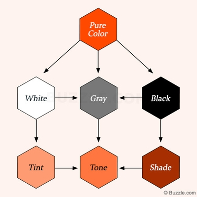
When you add white to a hue/color the result is a tint. The more white that is added, the softer the hue/color becomes. Often the word 'light' is associated with a tint. These hues/colors are considered delicate, springlike, clean, and youthful. Things associated with tints include: lime sherbert, pale yellow tulips, and pale peaches.


Shade
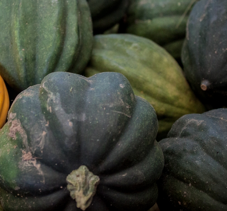
When black is added to a hue/color it becomes darker, just as an umbrella shades us from the sun, it darkens a color/hue. More earthy, these hues/color are associated with the autumn, nightime or darker wooded areas. Think of things you already know: acorn squash, bricks, or red wine.
Below are two excellent examples of what happens when a pure hue/color has white, gray or black added to it.

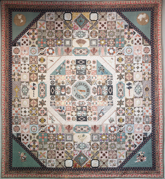
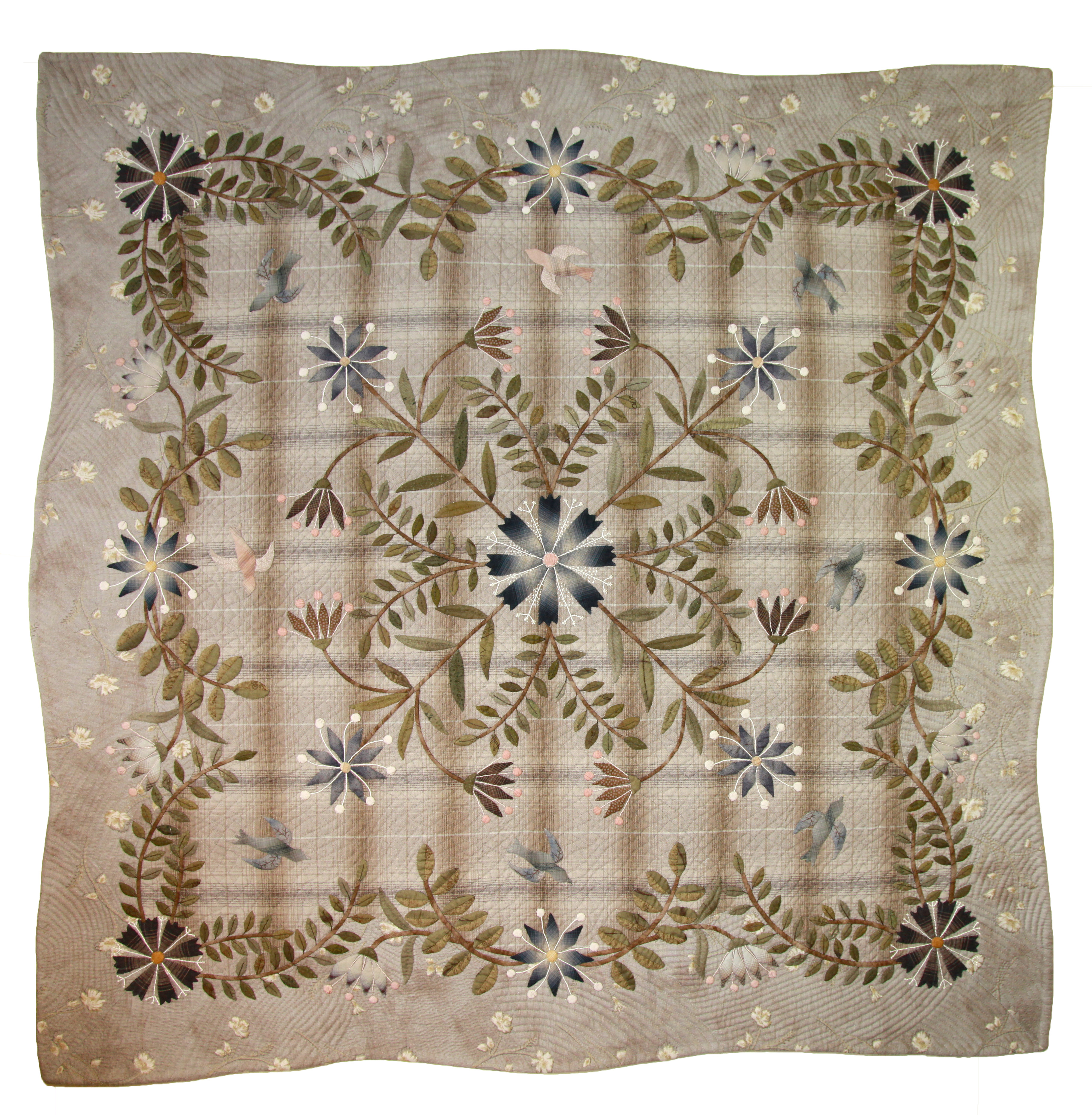
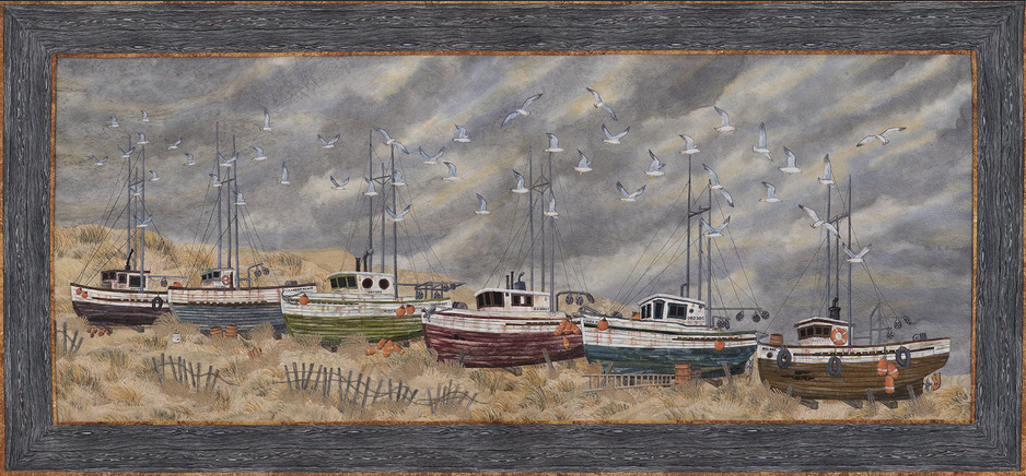
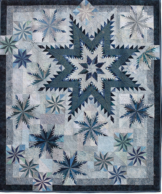
Now Let's look at some examples of quilts that fall under each of these categories:
Pure Hue/Color
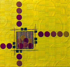
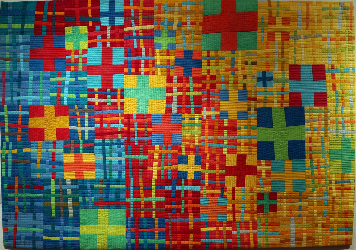
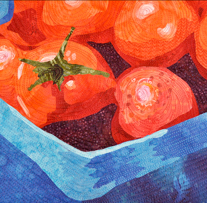
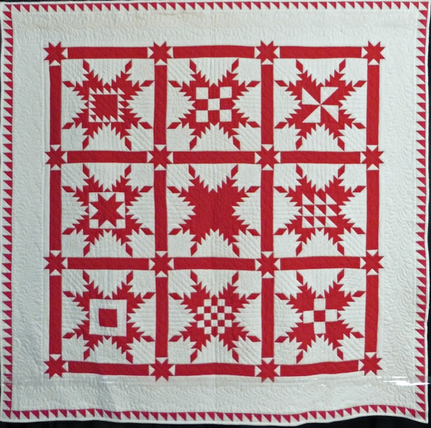
Tint
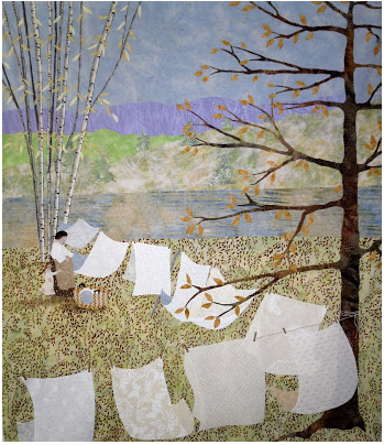
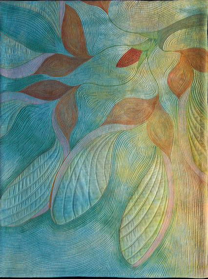
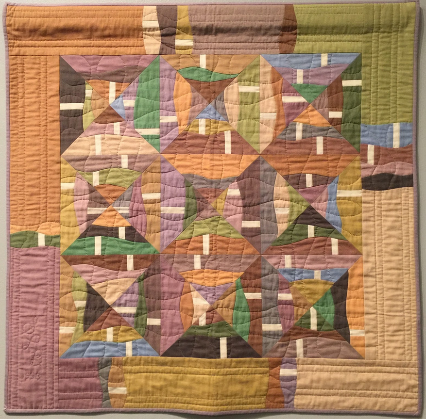
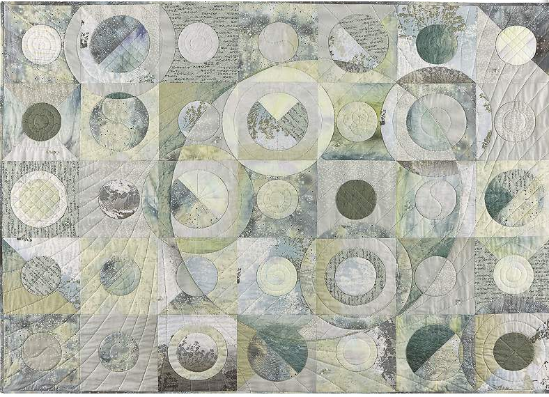
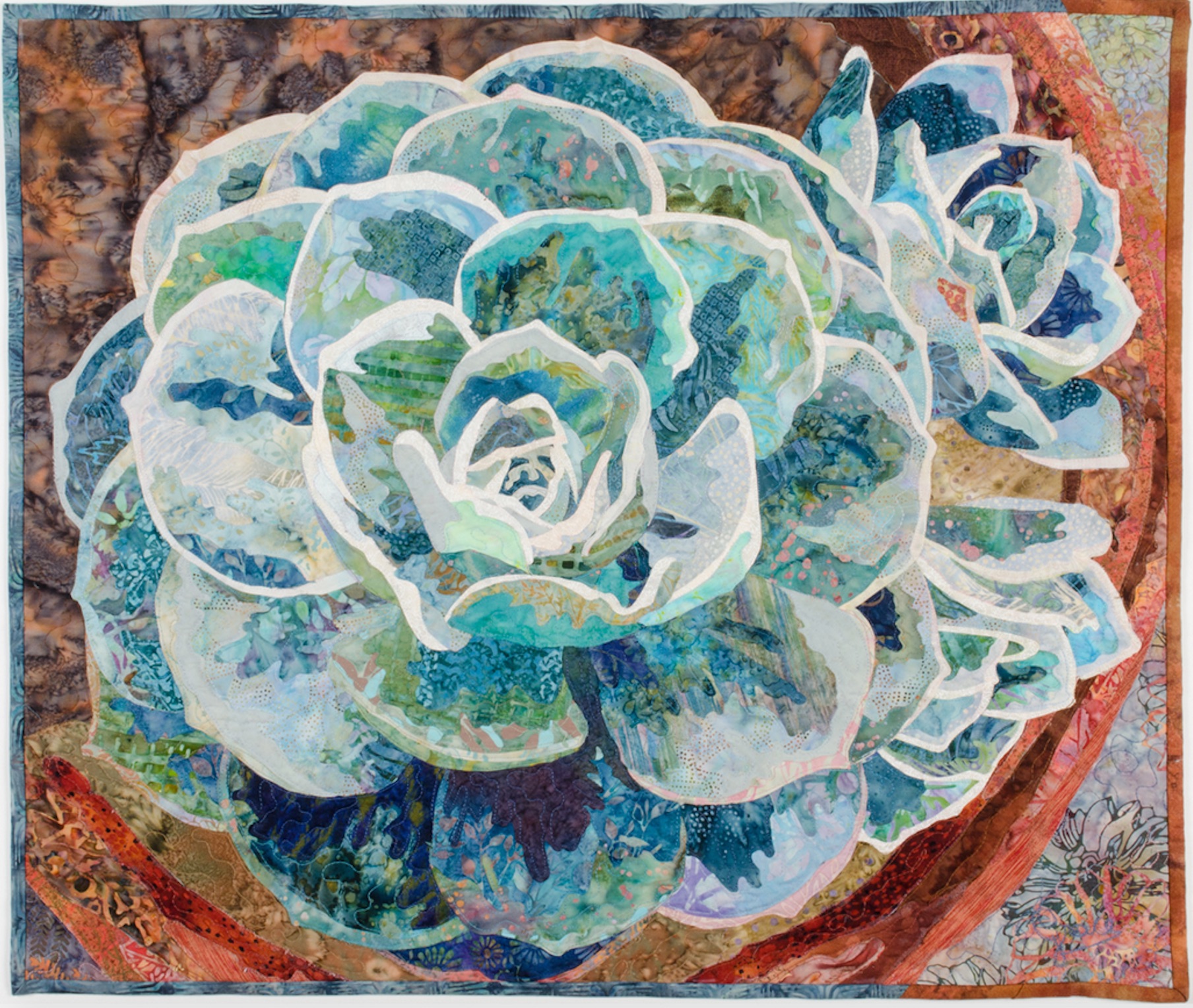
Shade
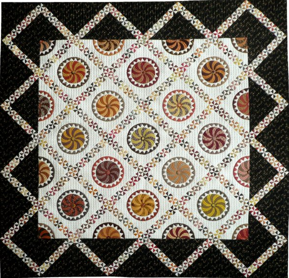
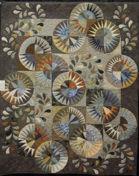
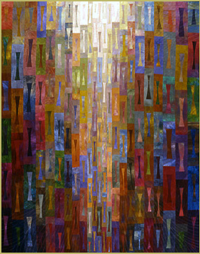
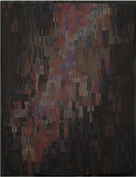
Tone
Work Exercise: Create Your Own Color Scale
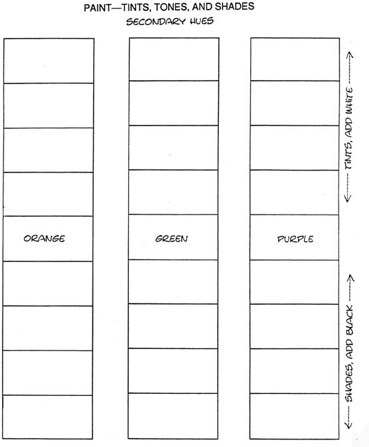
Using the example below, draw a set of boxes on a sheet of white cardstock paper. Give each box a pure color name of your choosing. Label the group of boxes as indicated on the far right box. This will be helpful as a reference.
1. Paint the pure color in the center (where you see the name listed). Wait a few minutes to let this dry.
2. Tints - Add a small amount of white paint to your color. Paint this new tint just above the first color. Let the paint dry a bit. Gradually add a bit more white to the first color and continue filling in the appropriate box. Repeat for the remaining two boxes.
3. Shade - Add a small bit of black paint to your color. Paint the new shade just below the first color. Let the paint dry a bit. Gradually add a bit more black to the first color and continue filling in the appropriate lower boxes. Repeat for the remaining two colors.
You can practice this exercise with as many colors as you desire.





.jpg)

Due to the size of the file and images, it takes a bit for the pdf to completely load. Click pdf and you will see at the bottom left hand corner words stating 'waiting for thequiltshow.co m'. That means it's working to bring up the document. Give it a few minutes.
Lilo
RSS feed for comments to this post