Three Easy Steps To Save This Lesson As A Pdf:
-Make sure you are logged in.
-Click on the small triangle next to the tool wheel in the upper right hand corner of the page (you'll find it above the Like button).
-Select the pdf. option. Wait a few minutes. It's a large file due to the number of images.
-Your file should appear with the title of the lesson.
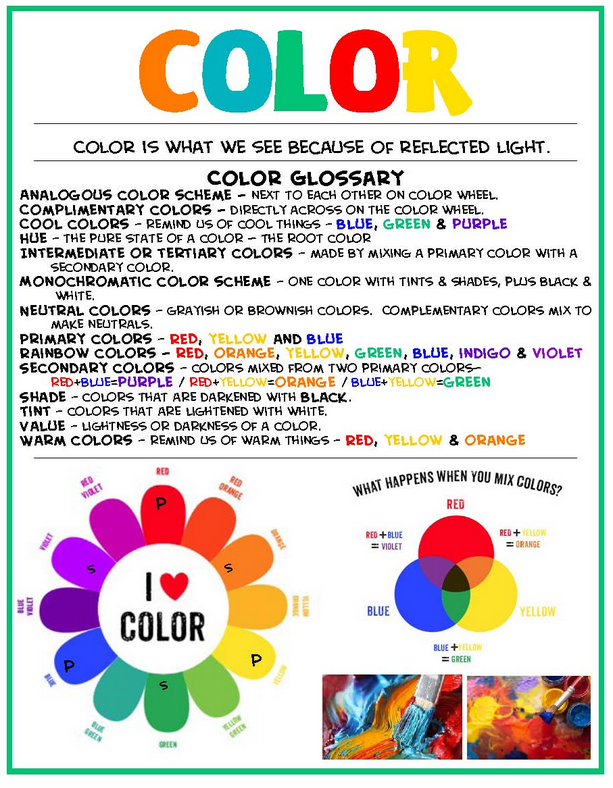
Learning any new language, especially color, can be daunting. There are strange and often misunderstood terms such as tints, shades, tones and value. What in the world do all of these obscure sounding words mean? When approached in manageable units, especially color, understanding can become much easier. Harnessing the language of color can help you gain a deeper understanding and self-confidence when it comes to creating more visual impact with your work.
Most of us are familiar with the basic red, yellow, blue primary color concept. But where did this idea begin? Sir Isaac Newton (1643-1727) discovered that by shining a beam of light through a prism, he could see the colors of the rainbow.
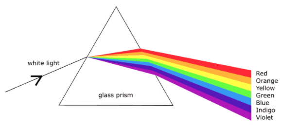
Rainbow Prism. Image courtesy of RookieParenting.com
During the mid-twentieth century, Herbert Ives (1882-1953) took Sir Isaac Newton's theory a step further with his scientific testing to determine that it is possible to create hundreds of colors by using a combination of just three basic colors (yellow, magenta, turquoise). With this discovery, he created a wheel that illustrates twenty-four nature true colors.
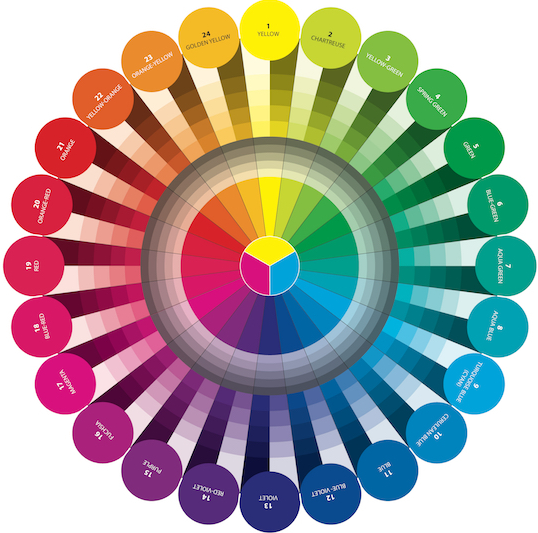
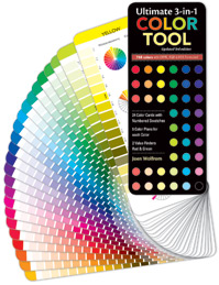
There are several different types of color wheel choices available and each has its uses. But for our lessons we will be using the Herbert Ive's method which is based on physics, the true colors in nature, and is the wheel of choice for all fabric, furniture, clothing, yarn and paper companies. The Herbert Ive's primary colors are Cyan (Turquoise), Magenta, and Yellow. If you have ever gone to purchase ink for your printer, you might have noticed that the colors on the box are also listed in the C, M, Y manner.
If you do not own a color wheel, this might be a good time to purchase one, as we will be using the Joen Wolfrom (Show 103: Visualizing Color!) Herbert Ives based wheel, during all of our color lessons. Joen also offers an Ultimate 3-in-1 Color Tool, which we will also be using as a reference.
Pure Hues/Colors
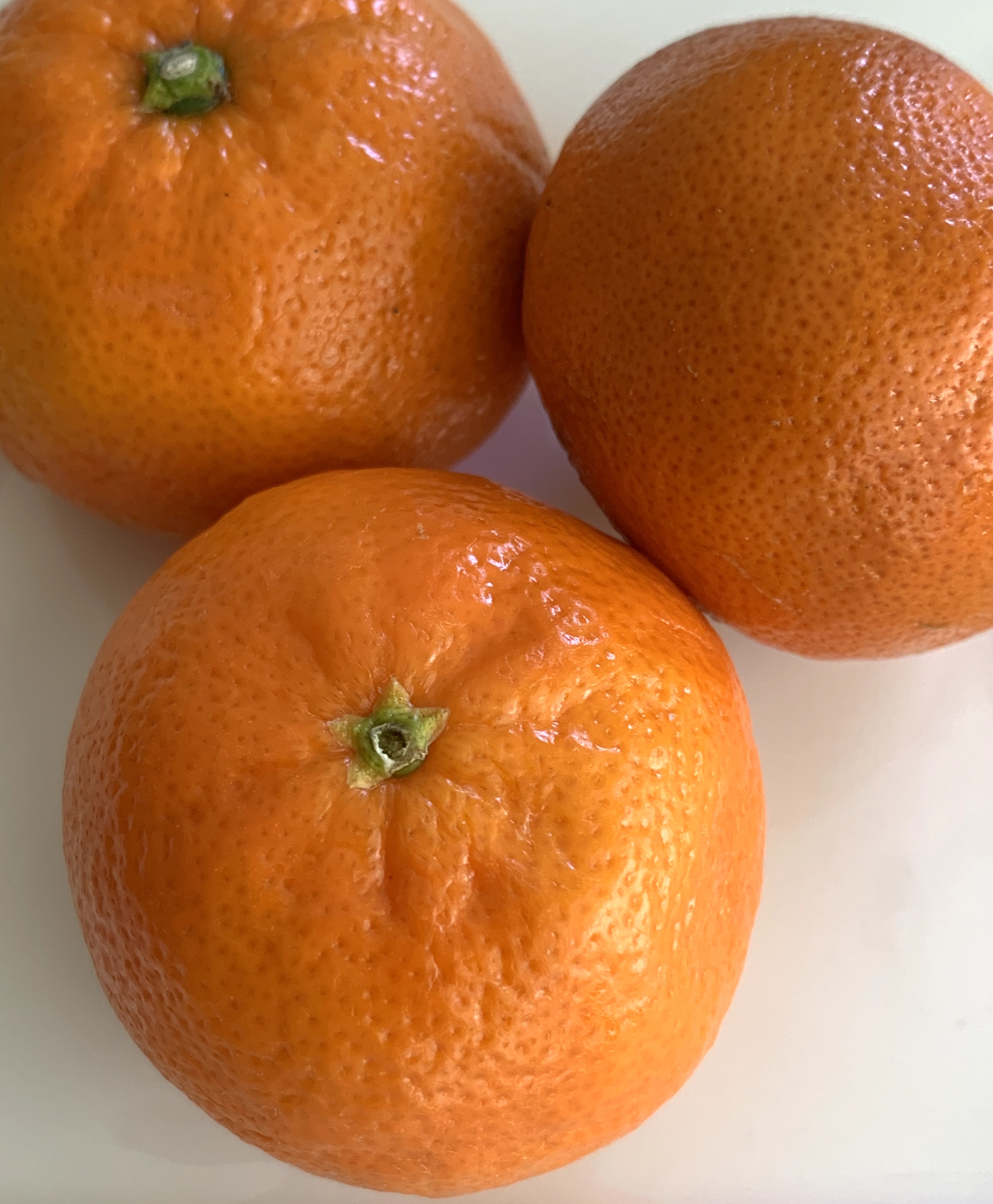
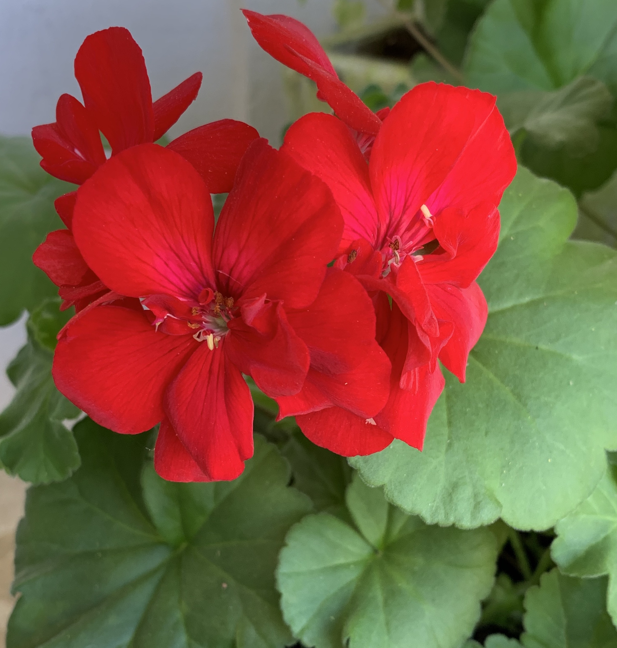
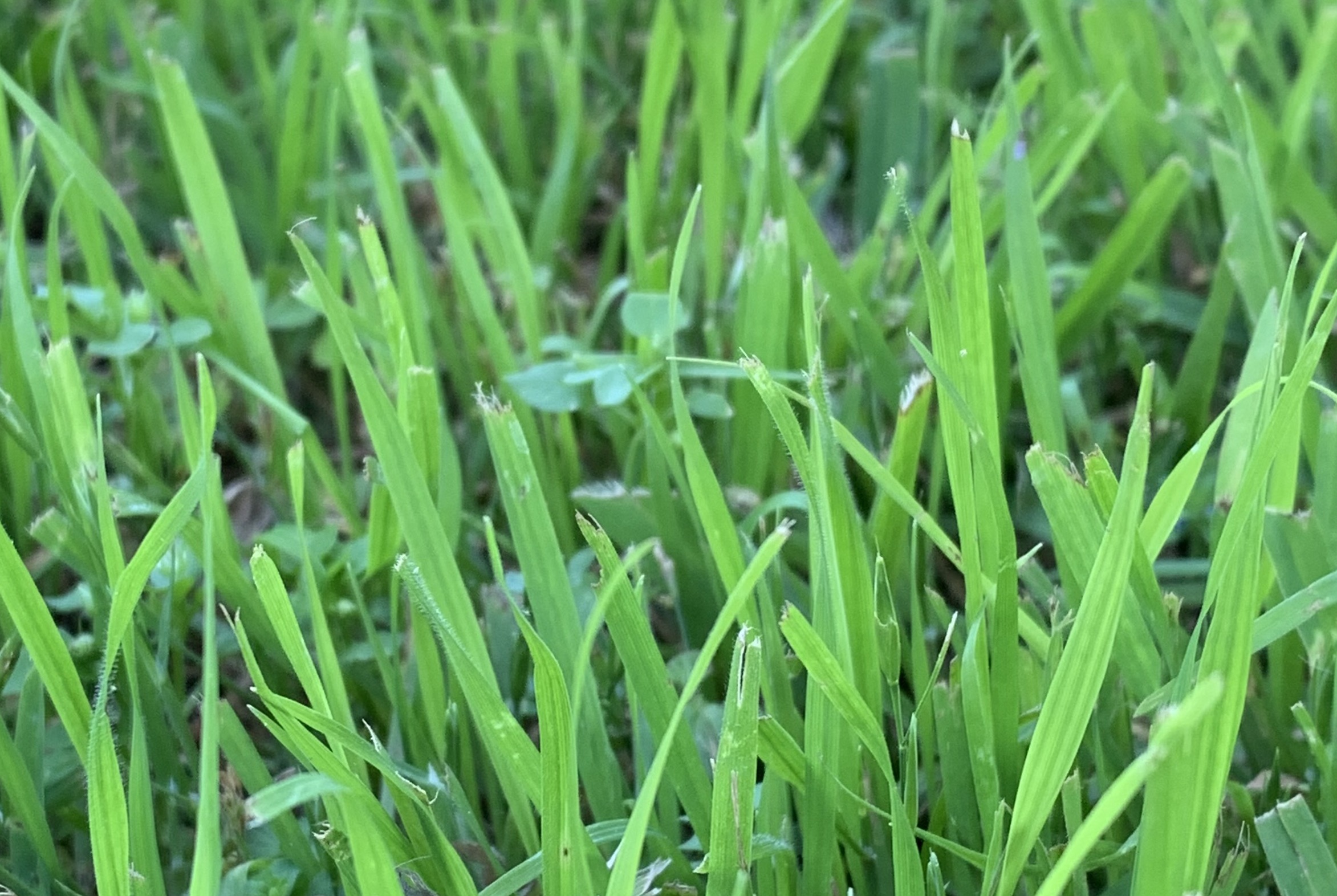
Pure hues/colors are the most vibrant and the head of their color family. The names we generally associate with them include red, green, purple, fuchsia, orange, yellow, aqua blue, cerulean blue, blue-violet, golden yellow, and yellow. Walk through any quilt store and these vibrantly colored fabrics are most likely those that will catch your eye. Pure hues/colors are exciting, powerful and love to be the extrovert, however, if too many are used in a quilt, they can overwhelm the viewer. Things associated with pure color include: tangerines, red geraniums, and grass.
Tints
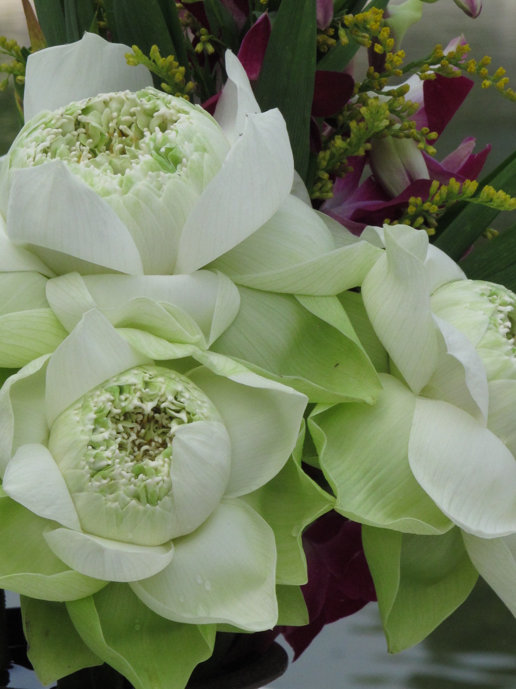
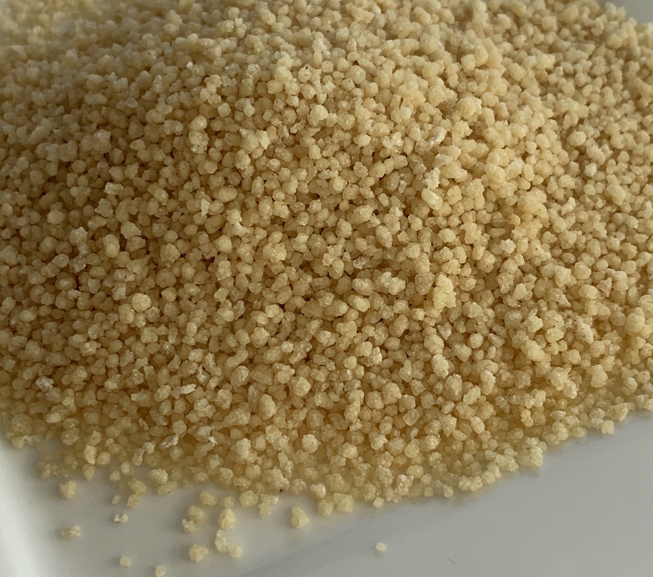
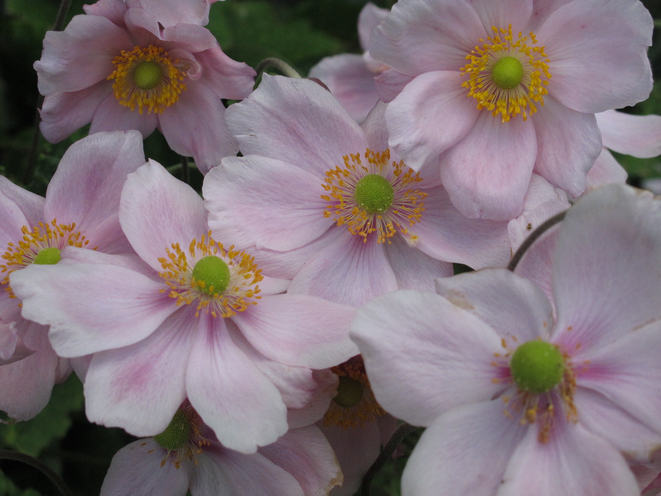
When you add white to a hue/color the result is called a tint. The more white that is added, the softer the hue/color becomes. Often the word 'light' is associated with a tint. These hues/colors are considered delicate, springlike, clean, and youthful. Things associated with tints include: green lotus blossoms, Quinoa, and pink anemones.

Shade
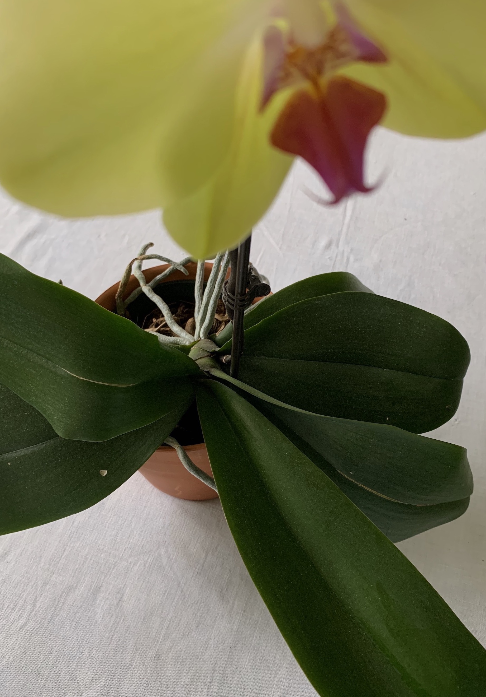
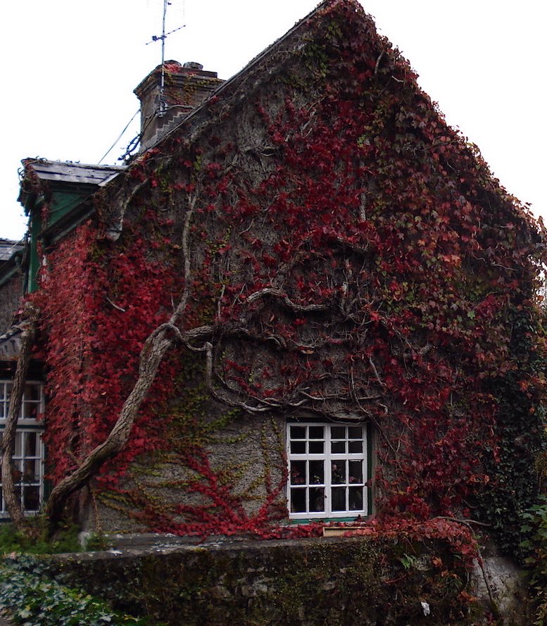
When black is added to a hue/color it becomes darker, just as an umbrella shades us from the sun. More earthy, these hues/color are associated with the autumn, nightime or darker wooded areas. Think of things you already know: rust on steel, orchid leaves, or fall leaves.
Below are two examples of what happens when a pure hue/color has white, gray or black added to it.
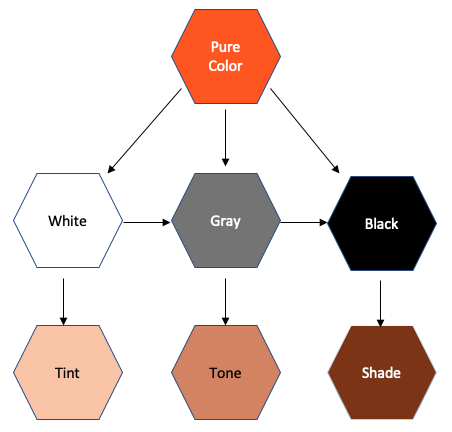
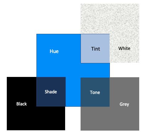
Images by TheQuiltShow.com
Now Let's look at some examples of quilts that fall under each of these categories:
Pure Hue/Color
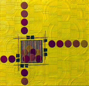
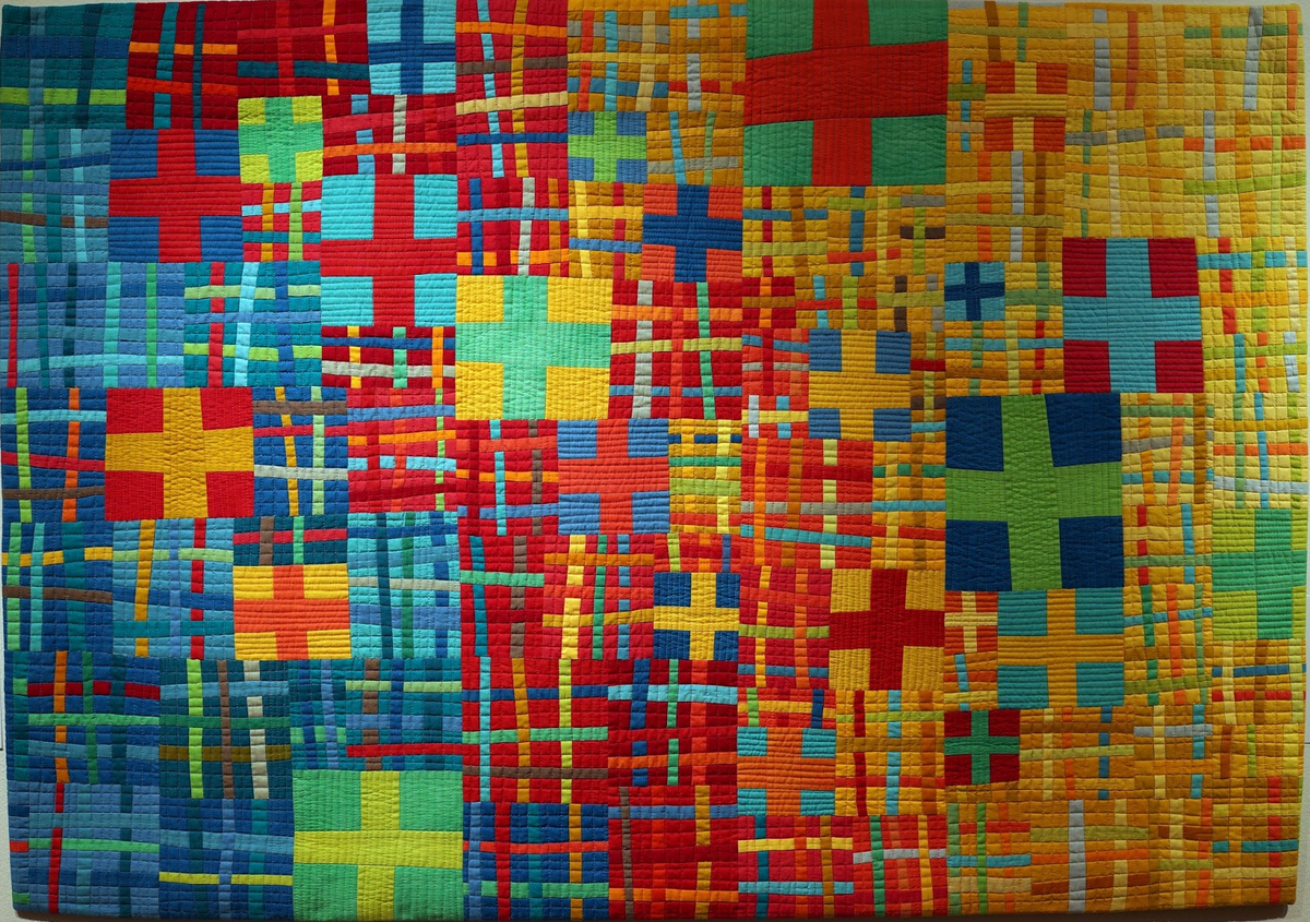
Dotting Inside the Box by Sandi Snow. Crossing Paths by Diane Melms.
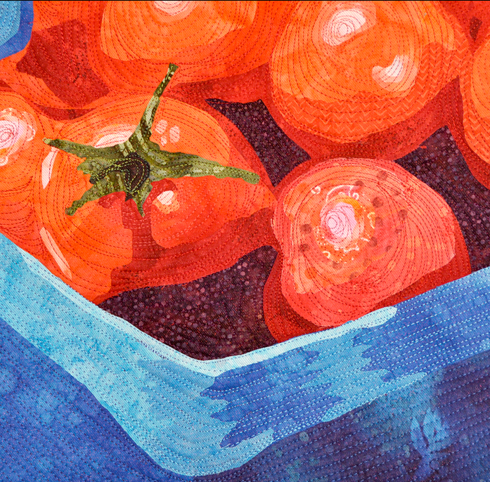
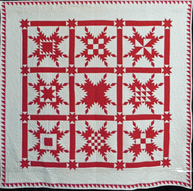
Midsummer Tomato by Diane Perin. Red and White Sampler by Doretta Bradshaw.
Tint
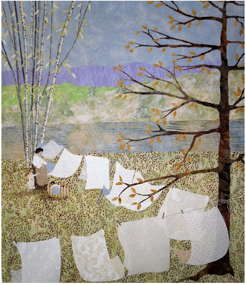
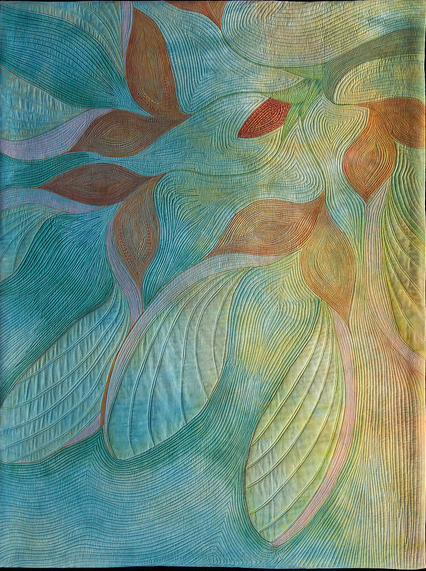
Washday with Frieda by Barbara Strobel. Spring Rhapsody by Nancy Cook.
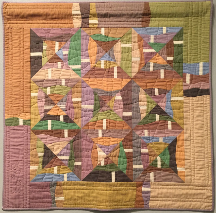
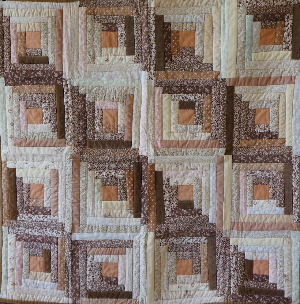
Summer at Ocean Beach: White Sky in July by Sonya Lee Barrington (Show 1012). Vintage Log Cabin by Jean Wells (Show 107, Show 1301, and Show 2513)
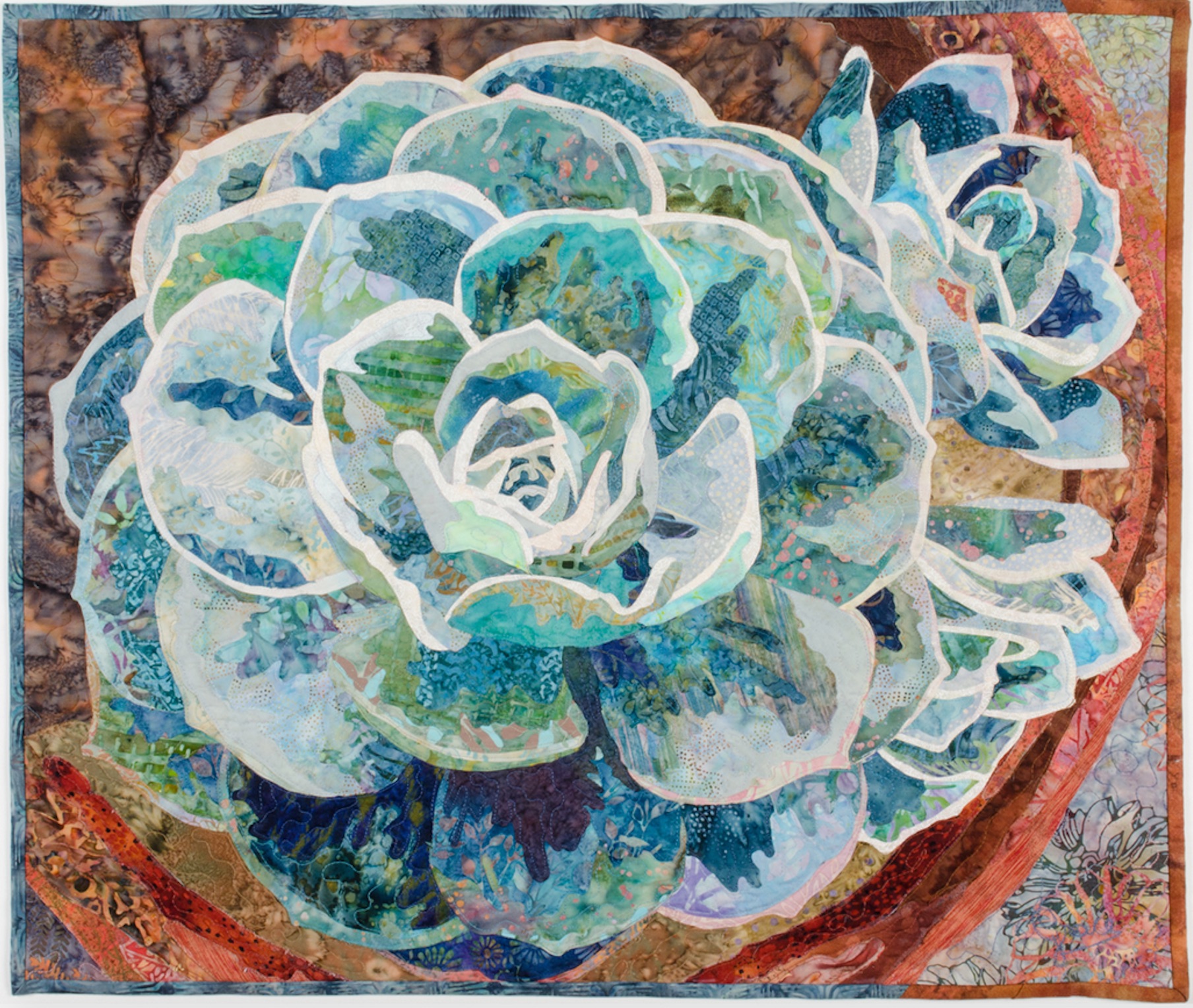
Hens and Chicks by Grace Errea
Shade
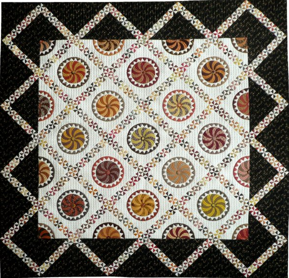
Twirly Balls and Pinwheels by Sue Garman (Show 304 and Show 503)
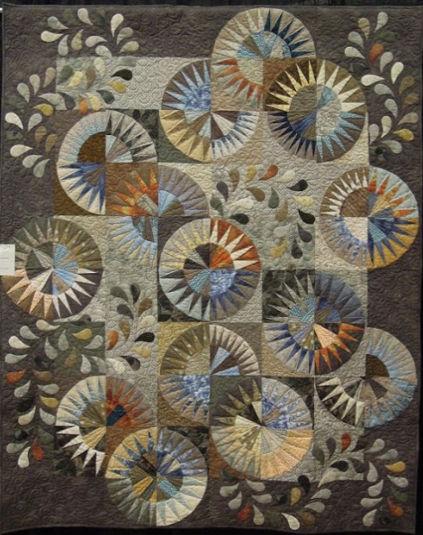
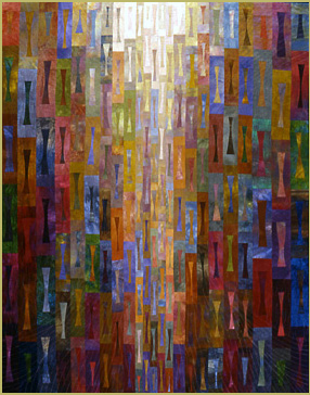
Rob's Quilt by Kathy Martin. It’s About Time by Janet Steadman.
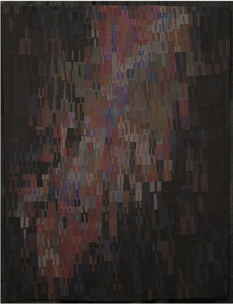
Tuning Fork #22: "Dark Waters" by Heather Pregger
Tone
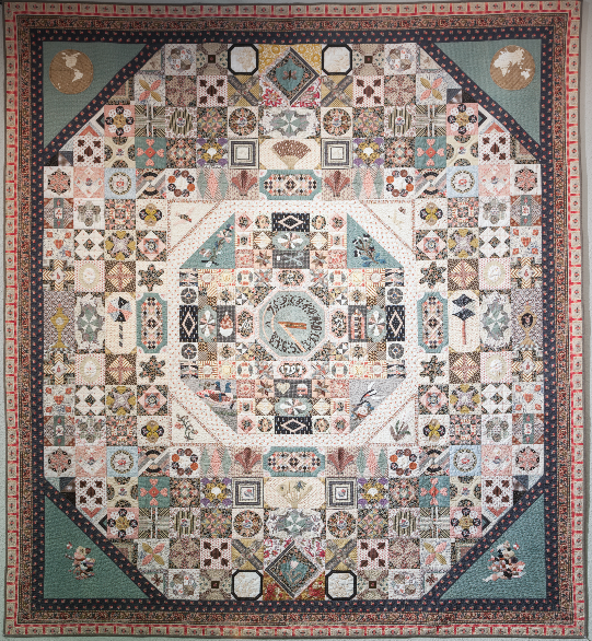
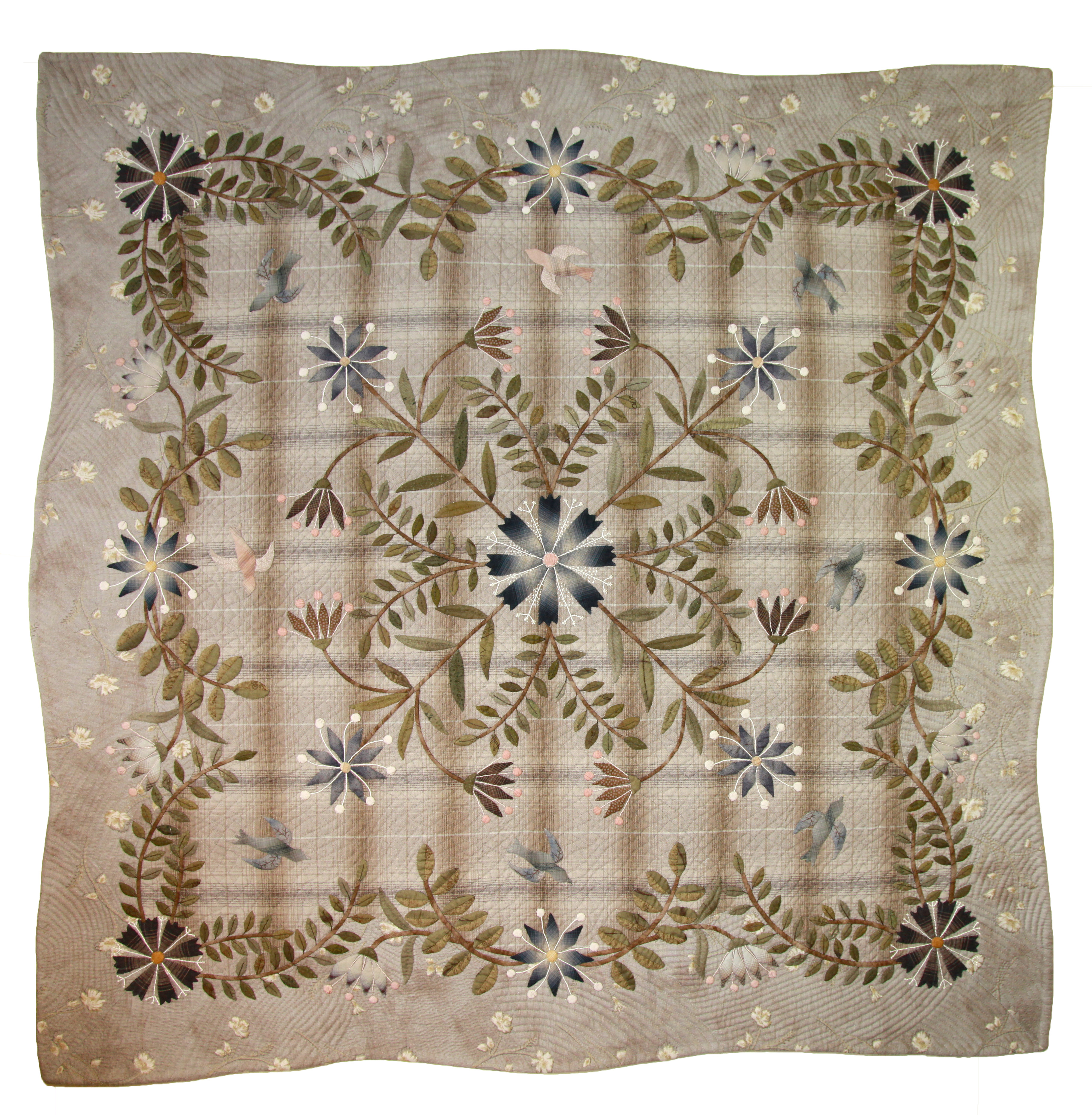
V & A Museum “1797 Sundial Coverlet” by Carolyn Konig (Show 1411). Floral Bouquet by Yoko Saito (Show 1505).
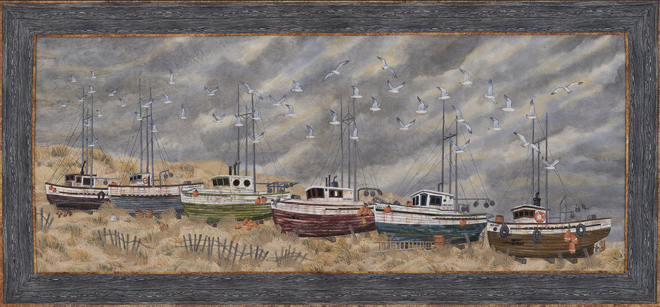
End of the Line? By Joanne Baeth
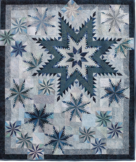
Silent Night by Maryellen Montague
Work Exercise: Create Your Own Color Scale
Using the example below, draw a set of boxes on a sheet of white cardstock paper. Give each box a pure color name of your choosing. Label the group of boxes as indicated on the far right box. This will be helpful as a reference.
1. Paint the pure color in the center (where you see the name listed). Wait a few minutes to let this dry.
2. Tints - Add a small amount of white paint to your color. Paint this new tint just above the first color. Let the paint dry a bit. Gradually add a bit more white to the first color and continue filling in the appropriate box. Repeat for the remaining two boxes.
3. Shade - Add a small bit of black paint to your color. Paint the new shade just below the first color. Let the paint dry a bit. Gradually add a bit more black to the first color and continue filling in the appropriate lower boxes. Repeat for the remaining two colors.
You can practice this exercise with as many colors as you desire.
![Paint Tints, Tones, and Shades to Create New (Secondary) Hues Example [Image by TheQuiltShow.com]](/images/2020/Quilts/TintsShadesTones.png)
Image by TheQuiltShow.com
Click here for more topics related to The Art of Quilt Design program.




.jpg)
