Star Members can watch Paula in Show 2010: Easy Piecing with Complex Fabrics Makes Stunning Quilts.
Star Members can watch Paula in Show 2010: Easy Piecing with Complex Fabrics Makes Stunning Quilts.

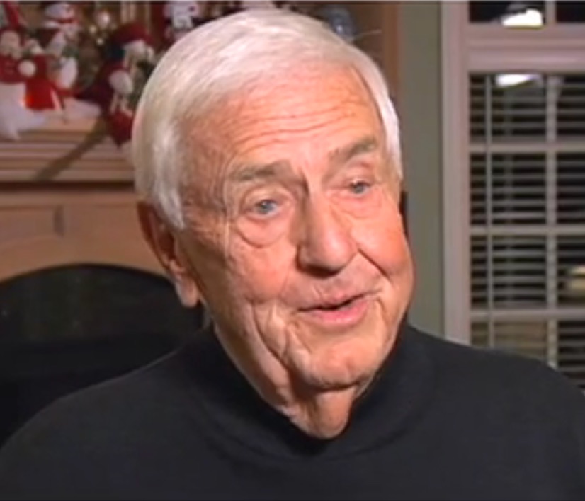
Bill Schroeder, the man who co-founded the American Quilter's Society (AQS) along with his wife, Meredith, has passed away. They founded AQS in 1984 and produced how-to books and the National Quilt Show and Contest in Paducah. In 1991 they built the Museum of the American Quilter's Society, which was designated as The National Quilt Museum in 2004.
To learn more about Bill and his life, click here.
To honor Bill and Meredith, we are opening up Show 1113 to everyone. This show features the co-founders of AQS and begins with a tour of the National Quilt Museum. We visit the offices of the American Quilter's Society, where a busy staff produces quilt magazines, assorted quilt-related books, and many annual quilt shows. Finally, we drop in at the Schroeder home, where—among other things—Meredith reveals the only quilt she's ever made…as part of an ugly quilt challenge.

Take this fun, fast color test we created. After you take the test, look at the 34 second video below on color mixing (what is "additive" and "subtractive"). Then click here to read Design to Quilt: Elements of Design-Working with Complementary Color (Week 16).
This week, as we continue our study of color as it relates to quilting, we focus on the Complementary color plan.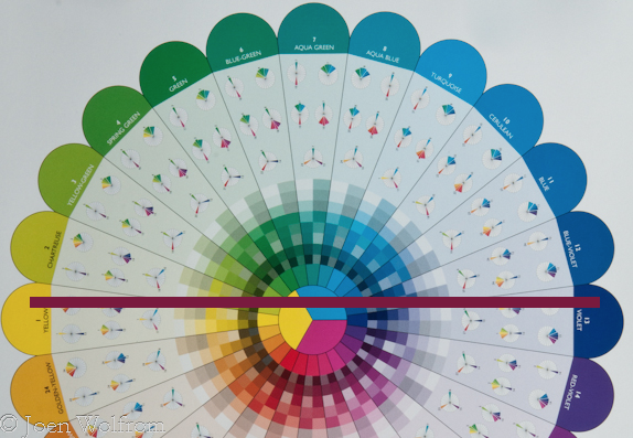
The complementary color plan features two colors directly opposite each other on the color wheel as seen in our Essential Color Wheel. Yellow is directly across from Violet. As opposites, these two colors together create visual excitement, vibrancy, intensity and high impact. But as direct opposites they compete for attention when placed together in their most saturated hue.
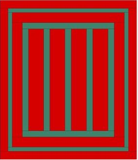
When placed together, the complementary colors in their most saturated form vibrate and can be jarring for the viewer. Think of complementary colors as two extroverts at a small dinner party. Both compete for attention with their enthusiastic talk, charm and laughter, but together, they are overwhelming for the rest of the guests at the table. The Amish Red and Green Bar quilt is an example of a saturated complementary plan featuring red colors that vibrate, making the quilt difficult view for a long period of time.
Used carefully, however, the complementary colors can create dynamic and very graphic quilts, when one color is the lead player, while the other takes a supporting role. In this case it is important to use a wide range of of colors within the two to create the most effective results. And don't be tempted to stray over by including a neigboring color as it becomes immediately apparent to the viewer that this neighbor doesn't belong in the group. As a quilter, this is where your Ultimate 3-in-1 Color Tool can come in handy. Each of the twenty-four pages features not only the pure color, but also the tints, shades and tones of that pure family. Use it for delving into your stash or take it along when fabric shopping to determine if a fabric fits within your complementary color plan.
In her book The Quilter's Color Club, Christine Barnes, says that "lowering the intensity of complementary colors is the most effective way to soften the contrast. Brilliant blue-green and red-orange can overwhelm, but quieter versions of those colors, such as azure and terra cotta, are easier on the eye." Working with
However, being opposites on the Essential Color Wheel can also be an advantage. Did you ever think about why life vests and life rafts are bright orange? As the opposite of Cyan (Turqouise) they contrast with the water and are visible for miles (see second bar from the left below). Understanding that these opposites can have a powerful effect means that you as a quilter can use them to make a statement.
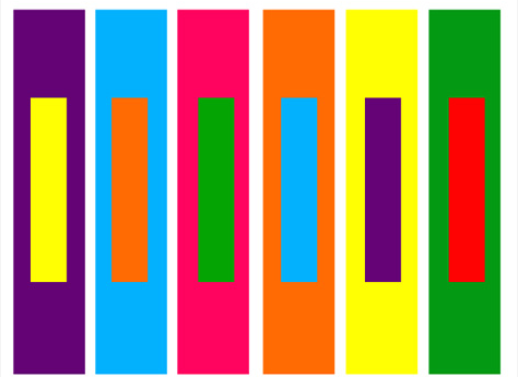
Need ideas? Anytime you are out and about with your camera or cell phone take time to look around. Inspiration for complementary color combinations are everwhere. Here are just a few examples:

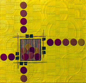
Now let's look at some quilts where in most cases one color is the lead and the other is secondary:
Supplies-
1 sheet of construction paper in six different saturated colors (Red, Yellow, Cyan-Turquoise, Blue, Green, Violet, Orange)
Ruler, pencil, scissors
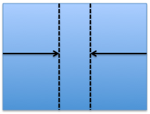
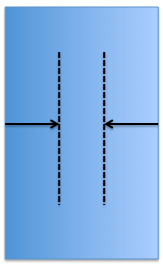
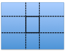
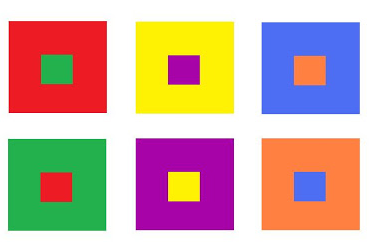
1. Cut 2 (4" x 6") rectangles from each color of construction paper. Divide the rectangles into groups (A & B) of six colors. Set group A aside for later.
2. You will now work with group B. Using one rectangle, measure and draw a line 2 1/2" from either side. Measure and draw a line 1 1/2" from top to bottom. The resulting drawn lines should be a 1" square in the center of your rectangle. Repeat for the remaining 5 colors in group B.
3. Carefully cut center square out from each of the rectangles.
4. Place a color from group A behind a group B as in the image above. Notice how the colors vibrate as well as move forward/recede.
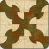
This appears to be another variation of the Drunkard's Path block. What do you think? Play the game and find out.
Mika McKinnon is a physicist who has crunched statistics on millions of data points and invented internally-consistent imaginary physics frameworks for TV shows; but she also got her first sewing machine at 6-years old and has yet to find a textile art she didn't want to try at least once. In this article, she writes about how she is "blown away" by the intricate gowns at the Met Gala and how much math, physics, and engineering goes into each design.
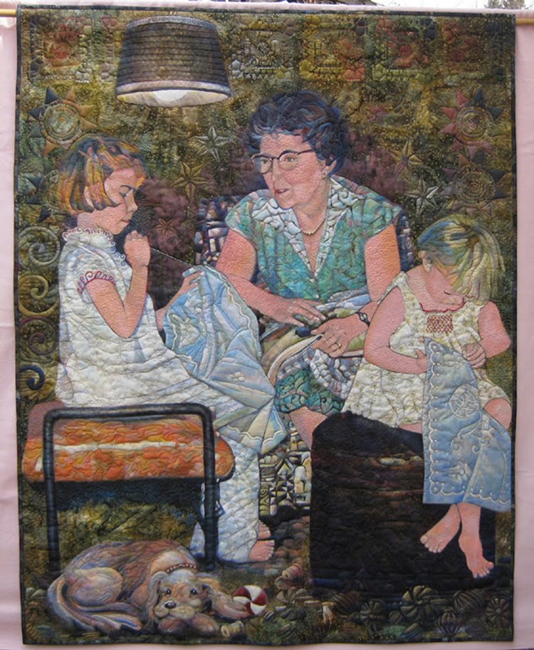
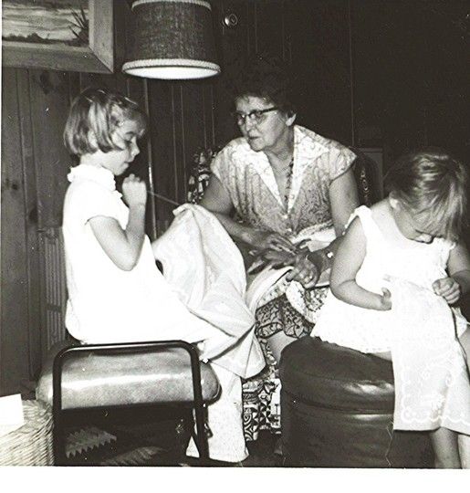
Based on a picture of Alex sewing at her grandmother's knee, Grandmother's Legacy is an award-winning quilt by artist and quilter Gail E. Thomas. Alex loved the quilt as a memory and a statement of passing on our passions from generation to generation. Then one day, Alex was shocked to receive this quilt as a gift from Gail. It is a family treasure.
To answer the question for those who haven't guessed, Alex is the one with her back to authority. Nothing changes.
Click on the button to See More of Gail's quilts and learn more about her.
