 16
16
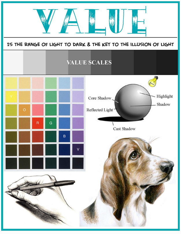
We now leave our study of color (Lesson 13) and direct our attention to one of the most often forgotten players in design, that of VALUE! It is said that while color receives all of the attention, it is value that actually does all of the work. Value's close relationship with color means that you need both working together to make for a successful quilt.
In the most basic terms, value is the lightness or darkness of a color. There are generally three categories of value: high, low, and mid.
High value means colors that have a great deal of light in them, with white being the highest of high value colors. Low value colors are darker, with black being the lowest of low value colors. Mid value colors are those that do not lean to the very light or very dark, and as such are very appealing to quilters.
Fabric manufacturer's know this about quilters, and that is why when you go shopping for fabrics it is difficult to find a large assortment of very light of very dark fabrics in a single color family.

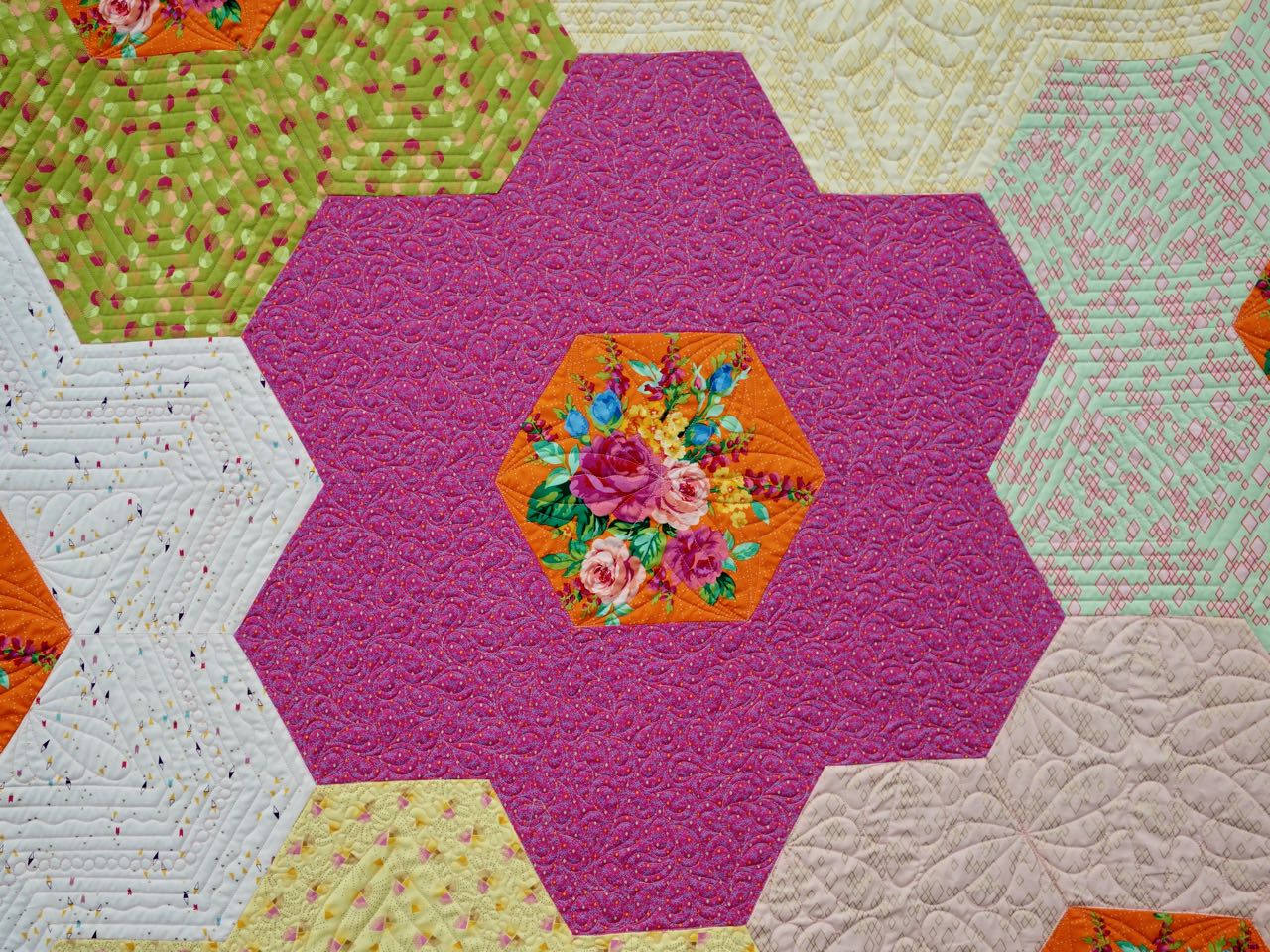
Let's say you want to make a lone star quilt using only magenta fabrics. If you select all mid-value fabrics (Collection 1), the beautiful star design will get lost or muddy. No longer are you able to determine the uniqueness of the star elements.

Collection 1
If you remove the pink/orange dot and add more high value-light fabrics (Collection 2), you will achieve a more pleasing value change with each round. This makes the star have maximum impact visually. Bottom line...when shopping (or pulling from your stash) swing to both the far dark and far light side when it comes to building a collection of fabrics for a project.


Collection 2
There are times when your desired effect is to have a less defined and 'blendy' result, as in the case of the fur of the dog in Sun Worship by Barbara Yates Beasley. Other subjects where a more 'blendy' effect could be used are landscapes, sunrises/sunsets, trees with many leaves, etc. The key to achieving success is to remember that when selecting fabric, try to incorporate a very wide range of tints, tones, shades and pure color. That way your design will have contrast, depth, and volume.
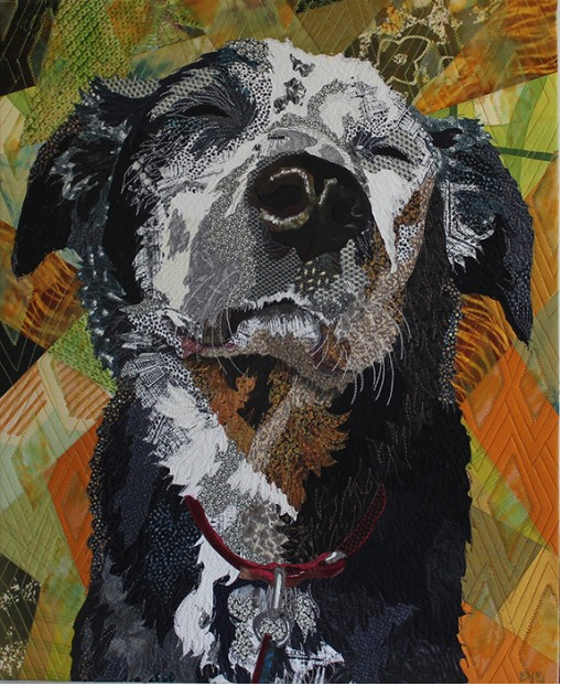
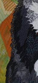
Sun Worship by Barbara Yates Beasely (Show 1905) [Images courtesy of Barbara Yates Beasley]
Easy terms to remember:
High - Light, Airy, Delicate
Low - Dark, Earthy, Heavy
Mid - Middle of the road
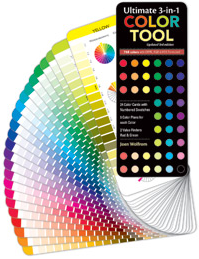
Not sure about your instincts? Use the Ultimate 3-in-1 Color Tool to help solve the mystery. Each of the twenty-four pages illustrates the pure color, tints, shades, and tones of a family, allowing you the opportunity to select from a wide array of fabrics to make a quilt more interesting.

Let's look at some examples of quilts featuring high, mid, and low values:

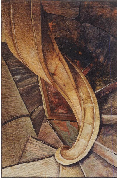
Vintage Log Cabin 1994 by Jean Wells (Show 107, Show 1301, Show 2513) [Image by TheQuiltShow.com]. Spyrogyra by Esterita Austin (Show 506). [Image courtesy of Esterita Austin].
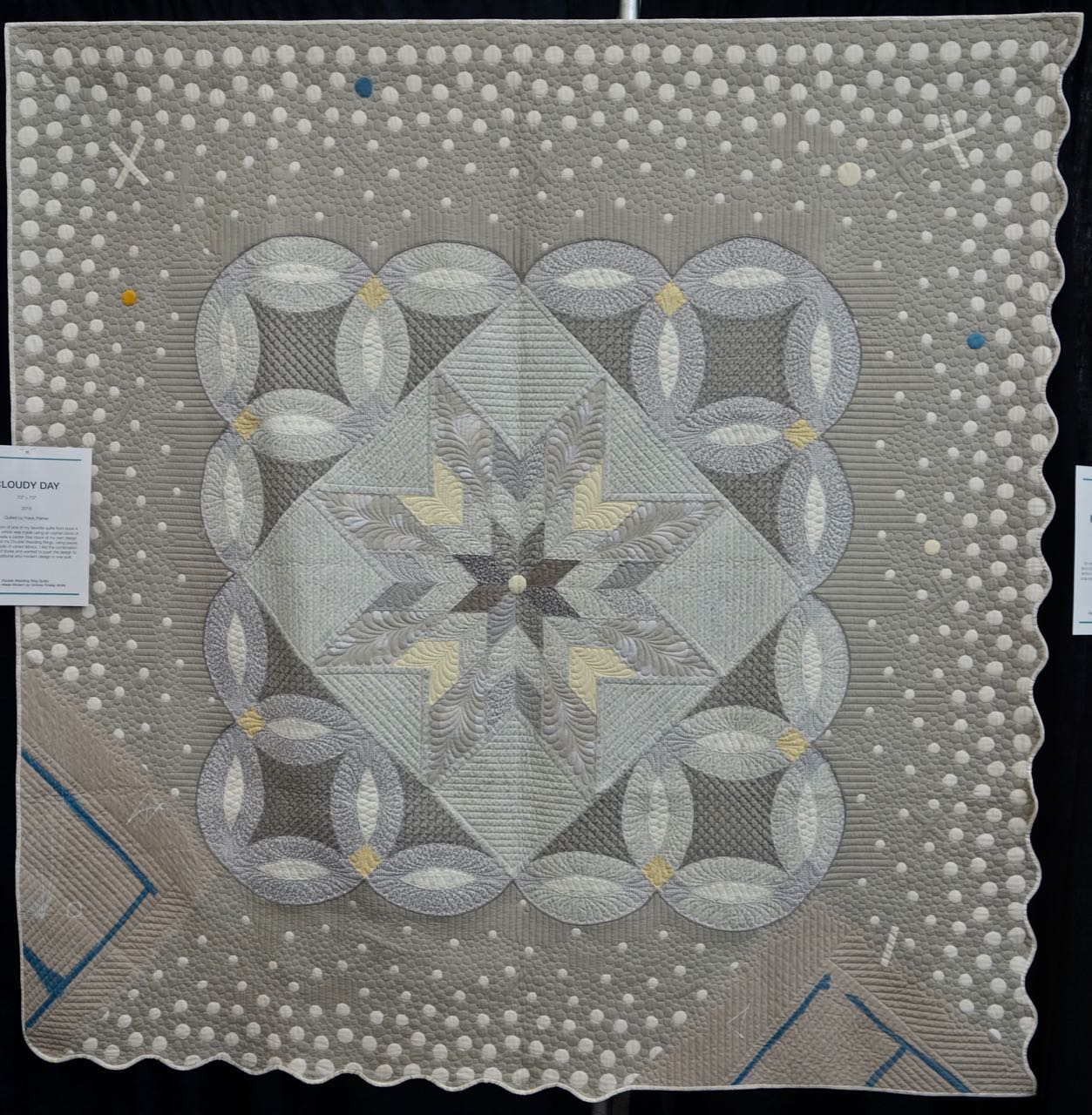
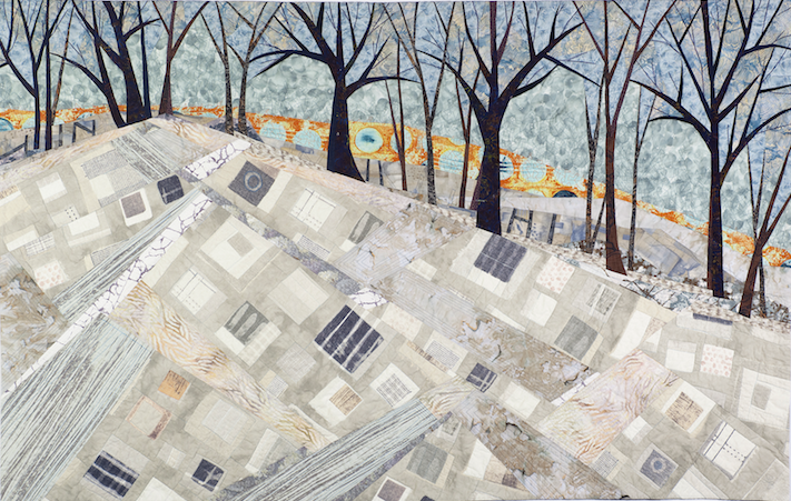
Cloudy Day by Victoria Findlay Wolfe. (Show 1404, Show 2002) [Image by TheQuiltShow.com]. Boundaries by Linda Beach (Show 1409). [Image courtesy of Linda Beach]
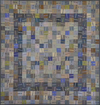

Chop Sticks by Alex Anderson. (Image courtesy of Alex Anderson). Sisters/Best Friends by Sandra Mollon (Show 2609). [Image courtesy of Sandra Mollon].
Fiber artist, designer, quilter, and author, Grace J. Errea, began quilting in 2000. Her art focuses on the depiction of inspiring scenes in a value based contemporary-realistic manner. Grace's spectacular quilt work seems effortless, but she shares the secret for what makes a successful quilt. It comes down to training your eye, evaluating your stash, and paying close attention to the type of impact you as the quilter want to evoke.
What is “VALUE”
(All image by Grace Errea unless otherwise noted)
by Grace Errea (Show 1303)
So you made what you thought was your masterpiece, only to realize that it is…quite frankly, boring. You think the problem is the colors but, you will find your problem if you inspect the values. It’s time to take your work to another level! This article will demonstrate how to train your eye and brain to see color differently through the use of value.
Let’s start by discovering where does “Value” come from and what is it. When we say “color”, we are using the word as a substitute for the word “hue." Hue is one of the three components of Color. It refers to the name such as red, blue, green. The second component is Saturation, i.e. how pure is that hue. A pure hue can be de-saturated by the addition of gray. Thereby we are creating what is called toned hues.
A hue can also be de-saturated by adding white or black. Black darkens the hue creating shades. Conversely, white lightens the hue and creates tints. This generates degrees of light and dark, and that is how values are created. A good design is produced when there is a good distribution of tints, shades, and mid-range values. Middle values provide the framework with, light and dark value contrast giving the design its visual impact.
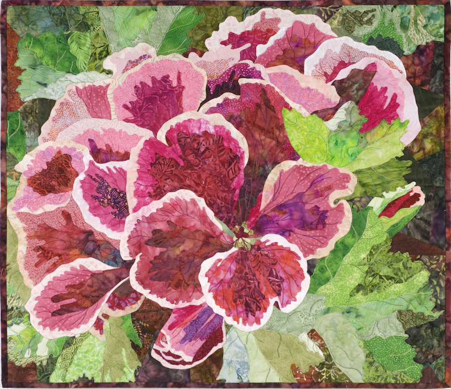
“Grenadine Picotee” has strong highlights at the edges of the petals that add impact to the shapes.

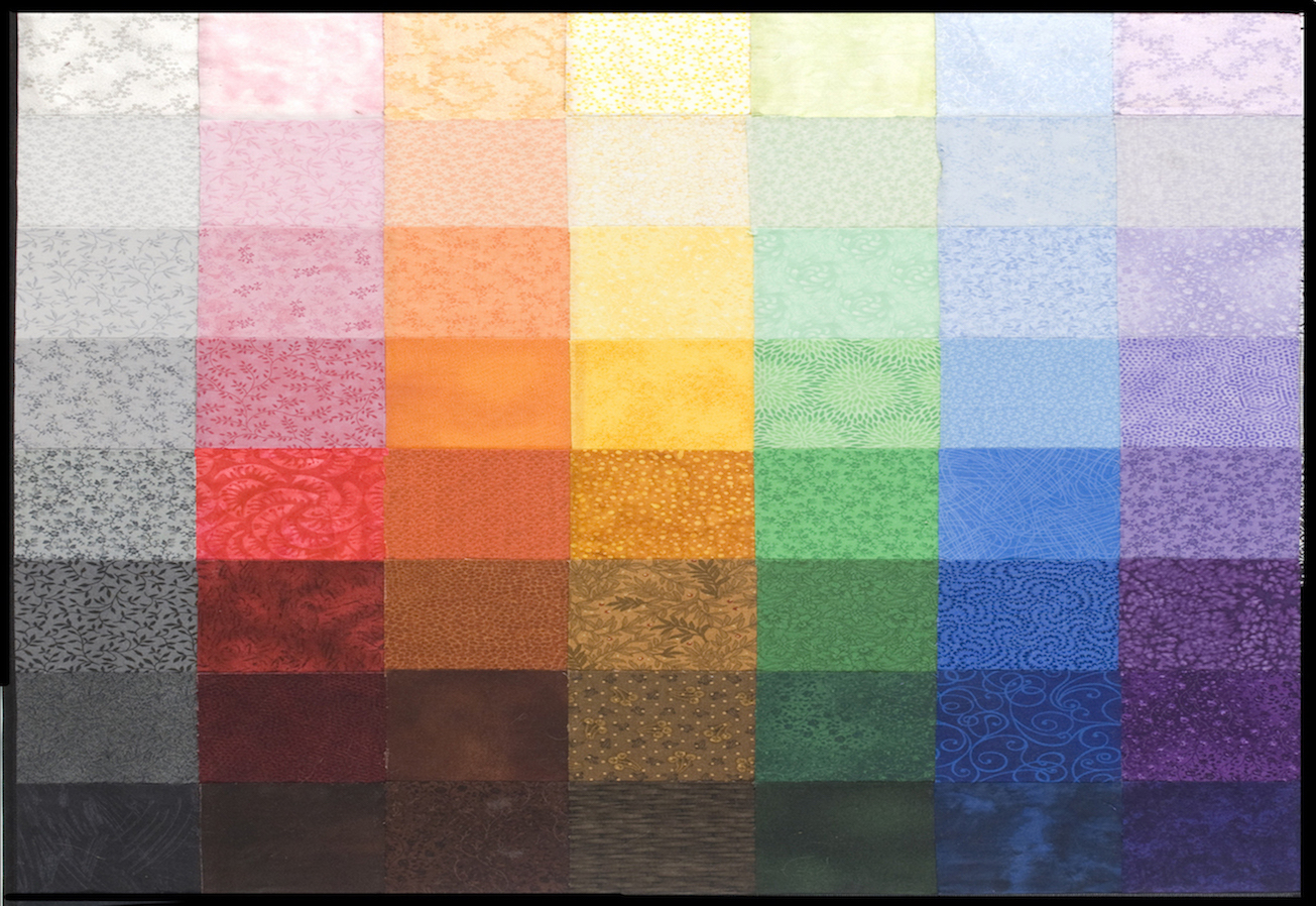
I use 8 values, from very light (Value 1) to very dark (Value 8). Each increment creates a smooth transition, as shown in this Gray Scale. Also, in the Value in Color Chart, showing equivalency in the primary and secondary hues. Each column represents a hue showing values from 1 to 8. Each row is one value across as a continuum. As you go down the column you will see discernable changes in value, as it gets darker.
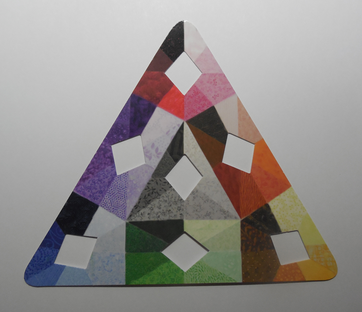
By using the Value Matching Tool, areas are isolated and easily “value-lized” when compared to the values that surround the opening.
Where and how to use Value:
- Highlighting a focal point

“Moondance” is an example of at least 3 or more values between the focal point and the background to accentuate the main character in your piece.
- Create atmospheric perspective

In landscapes, as you move further away, layers of atmosphere lighten the background. By using tints as you move away from the darker valued foreground, atmospheric perspective is created using value alone.
- Set the mood of a piece.
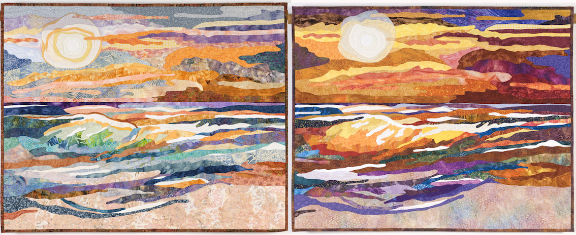
“Creamsicle Dawn” (left) was created using tints, yielding this calming, early morning feeling.
Conversely, “Popsicle Sunset” (right) has mostly shades which creates a dramatic, hot sunset that stirs the soul.
- Create 3-dimensionality

Three-dimensionality is created by lighting the subject as in “Hen and Chicks”. Light creates the highlights and shadows. It is all about the Value!
- Create the object in multiple hues or your favorite hue
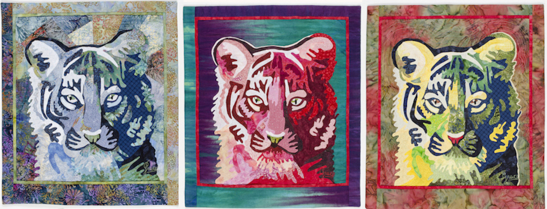
In “Blue Tigger”, “Red Tigger”, “Rudolph Tigger” the same pattern was used with different hue combination. The key is to maintain the value regardless of hue.
- Create High-Value and Low-Value Effects

In order for a focal to be highlighted there must be at least 3-values between the background and the outer edges of the focal point. More is better. If the focal point is lost in the design, it is not the color but the value that is causing the problem. Darken or lighten the background and voila! “Bateleur Eagle” is a good example of the High Value effect. Background is value 1 and the Eagle is value 7-8.

The “Hibiscus” is a high-value, but something is lurking within the petals. The value of Mr. Frog is similar to his neighborhood so he needs to be “found” upon closer inspection.
It all comes down to Value being relative to its neighborhood. Whether something is working beyond your expectations, or there is a problem to solve, give Value the credit or look for a Value solution first. All else can come second. To learn more about Grace Errea watch Show 1303, or visit her website www.amazingquiltsbygrace.com
Practice Exercise:
Select one of the quilts in this newsletter as inspiration, and using your personal stash, set up the range of fabrics from high, mid, to low value. See where you have holes. Take note, so the next time you visit the fabric store, you can be sure to seek out those values that you need. Repeat with as many quilts as you like. You will be surprised how many low and high value fabrics you have on your shopping list!
Click here for more topics related to The Art of Quilt Design program.












.jpg)
