 9
9

As we dive deeper into our study of color (Lesson 13), we look at the harmonious Split-Complementary color plan. Less harsh, and easier on the eyes than in the previous lesson's complementary plan [review Complementary Plan (Lesson 16)], this grouping of colors offers just as much visual impact, but in a softer more balanced manner. The transition between the colors is gradual, softer, peaceful and very pleasing. Think evening sunsets or morning sunrises, and you get the idea.
The split-complementary plan takes one color, "the lead," a "supporting actor" color, and a "cast member" or two on either side of the lead's complement. For example, on our Essential Color Wheel, Blue is our lead color. Directly opposite of blue is orange-yellow. Our split-complementary will now be made up of blue, golden-yellow and yellow-orange (supporting actors and cast member). This combination allows for contrast without the harshness or vibrations of the complementary plan.
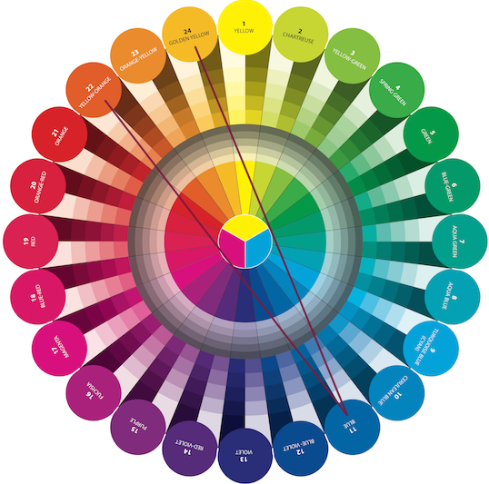
But like any plan, there are a few rules that need to be followed to achieve harmony with all the cast members. It is best to use an uneven number of 3, 5, or 7 colors in your analagous color selection [review Analagous (Lesson15)]. Definitely include the direct complement of blue (orange-yellow) when selecting fabrics as it makes for a softer and more subtle color shift (from Blue to Magenta) as in the example below by Hilde Morin in her quilt Afternoon Glow.
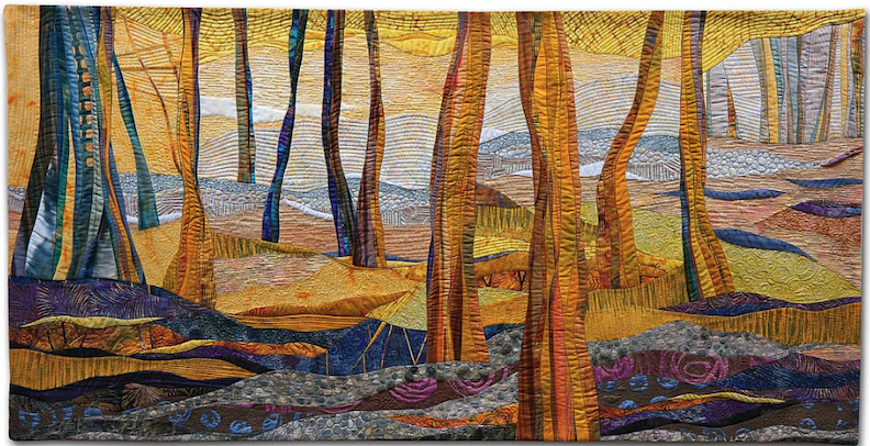
Afternoon Glow by Hilde Morin (Image courtesy of Hilde Morin)
Gloria Loughman's quilt Color Play shifts from orange-yellow to cerulean blue in a much more subtle and softer manner than Mel Beach's Orange You Glad I Got The Blues complementary shift from orange to cyan (turquoise). Both quilts are eye catching and have strong visual interest for the viewer, however, the quilt on the left reads as subtle with a great deal of movement, while the quilt on the right reads as strong, dynamic, and vibrates. The bottom line is, it's all about the message you want to send in your quilt.

Color Play by Gloria Loughman (Show 612) [Image courtesy of Gloria Loughman]. Orange You Glad I Got The Blues by Mel Beach (Show 2112) [Image courtesy of Mel Beach].
Using our Essential Color Wheel, let's put this to the test when selecting fabric from a stash.

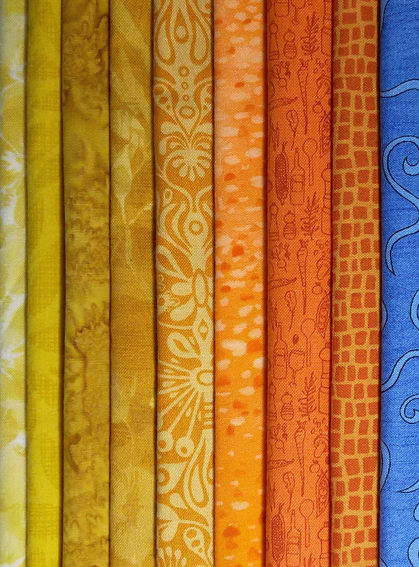
Example #1 (below): Using the narrowest of split-complementary plans, in this case the 3-1 combination of Golden-Yellow, Orange-Yellow, Yellow-Orange and Blue, these are the fabrics from our stash that we selected to use. Karen Kamenetzky's stunning quilt, Fundamental Change VI, beautifully illustrates the subtle color changes with that added little pop of blue to catch the viewers attention.
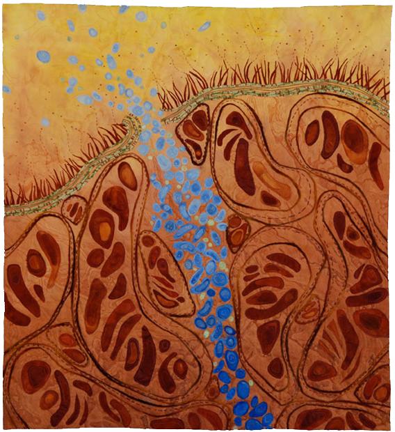
Fundamental Change VI by Karen Kamenetzky (Image courtesy of Karen Kamenetzky).

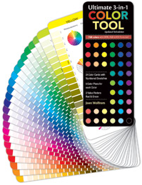
Example # 2 (below): This group of fabrics is a wider split-complementary plan using a 5-1 combination of Violet, Red-Violet, Purple, Fuchsia, Magenta, with Yellow-Green. If you are not sure about whether a fabric fits in your selected analogous color run, use the Ultimate 3-in-1 Color Tool to help solve the mystery. Each of the twenty-four pages illustrates the pure color, tints, shades and tones of a family, allowing you the opportunity to select from a wide array of fabrics to make a quilt more interesting.


Pink Poppy by Susan Brubaker Knapp (Show 901 & Show 1709) [Image courtesy of Susan Brubaker Knapp].

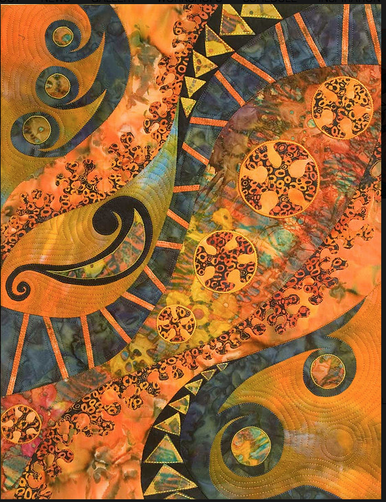
Let's look at some more examples of quilts using the split-complementary colors
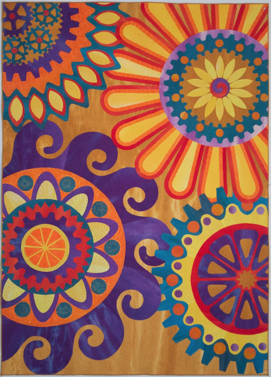
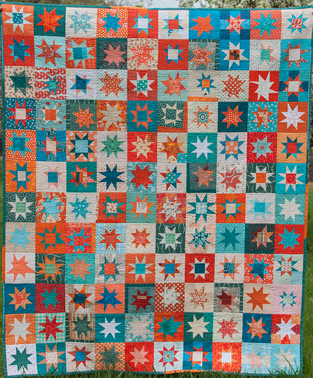
Delightful Spirals by Robbi Joy Eklow (Show 1008) [Image courtesy of Robbi J. Eklow]. Tealorange! by Lynn Carson Harris (Show 2310) [Image courtesy of Lynn C. Harris]
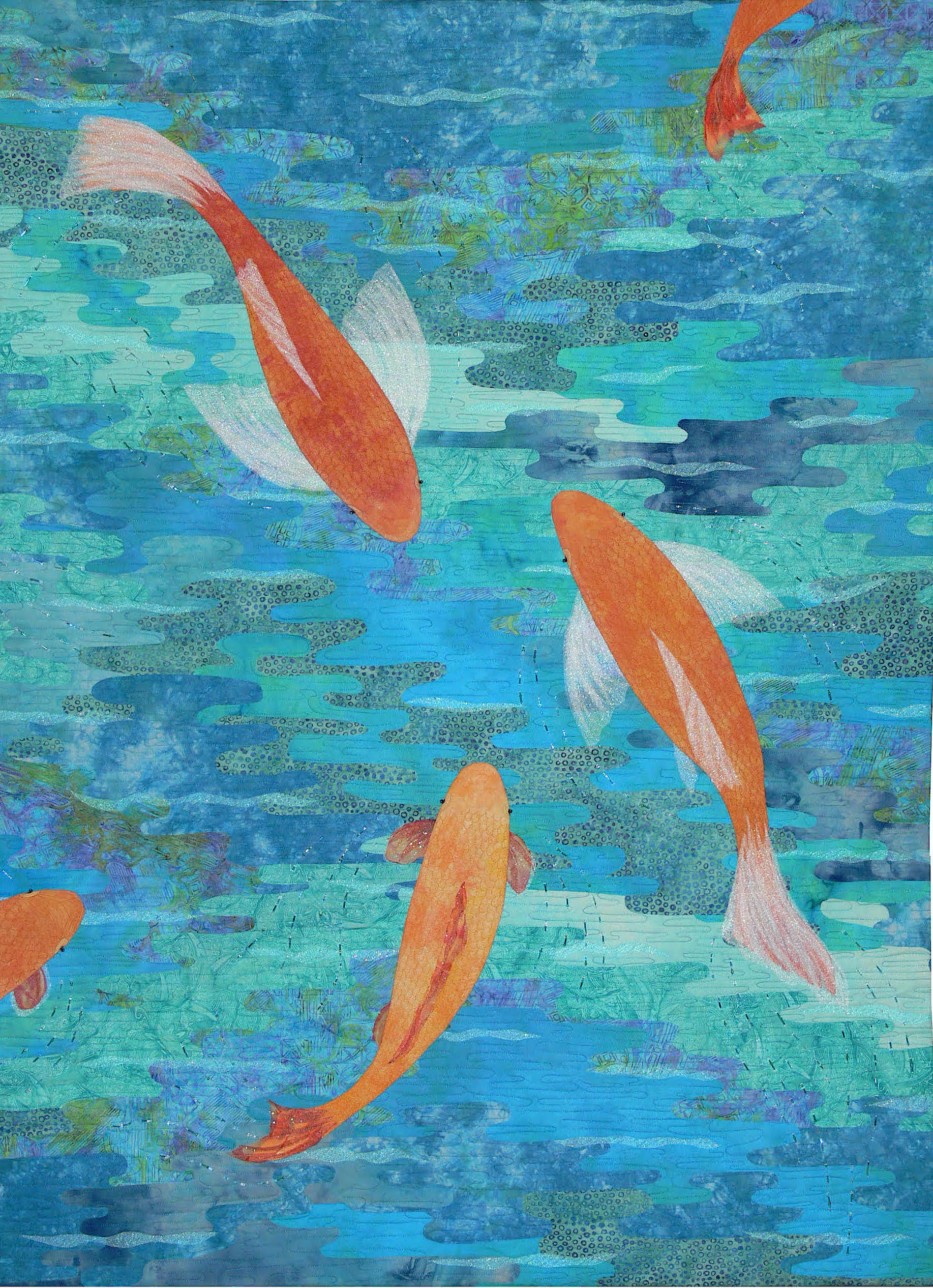
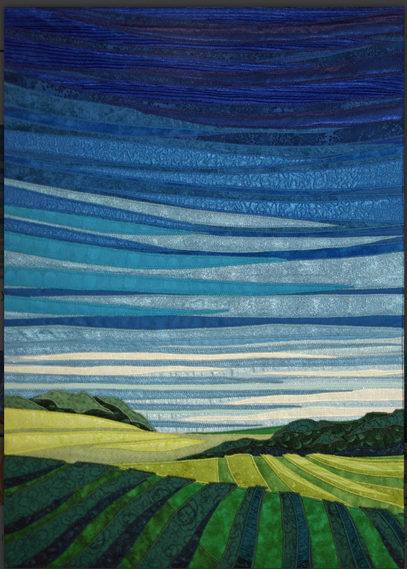
Midday Sky by Lubbesmeyer Art Studio (Image courtesy of Lubbesmeyer Art Studio). Koi by Sarah Ann Smith (Image courtesy of Sarah Ann Smith).
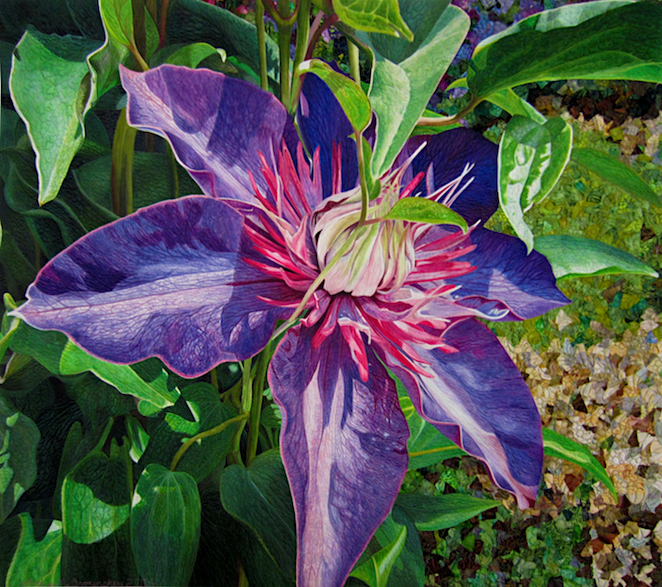

A Passion for Purple by Andrea Brokenshire (Show 1706) [Image courtesy of Andrea Brokenshire]. Namibia View by Gloria Loughman (Show 612) [Image courtesy of Gloria Loughman].
Split Complementary
by Frieda Anderson
(All images by Frieda Anderson unless otherwise noted)
Frieda Anderson (Show 705) is known for using her own hand-dyed silk fabrics when it comes to creating luscious quilts. She shares her approach when it comes to working in a split-complementary color plan.
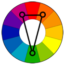
Split-Complementary
The split-complementary color scheme is a variation of the complementary color scheme. In addition to the base color, it uses the two colors adjacent to its complement.
This color scheme has the same strong visual contrast as the complementary color scheme, but has less tension.
The split-complimentary color scheme is often a good choice for beginners because it is difficult to mess up.

This is the description of a split-complementary color scheme. This color scheme is three colors spaced in an uneven triangle shape on the color wheel. I often find that if I just open up my eyes and pay attention to nature, it will give me all the color combinations I can ever use. But I certainly use my color wheel as a guide when I am working on my creations.
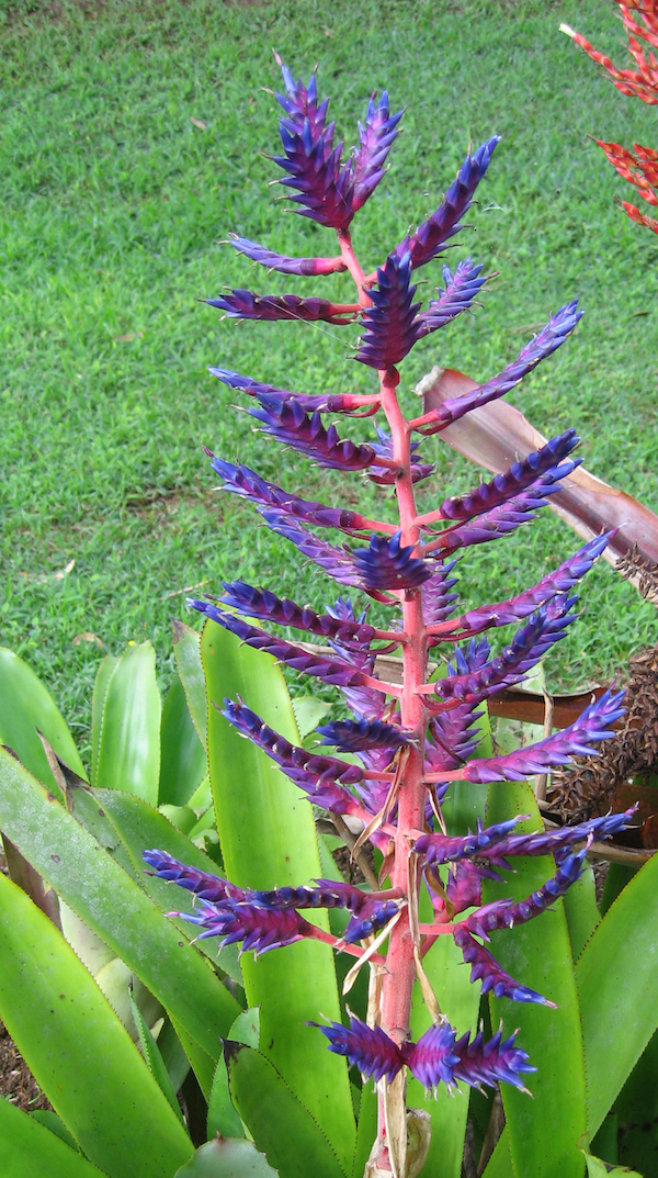
I knew that I wanted to make a quilt with large green leaves. While I was scrolling through my photos, I came across the image of a succulent plant that I had taken while vacationing in Hawaii many years ago. It was the perfect combination of lime green, orange and fuchsia, which is a triad color theme.
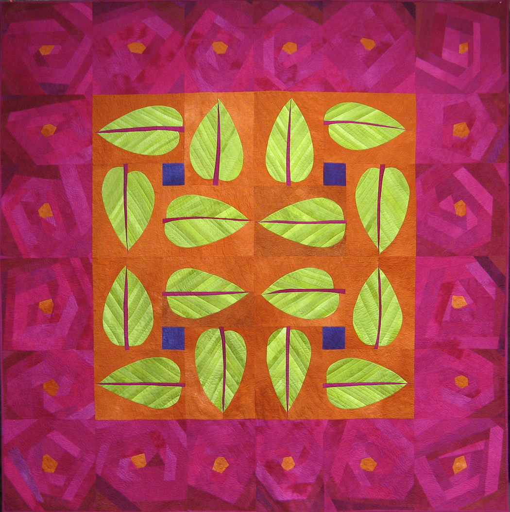
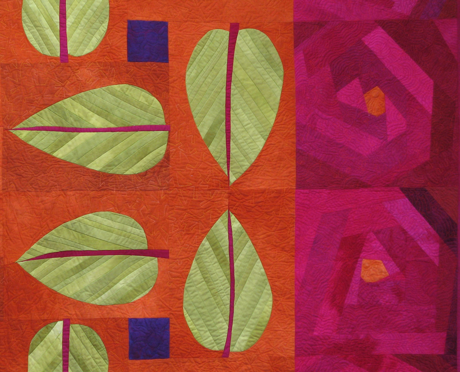
That photo inspired the color theme for my large quilt Shimmering Foliage. I used the one color I like the most, lime green, as my dominate color choice for the leaves. I then used the two other accent colors, fuchsia and orange, to really make this quilt vibrate. This quilt went on to win some awards, and it is still one of my all-time favorite quilts.
The construction of this quilt is made using a freezer paper template to achieve an easy curved leaf shape. This method requires you make a pattern in freezer paper of the shape you are going to piece. You then cut the pattern apart on the lines. Using the template as a guide, cut out each piece of fabric ½” larger than the template. Put starch on the seam allowance and fold the edge of each fabric piece over the freezer paper template, then press with a hot dry iron. Once you have all the template pieces covered with fabric, place the design back together, snugging each section together like it was before you cut it apart. Using a thin line of Elmer’s school glue on the edge of one seam allowance, fold one seam allowance over another seam allowance and hit it with a hot dry iron. You can now remove the freezer paper templates, and the glue will hold the seams together so that you can stitch the two pieces together.
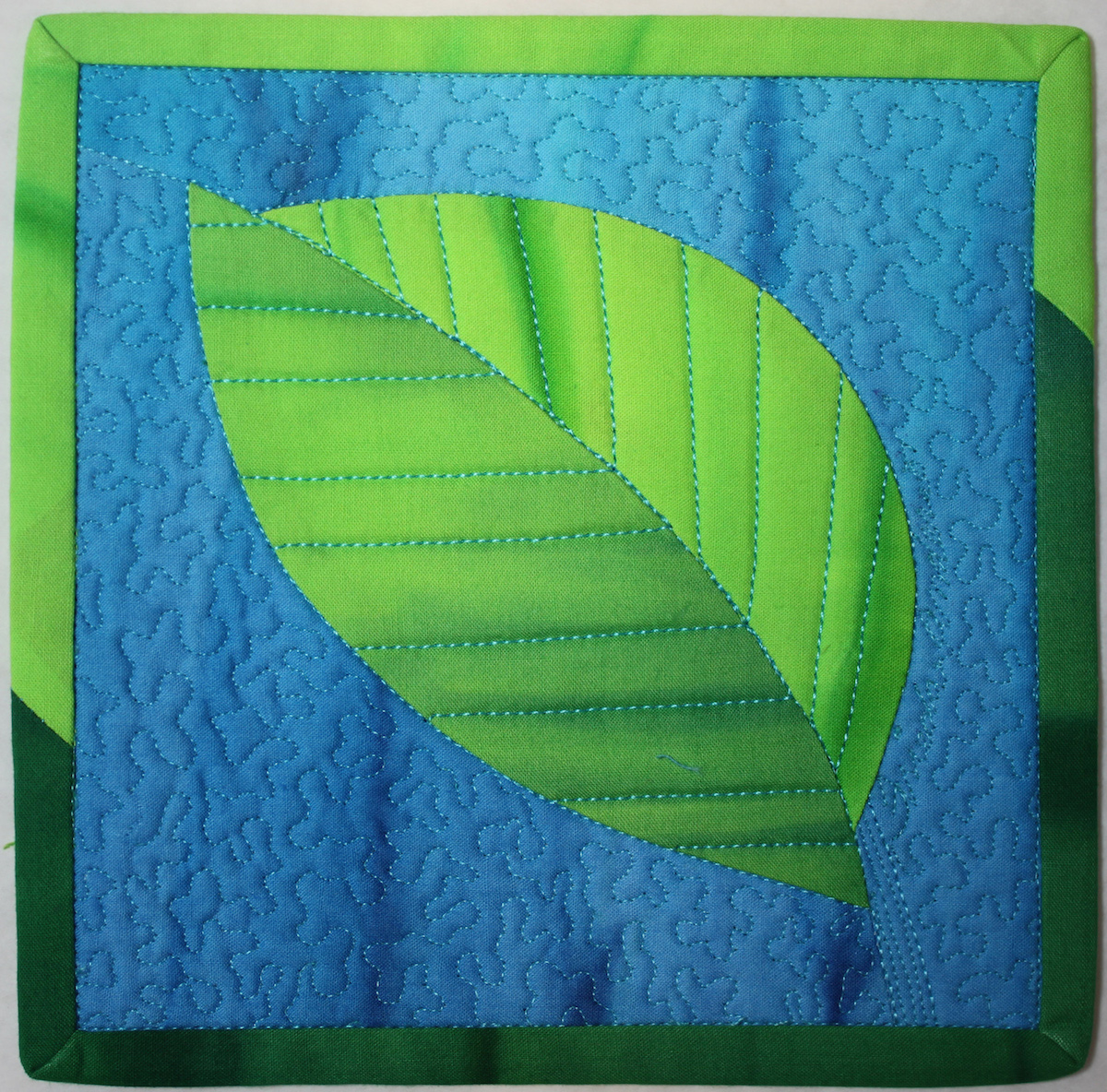
Check out my easy to follow directions for my little Leaf Mug Rug quilt and try this fun technique. I have a larger version too called Falling Leaves. Make the little one first and then tackle the larger version. You can find the patterns on my website on the patterns page.
Practice Exercise: Build a block
Use the two provided blocks to try out your own split-complementary color group. Build the blocks using fabric, construction paper or colored pencils.
 Click here to download Split Complementary Block 1 pdf.
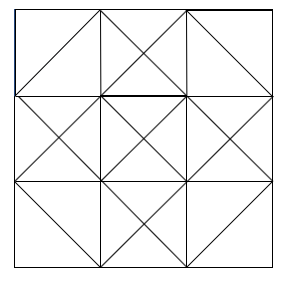 Click here to download Split Complementary Block 2 pdf.
Click here for more topics related to The Art of Quilt Design program.


 Join Alex this Tuesday for a FREE webinar and attend the "Tool School". Learn about quilting products, win prizes, go shopping, and have fun with Alex and Quilters Select.






.jpg)
