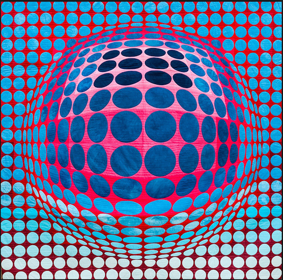
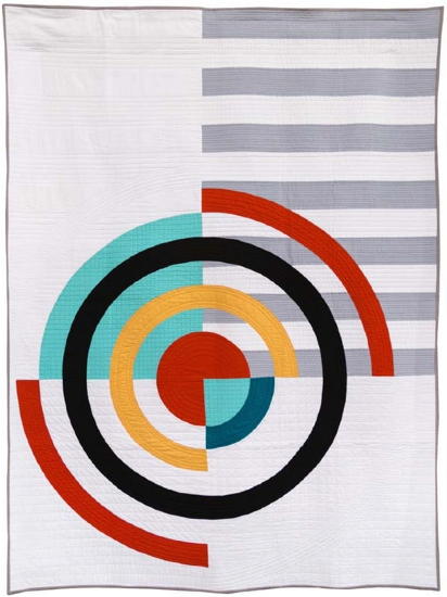
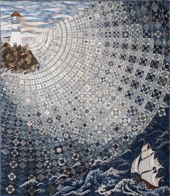
Força Barça by Rosa Rojas & Olga Gonzales Angulo (Show 1912). [Image by TheQuiltShow.com]
Three Easy Steps To Save This Lesson As A Pdf:
-Make sure you are logged in.
-Click on the small triangle next to the tool wheel in the upper right hand corner of the page (you'll find it above the Like button).
-Select the pdf. option. Wait a few minutes. It's a large file due to the number of images.
-Your file should appear with the title of the lesson.
Understanding the Principles of Design, which include balance, contrast, movement, rhythm, emphasis, pattern/repetition as well as unity/variety is fundamental when it comes to presenting your work. As the last lesson of this major unit, we want to focus on contrast and the important role it plays in tying all of your elements together for maximum appeal. Força Barça by Rosa Rojas and Olga Gonzales Angulo (Show 1912) is an example of a quilt with maximum visual impact and would stop any quilter in their tracks.
Do you remember at the beginning of our Principles section (Lesson 30) where we used the example of a very involved cake for a special occasion as a way to illustrate the important roles that each of the various parts played in making the cake remarkable?
It is with contrast that you as the quilter can bring life to your work. It is the last element in the cake assembly process. Contrast is the difference between all of the elements within the entire design. Each part of the cake (e.g. blueberry sauce, lemon curd, mascarpone filling, the layers of cake) is unique and interesting, but when combined, helps to bring the finished cake to a whole new level of enjoyment for those who receive a slice at the party.
Creating contrast can be achieved in a number of ways including:
Light vs. Dark
Warm vs. Cool
Black vs. White
Soft vs. Detailed
Large vs. Small
Texture
Shape
Text Size / Font
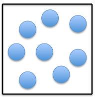
Let's say you want to design a quilt featuring blue circles. But find that the design is not that interesting in and of itself.
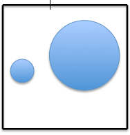
How about using just two circles, with one being considerably larger than the other?
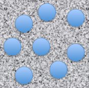
How about a bit of texture (Lesson 4) [with quilting or fabric choice] to make the circles stand out from the background?

Color can certainly make a huge difference. But if the colors are of the same value (Lesson 19) and, as in this example, direct opposites on the color wheel, the combination can be jarring to the eyes. This might not be the direction you want to go, unless you want to create that bit of unease for the viewer.
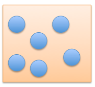
Colors that are farther apart on the value scale within a design present a calm and quiet message.
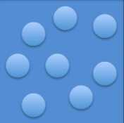
If both elements (background and circles) are in the same color family and closely located on the value scale (Lesson 19), there is still contrast. But the message, again, is of a quiet and calm nature.
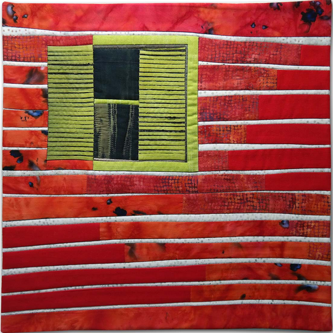
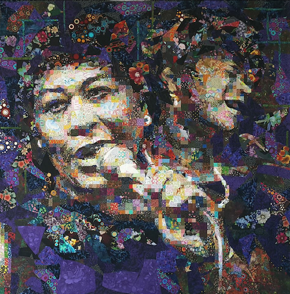
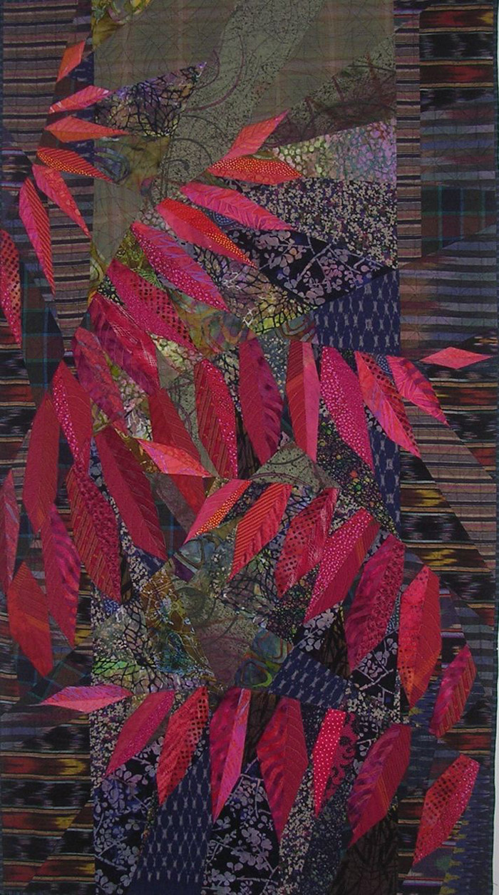
Let's look at some examples of quilts featuring various forms of contrast:
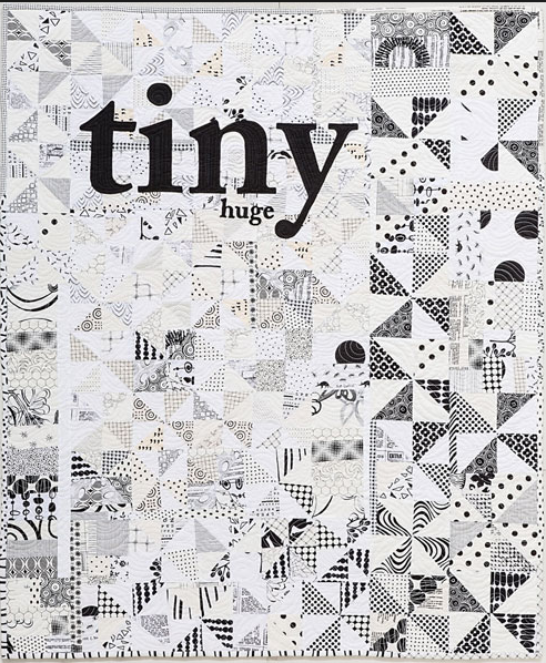
Size:
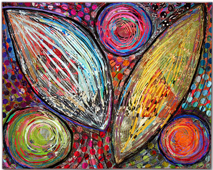
Value:
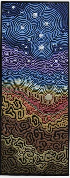
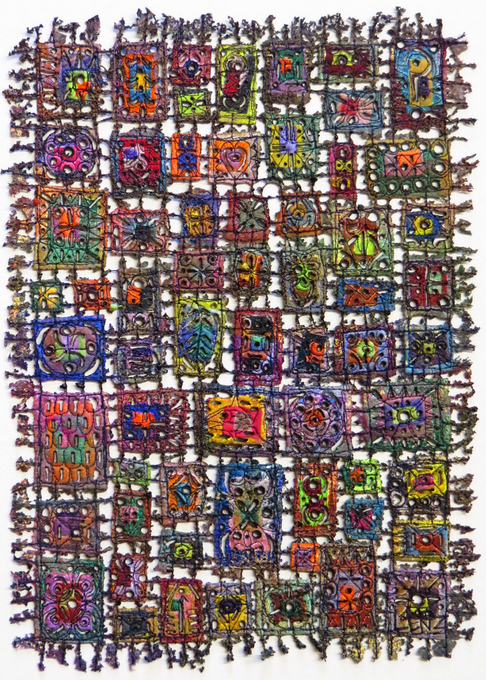
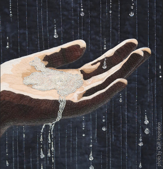
Texture:
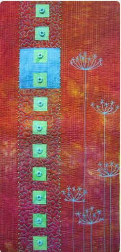
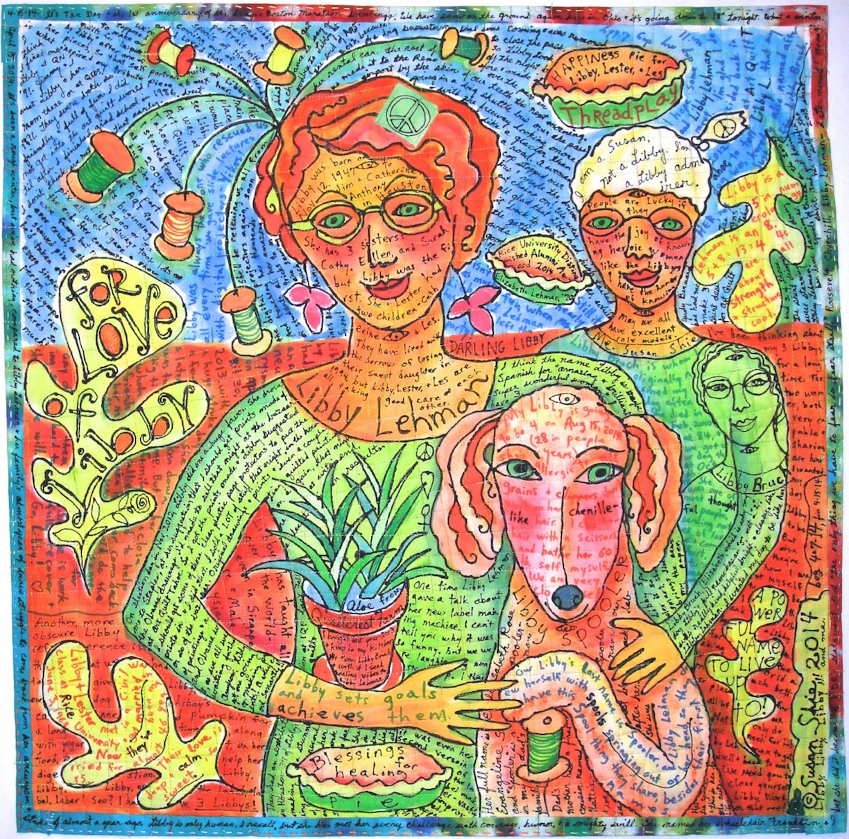
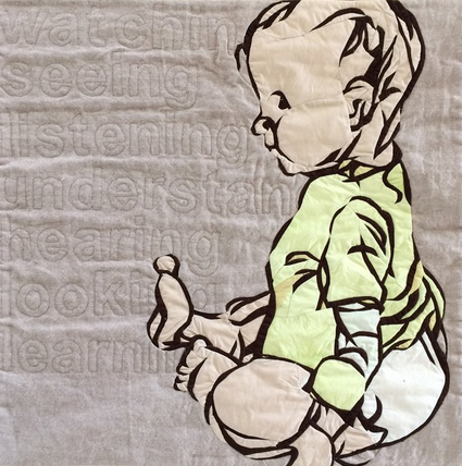
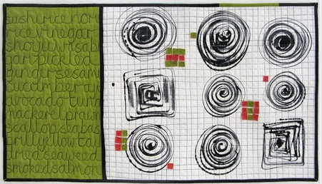
Text / Font:




.jpg)

