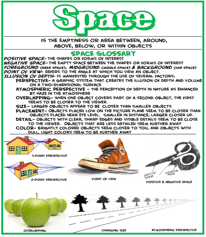
Creating the illusion of depth and spatial reality in your work is not difficult, if you know and understand the magic that key players can perform. Think of depth in a quilt as the ingredient that makes a grilled cheese sandwich so delicious. What's not to love? The sandwich is crispy, chewy, creamy, and salty all in the first bite. The basic ingredients are white bread, a cheese that melts easily, and butter or margarine. This works and probably makes for a good sandwich. But, what if you swapped out the bread for a sourdough? What if you included a mixture of different types of cheeses? How about adding a piece or two of bacon to the mix? Now the sandwich is more interesting on a whole new level. It is still a grilled cheese, but something that stands out from 'the usual'.
By incorporating a variety of different key elements to create depth and space, your quilts will be both interesting and appealing to viewers. Matt Fussell's graphic illustrations, in a simple but very effective manner, describe the six key ways an artist can create space on a two-dimensional surface. This week we will focus on only the first five.
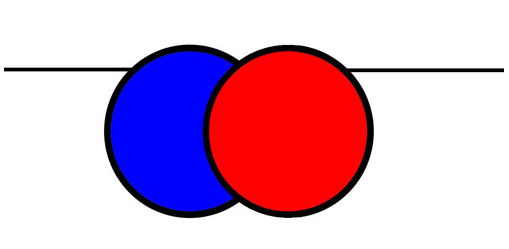
Overlapping-occurs when objects that are closer to the viewer prevent the view of objects that are behind them.
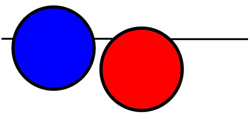
Placement-Objects placed higher within the picture plane will appear further away.
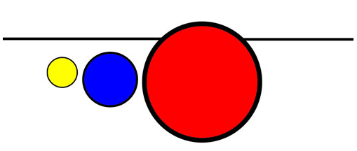
Size- Objects that are smaller will appear further away from the viewer.
Detail-Objects that are further away should have less details than those closer to the viewer.
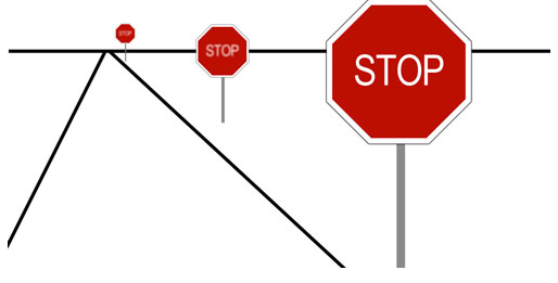
Color and Value- Objects that are further away are cooler in color temperature, while objects that are closer are warmer. Objects that are further away are lighter in value, while objects that are closer are typically darker in value.
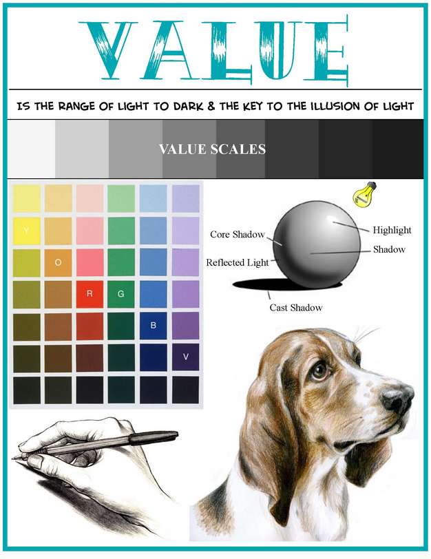
Now that you have seen and understand the graphic illustrations, let's look at examples in actual quilts:
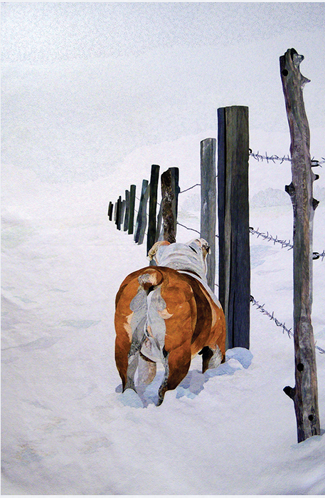
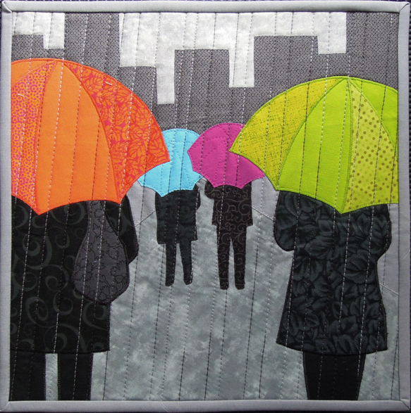
Placement- David Taylor (Shows 406 & 808) Overlapping- Terry Aske
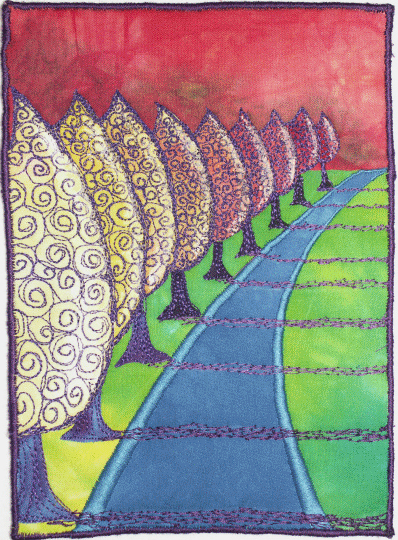
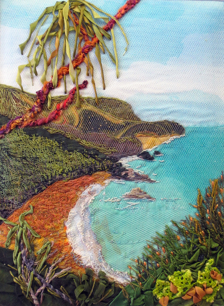
Size- Lyric Kinard (Shows 1311 & 1710) Detail-Judith B. Montano (shows 201, 507, 1212)
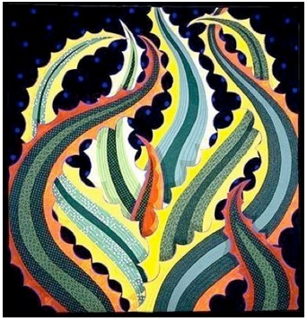
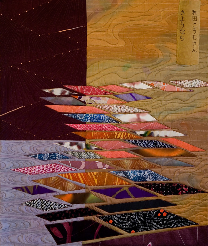
Color and Value- Jane Sassaman (Show 301) Sara Kelly
Creating Space
By Ann P. Shaw (2006)
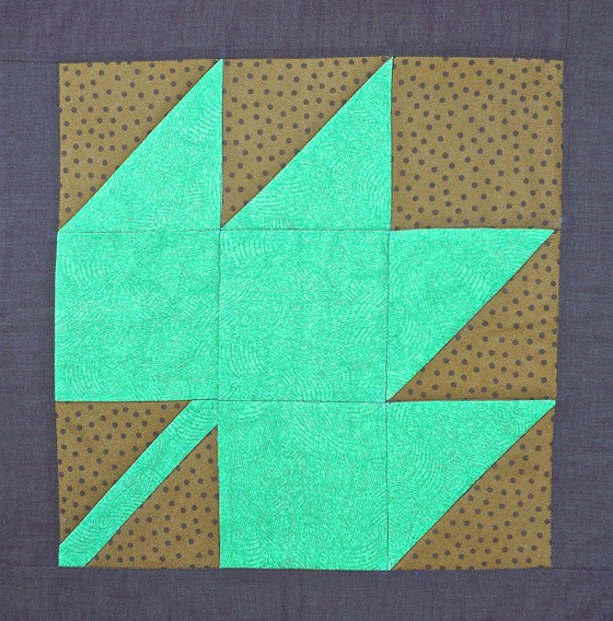
A typical traditional quilt block will feature a main pattern (such as the maple leaf pictured here) and the areas surrounding the pattern. Artists refer to the main subject (in this case the maple leaf) as “positive space” and the areas surrounding the main subject as “negative space” (in this case the background fabric). The balance between positive and negative space in quilt blocks varies. As you can see, more than half the space in this Maple Leaf block contains the leaf shape, clearly distinguished by the fabric selected. However, a quilt block like Log Cabin typically features only the strips of the log cabin pattern with no background fabric at all. In this case, the entire block is the subject. Traditional quilt blocks also tend to be symmetrical and are framed by a border fabric. This creates a visually stable design.
The Maple Leaf block with its surrounding border is also what artists call a “closed composition”. All of the elements of a closed composition are contained neatly within a border or frame. When viewed, your eye is immediately drawn to the main subject that is often centered. Most traditional quilt blocks make use of this idea of closed composition, either as individual blocks or sets of blocks arranged to form larger patterns. It is this quality of stable, consistent, static patterns that lend a visually pleasing and calm quality to traditional quilts.
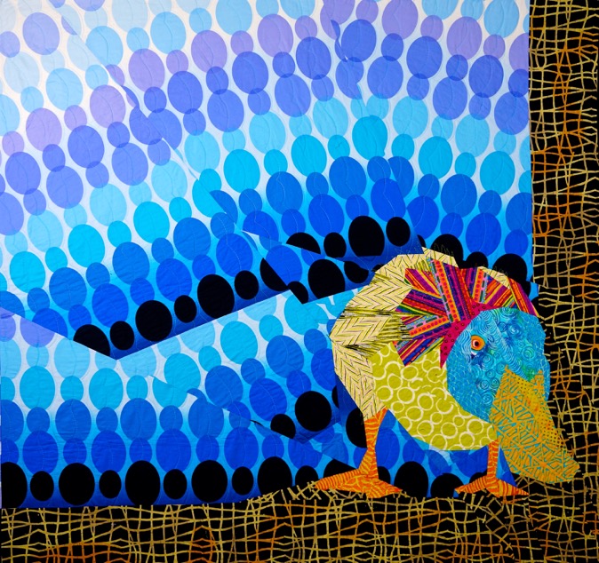
What happens when we start to create space in a quilt? By creating space I mean what happens when we increase the amount of negative space and place the subject off center? My quilt “Curious Duck” is a good example of what is called an “open composition”. In this case the asymmetrical placement of the duck and the angled placement of the blue ovals in the background lend a dynamic quality to the quilt. Notice there is a border only on the right side and bottom of the quilt, and Mr. Duck is playfully poking his beak beyond the background into the border. There is an implied movement in this quilt, almost as if the duck has waddled his way from the center, wondering what’s beyond the edge of the quilt. And look at the amount of negative space – it makes the duck seem much smaller relative the overall size of the quilt. The vibrant colors of the duck, the large scale and angled placement of the background print, the exaggerated amount of negative space, the asymmetrical placement of the duck in the lower corner, and the use of only two borders that are pieced as part of the overall design give this quilt a dynamic quality.
Open composition in quilts uses asymmetry, color and line placement to keep your eye moving from one element to the next. Sometimes the subject will extend into the borders or even beyond the edge of the quilt. In contrast to the calm, framed beauty of a closed composition quilt, an open composition quilt is visually active, inviting you to image what is beyond the edge of the quilt.
To create space in a quilt, try the following:
· Place the subject the quilt asymmetrically in the space.
· Expand the amount of negative space in the design to change the proportions of subject and background.
· Use color and pattern to create sharp contrasts between the subject and the background.
· Use asymmetrical, partial or no borders.
Practice Exercise: Winter Tree Landscape
by Kathy Barbro
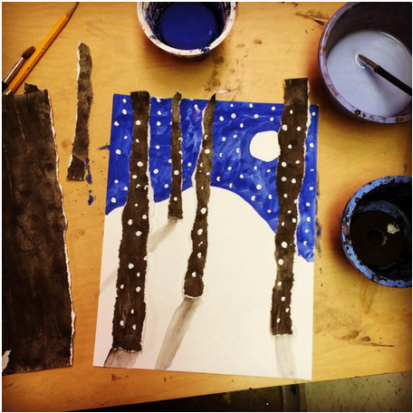
This winter tree landscape makes use of a simple idea, namely that torn paper looks a lot like the bark edges of a tree, but needs to be done neatly for maximum impact.
Materials:
Multi media paper, two sheets
Tempera paint (blue, black, brown, white) I like the cakes
Scissors
Glue Sticks
Pencil
1. Paint a full sheet of paper with the black or brown paint. For maximum contrast, use black. Set this paper aside to dry.
2. On the second sheet of paper, lightly draw a snow line and moon in pencil.
3. Paint the sky blue around the moon and above the snow. Set this paper aside to dry.
4. Tear the painted black paper vertically so that you have a number of 11" strips of paper. Vary the thickness of the paper strips.
5. Arrange 4 or 5 of the black strips on the blue and white background. To create a little perspective, keep the wider strips long and near the front, and the skinnier strips short and near the back. Cut away any extended portions of the strips.
6. Glue strips in place with the glue stick.
7. Dilute the black paint to make a light gray. Paint in shadows in the snow that point away from the moon at each tree base.
8. Liberally add dots of thick white tempera to create falling snow to the scene.
Click here for more topics related to the Design to Quilt program.


.jpg)

RSS feed for comments to this post