This week in our Design to Quilt program, we focus on Unity. Unity can be thought of as everyone in a group working together. Unity represents calmness and order through repetition, either by shape or color. It can be achieved with pattern, color or theme.
Let's use the example of a quilt guild annual quilt show. Such a project requires many entries. Everyone in the guild is encouraged to include a quilt that will, of course, be displayed. Quilts on display will fall into various categories (e.g. Traditional, Contemporary, Art, Mixed Media, etc.) and due to the exhibit space may only be between the sizes of A-B inches high and Y-Z in width.
As the quilts are dropped off at a designated location, workers begin sorting. You know the drill. You might have even helped with your local guild quilt show set-up. All of the Traditional quilt here. All of the Contemporary one's there. And so on...until all of the quilts have a place. The quilts are then hung by group in their designated areas. By presenting all of one grouping together, it offer the show attendee a unified and harmonious view. All of the handmade traditional quilts play well together, while all of the contemporary quilts play well together in their area as well. It is this unity that makes for a sense of harmony.
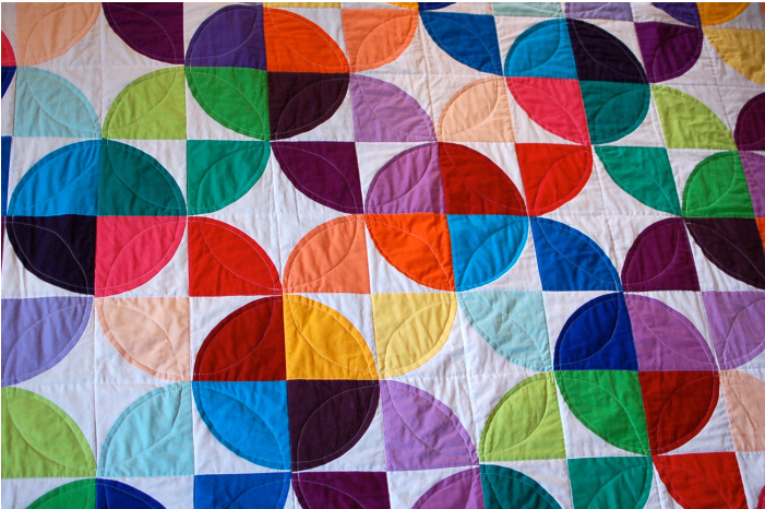
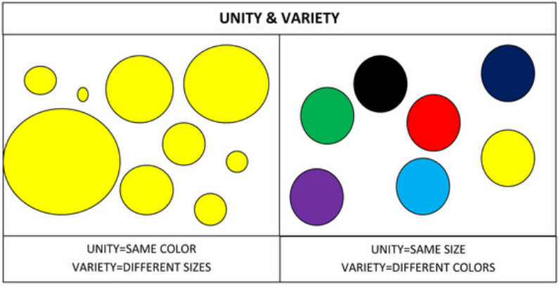
In this example notice how all of the circles on the left are the same color while in the area on the right all of the circles are different color, but the same size.
Now that you understand the ways that you can create Unity, let's look at some excellent examples of quilts featuring Unity:
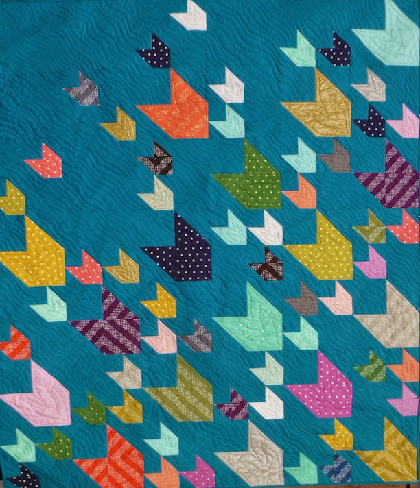

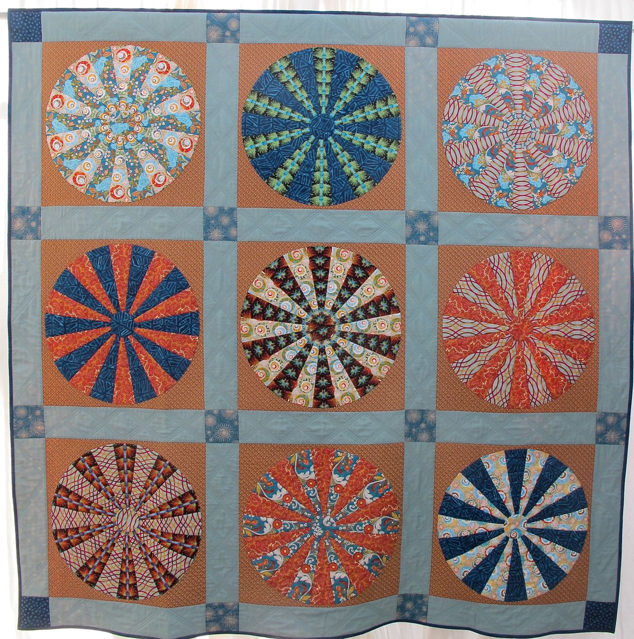
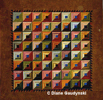
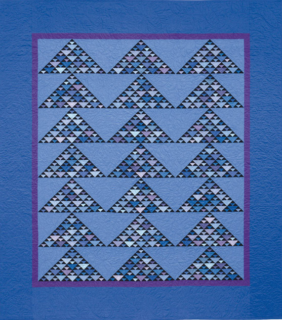
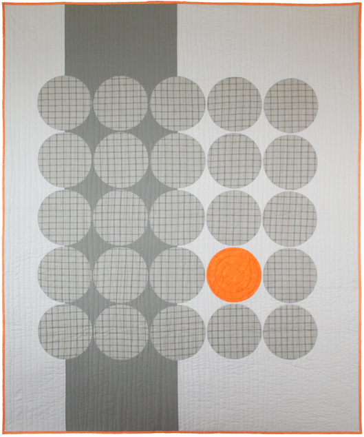

This week, Ann P. Shaw (Show 2006) shares how she auditions fabric for a quilt from start to finish when looking to create maximum visual Unity by incorporating a variety of the same type of fabric.
Unity from Variety by Ann P. Shaw (Show 2006)
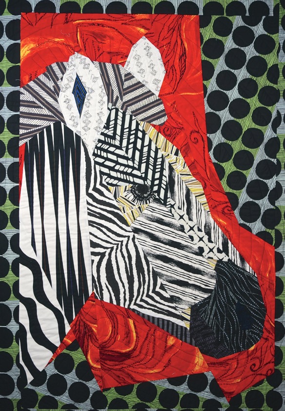
Fabric selections are a good way of creating unity with variety in a quilt design. Often, when we think about fabrics for a quilt, we choose a few colors that blend or select thoughtfully coordinated colors and prints. And when we run out of some particular fabric have way through a project, it can lead to a desperate search for another yard of the same fabric to complete the quilt.
For many of my quilts, I like to think broadly about how different printed fabrics can have a very similar visual impact. This is a good way to expand one’s use of fabrics and develop a richer look to one’s quilts.
My quilt, Grant’s Zebra, is a good example of creating unity from variety in my fabric selections. I love Zebras and I’ve seen many wonderful zebra quilts where individual black fabric pieces are appliquéd or fused onto the white body of the zebra to create its stripes. However, I thought it would be an interesting challenge to create a pieced zebra quilt where the fabrics did the design work without having to piece each individual stripe. That meant I would need to carefully consider the black and white printed fabric I would use. In this case, different fabric choices, each with some kind of black and white stripy print would help create the overall look of the zebra.
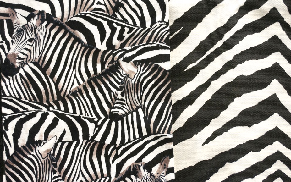
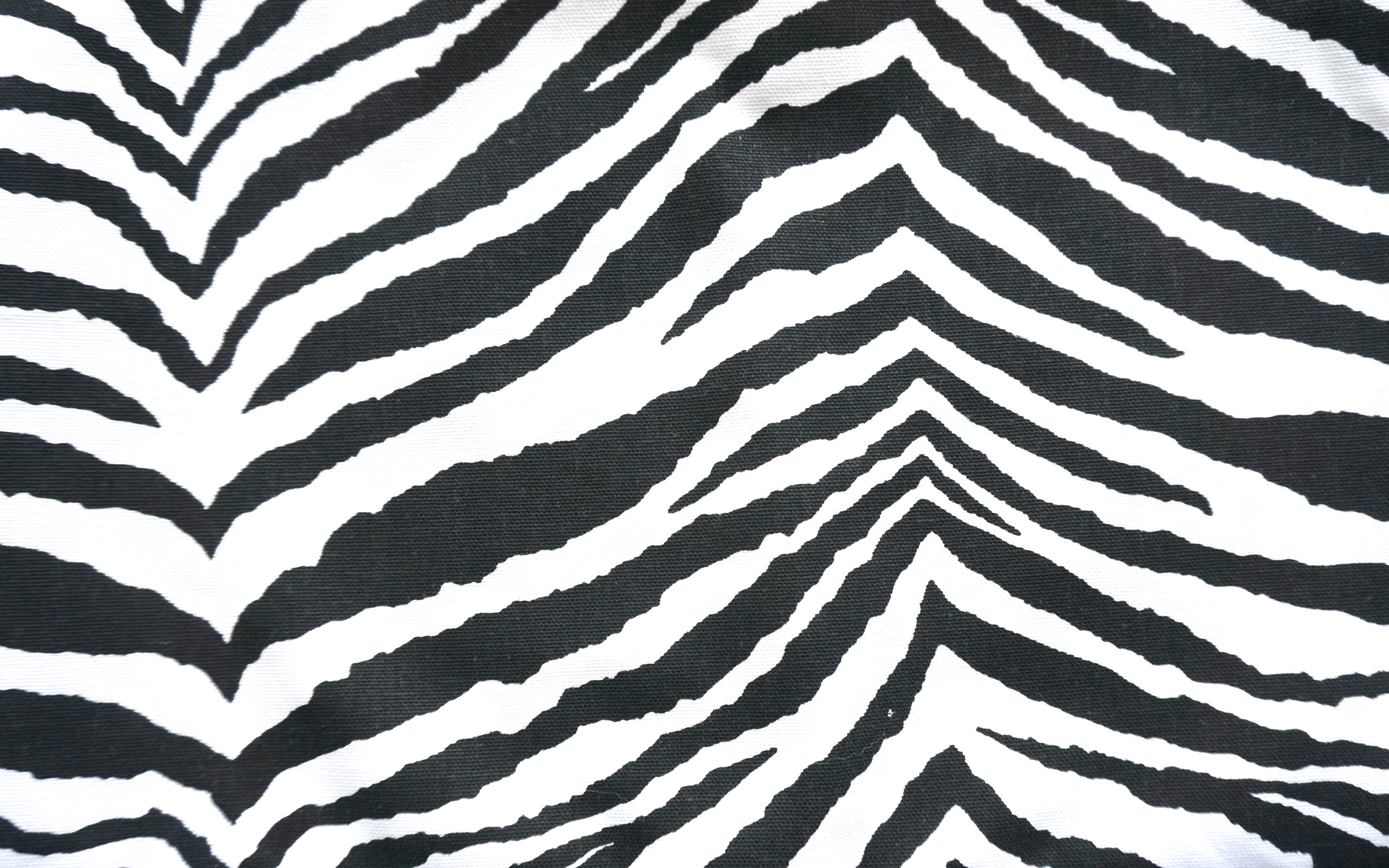
I started pulling black and white prints from my stash and found a zebra print (Image on the left). Perfect, but the scale of my other zebra prints was too small (Image on the right). Besides, I knew that using other kinds of prints would add spark to the overall look of the quilt.
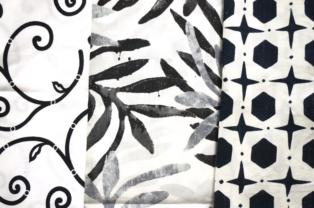
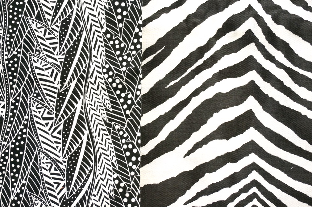
Some prints had swirls or dots or leaves, but didn’t provide the look of a zebra ((Image on the left). Other prints had a stripy look, but had too much black (Image on the right).
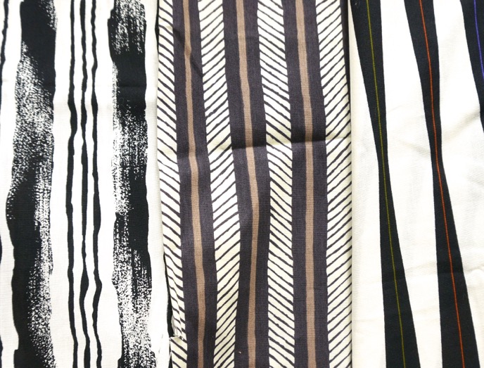
As I began winnowing down my choices, I focused on stripy-like prints, and found several prints that were the right large scale.


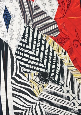
I then experimented with the placement of each print, using the largest print in the neck of the zebra (Image middle) and smaller prints around the eye (Image far right). The trick was to use prints that had a stripped look and had similar amounts of white (or cream) background. I also liked that some of the prints had little bits of other colors (even lime green, my favorite color!) that helped break up the mass of black and white.
To create unity from variety in a quilt design, identity printed fabrics that:
- Have a similar range of colors
- Have a similar scale in their prints
- Have a similar unifying background color
- Have a similar visual effect (such as stripes, overall texture, etc.).
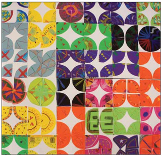
Practice Exercise: Creating Unity and Variety
by Don Masse
This exercise can be done using scraps of printed fabric or paper. Fabric will be a bit more tricky, so we recommend that you starch heavily before cutting out the 6" squares.
Supplies
6" x 6" squares of white and colored paper
1 large sheet of paper to mount your finished squares (e.g. poster board, foam core)
Scissors
Glue Sticks
Crayons, colored pencils or markers
For instructions, click on the link below:




.jpg)
