Laura Wasilowski's whimsical style, keen sense of humor, and ability to tell a story within a small detailed format, may look effortless, but there is more to making her endearing scenes than meets the eye.
Balance in a composition
by Laura Wasilowski (Shows 303,1006)
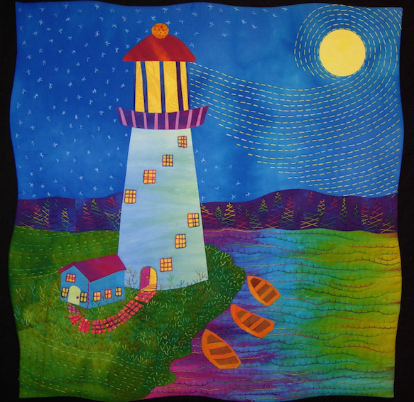
If there is a recipe for creating artwork then there is an important ingredient to include. This ingredient spices up the design. It is variety. Variety takes a bland concoction and adds flavor using diverse motifs, colors, and pattern. By varying the shapes, colors, and placement of shapes in your artwork, you create lively and active designs.
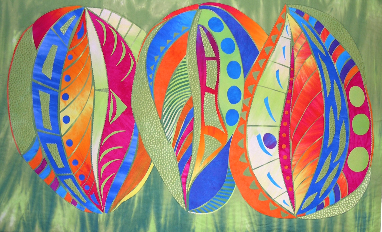
In Seedpods, the simple dot motif appears in various sizes. Large, medium, and small dots scatter across the surface carrying the eye from one side to the other. The stripped motifs also vary in size. Fine lines create narrowly striped fabrics and wide strips make bold stripes. By providing a mixture of motif sizes, energy is added to the piece.
Color also adds variety to artwork. Changing colors and color values in a composition keeps the eye active and searching for the next instance of that color. High contrast colors in Seedpods lift off the background while analogous colors recede into the background. This variety of colors choices push and pull the eye across the piece.
Another important ingredient of design is placement. Placement of shapes and colors adds a dynamic flow to a design. Placing shapes at different elevations is an effective way to lend action or movement to a piece. In Seedpods, dot shapes are placed at varying heights. Repeating colors at varying intervals across a piece also works the eye and gives energy to the artwork.
All this variety of size, color, and placement of shapes leads to unity. A variety of elements in a composition appeals to the eye but it achieves harmony or unity. Unity is a feeling that all the elements work together and form a whole piece of artwork.
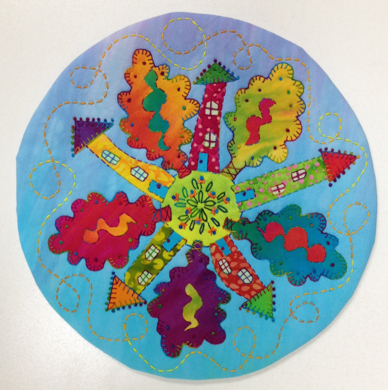
In my quilt, Pretty Planet #10, the design principal of balance plays an important role. When elements in a design share equally in interest or visual weight, balance is achieved. The viewer’s eye travels the art work and senses the placement of the various design elements, giving the viewer a sense of harmony or balance within the artwork.
In the case of Pretty Planet #10, design elements like the houses and trees radiate evenly around a central point. This is radial balance. Radial balance is an easy design format to follow when making art work. By placing similar elements in a circular pattern the sense of a spinning wheel or rotating objects appears. In this case, the feeling of motion created by radial balance is also repeated in the circular shape of the quilt.
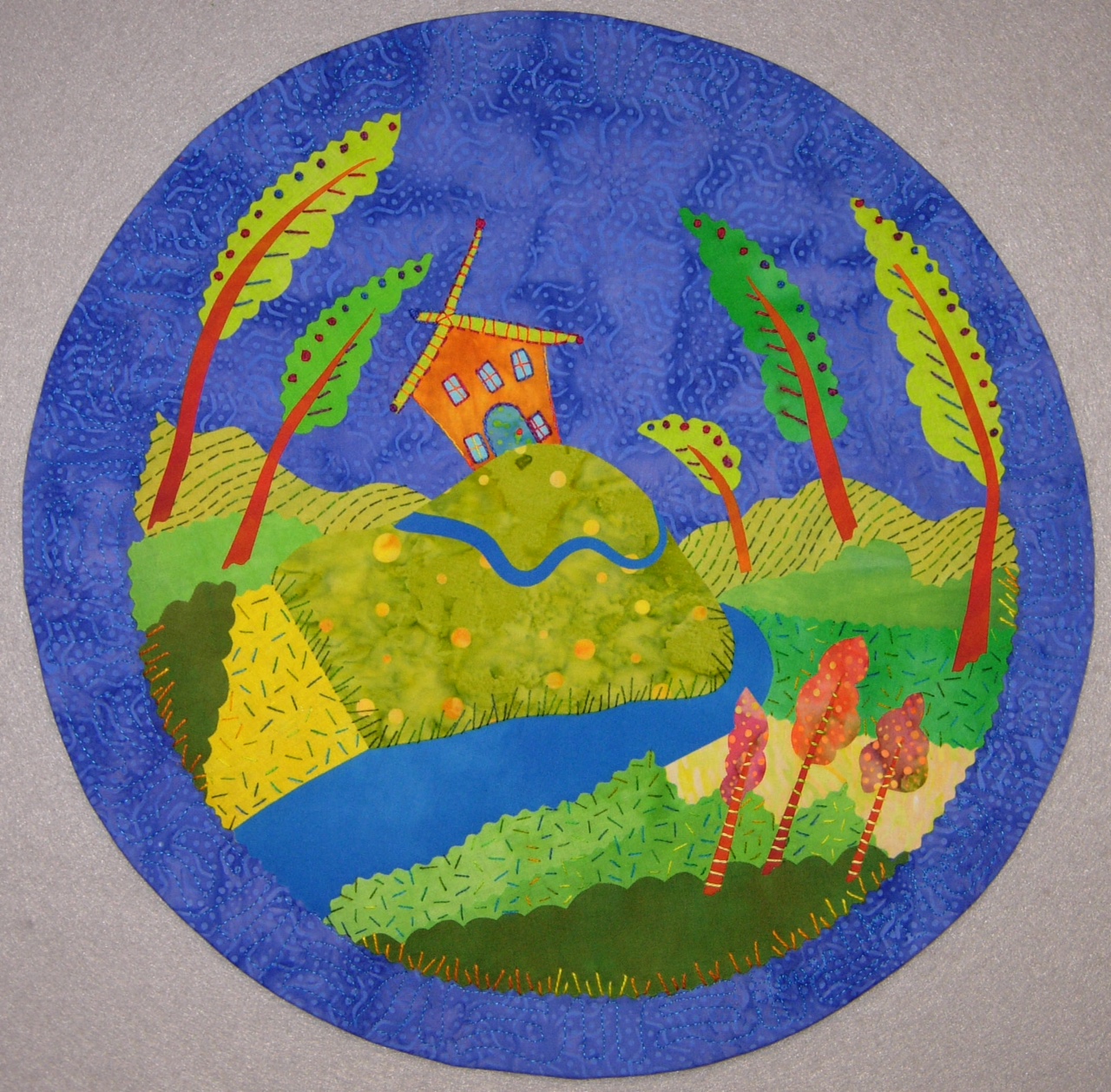
Pretty Planet #3 is also a round quilt but there is no center point. Instead the disparate elements in this design are given equal visual weight or balance by their strategic placement on the background fabric. This is called asymmetric balance. Similar shapes, like the trees, are positioned at different angles to draw the viewer’s eye around the place. The darker green at the bottom of the quilt and orange trees add weight, balancing out the importance of the house shape.
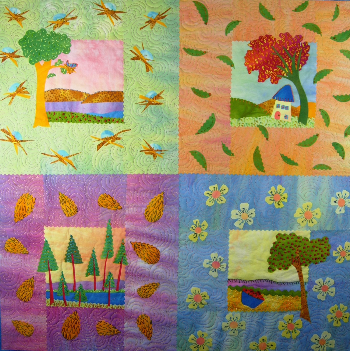
Arbor Day uses a traditional four-patch layout that reflects symmetrical balance. Symmetrical balance is also known as “formal” balance. When design elements are positioned on either side of a central axis or line, they have an equal visual weight. Even distribution of shapes and a layout of repeating horizontal and vertical lines are very common in traditional quilt compositions. This gives them a feeling of formality and calm balance.
Pay attention to balance while making a composition. The placement of elements, arrangement of shapes, and repetition of colors create balance. When making artwork, step back and look at the it with a critical eye. Do the elements share equally in visual weight? Is your eye continuously drawn around the piece? Does it feel in balance?


.jpg)


RSS feed for comments to this post