This week, as we continue our look at how the type of fabric choices you make can affect the outcome of your quilt, we focus on the often misunderstood taupe palette. This group of fabrics is more often than not relegated to what is often called the 'beige' category. But, understanding the subtle nuances of taupe go way beyond just being mere beige.
As you know, working within a single monochromatic color can be challenging for any quilter. Monochromatic literally means "containing or using only one color." And yet, the taupe color palette can create a sense of simplicity, calm, harmony, relaxation and sophistication.
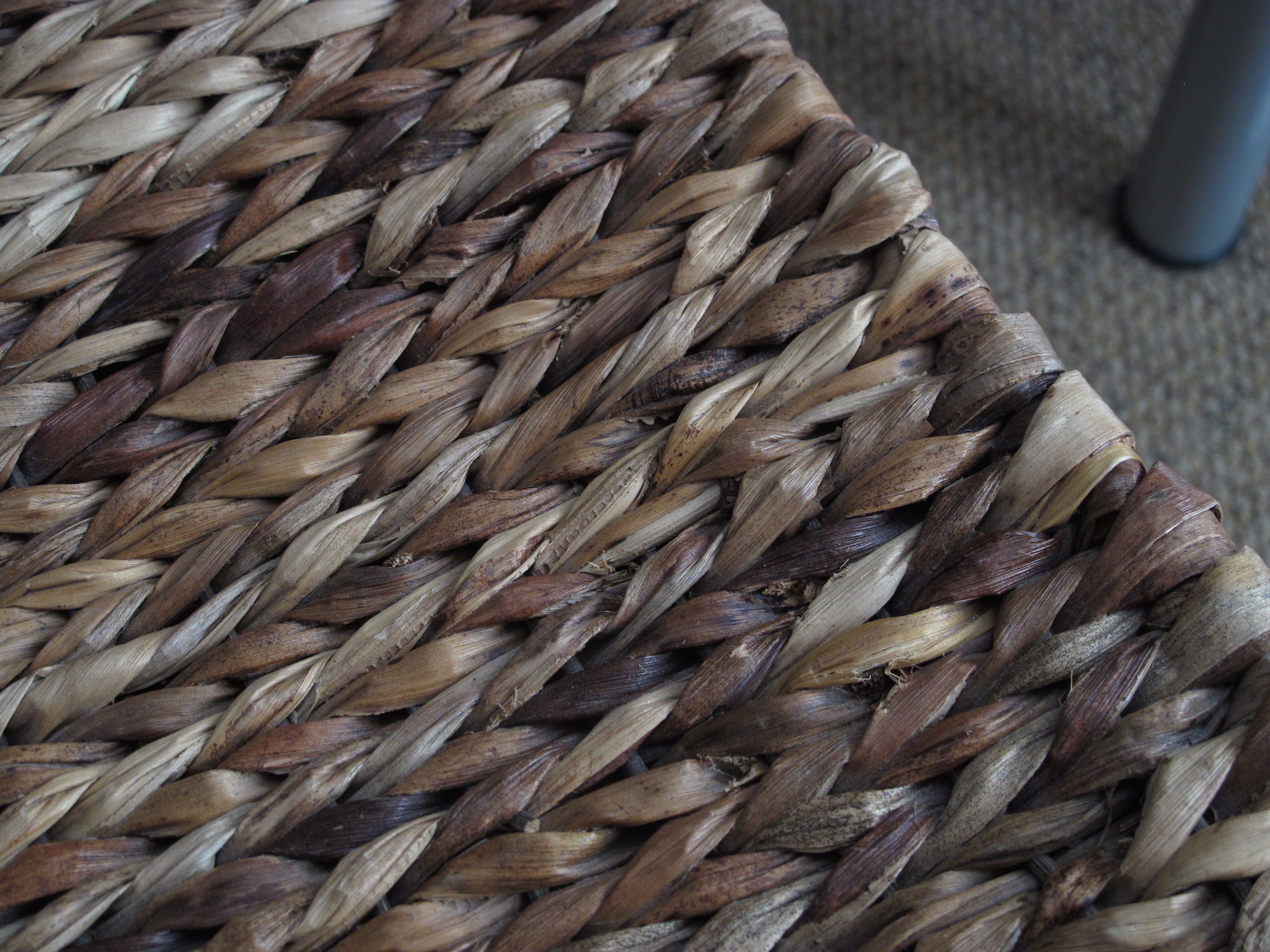
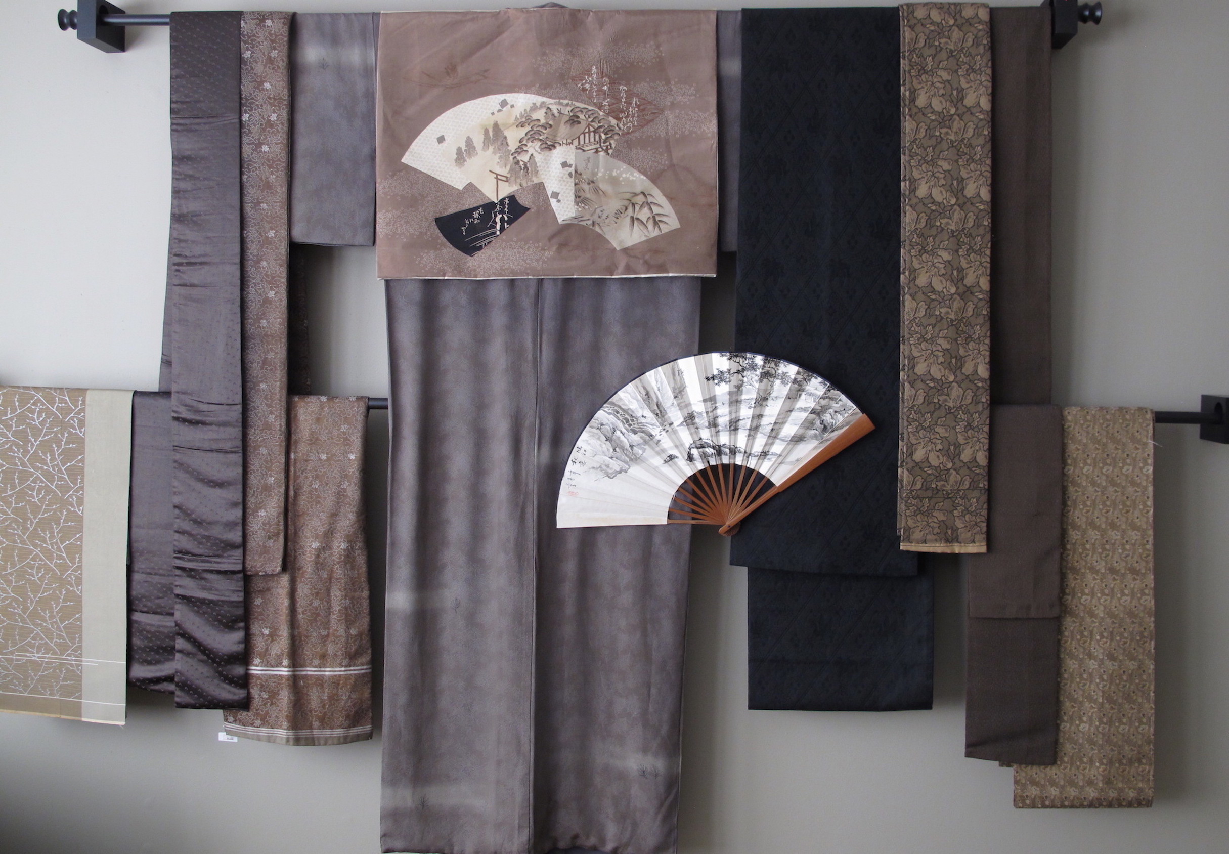
Examples of the variations can be seen in the wall display (on the right) and in the woven rush seat (below)
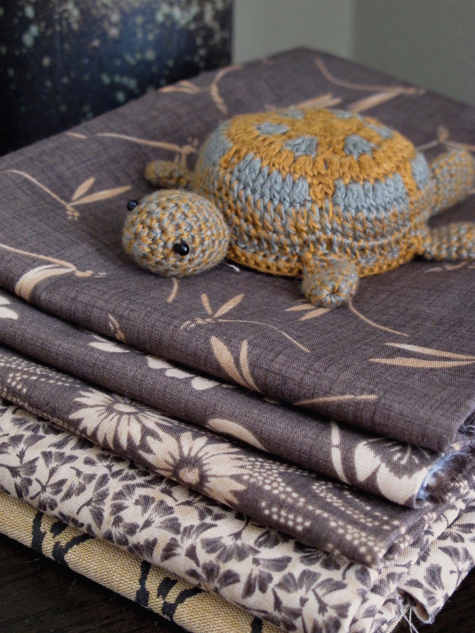
At first glance the grouping may seem to just be shades of brown, but, step in as we take a closer look at the small fabric stack to the right. The fabrics are actually a tone of red-violet. Thirty years ago, Japanese quilt artist Yoko Saito, visited the US and was fascinated by the slightly faded or washed out look of American antique quilts. Wanting to recreate this softer 'antique look' in quilts, Yoko began to design fabrics to replicate this look. In her book Japanese Taupe Color Theory: A Study Guide she suggests that one should compare the fabric colors to foods that we know.
For example, let's think of coffee and the variations of colors that can be achieved by the addition of milk. The more milk you add to the coffee, the more muted the original brown becomes. But it is still coffee. What about blue jeans? The more you wash and wear those beloved blue jeans, the more faded and soft they become. Looking at the stack of fabric on the right, it could be said that this color could be plum puree with just a bit of milk added.
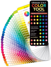
If you are not sure when shopping for taupe fabrics, use your Ultimate 3-in-1 Color tool.
While creating a sophisticated taupe grouping of fabrics takes a keen eye, determination, and a good understanding of value, the end results can be stunning. These are not the quilts that grab your attention from across the room, but require you to step in for closer observation. Let's look at some examples of quilts:
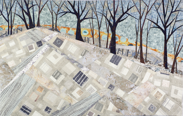
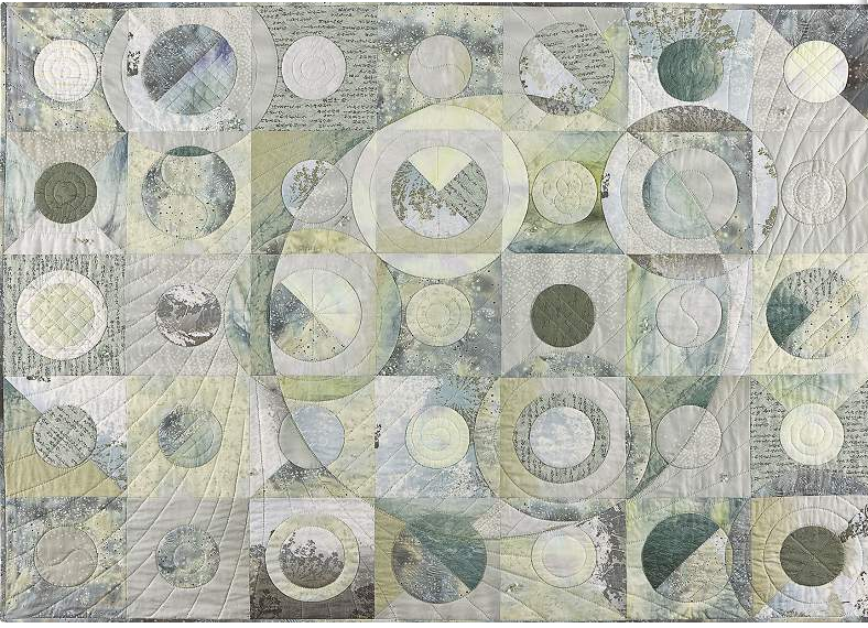
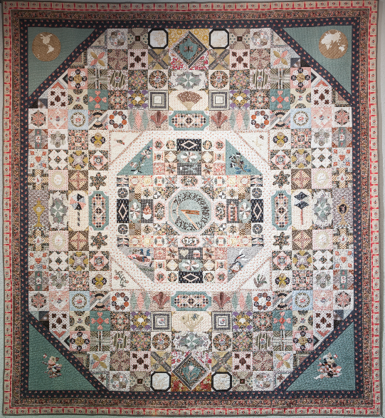
Priscilla Knoble (Show 1505) has used her fluency in Japanese and quilting knowledge to share the world of Japanese quilting books with those desiring to make their own pieces. Her understanding of the Japanese esthetic and quilting techniques are a huge aid for those desiring to gain an understanding of the Japanese form of quilting. Priscilla shares Yoko Saito's focus on a broad range of taupe fabrics to achieve interest for the viewer.

Monochromatic
How Yoko Saito uses a variety of fabrics while still achieving that monochromatic color scheme
by Priscilla Knoble
Sometimes I think that the concept of “color” is something we take for granted unless it appears in such a way as to stun our senses for a brief moment in time. Perhaps nowhere does this happen more to those who love fabric and color than when we see a quilt that jumps out at us. Sometimes it is the pattern, sometimes it is the texture, although I would venture to say that it is probably most often the colors that the artist used that has us catching our breath.

When it comes to color, the term “monochrome” might be misconstrued as monotonous or boring. I think that this can be true if one uses one flat color over a large space. Think how dull our world would be if nature used only one color/tone/hue! The multitude of greens when looking at a garden, the browns that are woven together in the bark of a tree– all of those slight and subtle differences add great depth and dimension. Painters also achieve beauty and depth when they mix a number of color values. Much like nature and art, achieving magic when we quilt could be as simple as the monochromatic fabrics we choose.
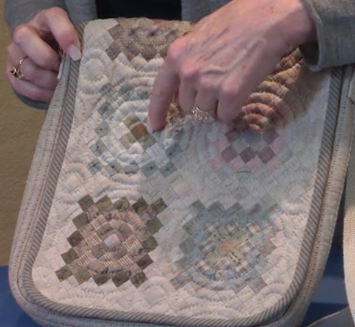

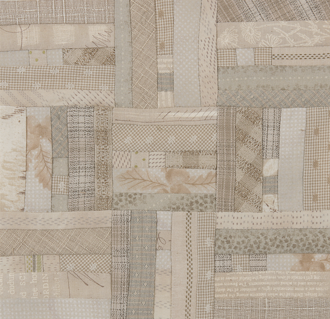
Yoko Saito, a famous quilt designer, artist, teacher and shop owner from Japan, is perhaps best known for her great influence on what we often call Japanese Taupes. While Japanese Taupes come in many soft colors, they are most often used in a fairly monochromatic way. In her book, Yoko Saito’s Japanese Taupe Color Theory – A Study Guide, she explains it in her foreword, “Taupe is not just grey, or ‘tea-colored.’ The world of taupe that I created encompasses not only a variety of colors, but the subtle manipulation of them. Take a hue and add a tint or shade in small degrees from light to dark. Or imagine steeping tea and watching the color becoming deeper and deeper until the flavor is robust. This is the simplicity and complexity of taupe colors.”

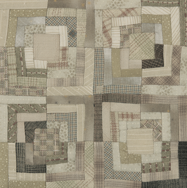
Ms. Saito is ingenious in her use of monochromatic colors. Often for any background or area of a project that calls for essentially one color, she will use a variety of hues and shades to achieve movement that attracts the eye. She also goes one step further than color and uses a combination of textures by mixing cotton prints and hand-dyed woven fabric. This is demonstrated wonderfully in both of the color collections that she put together, Pearl and Sand.
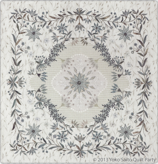
Adding a variety of fabrics with differing hues and shades of a color is an easy way to cause someone to do a double-take when looking at your creation. Why not try this the next time you start a project that has monochromatic areas and see what a difference it might make
Practice Exercise: Taupe in your Stash
Collect fabrics you have in stash in groups of blues, greens, chocolates, or oranges.
See how many fall into the taupe category.
From the groups build either of the blocks or one's of your choosing.
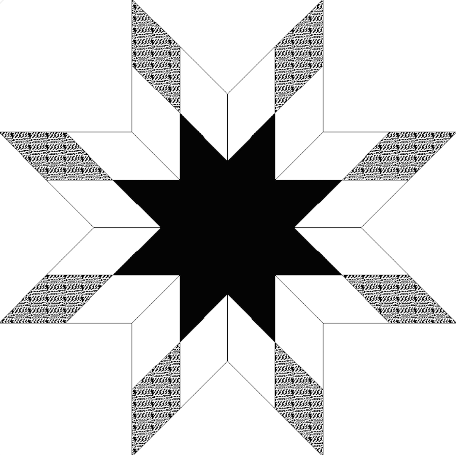
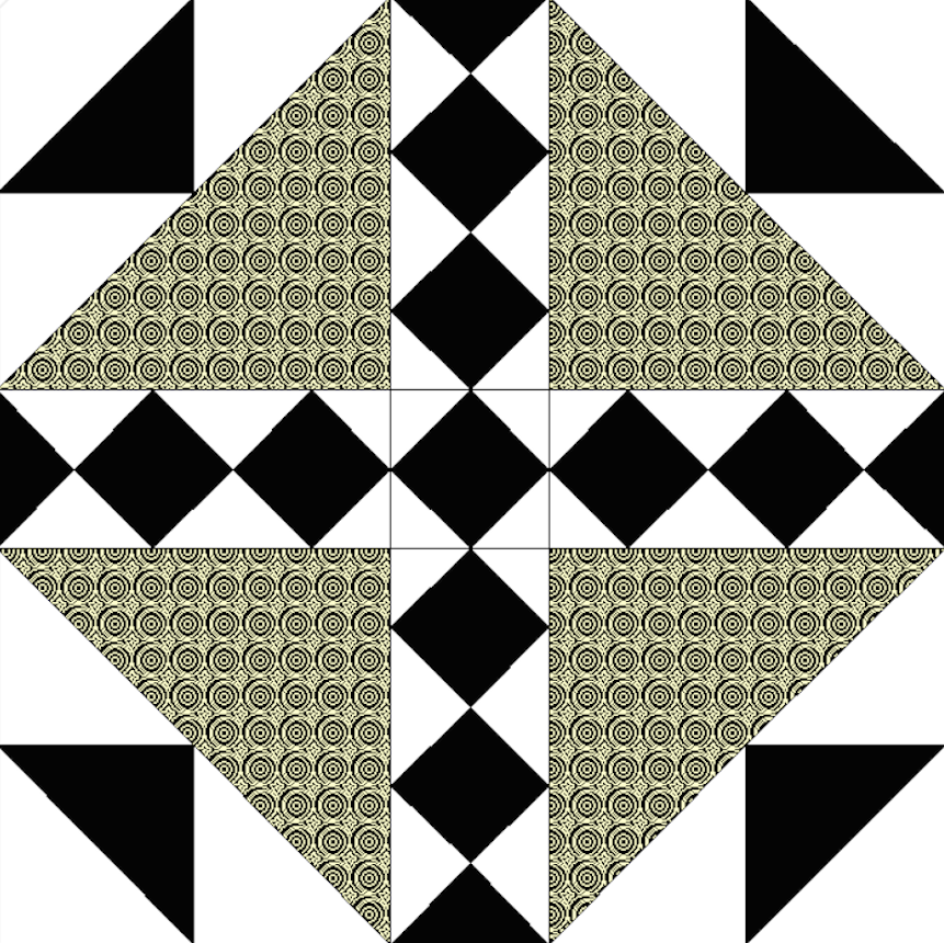
Click here to download the Quilt Block Square .pdf file.




.jpg)


We have added a link to Yoko's Facebook page.
Thanks,
Lilo
RSS feed for comments to this post