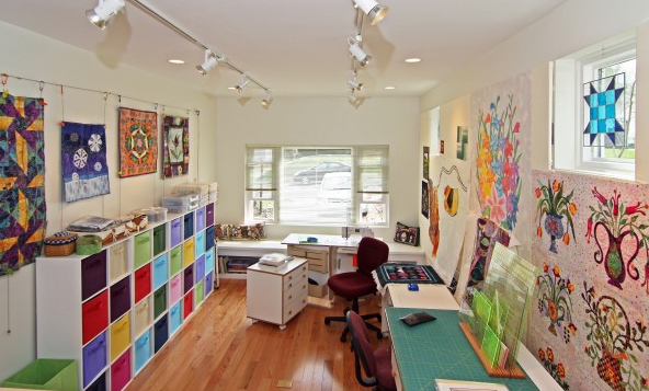
Bouquets For A New Day above the cutting station on the right. (Mosby Building Arts)
Many a quilter dreams of having a dedicated studio space. Often reality does not allow such dreams, while children, work and other obligations take precedence. When the time and budget does allow for a personal studio space, there might be a number of things to consider that just may not have been on your radar. This is the second of four studio visits wherein we present obstacles, ideas, and tips from fellow quilters who have generously shared their studio designs from an idea to a finalized space.
Recently, while searching the web for our dream studio article (Week 34) we had, what can only be described as, a serendipity moment. The stunning one-garage remodel with the bright and open studio definitely caught our eye. Digging deeper for images posted on the building company's website, and to our surprise, we spotted the very first 2008 TQS BOM, Bouquets for a New Day, designed by Sue Garman on the design wall. We had no idea if the quilter was currently a TQS member. A flurry of emails later we tracked down Cindy from MO, who by the way is still a member, to see if she would agree to an interview regarding her studio.
How did you approach the project?
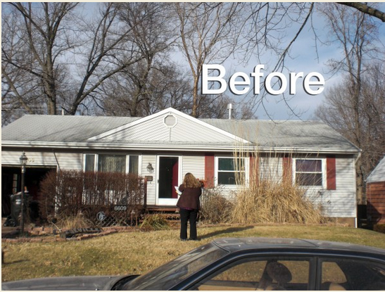
With retirement from my government job nearing, the prospect of being able to spend more time quilting brought to mind my then current working conditions. I was sewing in an 8' x 10' bedroom with bad lighting, cutting fabric on the dining room table, and storing other quilt supplies and fabric throughout the house. My hobby had taken over the entire house. It was frustrating and time for a change. As a highly organized person, I wanted a more efficient space that would allow me to create on a full time basis. With no room in the house, I began considering my one-car garage. Too small for parking my car, the garage became a convenient place to just store odds and ends. I had money saved, and with that began thinking of what my ideal studio would contain.
What were the 'must have elements' of the studio?
Having lived for many years with my quilting spread throughout the house meant that my 'ideal' studio would have a place for everything and a purpose for everything. I wanted an off-white color scheme to unify the space and wood floors for easy clean up. Above all, I needed good lighting, a large design wall, storage, multiple workspaces, and room to include my Horn cabinets.
Did you use an architect or designer? What was your budget?
I did not want to be my own General Contractor on the project so I enlisted the help of a designer with Mosby Building Arts, who spent 3-4 hours discussing my specific vision while also making suggestions as to how we could turn my idea into a reality. It was the designer's suggestion that clerestory windows be added to bring in more needed natural light, as well as using locally sourced hardwood rather than my initial idea of having bamboo flooring. The cost of shipping bamboo far outweighed what I could find being locally harvested in my area. With a budget of $45,000, most of the project funds would go toward the conversion of an unheated garage to a year-round work space. The other consideration was that the space could serve another purpose if I sold the house in the future.
Tell us about the process. How long did it take?
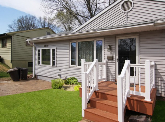
The project began in early December, but had to be put on hold until February due to weather. The studio was completed by the end of April. With no interior access to the garage from the house, we inserted a doorway through the existing dining room wall. The original unheated 10' x 20' garage space required a new sub floor as well as the addition of electrical wiring, A/C and heating ducts ensure that the space could be comfortable year-round. The room was divided so that the upper level would be my design area, while the lower level would serve as the work space.
Describe the completed studio and how you feel about the space?
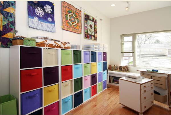
I love my studio, the dedicated spaces mean that I can easily move from one area to another depending on my current project. The upper area is inviting and has good light for my designing, while colorful fabric drawers along several walls contain projects and other supplies in a neat and orderly fashion. All of the furniture is on wheels for easy movability. An electrician installed higher amperage plugs into the floor and at a higher than standard level on the walls. No more blowing fuses, cords across the floor, or leaning over to plug gadgets in. The deep window seat allows me to keep books (two deep within easy reach).The clerestory windows add light on even the grayest of days. I spend an average of three hours a day in the studio, but now, it takes only ten minutes to pick-up at the end of the day. I also love how the siding was matched to continue the lines of the house.
What do you wish you could change?
I have started doing hand dyeing, but there wasn't room in the original plan to include this feature. It will be an additional renovation in another part of the house later down the road.


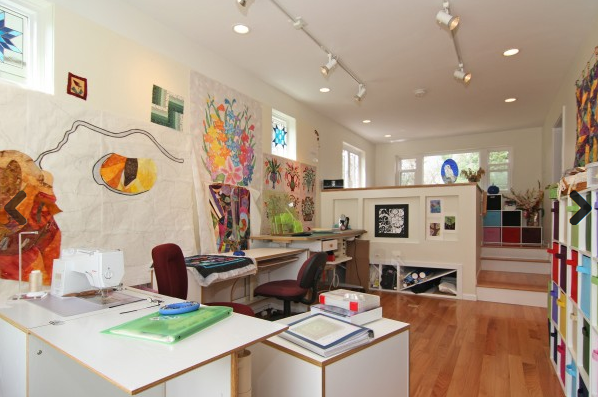
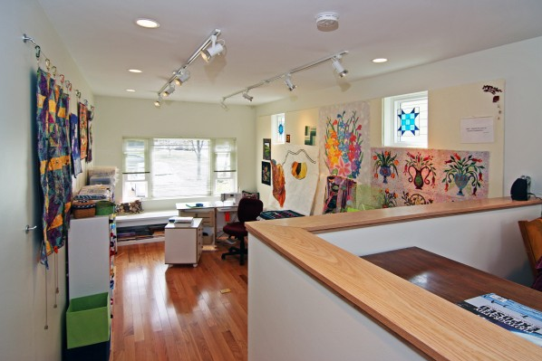


.jpg)



The floral vase blocks are from our 2008 Bouquets For A New Day, designed by the late Sue Garman. You can find the pattern on her website shop (ComeQuilt.com).
Lilo
Suzanne - The canvas drawers and shelving are from Closetmaid and you can get them at Target. I store all of my fabric in them - somewhat by color
Marilyn - The garage was 10 feet wide by 20 feet long with a 4 inch "step" at the door. I did not want to deal with getting the car in such a narrow space while going up such a bump. The studio uses the entire space and has two levels but not two floors. Between the layout and the ceiling height, it looks larger than it is.
Dotti - It is a cable and magnet system that my architect designed. This link shows the inspiration: https://cdn.shopify.com/s/files/1/1140/3964/products/MH35-R_520x400.jpeg?v=1457387410
My "studio" will be in a smaller bedroom, but yours gives me great ideas! Thanks for sharing!!
RSS feed for comments to this post