We all dream of a studio that is functional, has enough storage for our stash and other must have items, and is roomy enough to easily move around. It's so wonderful to have a dream...when in reality, most quilters don't have the luxury of lots of real estate when it comes to their designated creative space. With careful planning and designing, a functional and efficient work space can become a reality.
The core work elements of most any quilt studio are sewing, pressing, and cutting. And as such, they should work together in harmony. Movement from one area to another should ideally be done in what is called a 'work triangle.' The concept comes from the kitchen design world. For the most efficient work, the refrigerator, stove and sink are placed in a triangular arrangement (with each area having its own dedicated tools and supplies). This avoids the necessity of walking miles between tasks. Design also factors into this equation, but as design is ideally done vertically, it won't take up your prime floor space.
Carolyn Woods in her book Organization Solutions for Every Quilter suggests the following:
"Your furniture arrangement will influence the flow around your room. Flow refers to how you move around and navigate through your room. Place the furniture to optimize the flow through the room.
For balance, make sure that your room isn't more heavily weighted on one side than on the other, meaning that the height and bulk of the furniture and belongings seem unevenly distributed. Also be sure not to push everything up against the walls, leaving a big dead space in the center of the room."
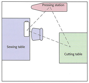
Lois L. Hallock bring up another point to consider (in her book Creating Your Perfect Quilting Space) when it comes to setting up the work triangle:
"Most books suggest keeping the work triangle as small as possible in order to shorten the distance that you travel when moving between stations. But there are some limits to how small one should make a work triangle. You need work surfaces between these stations in order to prepare food or stage ingredients. It follows that a bigger kitchen is not always better; if it's poorly laid out, it can be worse. Well-designed gourmet kitchens incorporate more work triangles, not larger ones."
Designing your Space:
Before you begin shifting pieces of furniture around, grab some graph paper and do a bit of playing. Or, if you prefer, we found a number of free online room planner programs available here. Also, keep this in mind when designing your space:
- Allow enough space to move freely between work items. You don't want it to feel too crowded.
- Consider windows and door openings. Do you like to look outside when ironing?
- Draft a number of different layout plans. Most popular are U-shape and L-shape designs.
- Be sure to include floor lighting if you will need lamps that are not wall/ceiling mounted.
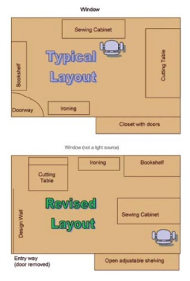
Make a paper “pattern" using ¼” graph paper, draw out the dimensions of your room with one square representing one square foot. Make sure you include the location and measurements of windows, doors, and closets. Remember to note if opening or closing doors block or hinder access to floor and wall space.
Next, make paper “furniture.” Decide if you’ll use your existing furnishings or purchase new quilt-specific cabinets and storage units. Measure your existing or new furniture and draw to-scale representations of these on a second sheet of graph paper. Cut out these pieces so you can experiment with furniture “arrangement” without actually moving heavy pieces. Note where large doors or drawers open and table extensions take up space.
Using your drawn room layout with noted light sources and paper “furniture,” try different arrangements, keeping the most-used items within easy reach and allowing enough room to move around your space in comfort. You’ll quickly realize which layout works best for you. Quiltviews
Layout Designs:
Let's look at ideas for configurations of a studio space that might be the perfect fit for YOU.
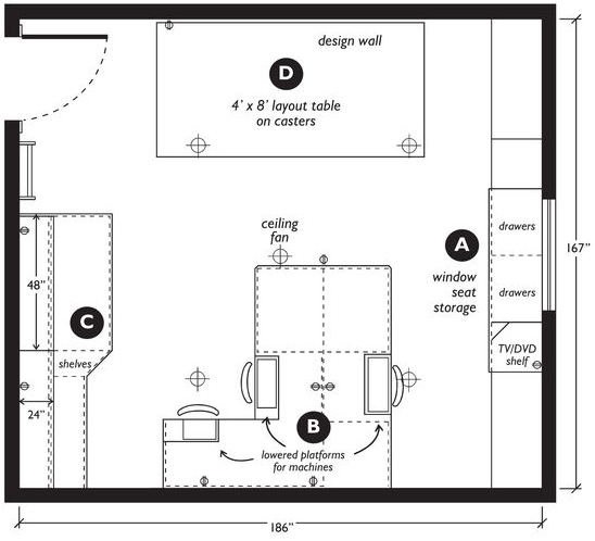
This four station PalmerPletsch design allows for ease of movement around the studio.
Notice that the cutting table is on wheels to allow access to the design wall. Pinterest
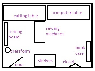
Is your studio in a small bedroom? PurpleHippoCreations uses multiple work triangles in her space.
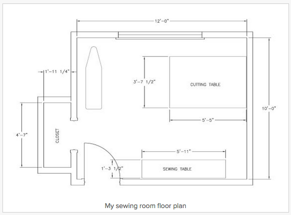
Brooke at Customstyle found this arrangement worked best in her 10' x 12' room.
With only a small closet available, she added a variety of shelves around the studio to keep the floor clear.
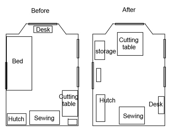
Sometime the window configurations (in this case on three walls) and electrical sources mean that the options for arranging a room are a bit more challenging. But, Melissa made the best use of her limitations by removing an infrequently used guest bed to open up the space and make the work flow much better. Cornbreadandbeans


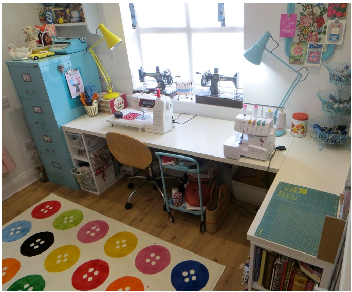


.jpg)
Also, what is a hutch?
Does anyone use their serger very much? I have one but haven't used it in a very long time.
RSS feed for comments to this post