 5
5
Three Easy Steps To Save This Lesson As A Pdf:
-Make sure you are logged in.
-Click on the small triangle next to the tool wheel in the upper right hand corner of the page (you'll find it above the Like button).
-Select the pdf. option. Wait a few minutes. It's a large file due to the number of images.
-Your file should appear with the title of the lesson.
One is never too old to learn something new. That is certainly the case with our The Art of Quilt Design program. We too have found a number of ideas that WE just LOVE and want to incorporate into our personal work. Check out the tips that made the top of Lilo's and Mary Kay's things to keep in mind when creating a quilt.
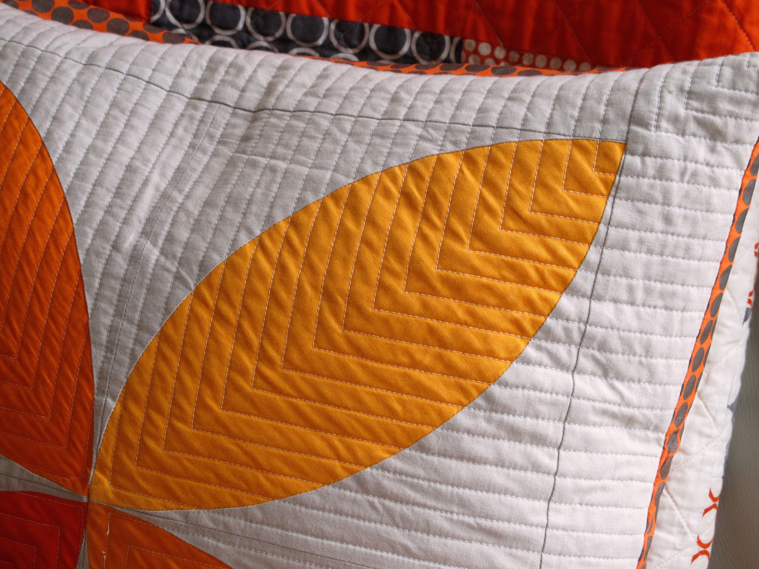
Pillow by Jacquie Gering. (Show 1202). [Image by Lilo Bowman]
Lesson 2: Elements of Design - Line Part 2
Understanding the way different types of lines give visual cues can help you as the artist communicate a message that can impact the viewer in a subtle, or not so subtle, manner without a great deal of dialogue. Learn the words that we often associate with different types of lines here.
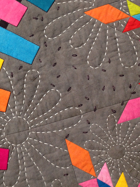
Flowered & Feathered Frenzy by Susan K. Cleveland (Show 109, Show 1001, Show 2308, Show 2510). [Image courtesy of Susan K. Cleveland]
Lesson 4: Creating Visual Texture
Susan K. Cleveland's suggestions for adding visual texture:
"Background quilting can create a rich, elegant texture or something wild and crazy. While machine quilting creates a flat line and contours between the lines, hand quilting creates texture within its broken line. Or, add visual texture with embellishments such as beads, ribbons, buttons, etc." See more ideas from Susan K. Cleveland here.
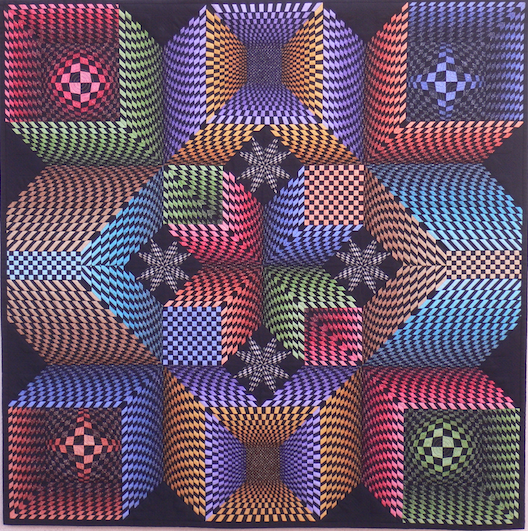
Lone Star Explores Space by Peter Hayward (Image courtesy of Peter Hayward)
Lesson 9: Form
Understanding space and form allows the quilter to manipulate patterns to create stunning effects. British quilt artist Peter Hayward shares how his love of optical illusion led him to create a unique interwoven design that combines color, shape, and form using a traditional quilt pattern. The resulting Lone Star Explores Space is truly a fool-the-eye experience. Learn more about this stunning quilt here.
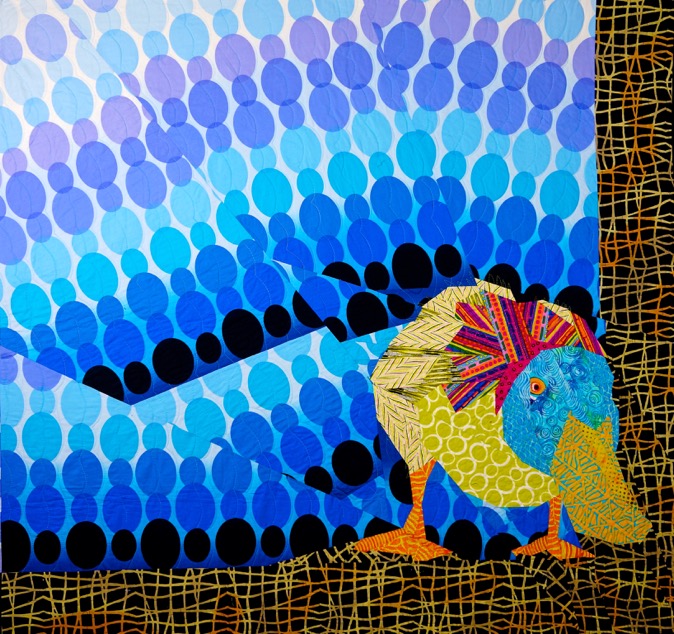
Curious Duck by Ann P. Shaw (Show 2006) [Image courtesy of Ann P. Shaw]
Lesson 10: Space
Think of depth in a quilt as the ingredient that makes a grilled cheese sandwich so delicious. What's not to love? The sandwich is crispy, chewy, creamy, and salty all in the first bite. The basic ingredients are white bread, a cheese that melts easily, and butter or margarine. This works and probably makes for a good sandwich. But, what if you swapped out the bread for a sourdough? What if you included a mixture of different types of cheeses? How about adding a piece or two of bacon to the mix? Now the sandwich is more interesting on a whole new level. It is still a grilled cheese, but something that stands out from 'the usual."
By incorporating a variety of different key elements to create depth and space, your quilts will be both interesting and appealing to viewers. Learn more ideas about space here.

Honeycomb by Kelly D. Young. (Image courtesy of Kelly D. Young)
Lesson 14: Elements of Design - Understanding Monochromatic Color
The trick to keeping a quilt from becoming visually flat is to use as WIDE a range of Tints, Tones, Shades and pure Orange as possible. Hand-dyed fabrics, with their subtle nuances, offer the quilter the widest range when it comes to working in a monochromatic plan. The old addage, "If five fabrics are good, then ten are even better," is a good thing to remember when building a fabric grouping. Learn more about Monochromatic color here.
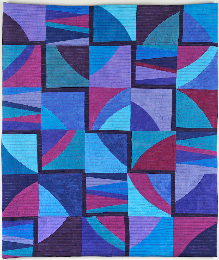
Blue Maze by Cindy Grisdela (Image courtesy of Cindy Grisdela)
Lesson 15: Elements of Design - Understanding Analogous Color
The Analogous color plan uses either three, five, seven, nine, or half of the colors along one side of the color wheel. However, you need to be careful to not go too far astray. "If our color wheel were a delicious pie (mmm, pie!), then an analogous color scheme would be a fairly large slice. The key to creating a good analogous scheme is to remember that your eyes are bigger than your appetite. As a rule of thumb, avoid having a slice that’s bigger than one-third of the whole, or you’re bound to make users sick." (From Sitepoint) Learn more about working within the analogous color plan here.









.jpg)
