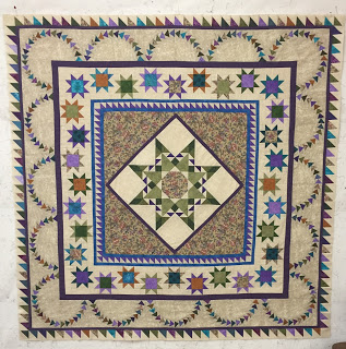
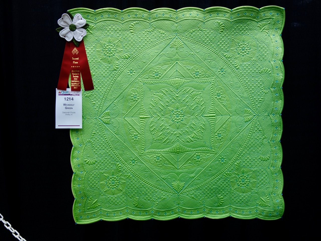
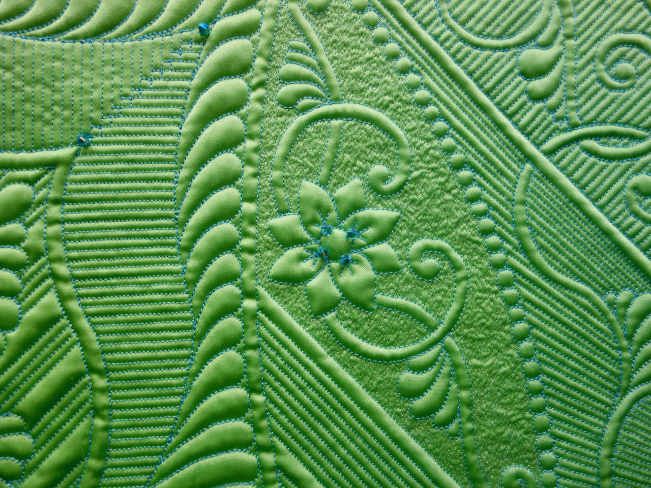
Actually the full category is Small Wall Quilts - Movable Machine Quilted and Deborah Poole of Shelley, Idaho won the 2nd place prize. Her 47" x 47" quilt "Wickedly Green," has beading, crystals, embellishments, free-motion quilting and matchstick quilting.
If you missed Lisa Calle's 3rd Place winner click here:
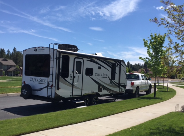
You might be wondering why G and I would be going on a Quilt Diet and how we are going to adjust on the road?! It is not what you think! On our last big Quilt Road Trip, where we were traveling from Arizona Quilts to 3 Dudes Quilting and then on to The Olde World Quilt Shoppe...and all those other fabulous shops in between, there was an ongoing discussion about our RV. We love it, but does it fit the needs and type of camping we like to do??? After we got home and were just kicking tires at RV dealers and shows, G happened to mention that we could only pack 600 lbs of stuff in the RV????!!! I looked over at him and said, "Well, as I see it, you and I use up a big chunk of that change!"
How do we remedy this? First off, we sold our RV! Second, we started a new healthy eating lifestyle. Then we took a long hard look at the ups and downs of our camping life. And, for the kind of life we lead, we decided to choose a different type of camping vehicle that would afford us more flexibility. A small off road travel trailer which will allow more flexibility and a higher weight limit. The travel trailer is smaller than the RV and takes some creative packing, but the way I see it, this might be the perfect Quilt Diet. I had NO understanding that there was a weight limit to what you can pack into these vehicles...but, now that I do, I am going to keep track of every pound I lose because a pound less of me and G means space for approximately 3-4 yards of quilting cotton!!! This Quilt Diet may be the most motivating "diet" I have ever been on!!!
Now that we are home for a bit, waiting on the arrival of our newest family member, I have been working on Sisters Outdoor Quilt Show quilts! I finished the binding on my Great Granny Squares (one more quilt to bind). I love how my fabric choices played together! I hope you are able to come visit the Sisters Outdoor Quilt Show...I'll have 4 quilts on display!
Hope your June is filled with Stitching, gardening and warm weather!!
Patricia Belyea of Okan Arts got a chance to see some pretty remarkable quilts collected by Bill Volckening. Currently his collection numbers 450, with quilts from the 18th century to the 21st century. Click on See the Quilts to learn more about the collection and to see more quilts.
Want to see more of Bill's quilts in person? His exhibit, "Off the Grid" is currently at the International Quilt Study Center & Museum at the University of Nebraska - Lincoln. The exhibit will be there through August 27, 2017. Bill writes about the exhibit:
The first 1970s quilt I bought reminded me of my childhood, especially summers spent at the community pool. As I accumulated more quilts—many made from polyester double-knit fabrics—the critics had plenty to say. People would actually make faces when I talked about polyester quilts. I didn’t care. I was enthralled. When I started bringing the quilts to show-and-tell with the local quilt guild, they were better appreciated. Part of that was generational—the group had a sense of Modern art, and the quilts’ aesthetic prompted a certain nostalgia in people who had come of age in the 1970s.
The quilts were inexpensive and the collection grew quickly. Today, it includes more than 150 quilts that represent a pivotal period in the history of American quiltmaking. My role as a collector is to get people looking, which, of course, is an easy job with such eye-popping, jaw-dropping quilts.
Bill’s blog, Wonkyworld, details the thrill of the collecting hunt.

Name: Meg Hawkey Vintage Crayon Block
Designer: Ann Myhre
Show 2009: Sweet Treats with Vintage Appeal
Begins: June 6, 2017
Price: Free to Star Members
Description: Ann has created a beautiful block using the techniques described in Show 2009: Sweet Treats with Vintage Appeal featuring Meg Hawkey and Sally Frey. The block was created using color crayons and embroidery.
You must be logged in as a Star member to download the patterns. If you are not logged in, you will have to login and then return to the TQS Show Techniques page.
Become a Star member and get this pattern for Free.
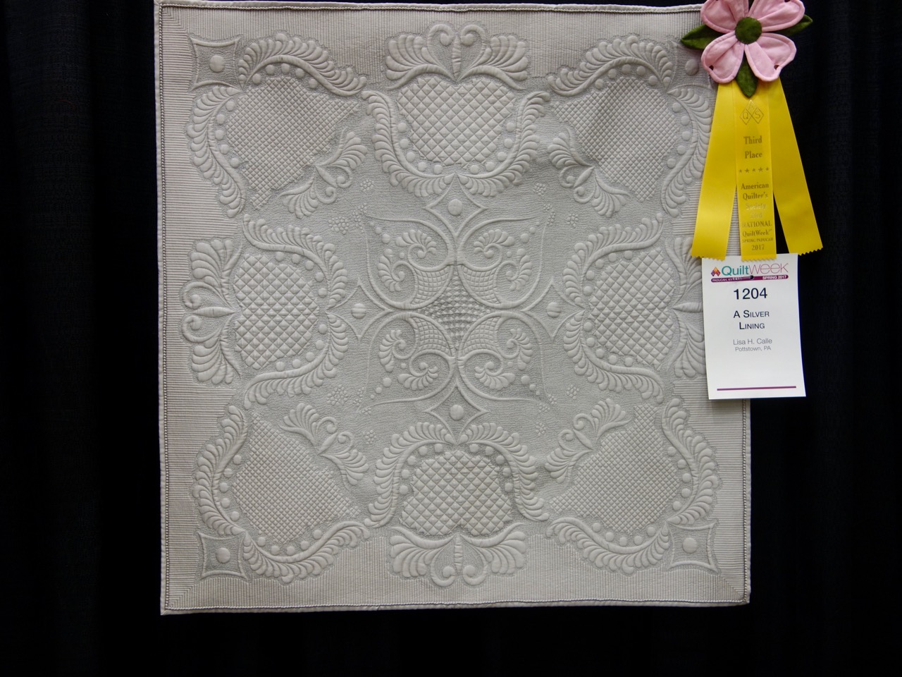
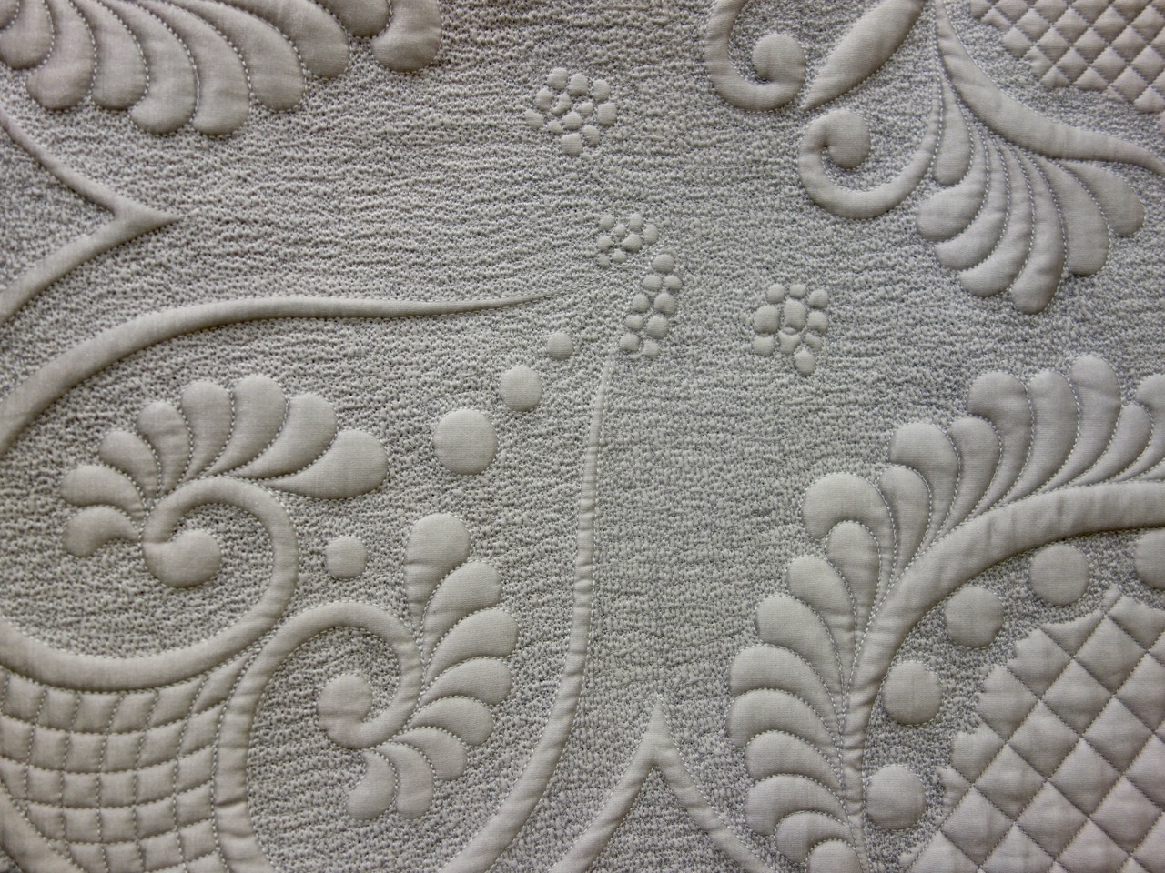
Lisa H. Calle used her quilting expertise to create A Silver Lining. This Quilt is a 36" x 36" wonder using free-motion quilting and longarm computer-aided quilting. Take a close look at the stippling in the detail picture. 2nd Place in this category will be in the Wednesday newsletter and 1st Place in the Friday newsletter. You have a lot of great quilting to see.
Star Members can learn more about quilting with Lisa in Show 1703: Quilting the Bones & Beyond.
We love the amazing quilting of Lisa Calle, but quilting has been an art for many years. Check out this French quilt from 1750-1800.
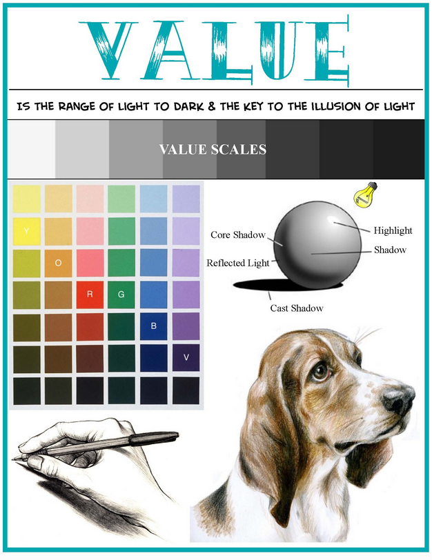
This week, we leave color and direct our attention to one of the most often forgotten players in design, that of VALUE! It is said that while color receives all of the attention, it is value that actually does all of the work. Value's close relationship with color means that you need both working together to make for a successful quilt.
In the most basic terms, value is the lightness or darkness of a color. There are generally three categories of value: high, low and mid.
High value means colors that have a great deal of light in them, with white being the highest of high value colors. Low value colors are darker, with black being the lowest of low value colors. Mid value colors are those that do not lean to the very light or very dark, and as such, are very appealing to quilters.
Fabric manufacturer's know this about quilters and that is why when you go shopping for fabrics, it is difficult to find a large assortment of very light of very dark fabrics in a single color family.
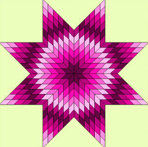
Let's say you want to make a lone star quilt using only pink fabrics. If you select all mid value pink fabrics, the star design will get lost or muddy. No longer are you able to determine the uniqueness of the star elements. Notice how with each round, the wide range of pink values changes. This makes the star have maximum impact visually.
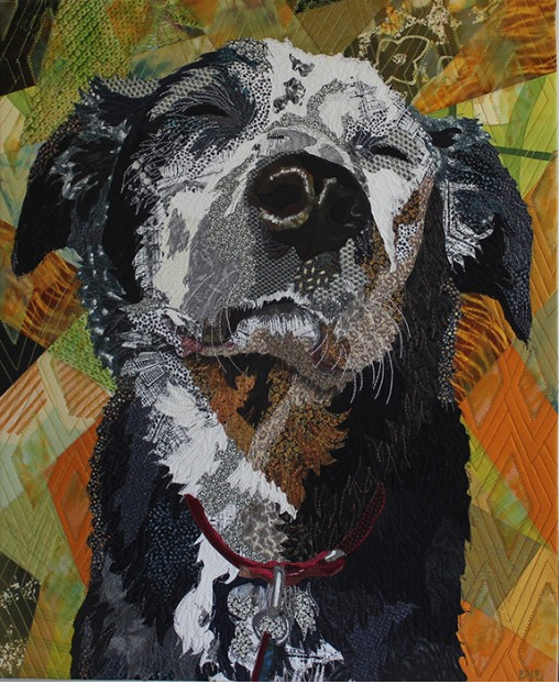
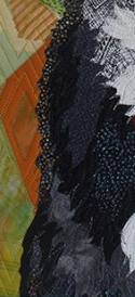
However, there are times when your desired effect is to have less defined and 'blendy' results as in the case of the fur of the dog in "Sun Worship" by Barbara Yates Beasley. Other subjects where a more 'blendy' effect could be used are landscapes, sunrises/sunsets, trees with many leaves, etc.
The key to achieving success is to remember that when selecting fabric try to incorporate a very wide range of tints, tones, shades and pure color. That way your design will have contrast, depth and volume.
High - Light, Airy, Delicate
Low - Dark, Earthy, Heavy
Mid - Middle of the road
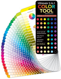
Don't rely on your instincts? Use the Ultimate 3-in-1 Color Tool to help solve the mystery. Each of the twenty-four pages illustrates the pure color, tints, shades and tones of a family, allowing you the opportunity to select from a wide array of fabrics to make a quilt more interesting.
Let's look at some examples of quilts featuring high, mid, and low values:
Fiber artist, designer, quilter, and author, Grace J. Errea, began quilting in 2000. Her art focuses on the depiction of inspiring scenes in a value based contemporary-realistic manner. Grace's spectacular quilt work seems effortless, but she shares the secret for what makes a successful quilt. It comes down to training your eye, evaluating your stash and paying close attention to the type of impact you as the quilter want to evoke.
by Grace Errea (Show 1303)
So you made what you thought was your masterpiece, only to realize that it is…quite frankly, boring. You think the problem is the colors but, you will find your problem if you inspect the values. It’s time to take your work to another level! This article will demonstrate how to train your eye and brain to see color differently through the use of value.
Let’s start by discovering where does “Value” come from and what is it. When we say “color”, we are using the word as a substitute for the word “hue." Hue is one of the three components of Color. It refers to the name such as red, blue, green. The second component is Saturation, i.e. how pure is that hue. A pure hue can be de-saturated by the addition of gray. Thereby we are creating what is called toned hues.
A hue can also be de-saturated by adding white or black. Black darkens the hue creating shades. Conversely, white lightens the hue and creates tints. This generates degrees of light and dark, and that is how values are created. A good design is produced when there is a good distribution of tints, shades, and mid-range values. Middle values provide the framework with, light and dark value contrast giving the design its visual impact.
“Grenadine Picotee” has strong highlights at the edges of the petals that add impact to the shapes.

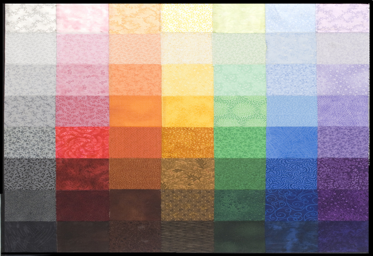
I use 8 values, from very light (Value 1) to very dark (Value 8). Each increment creates a smooth transition, as shown in this Gray Scale. Also, in the Value in Color Chart, showing equivalency in the primary and secondary hues. Each column represents a hue showing values from 1 to 8. Each row is one value across as a continuum. As you go down the column you will see discernable changes in value, as it gets darker.
By using the Value Matching Tool, areas are isolated and easily “value-lized” when compared to the values that surround the opening.
Where and how to use Value:
- Highlighting a focal point
“Moondance” is an example of at least 3 or more values between the focal point and the background to accentuate the main character in your piece.
- Create atmospheric perspective
In landscapes, as you move further away, layers of atmosphere lighten the background. By using tints as you move away from the darker valued foreground, atmospheric perspective is created using value alone.
- Set the mood of a piece.
“Creamsicle Dawn” (left) was created using tints, yielding this calming, early morning feeling.
Conversely, “Popsicle Sunset” (right) has mostly shades which creates a dramatic, hot sunset that stirs the soul.
- Create 3-dimensionality
Three-dimensionality is created by lighting the subject as in “Hen and Chicks”. Light creates the highlights and shadows. It is all about the Value!
- Create the object in multiple hues or your favorite hue
In “Blue Tigger”, “Red Tigger”, “Rudolph Tigger” the same pattern was used with different hue combination. The key is to maintain the value regardless of hue.
- Create High-Value and Low-Value Effects
In order for a focal to be highlighted there must be at least 3-values between the background and the outer edges of the focal point. More is better. If the focal point is lost in the design, it is not the color but the value that is causing the problem. Darken or lighten the background and voila! “Bateleur Eagle” is a good example of the High Value effect. Background is value 1 and the Eagle is value 7-8.
The “Hibiscus” is a high-value, but something is lurking within the petals. The value of Mr. Frog is similar to his neighborhood so he needs to be “found” upon closer inspection.
It all comes down to Value being relative to its neighborhood. Whether something is working beyond your expectations, or there is a problem to solve, give Value the credit or look for a Value solution first. All else can come second. To learn more about Grace Errea watch Show 1303 or visit her website www.amazingquiltsbygrace.com
Select one of the quilts in this newsletter as inspiration, and using your personal stash, set up the range of fabrics from high, mid to low value. See where you have holes. Take note, so the next time you visit the fabric store, you can be sure to seek out those values that you need. Repeat with as many quilts as you like. You will be surprised how many low and high value fabrics you have on your shopping list!
This looks like a double pinwheel, but I bet that's not its official name. What do you think it is? Play the game and find out.

