 50
50
Three Easy Steps To Save This Lesson As A Pdf:
-Make sure you are logged in.
-Click on the small triangle next to the tool wheel in the upper right hand corner of the page (you'll find it above the the Like button).
-Select the pdf. option. Wait a few minutes. It's a large file due to the number of images.
-Your file should appear with the title of the lesson.
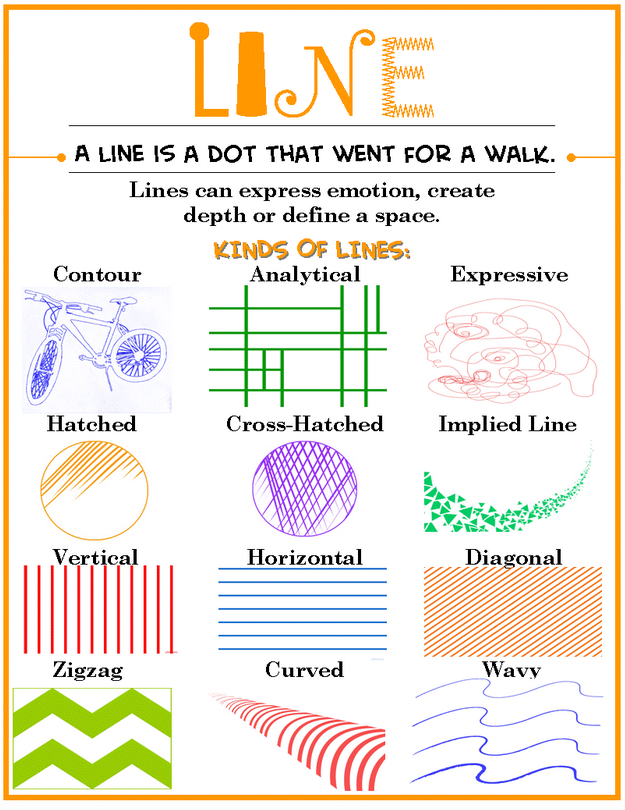
(Image courtesy of Ann Gibson at Canyon Creek Elementary School)
We begin The Art of Quilt Design Program with the Elements of Design. Elements of Design include line, shape, form, texture, space, color, and value. Think of these terms as the ingredients in your kitchen.
Let's use something we are all familiar with - scrambled eggs. On their own scrambled eggs are tasty, but when you add other ingredients such as butter, salt and pepper, the dish has more depth of flavor and interest. The same principle holds true for your quiltwork. You as the designer should be striving to create a piece that holds the viewers interest by incorporating all, if not most, of the elements.
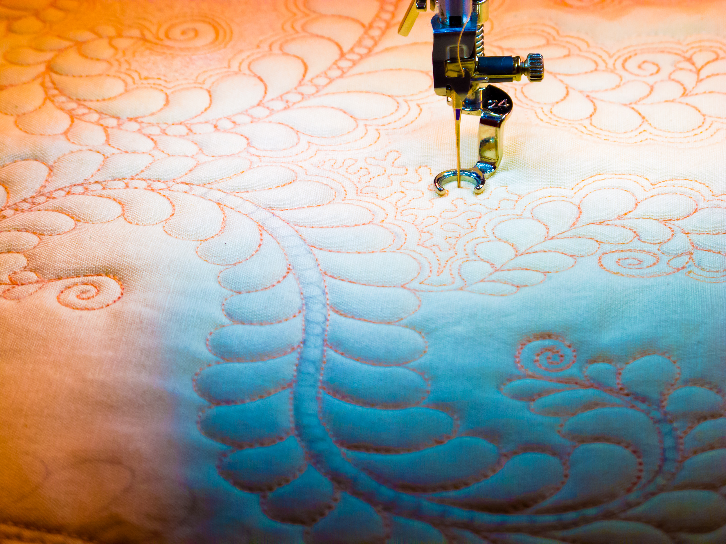
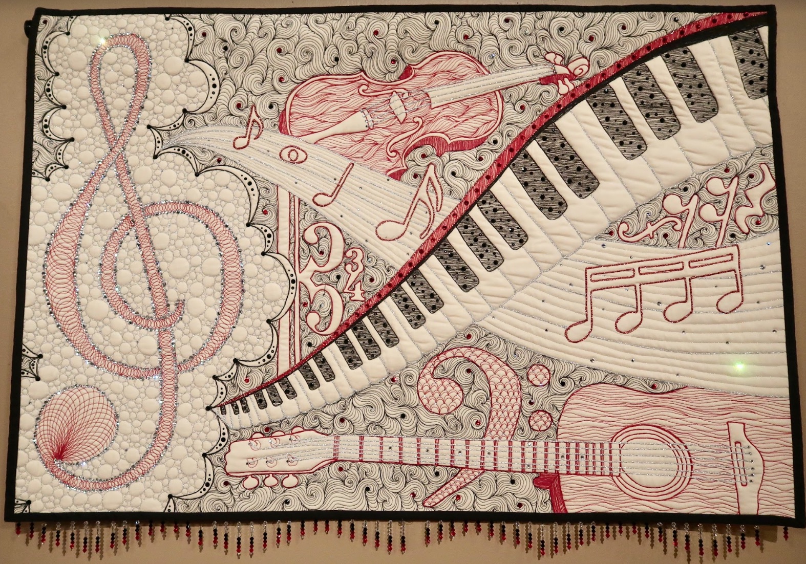
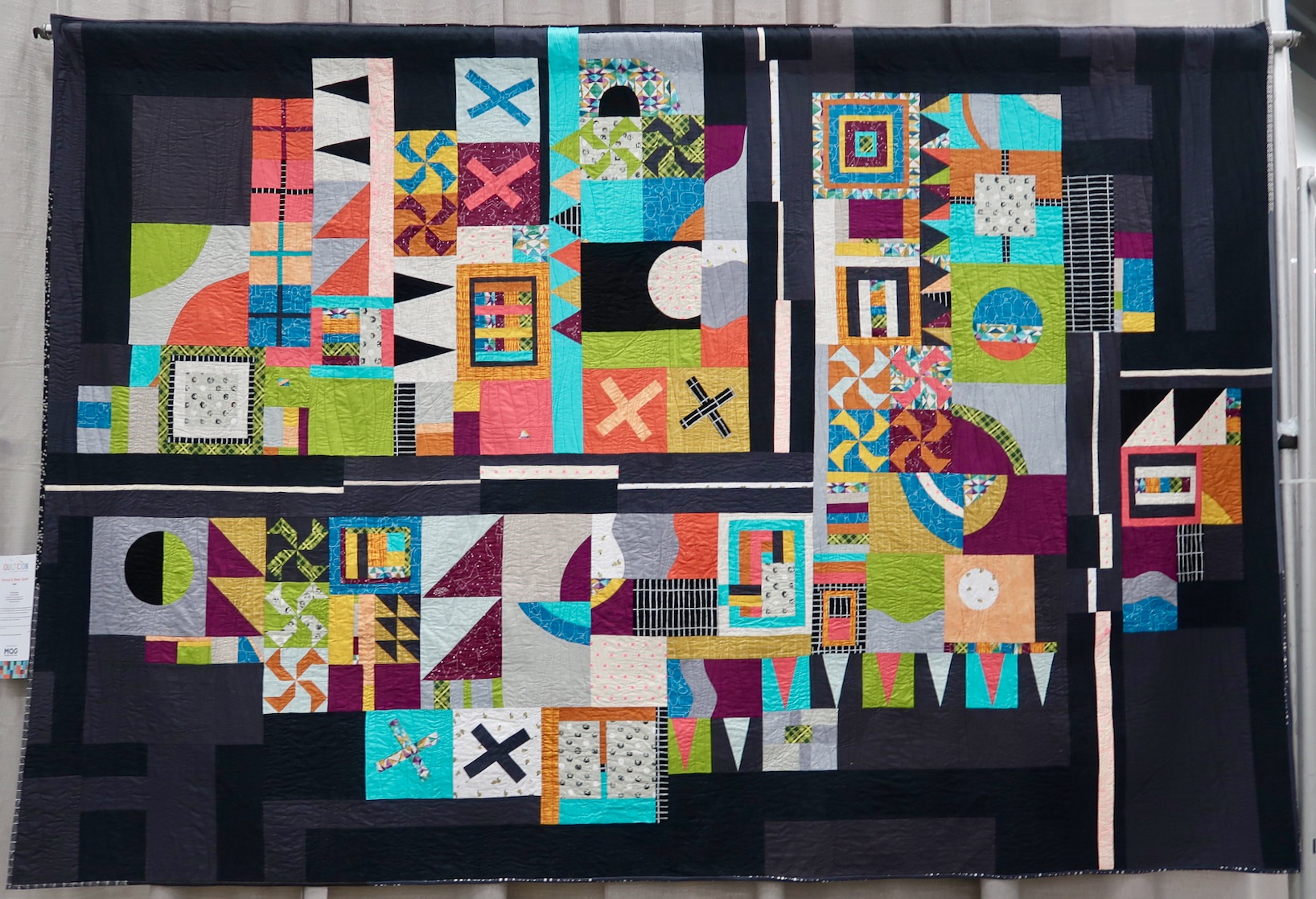
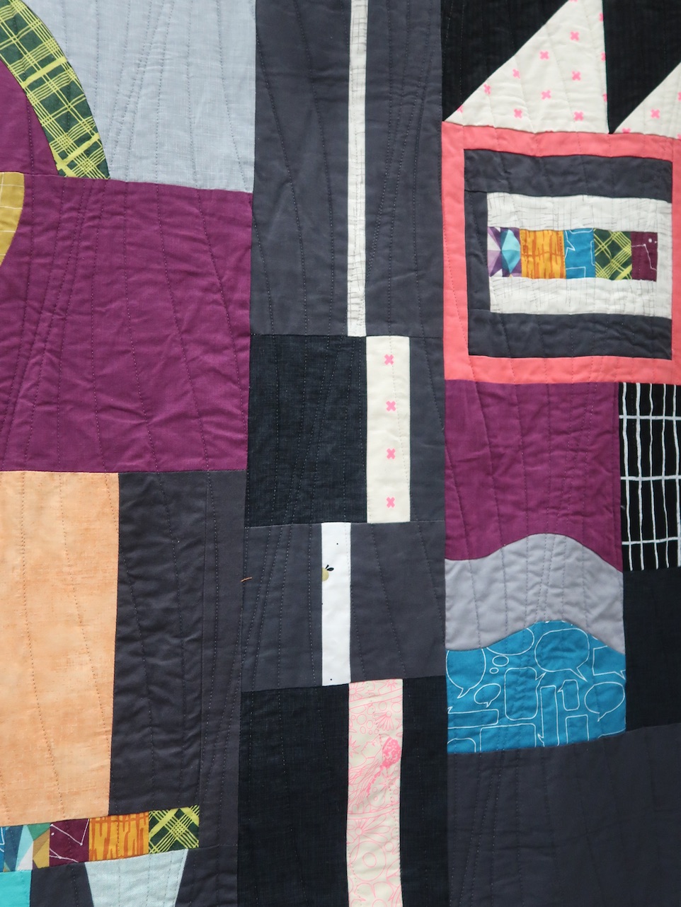
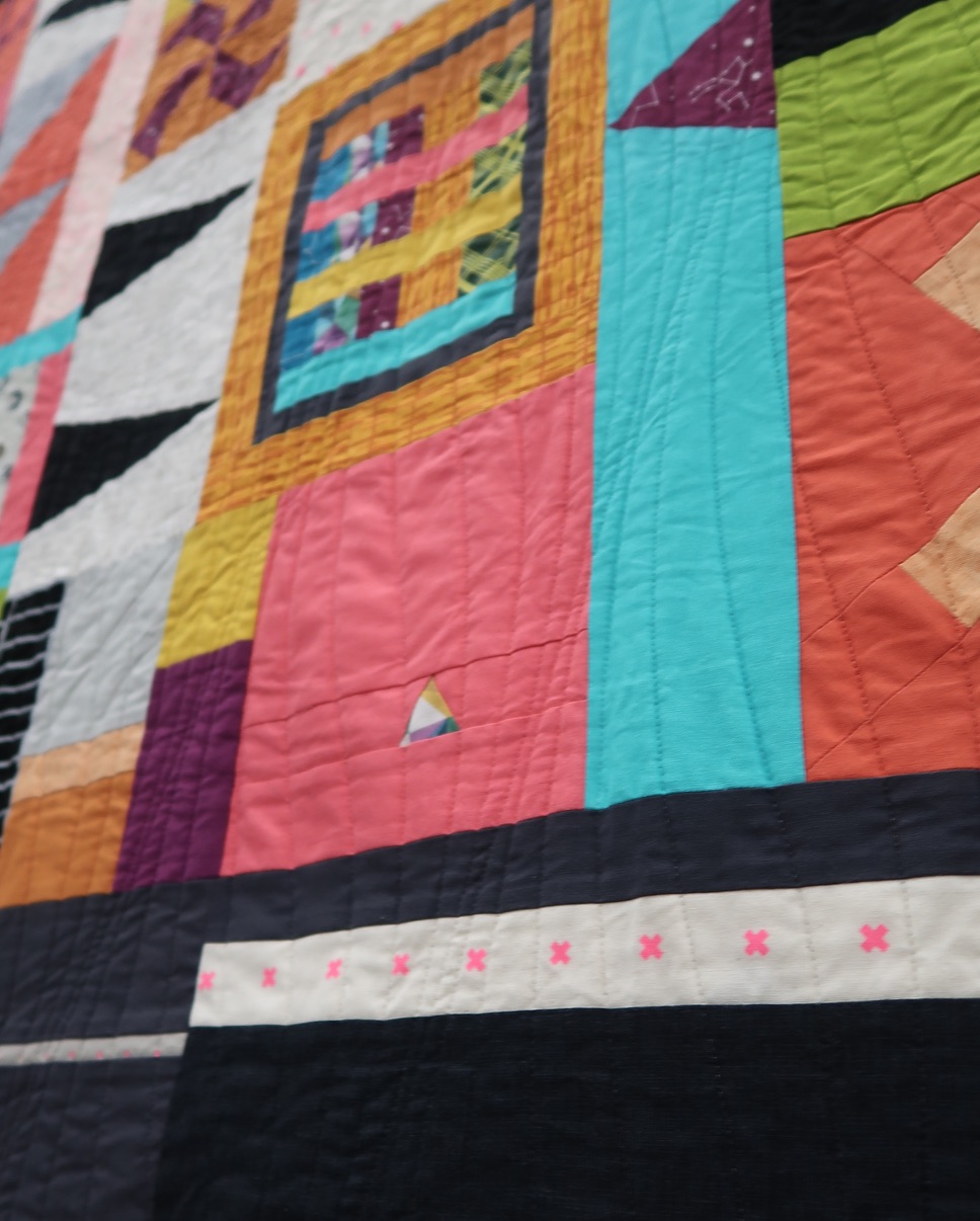
Let's start with Line. As in the example above, lines can be thick, thin, straight, wavy, curved, tapering or uneven. Lines can create texture, send our eyes moving in a certain direction, create mood, gesture, or outline. When it comes to quilting, the simplest line can be the stitches that hold together the top, batting, and backing.
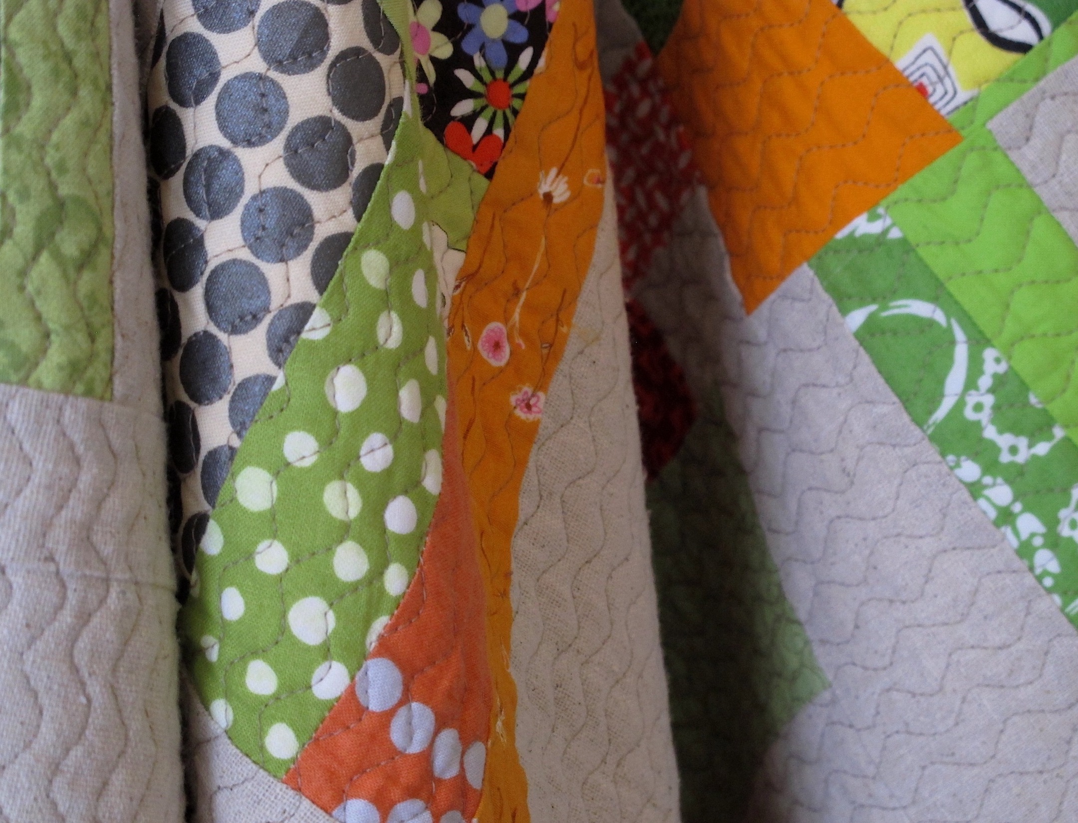
Gently waving lines
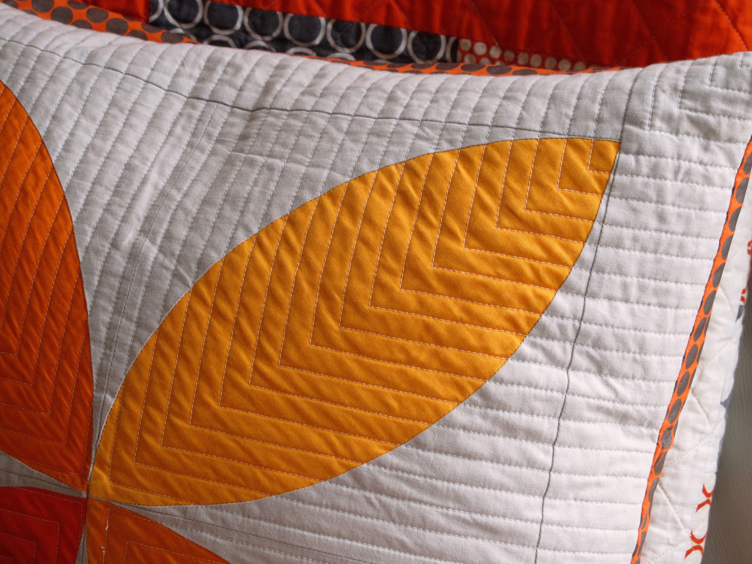
Lines in an orderly formation
Complex lines of feathers, wreaths, twirls
But Line can be so much more! Artist Leni Levenson Wiener (Show 1413: From Film to Fabric - Photos as Inspiration) shares her apporach to line when it comes to capturing a viewer's interest in a quilt.
Line
by Leni Levenson Wiener
In art, line can refer to several different ideas. Line can be an actual mark on the surface of the work; it can define or outline shapes or represent the negative spaces between shapes. Line can be literal or implied; either a visual path the viewer takes through your composition or a connection by an invisible thread from values, shapes or colors that repeat to form a pattern and travel across the surface of your artwork. Line can also be the direction of the shapes and elements you use that create gesture and movement in your composition.
Line as visual path
Often we hear the expression “to draw the eye in” which refers to the visual path used to guide the viewer through an artwork or to insure the focal point is the most important aspect of the composition. This visual path can be clearly depicted or it can be implied, the eye gently taken along from one point to another by an actual or suggested line. This path can run from the front of the composition to the back, up and down, from side to side, or around in a circular or radiating fashion.
 Pinebrook illustrates two principles of line. One is the literal path of the water that leads the eye into the composition, but line is also at play with the trees; the vertical lines they create and the spaces between them are a strong visual element as they are rhythmic and repetitive. (Pinebrook)
Line in the composition can be thick or thin. Horizontal lines imply a static composition where no movement is present. Vertical lines emphasize height and draw the eye up into the composition, while diagonal lines bring energy and movement to the work. Radial lines are diagonals that converge and draw the eye to the point from which the lines emanate, while circular lines draw the eye around the work and back again.
(Pinebrook) image courtesy of Leni L. Wiener
In Headed Home, the converging radiating lines both draw the eye into the center of the composition, but because they are diagonal, they create energy and the perception of movement towards the perspective point on the horizon. In Lizard, it is the fabric used for the sky which creates the repeating circular lines, making an otherwise static composition alive with movement.
 Headed Home and Lizard. Photo courtesy of Leni L. Wiener
Repetition
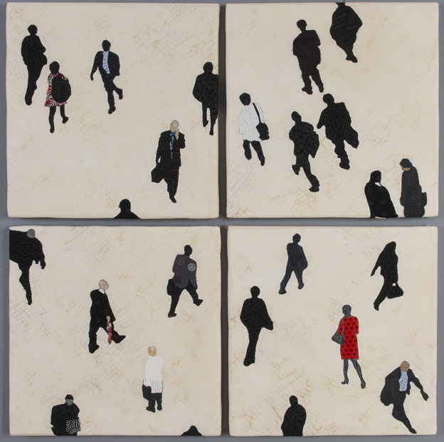
In Rush, because the silhouetted figures are repeated and dispersed against a contrasting background, they create a pattern; but repetition does not mean the shapes and lines themselves need to be identical, they need only suggest each other. Either way, the resulting pattern serves to create a feeling of rhythmic movement across the surface of the work. Note also how little bits of red and blue are strategically placed, which subtly helps pull the viewer to different points around the composition--the suggestion of an invisible, or implied line. Repetition not only enlivens the surface of the work, it serves as a unifying element.
Rush by Leni Levenson Wiener. Photo courtesy of Leni L. Wiener
Line as gesture
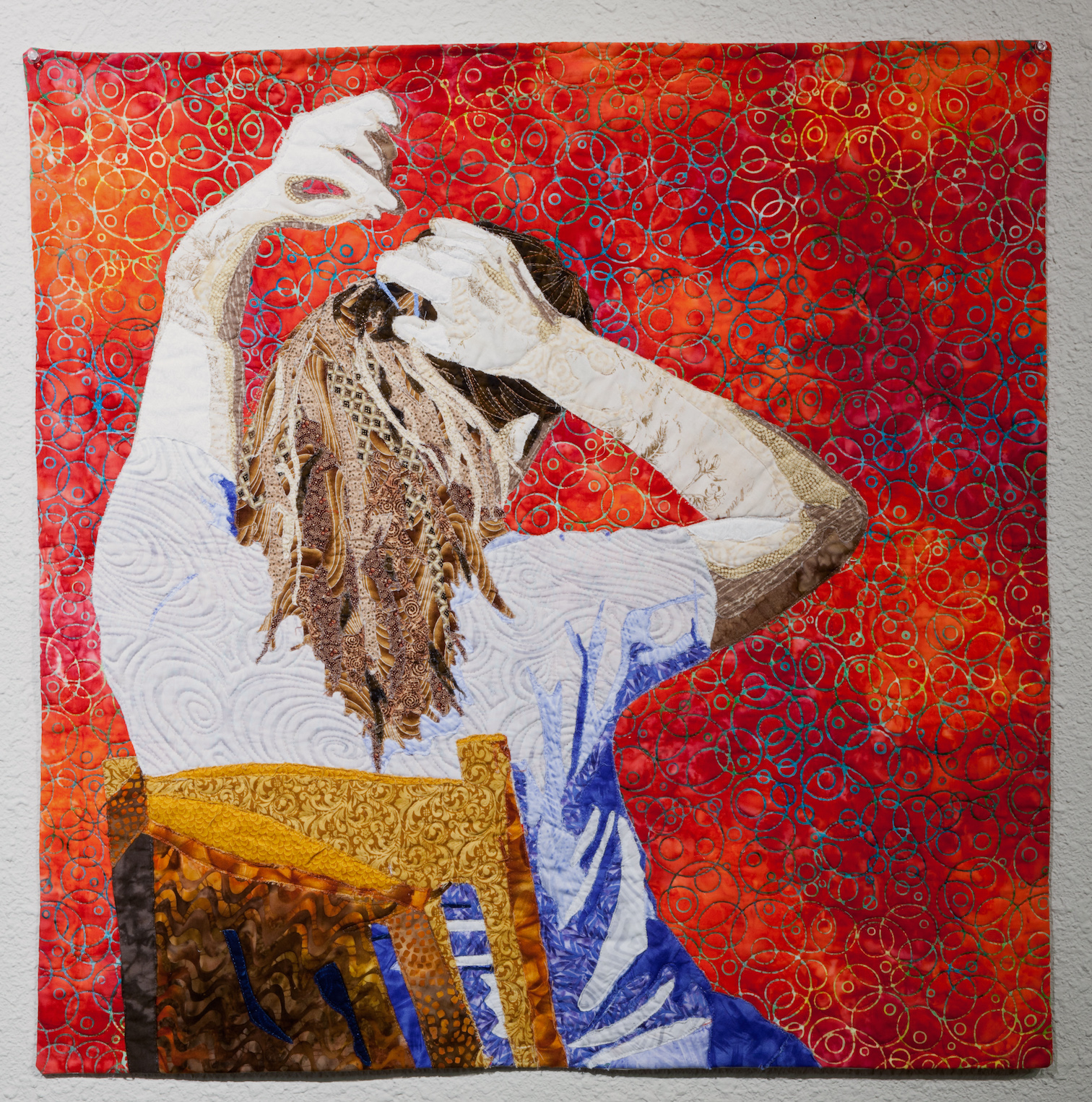
As gesture is simply the movement of the human body that expresses an idea, an opinion, or an emotion, line used in figurative art becomes a powerful tool with which to communicate with a viewer. Body language; the tilt of the head, the position of hands, the implied movement of arms can all speak clearly to the viewer.
In The Endless Dance of the Ponytail, the placement and the resulting line of the arms suggest movement, like a dancer, about to reach the peak of momentum. Because the lines of the arms are diagonal, they inherently exhibit more movement than they would if they were in a horizontal or vertical position. The dynamic tension created by the opened space left between the hands becomes the focal point of the work, drawing the viewer up to the peak of movement. Were the hands closed, the closed line would have drawn the eye around the surface and back again and would have cost some of the perceived energy. And you thought lines only took you from point A to point B!
The Endless Dance of the Ponytail. Image by Gregory Case Photography
More ideas for adding interest with Line:

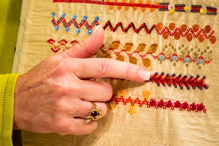
A radial line An orderly line

An implied line
Practice Exercise: Create Your Own Graphic Line Drawing by Deep Space Sparkle
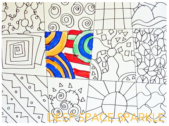
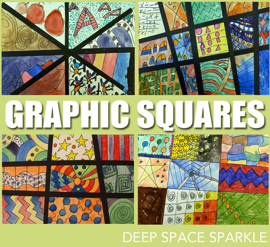
(Images courtesy of Deep Space Sparkle)
Option 1:
On a sheet of plain paper, draw two straight lines across the paper and two lines down. Using your drawing tools of choice, fill in each area with a design. Add color or not. The choice is yours. When you have completed the drawing, add strips of dark construction paper to make the image more graphic.
Option 2:
Make a quilt sandwich with your top fabric being a solid color. Stitch out the lines on the sandwich. Fill in each area with some free motion designs. Don't worry about them not being perfect, this is just a practice piece.


 Pinebrook illustrates two principles of line. One is the literal path of the water that leads the eye into the composition, but line is also at play with the trees; the vertical lines they create and the spaces between them are a strong visual element as they are rhythmic and repetitive. (Pinebrook)





.jpg)
