

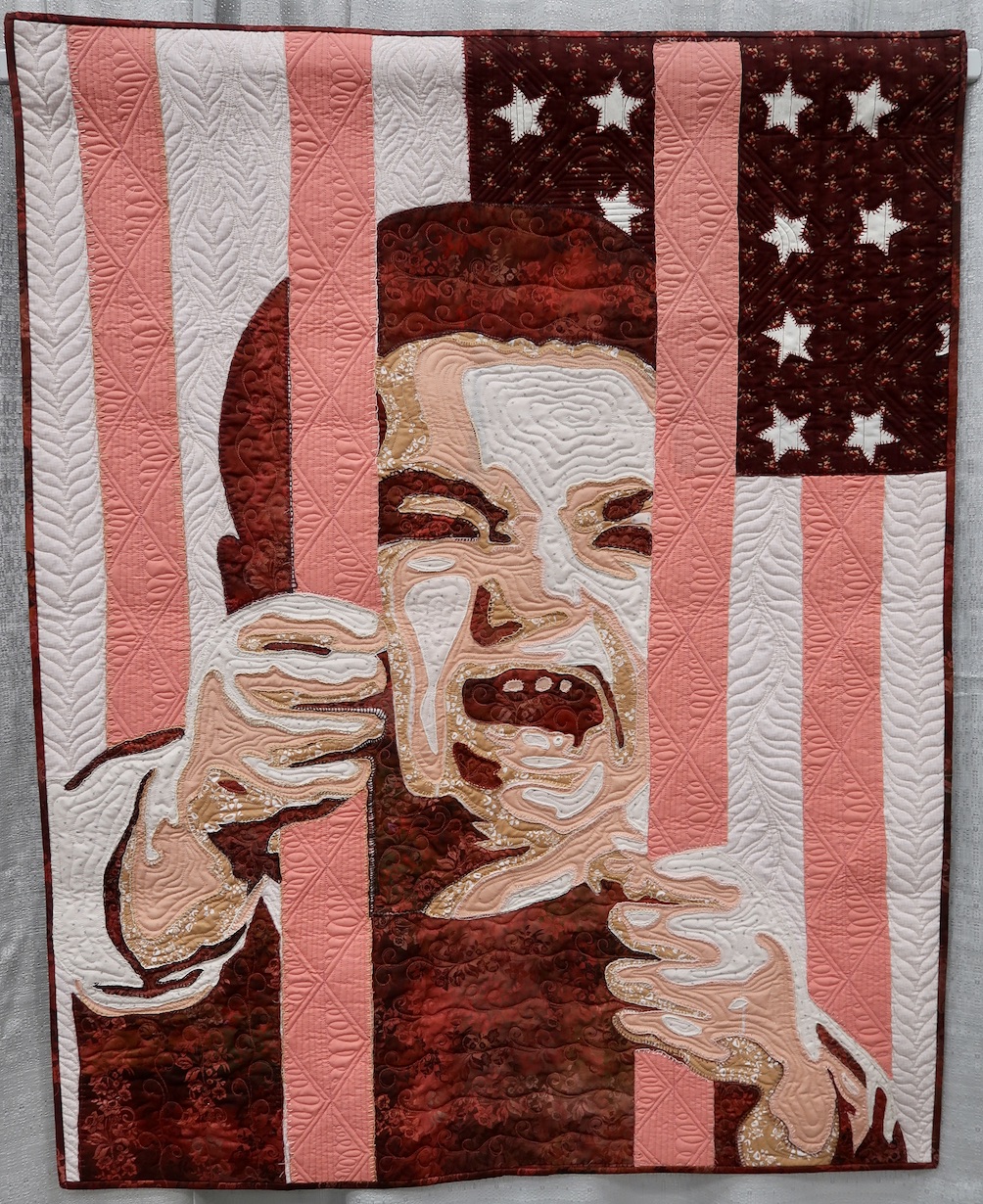
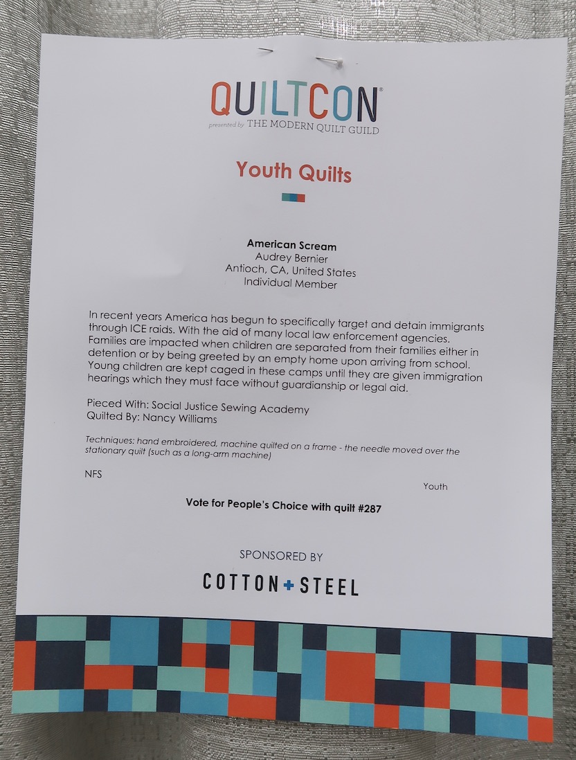
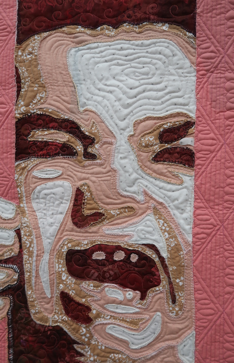
Pieced with the help of the Social Justice Sewing Academy, Audrey Bernier felt strongly about bringing attention to a very sensitive subject in today's society and did so with her quilt, American Scream.
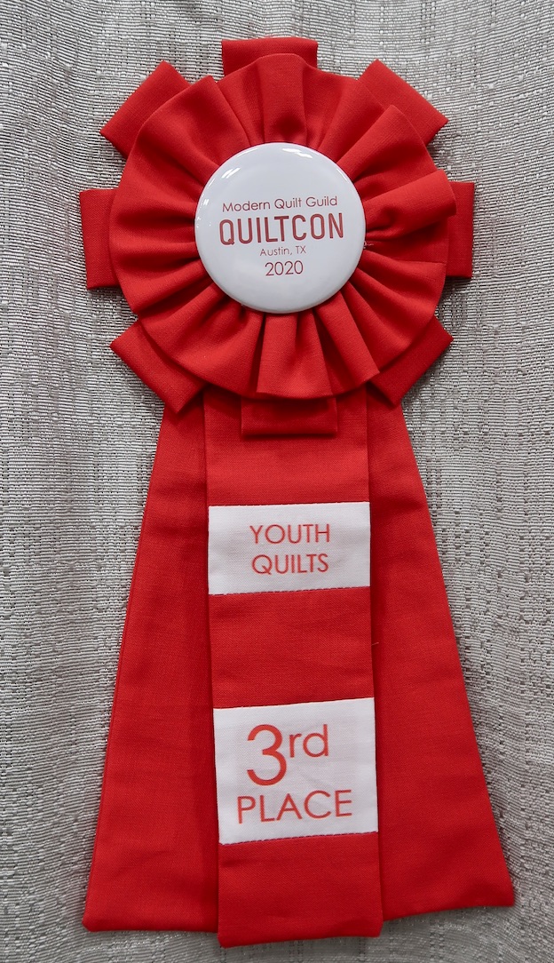
American Scream by Audrey Bernier won Third Place, Youth Quilts, sponsored by Cotton + Steel, at QuiltCon 2020.
Photos by Mary Kay Davis
Alex talks with BERNINA Ambassador, Sue O'Very. Sue is the owner of Sue O'Very Designs, where she shares her love of embroidery and sewing projects. She is celebrating 10,000 subscriptions on her SueOVeryTV channel on YouTube with a special contest you can enter. She and Alex also discuss her new venture teaching sewing to beginners. Check out the celebration and how you can participate.
Alex did a project recently that she is sure you will love. This is a fun project that will definitely be a keepsake for generations (or maybe not). Either way, you will enjoy learning what she did and the next closet she cleaned as we all stay in place together. Join her LIVE today Wednesday April 15 at 10am PST, 1pm EST, 6pm London.
Since we opened TheQuiltshow.com in 2007, Ricky and Alex have combed the world bringing you a variety of teachers and techniques. So many that it is hard to find what you want to see or see again. In our redesign, we have concentrated on making this easier. In Sneak Peek #1, Ricky and Alex talk about how the new site will help you find what you are looking for. Don't miss out on the Special Stay-in-Place $19.95 6 mo membership. Thank you for joining or renewing.
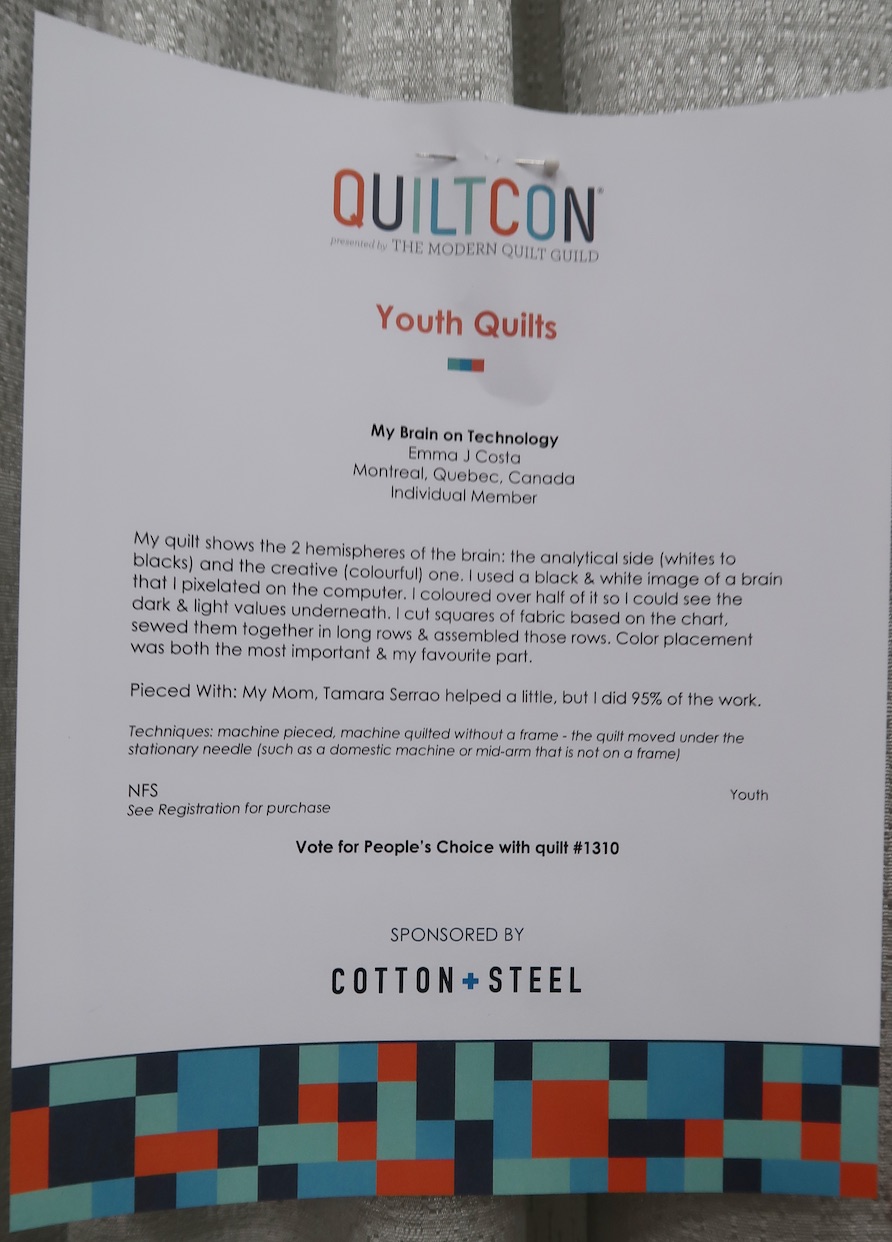
We wish we had both sides of Emma Costa's brain (the analytical and the creative) when it comes to designing a quilt. We love how she used technology to help her create the design and then discovered that picking out and placing the fabrics was her favorite part of the process.
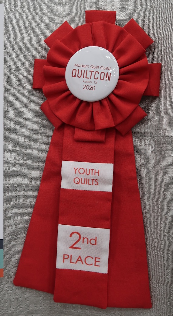
My Brain on Technology by Emma J. Costa won Second Place, Youth Quilts, sponsored by Cotton + Steel, at QuiltCon 2020.

Photos by Mary Kay Davis
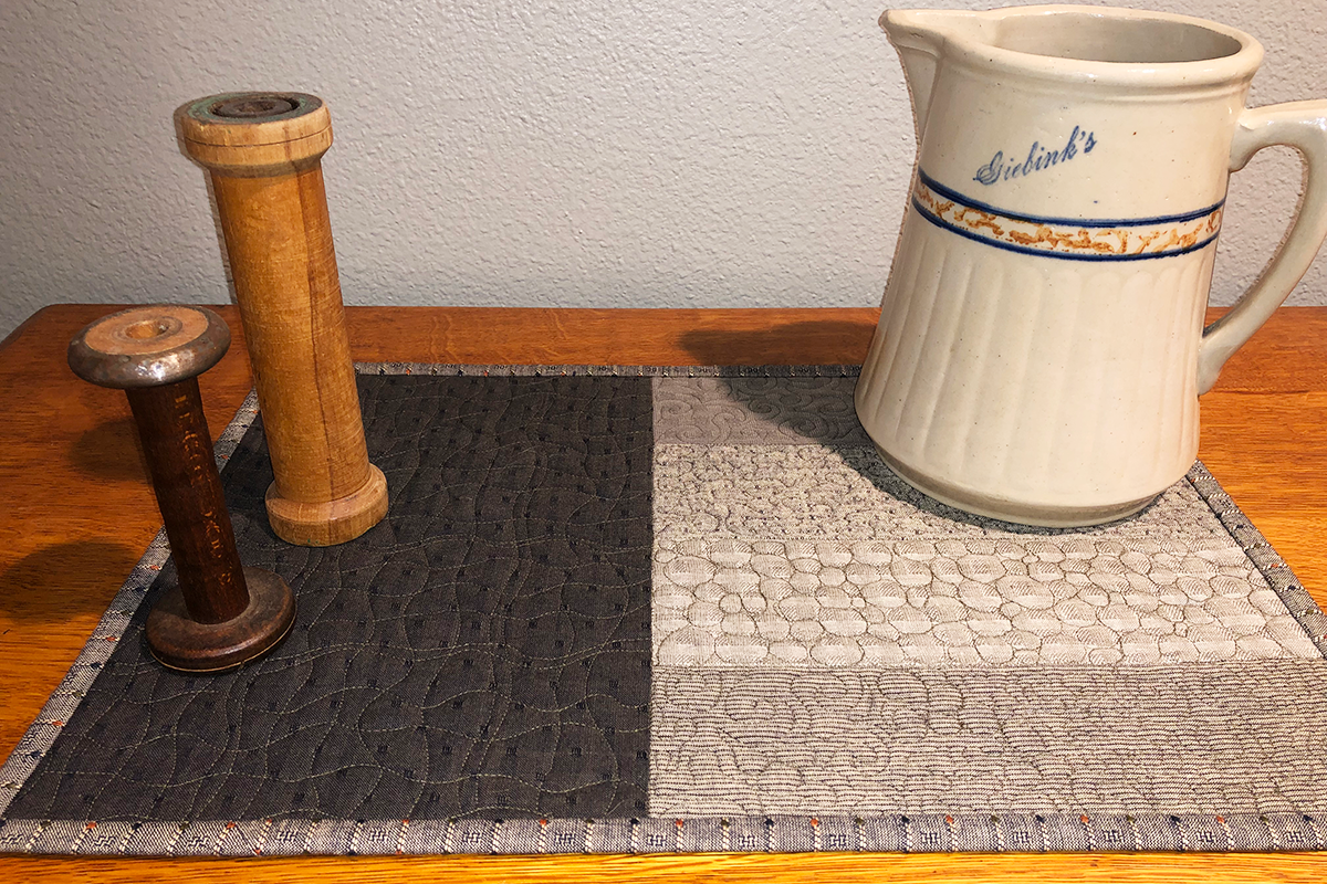
This BERNINA Made to Create Studio online class will share tips and how-to steps for free-motion quilting success. The tutorial will take the quilting design from a sketch on paper to four unique placemats that will help you practice your free-motion skills.
Enter to Win a Precision Machine Quilting Ruler and a copy of The Quilt Life autographed by Alex (Ricky is at Autumn Rock). You can get extra entries by sharing or just watching a quick video. One entry set per household. Entering ends Thursday at 12 midnight PST. We will ship anywhere in the world.
Don't forget the prize for everyone...our Stay-in-Place 6 mo membership special for $19.95. Click here.
Good luck.
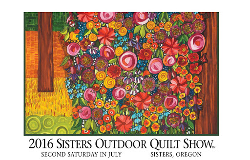
The puzzle today is actually the poster from the 2016 Sisters Outdoor Quilt Show titled Infinite Stiches, which Kathy Deggendorfer designed. Kathy's vibrant and colorful watercolor paintings are whimsical representations of life in Sisters, Oregon.
Watch Kathy and learn about her art in Show 2608.
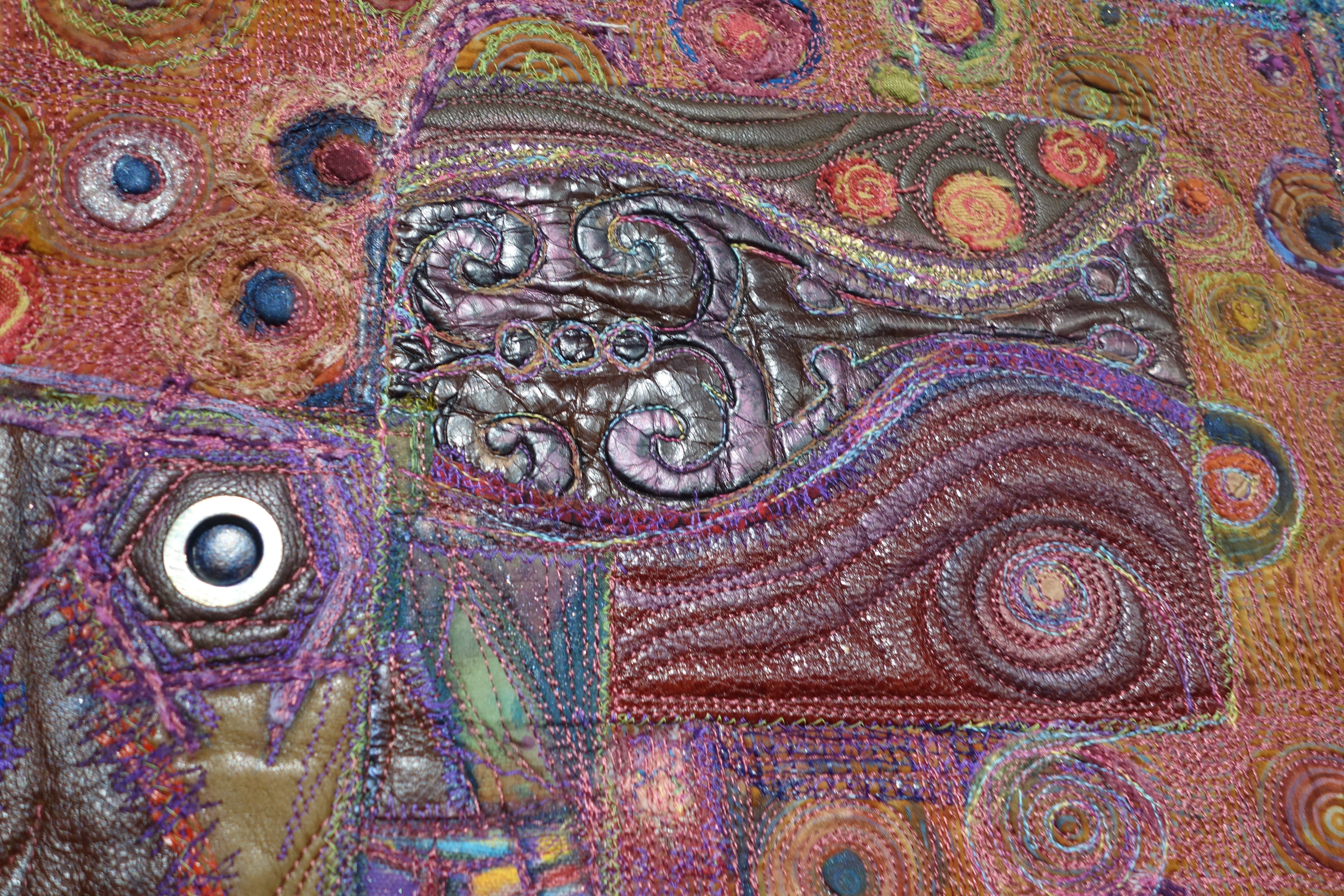
Urban Desires by Michele Sanandajian - Detail
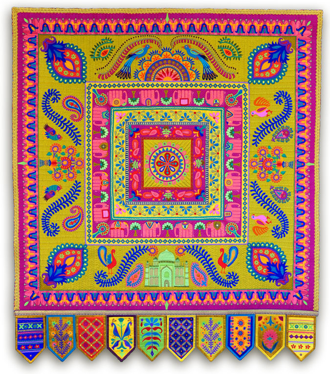
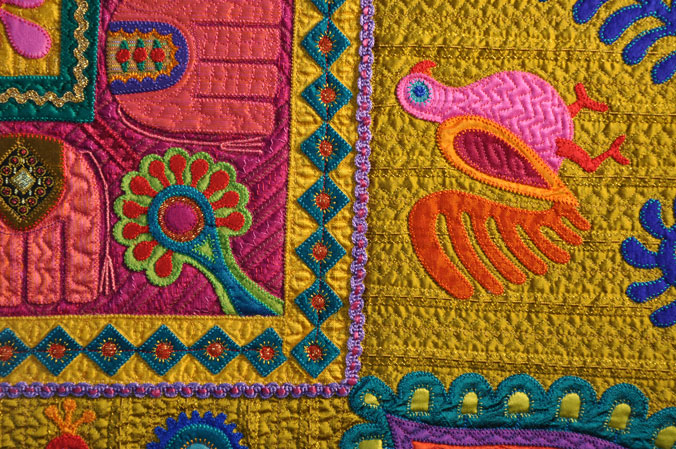
(Images, Jane Sassaman blog)
Mary Elizabeth Kinch (Show 1502: Small Pieces, Big Impact) shares how, with even small pieces of fabric, one can create visual impact and movement in quilts.
Texture is the physical quality of a surface or a substance that we experience through our sense of touch. A strong element of design, texture adds depth and visual variety. It draws the viewer in, engaging them with the work and creating an emotional response. Everything has texture!
There are two types of texture in design: tactile and visual or implied.
Tactile Texture is the actual real physical quality of the surface that can be felt and appreciated, like the smoothness of satin or the roughness of sandpaper. Tactile texture is created with materials, processes and techniques, and how these are used together.
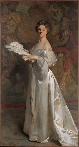
John Singer Sargent, 1894-1895, Ada Rehan. Collection of the Metropolitan Museum of Art, Accession Number: 40.146
Visual or Implied Texture is a realistic illusion that is representative of, or imitates, texture. It is the perception of texture and is as powerful sensorily as tactile texture. Even though we cannot touch it, we experience a mental response as if we could feel what we see. John Singer Sargent expertly creates visual texture through the use of value, clearly depicting not only the luscious folds of the gown but the smoothness and weight of the silk satin used in the dress.
Creating visual texture and a sense of depth and contour, is achieved through a combination of different elements such as value, line and the principle of repetition.
This photo is a great example of perceived visual texture through the use of value, line and repetition. The rhythmic texture of the railings on the bridge is created through repetition and line. Value (and a bit of repetition) creates the soft texture of the leaves. And line and value do the work of creating spiky texture of the pine needles in the upper foreground.
(Photo by Ian Kinch, Bow Bridge, Central Park, 2016 https://www.instagram.com/i.w.kinch/)
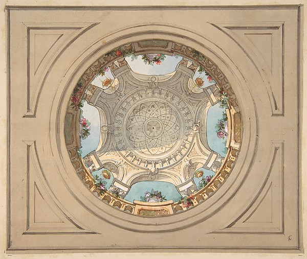
Trompe L’oeil, a form of visual texture, is a design technique that is all about tricking our eye into seeing a 2D object as 3D. Here Mr. Lachaise and Mr. Gourdet have created a lovely example of trompe l’oeil. My eye is definitely tricked!
Quilts are naturally tactile through the use of various materials and techniques such as the quilting stitch, trapunto, decorative stitches or embellishments. Quilts made with many small pieces, are immensely tactile because of the sheer number of tiny morsels of fabric and the seams that join them.
Jules-Edmond-Charles Lachaise and Eugnene-Pierre Gourdet, Design for a ceiling with trompe l’oeil balustrade, second half 19th century. Collection of the Metropolitan Museum of Art, Accession Number 67.827.499
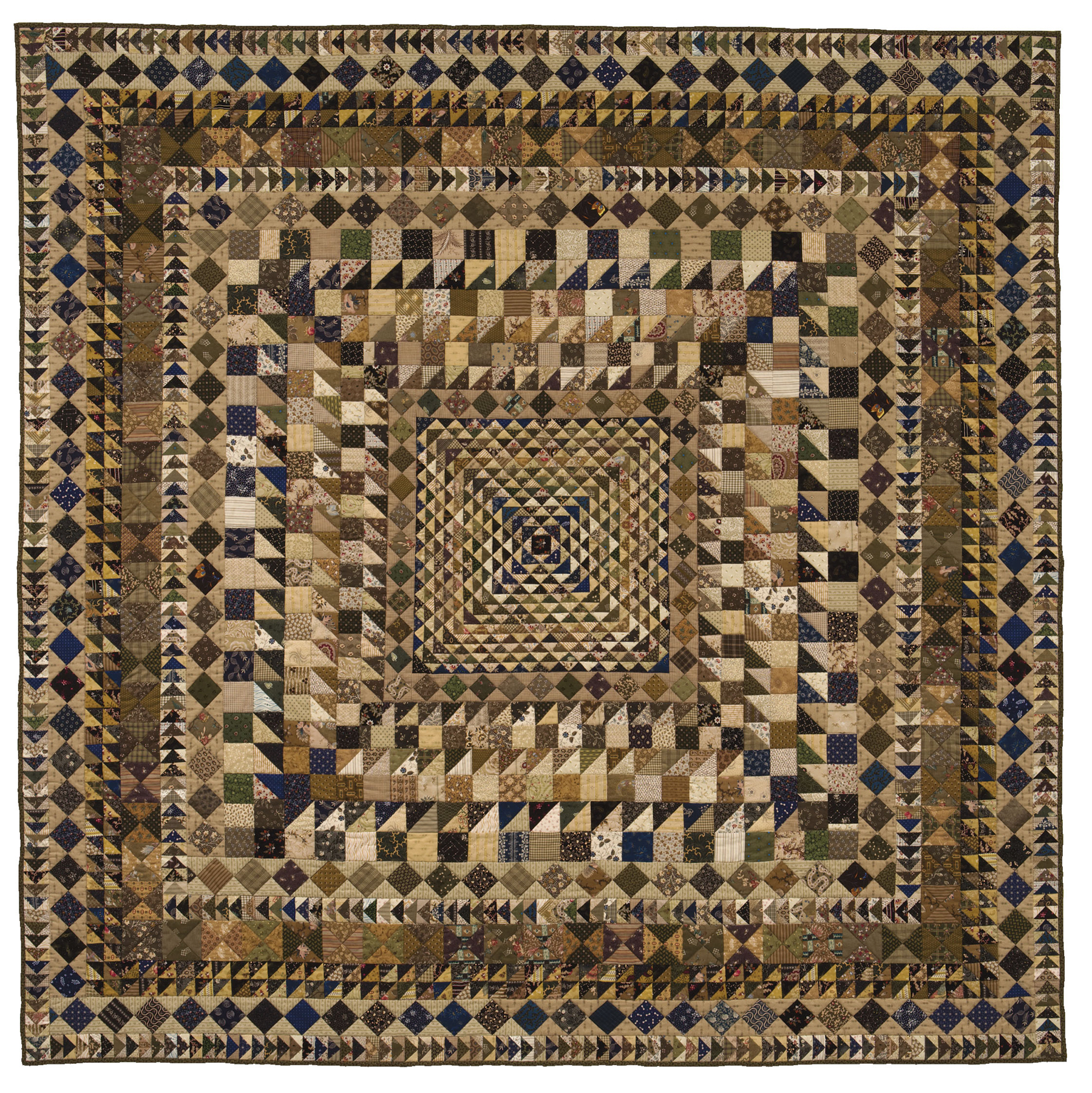
In quilts visual texture is created using the same concepts of value, line and repetition. Leap of Faith employs all three to generate visual texture.
Thoughtful value placement and careful positioning of color create the trompe l’oeil effect, in the centre of the quilt creating the impression of a 3D form. The contrast of light and dark, the dark points of the HSTs facing towards the centre, and the four darker inner rounds create dynamic visual texture and the illusion of depth. The next “frame” of dark squares on point on a medium background anchor the sense of movement and depth of the inner composition. Further out, the combination of values used in the round of “Broken Dishes” and two rows of HSTs contrast with the values used in the rest of the quilt, creating another “frame” and reinforcing the illusion of depth in the centre of the quilt.
Leap of Faith by Mary Elizabeth Kinch 2007.
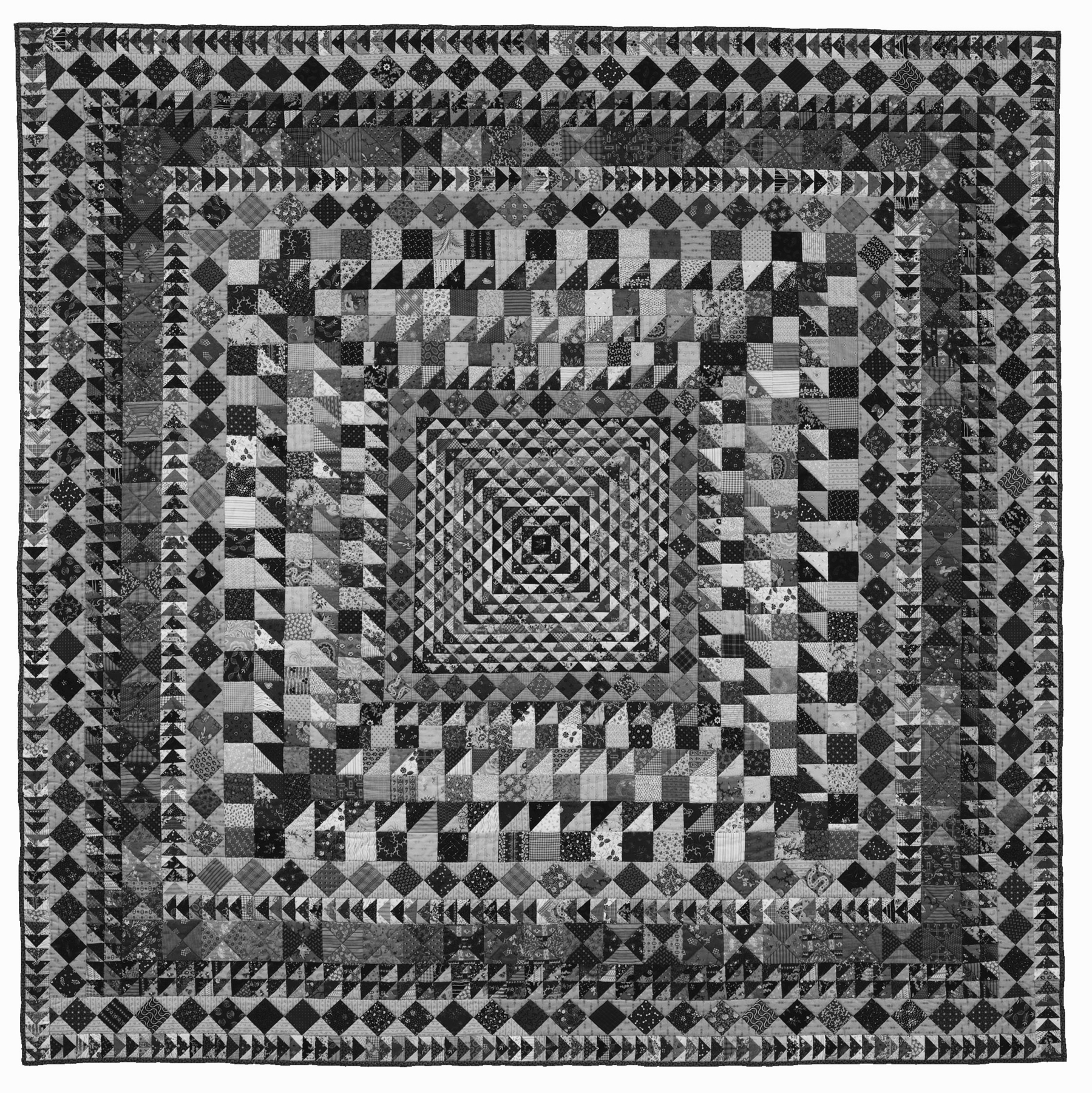
Here is the same quilt in black and white. Removing the element of colour sometimes the effect of value is more obvious. More texture is created with the lines in the block construction and by repeating the same block in each round. The outer rounds of “Flying Geese” purposefully having the geese “flying” in opposite directions adds some positive tension to the texture through movement.
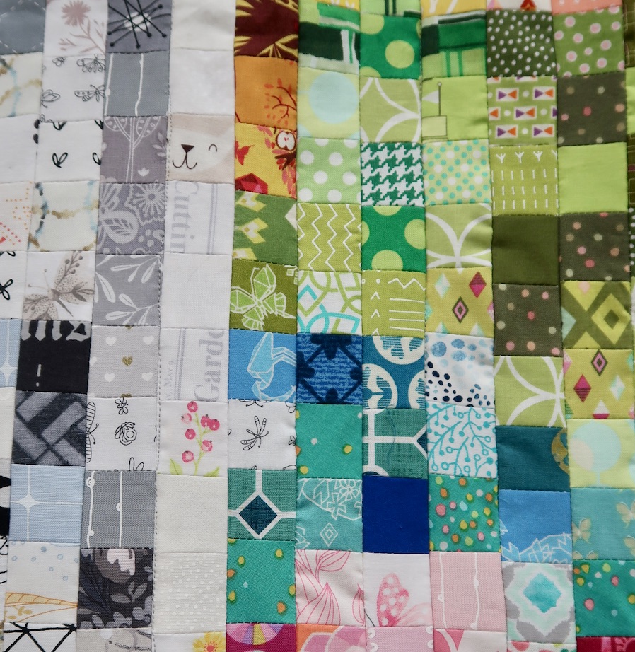
This quilt’s small scale piecing created an opportunity for generous combinations of printed fabric designs to create visual texture. Printed fabrics offer great diversity when we think of them not just for their colour but also look at them in terms of scale of the print, style of the printed pattern and the density of the print.
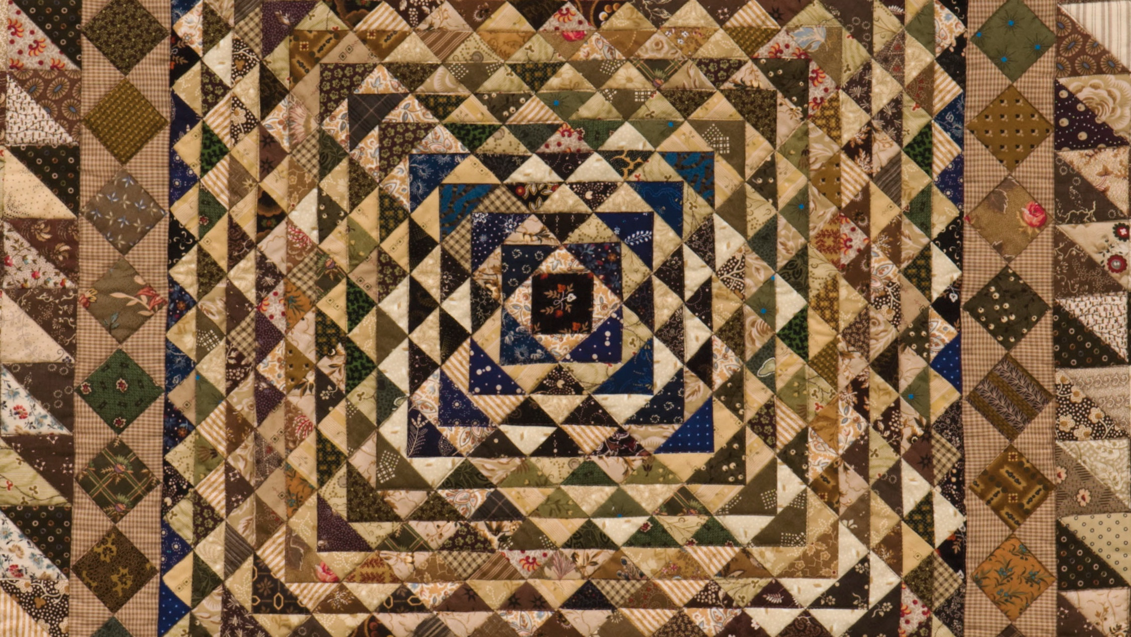
In this close-up you can see how a variety of prints helps create visual texture. Consider print characteristics like large and small scale florals, stripes (both straight lined and patterned), dots, plaids, bold graphic motifs and subtle low volume prints. The possibilities are endless!
Using line, value and repetition together you too can create exciting visual texture in your quilts.
Find a number of ways texture has been used in these two very different quilts.
Hint: Not all of the fabrics are cotton.
Fabric Fancification, a TQS Classroom Project quilt by Lauren Vlcek (Show 1206 & Show 2207)
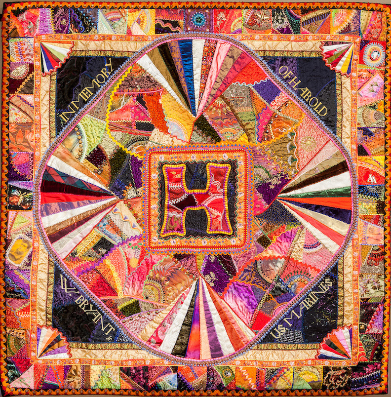
To Uncle Hal With Love by Allie Aller (Show 1906 & Show 2105)
Click here for more topics related to The Art of Quilt Design program.