7

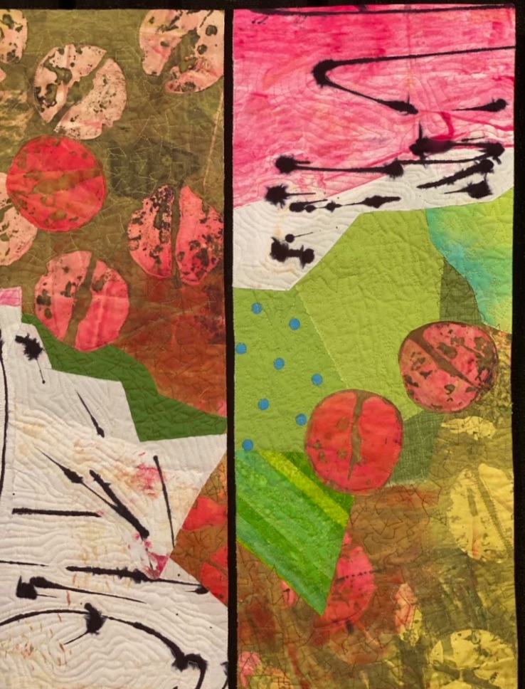
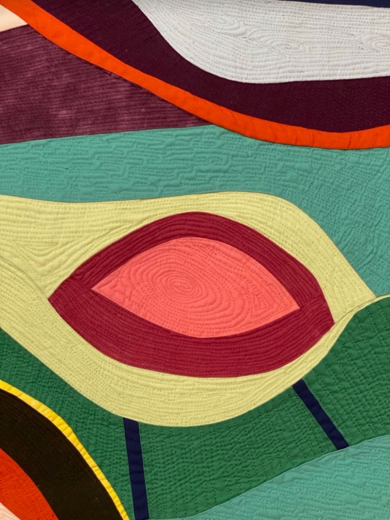
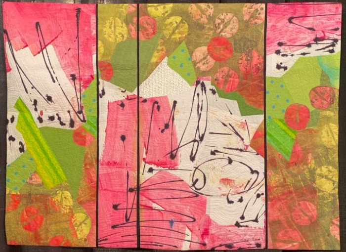
Ellen Lindner felt her quilt, Jubilation, should represent the bright colors and high energy of the joy that comes with any jubilation. We think she did a great job getting the feeling across.

Jubilation by Ellen Lindner of Melbourne, Florida was featured in the Abstract, Small category at Houston 2019.

  6

We continue our selection of quilts exhibited in 2019 at the Houston International Quilt Festival as part of their 45th Anniversary, the Sapphire Anniversary. The Sapphire Celebration exhibit is described as:

"Quilters have long used the color blue to symbolize trust, loyalty, wisdom, confidence, intelligence, faith, truth, and heaven. Sapphire is also the chosen gem to celebrate 45th anniversaries—which International Quilt Festival is doing this year (2019)! These new and antique blue and white quilts will be suspended from the ceiling in a spectacular and unforgettable display."

To be a part of the exhibit, quilts had to fit the following criteria:

  • Entries may be Traditional, Modern or Art.
  • Entries must have been made between 1974 and 2019.
  • The minimum size is 50” x 50”

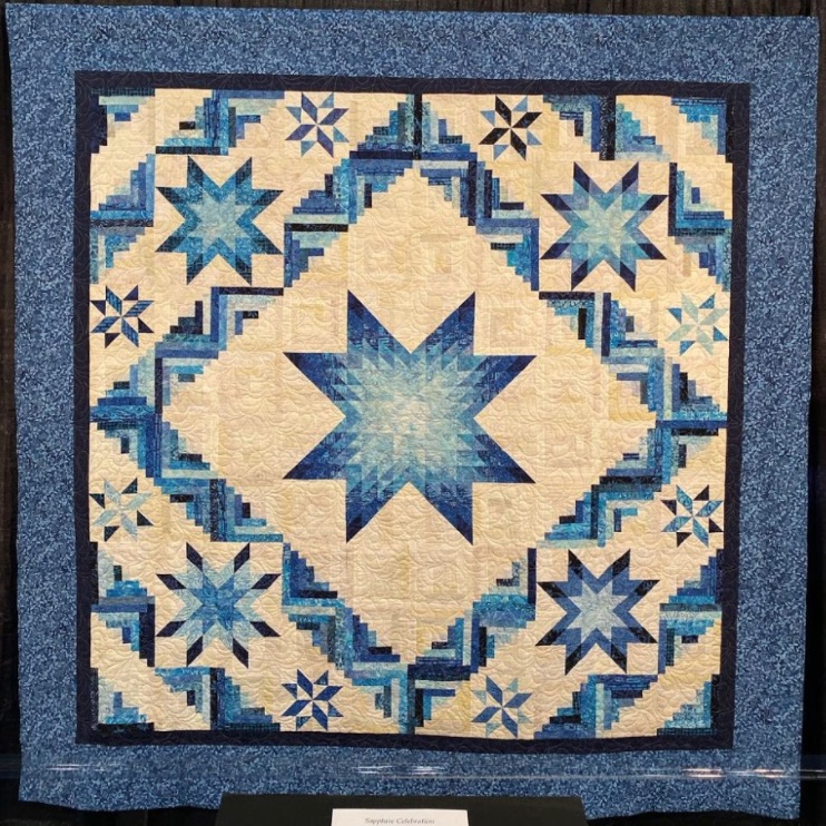
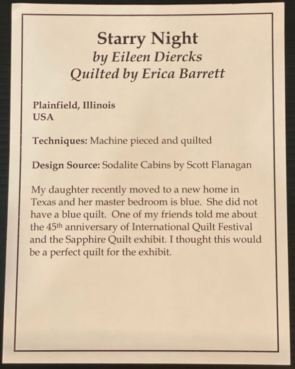
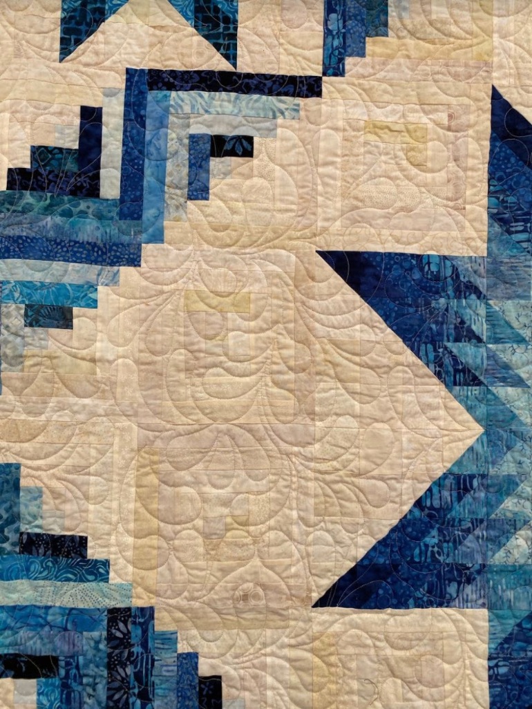
Please enjoy the seventeenth quilt from the exhibition by Eileen Diercks and quilted by Erica Barrett.

Title of Quilt: Starry Night

Quilter's Name: Eileen Diercks

Quilted by Erica Barrett

  5

Alice T. Megna made her quilt, Dancing into Spring, using a technique she learned for piecing curves from Sheila Frampton Cooper. She was inspired by the wildflowers growing in Texas during spring, and just like nature itself, she let design come organically to her rather than planning it out ahead of time.

Dancing into Spring by Alice T. Megna of Round Mountain, Texas was featured in the Abstract, Small category at Houston 2019.

  2

Try the New Search Box at the Top of the Webpage

It looks like this: (this is just an example picture. Go to the top of the page to search)

We are still working hard to bring you a new website. One of the features of the new website is a new search that looks at the whole site at the same time. We have installed it here at the top of the website for you to try out. Is it perfect....No, BUT it is better, more fun, and easy to understand. Several things to note. It is still in beta as we tweak it to get it better. If an article only has a video, the search cannot return a picture (google doesn't show any pictures).

Try these tests and then try your own and let us know what you think. Pick an artist name or a quilting technique. Beware, you can get lost looking at the quilts.

  1. Go to the top of the any page on the website. The search box in this blog is just an example picture.
  2. Search for trapunto (Your results should look like the pictures below)
  3. Search by typing in "1st" and go to the blog tab. Look at all the 1st place quilts you can see.
  4. Search "Tula Pink", then search "Tula". You can see that using a very common word returns a lot of answers. Sometimes less is more.
  5. Think of your own search

  9

Alex continues her quilting tutorial on quilting design from lessons she learned from Lucy Hilty. Filling the space, turning corners, amount of quilting, overlapping designs, and more are covered in this continuing program. Coming soon is the "Kaffe Fassett Mystery Quilt"....well it's a mystery because Alex hasn't finished creating it in her mind yet. These lessons are recorded, but the LIVE is more fun and starts at 10am PST, 1pm EST, and 6pm London time Friday June 12, 2020.

  13

This is our last lesson devoted to value, and if you have been following along in our design series, you have learned how important of a role both color (Lesson 13) AND value (Lesson 19) play when selecting your fabrics. Whether it's an art quilt, or one steeped in tradition, here is a quick review with easy to remember tips to keep in mind for creating your next successful quilt:

  • In the most basic terms, value is the lightness or darkness of a color. There are generally three categories of value: high, low, and mid.
  • High value means colors that have a great deal of light in them, with white being the highest of high value colors. Low value colors are darker, with black being the lowest of low value colors. Mid value colors are those that do not lean to the very light or very dark, and as such, are very appealing to quilters.
Easy terms to remember:

High - Light, Airy, Delicate
Low - Dark, Earthy, Heavy                                                                                            
Mid 
- Middle of the road


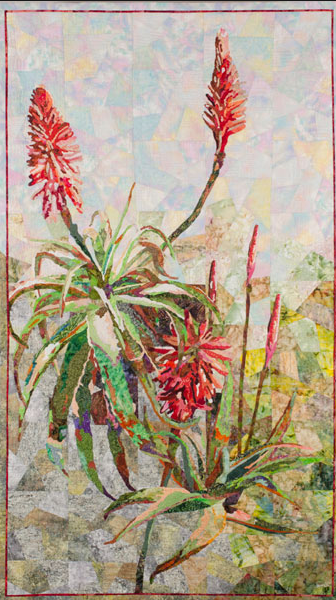
                                                                                                                                                                                     Aloe Vera by Grace Errea (Image courtesy of Grace Errea)

  • The key to achieving success is to remember that when selecting fabric, try to incorporate a very wide range of tints, tones, shades, and pure color. That way your design will have contrast, depth, and volume.


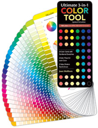
  • And last, but not least, use easy to follow tools such as the Ultimate 3-in-1 Color Tool to help keep you on the right path. Each of the twenty-four pages illustrates the pure color, tints, shades, and tones of a family, allowing you the opportunity to select from a wide array of fabrics to help you make YOUR quilt more interesting.
 

Fiber artist, designer, quilter, and author, Grace J. Errea (Show 1303: Discover the Rewards of "Value-Based" Quilting), began quilting in 2000. Her art focuses on the depiction of inspiring scenes in a value based contemporary-realistic manner. Grace is a self-taught artist and her work illustrates and has been recognized for exceptional primary use of values and secondary use of color. Her focus on value makes it easy for her and her students to create inspiring botanicals, landscape scenes, and portraits, in any color.
 

Color Harmonies

by Grace Errea (Show 1303)
(All images by Grace Errea unless otherwise noted)


First comes VALUE, and then comes HUE/COLOR. When discussing Color we need to talk about Color Harmonies, which are combinations of hues that work well together, support each other, and create amazing artwork. Once the value of your piece is decided, then hue can be finally defined. Color Harmonies are important as some hues combine better than others. For this we will refer to the standard Color Wheel.
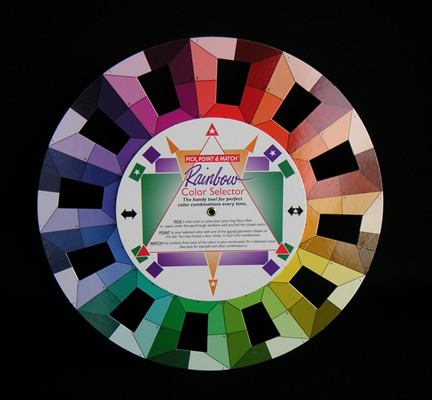
There are a few Color Harmonies that should be mentioned:

Achromatic – just black and white. Value does not exist in this realm, as it is ONLY black and white. Well, let’s stretch the point a little. Even here Value can be pushed a bit.

There are only 2 distinct and separate hues in this harmony. Values are determined by how much of each of the hues (black or white) is present, rather than the smooth transition you obtain when hues are mixed with white or black to create values.

Compare the Black and White Blade to the Blue blade.

Notice here that in Value 1 of the achromatic harmony, you have mostly white and very little black. This black increases as you move through the values until Value 8 is exactly the reverse.

Monochromatic – One Hue.

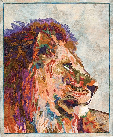
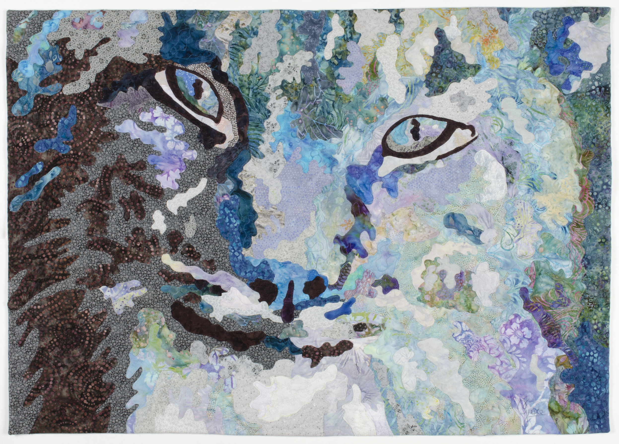
Fur Blue is an example of a monochromatic color harmony, i.e., one Hue. With only one hue, you need to use value to the fullest. There is nothing else to juxtapose to create your design.
Complimentary Harmony – opposites on the color wheel.
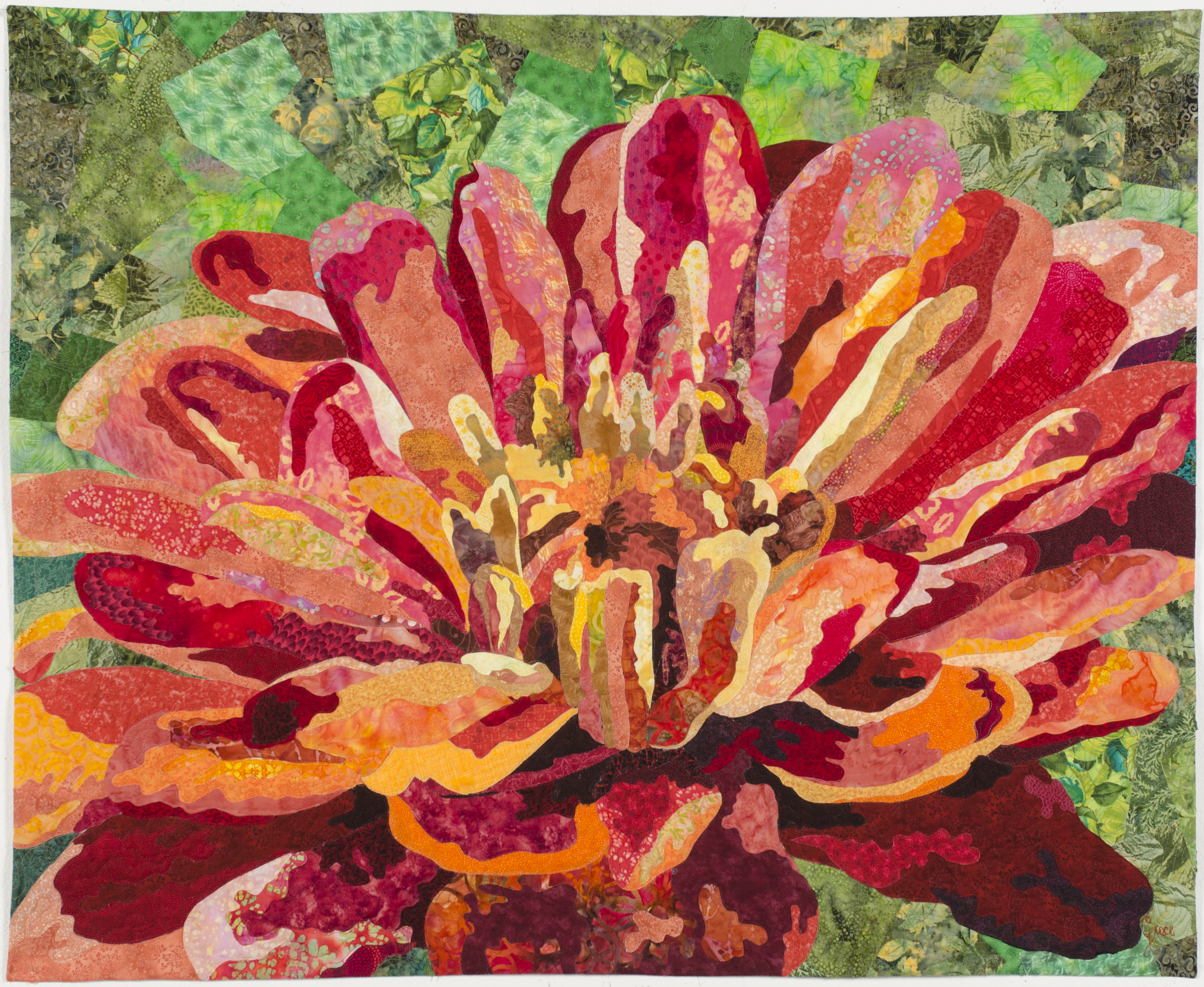
 

In this harmony you work with one primary hue and its compliment - a secondary hue. The complements couples are Red/Green, Blue/Orange, and Yellow/Purple. With the complimentary scheme, you need not be as careful about Value. Complimentary colors look brighter side-by-side as they possess a dynamic contrast. In Samba Zinnia, the red is about a value 5, and is seated next to a green, also value 5-6.


Analogous Color Harmony - Three adjacent hues on the color wheel.
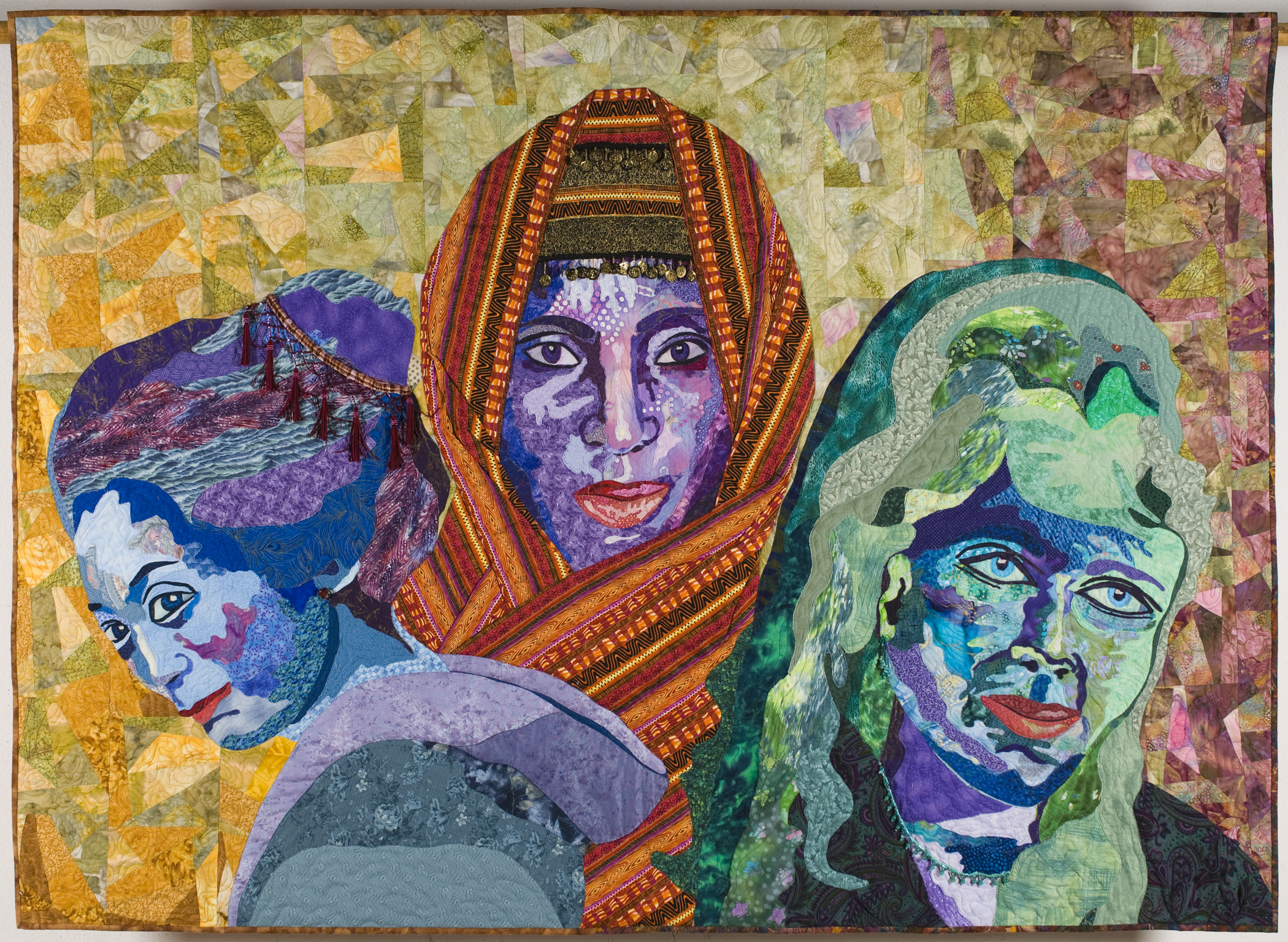
 

This color combination is always harmonious and each hue enhances the other. In this harmony, one of the hues is common to the other two. In Women of Color you see the blue face, the purple face, and the green face. The common hue is Blue, since green and purple are both created by using blue as one of their components.


Triadic Color Harmony - Three Primary hues or three secondary.
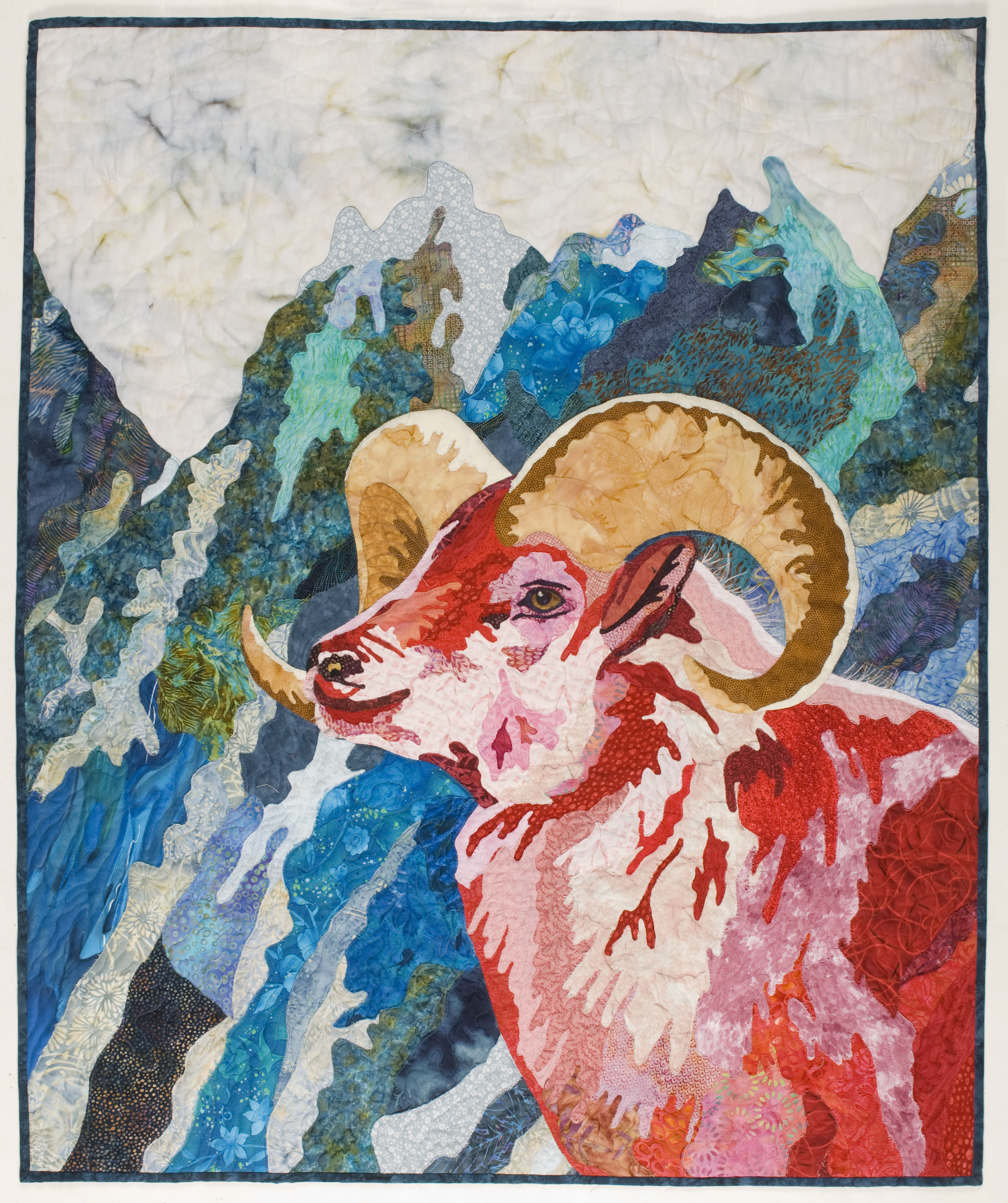
 

On the color wheel these are the three points in an equilateral triangle. The Red Ram displays the 3 primary colors of Red, Blue, and Yellow. Another Triadic combination is the 3 secondary colors of orange, purple, and green.


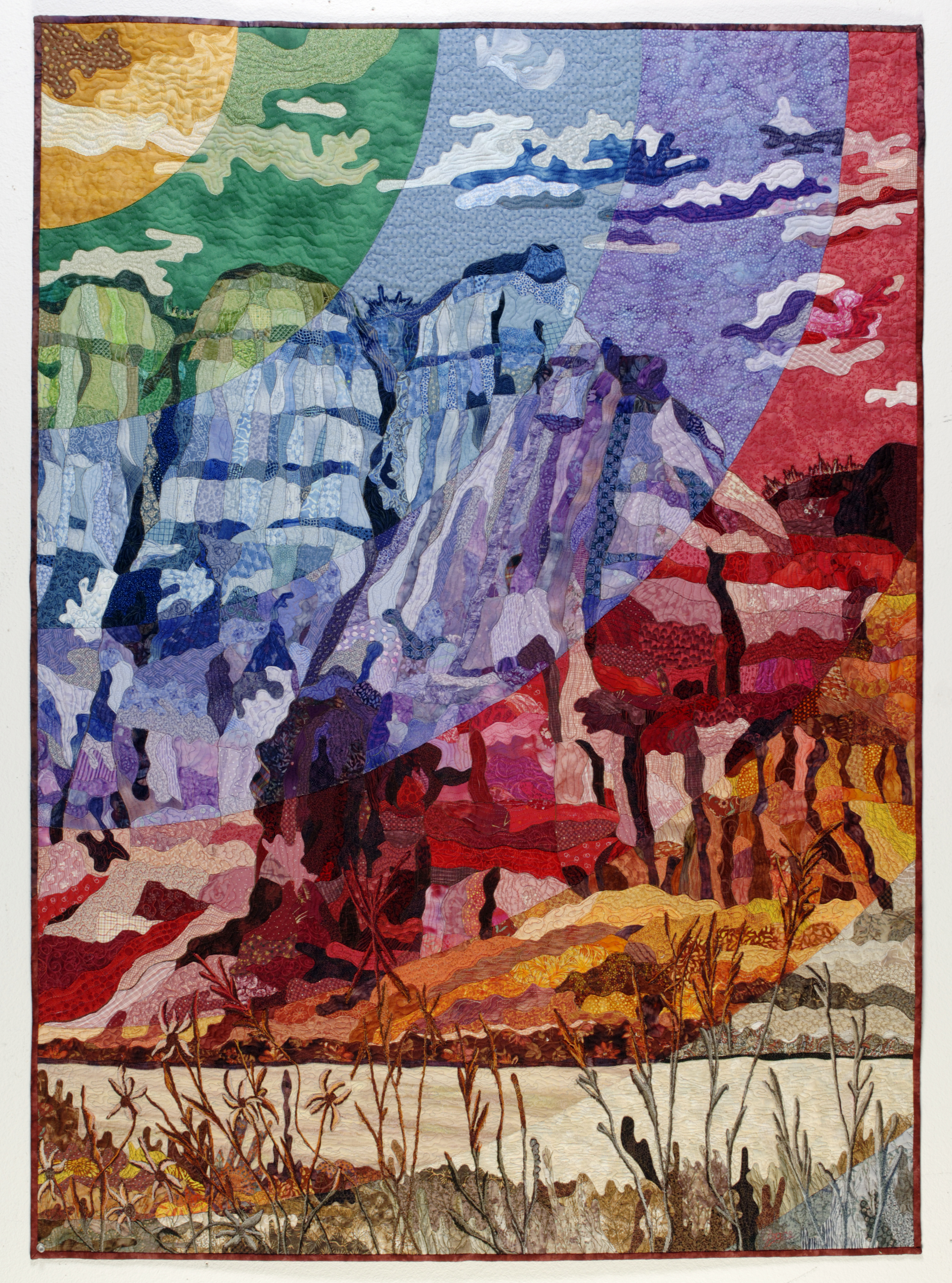
Rainbow Color Harmony Last but not least, this is a pleasing combination of all the hues. Rainbow Canyon is an example.


There is no Practice Exercise this week, but we do suggest that you might want to review past lessons as there will be a review quiz coming in the next few lessons.

Click here for more topics related to The Art of Quilt Design program.
  5
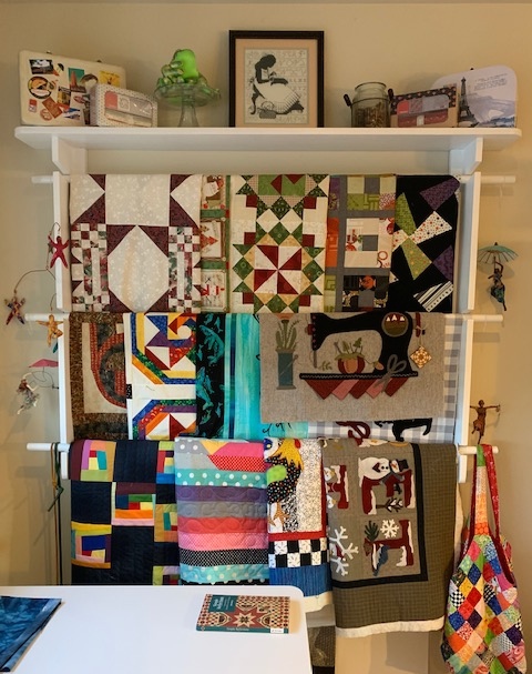
I was videoing a segment for Quilt Roadies detailing a rack of projects that I have in the Bee Hive. As I reorganized them, I started pondering those in the quilting world who are toppers, those that work on one project at a time, and those that get it done...no matter how many they have in the queue. I gather that one is a topper because they are not as interested in the quilting segment of the process...but, then they end up with all these tops! Which would not only be a whole lot of quilting for someone who doesn't enjoy that step, or a big bank note to your local longarm quilter!
 
I have no idea how I ended up with so many quilts in various stages of completion, but what I do know is that I need to get a handle on it right now! My rack cannot hold the weight of another quilt top!!! I decided to be practical and decisive and tackle the problem before I get labeled a topper, which I don't want to be. I want to reinvent myself as a finisher worthy of wearing a crown as queen of the finishers, LOL!
 
 
I divided the pile into four segments. The top two rows are tops that need quilting, the bottom row are layered quilts where quilting has been started, and on the floor are quilts that only need the binding made and attached. I admit I sent three quilts out to a longarm quilter...that was a hit to the budget. And, one of the local longarm quilters I talked to told me she has quite a bit of a backlog because with the shelter in place a lot of quilt tops were being finished.
 
I think by facing my quilting pile with my eyes wide open has somehow lifted a burden that has made me previously avoid that corner of the room, LOL. So let me know...how do you manage your ever growing quilting life?
 
Stay tuned and travel along with us on Quilt Roadies.

Click here for Anna's blog.


  13

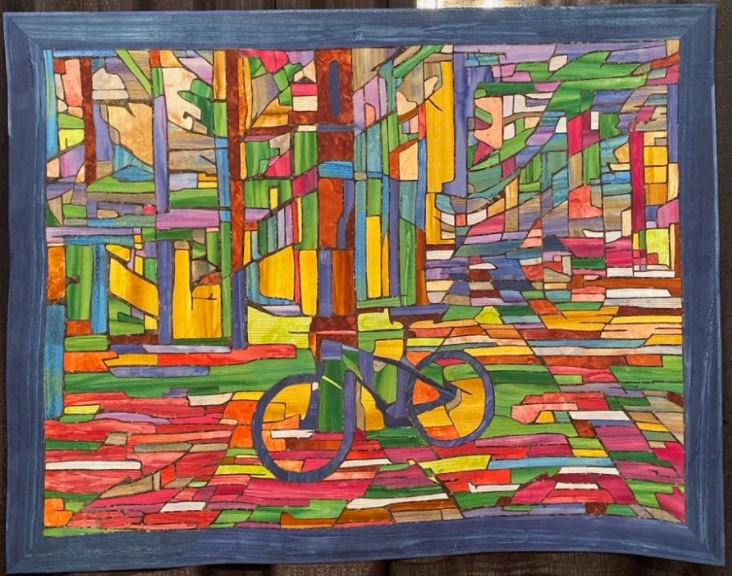
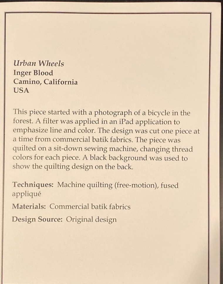
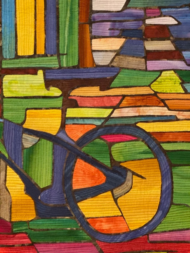
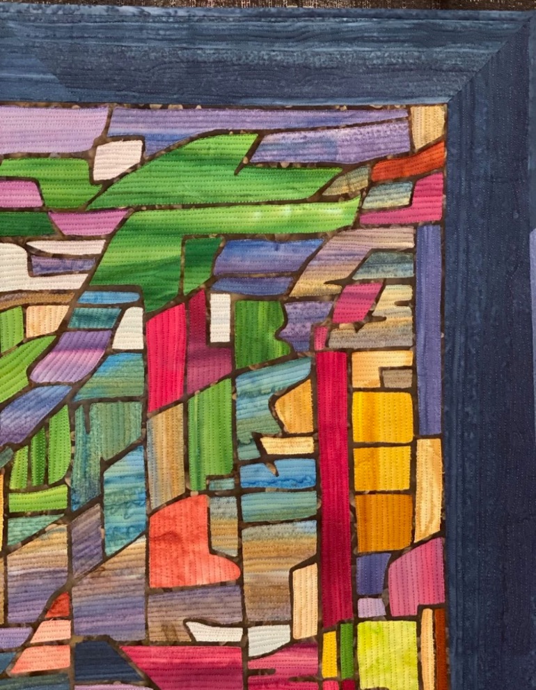
Inger Blood created Urban Wheels based on a photograph she manipulated using software on her iPad. From there, she let colorful batik fabrics take control, changing the color of quilting thread with every color change in the quilt...and there are quite a few.

Urban Wheels was featured in the Abstract, Small category at Houston 2019.

  4

Alex is back continuing her quilting design lessons learned from Lucy Hilty, a Mennonite quilt teacher. She offers good basic quilting lessons that can help guide your quilting choices. The LIVE is June 10, 2020, at 10am PST, 1pm EST, and 6pm London time. A special thank you to our recent viewers from India, Germany, France, and Vietnam. The lessons are recorded for later viewing and repeat viewing, but we love seeing you LIVE so you can ask questions.

Don't miss the current Masterclasses, Piecing Masterclass Part 1 and Piecing Masterclass Part 2. The Stay-in-Place Special is still on for a limited time.


  12

Alex learned quilting design from Lucy Hilty, a Mennonite quilter. Alex will share with you the lessons she learned about quilting design and some tips of her own when putting the ideas into practice. Alex is LIVE Monday June 8, 2020 at 10am PST, 1pm EST, and 6pm London time.