Three Easy Steps To Save This Lesson As A Pdf:
-Make sure you are logged in.
-Click on the small triangle next to the tool wheel in the upper right hand corner of the page (you'll find it above the Like button).
-Select the pdf. option. Wait a few minutes. It's a large file due to the number of images.
-Your file should appear with the title of the lesson.
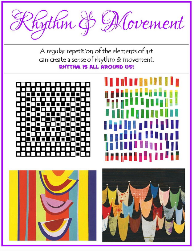
Rhythm and movement in art can transport you. "No," you say? Let's set the scene. It's a cold, rainy day, and you are listening to music while ironing fabric in your sewing space (not the most exciting of tasks for most of us). Suddenly, the melody of a favorite tune comes wafting through the airways and you begin to sway and move to the rhythm of the beat. No longer are you just ironing, you are lifted and carried away, if for only a brief moment.
Rhythm and movement in quilts can in the same way move the viewer by drawing them in and taking them on a visual journey into, around, or across a quilt. Whether traditionalist, art quilter or something in between, you as the artist can achieve this in your work by combining a single or group of elements (e.g. rectangles, triangles, circles) in a pattern that varies slightly. It is the play with unexpected twists and turns, that will hold the viewers attention.
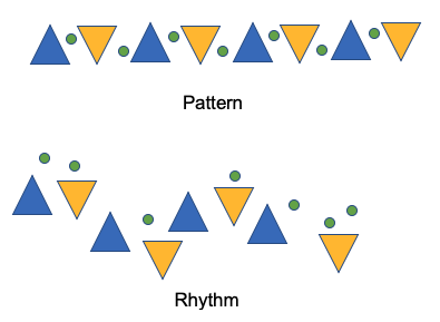
Using the examples below, look at what a difference movement/rhythm can make when you throw them in the mix of a pattern sequence.
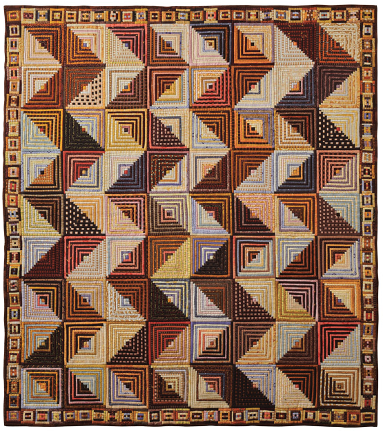
Let's follow the progression of taking a very basic unit (Half-Square Triangle or HST) to create movement across the span of a quilt.

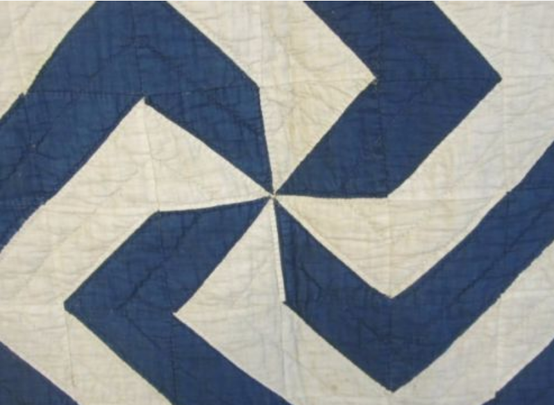
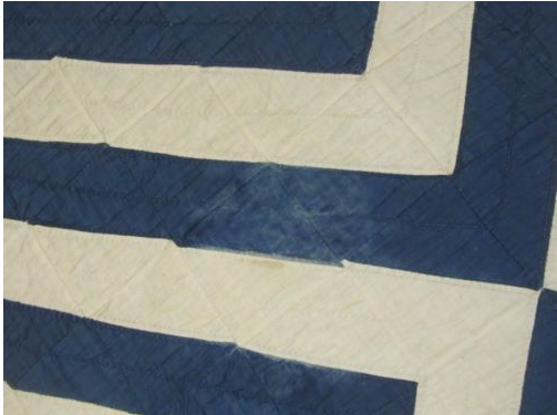
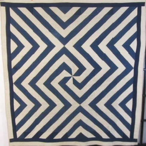
How about using just blue and white solids? Can you see where this quilter's head was going with this very simple block? Did she draft the final design out beforehand on a slip of paper or spread her stack of finished blocks on a floor to see where the pattern could lead?
We will never know the answers to these question. But look at the stunning results! This is a two-color quilt using just ONE block (with a strip of blue on each side). This quilter certainly marched to the beat of her own drum using very few resources.
More examples of using rhythm and movement in quilt work:

Lilith by Karen K. Stone (Show 1611). [Image TheQuiltShow.com] ; Streak of Lightning by Amy Pabst. (Image TheQuiltshow.com)

Lateral Ascension by Cassandra Ireland Beaver. (Image AQS)
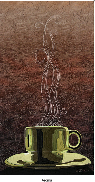
Aroma by Kate Themel. (Image courtesy of Kate Themel)
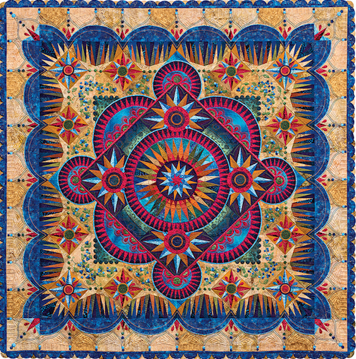
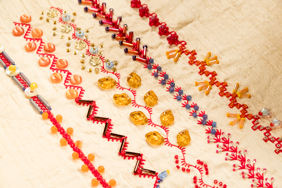
Sampler Detail by Allie Aller (Show 1906)
Arandano by Marilyn Badger. (Image TheQuiltShow.com)
Movement in Artwork by Leni Levenson Wiener
(Show 1413 and Show 2204)
(All images courtesy of Leni Levenson Wiener, unless otherwise noted)
There are a few things to consider to give a sense of movement to your artwork:
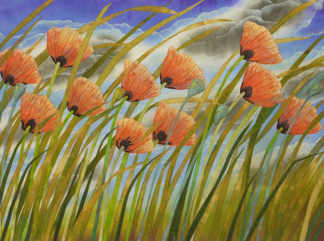
Image
This one is pretty obvious, the image you choose will greatly determine the feeling of movement. A seascape with the horizon line as the focal point is not going to have the same amount of movement as a waterfall rushing over a rocky cliff. Some images require you to amp up the feeling of movement, others require a gentle and peaceful and more calming approach.
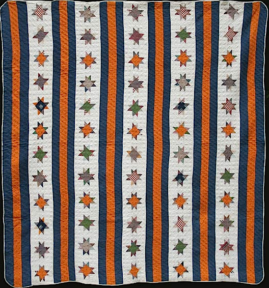
Format
This refers to whether your overall artwork is horizontal (the top and bottom being longer than the sides) or vertical (the sides being longer than the top and bottom). A horizontal format will feel more restful and still than one that is vertical. It is no accident that many landscapes and seascapes are horizontal.
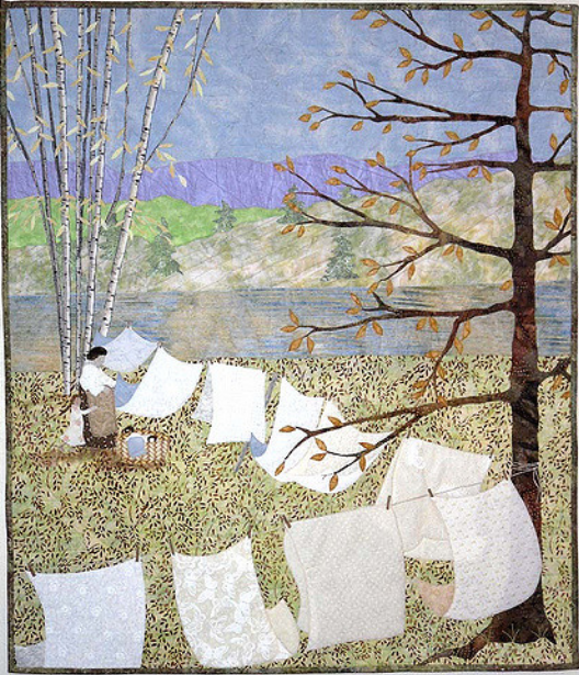
Direction
Now let’s think about the direction of the pieces of fabric within your composition. As in format, horizontal lines will appear to have little or no movement, vertical lines feel a bit more energetic. But to really show movement, a diagonal or swirly line will be your best choice. The placement of elements in the design or the direction the pieces of fabric need to draw the eye in and around the composition; this perceived motion tells the viewer something about the subject matter and the tone of the artwork.
Fabric
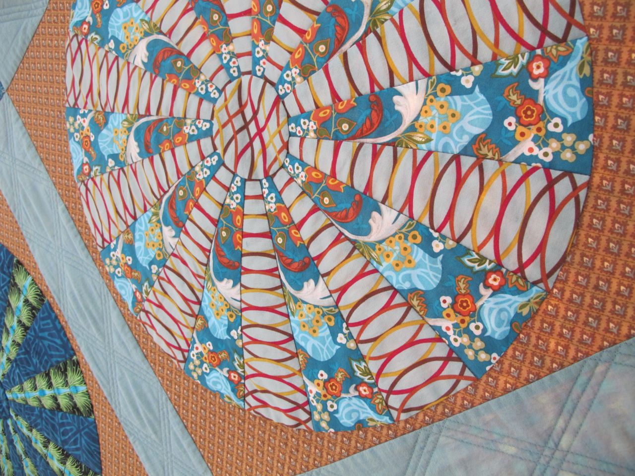
We have an additional advantage over painters in that we are using fabric as our medium, which means the choice of fabric can support the movement we wish to convey. Using a fabric with swirly or curving lines will add to the feeling of movement in the composition. Patterns that are more static will enhance the feeling of restfulness and calm in a composition. Even a bit of fabric that has its own movement can enliven a more static composition. The stronger the color, the more energy and therefore sense of movement will be depicted, as well.
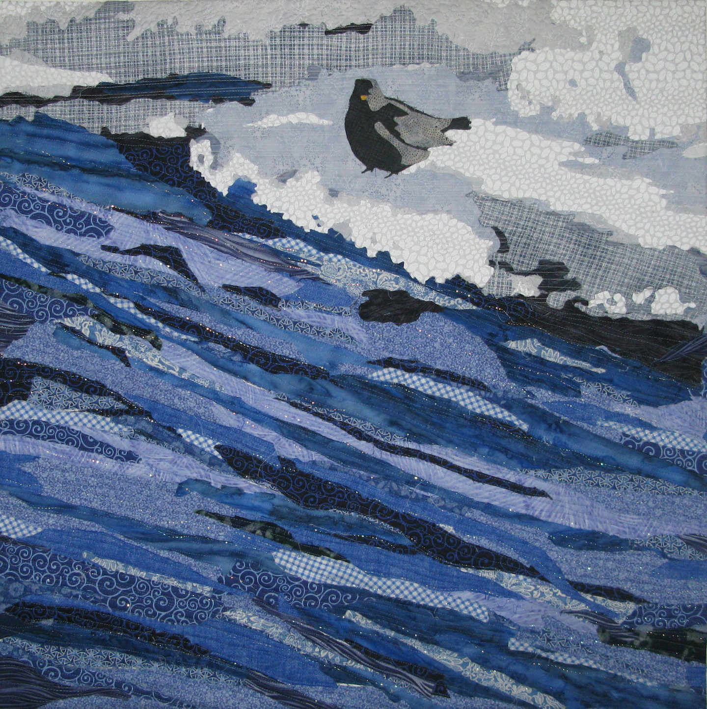
Icy Perch—The water moves in a diagonal line from one side of the composition to the other. You can’t help but look at the piece from one side to the other, your eye travels along with the water, giving the feeling that it is moving through the space. The use of fabrics with swirling lines and curves in the assortment of fabric helps to support that feeling of movement.
 Ruffled Feathers—The wings of the goose are diagonal in the composition but there is another trick I have employed here—the head and wings come out beyond the edges of the composition giving the illusion that he is moving out of the space towards the viewer. This can be a very effective tool in creating a sense of urgency and immediacy.
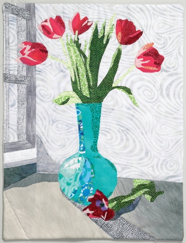
Tulips in Vase—This piece does not require a sense of movement but the principles of movement are used more subtly here. Although, this still life is static, there is still one flower placed at an angle in the foreground and a diagonal line of the shadow from the window, both of which make the composition feel less stiff. The use of a softly colored swirly background behind the vase also enlivens the artwork and makes it more visually dynamic without adding a sense of actual movement.
Worksheet Project: Movement with Lines
Supplies Needed:
- One sheet of white construction paper, 9" x 12"
- One sheet of black construction paper, 12" x 18"
- Ruler
- Pencil and eraser
- Markers or colored pencils in assorted colors
- Glue sticks
Directions:
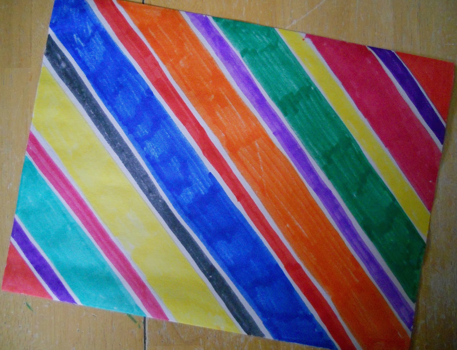
1. Draw a series of diagonal lines on the white construction paper. You can draw three smaller lines going across the page or fill the space with lines. Both look great, in my opinion.
2. Color in the diagonal lines using markers/colored pencils.
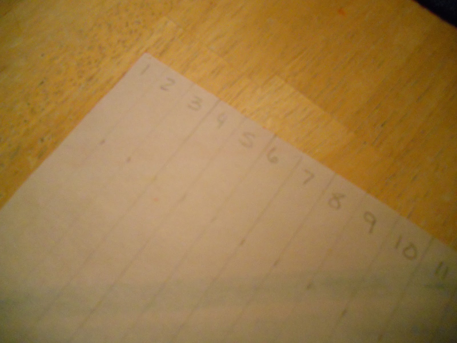
3. Turn the page over and divide the page into twenty-four 1/2" wide strips. Use your ruler for this and try to be as precise as possible. Number the drawn strips on the back from 1-24 along one end (the same end of the strips for all numbers), BEFORE you cut the strips apart.
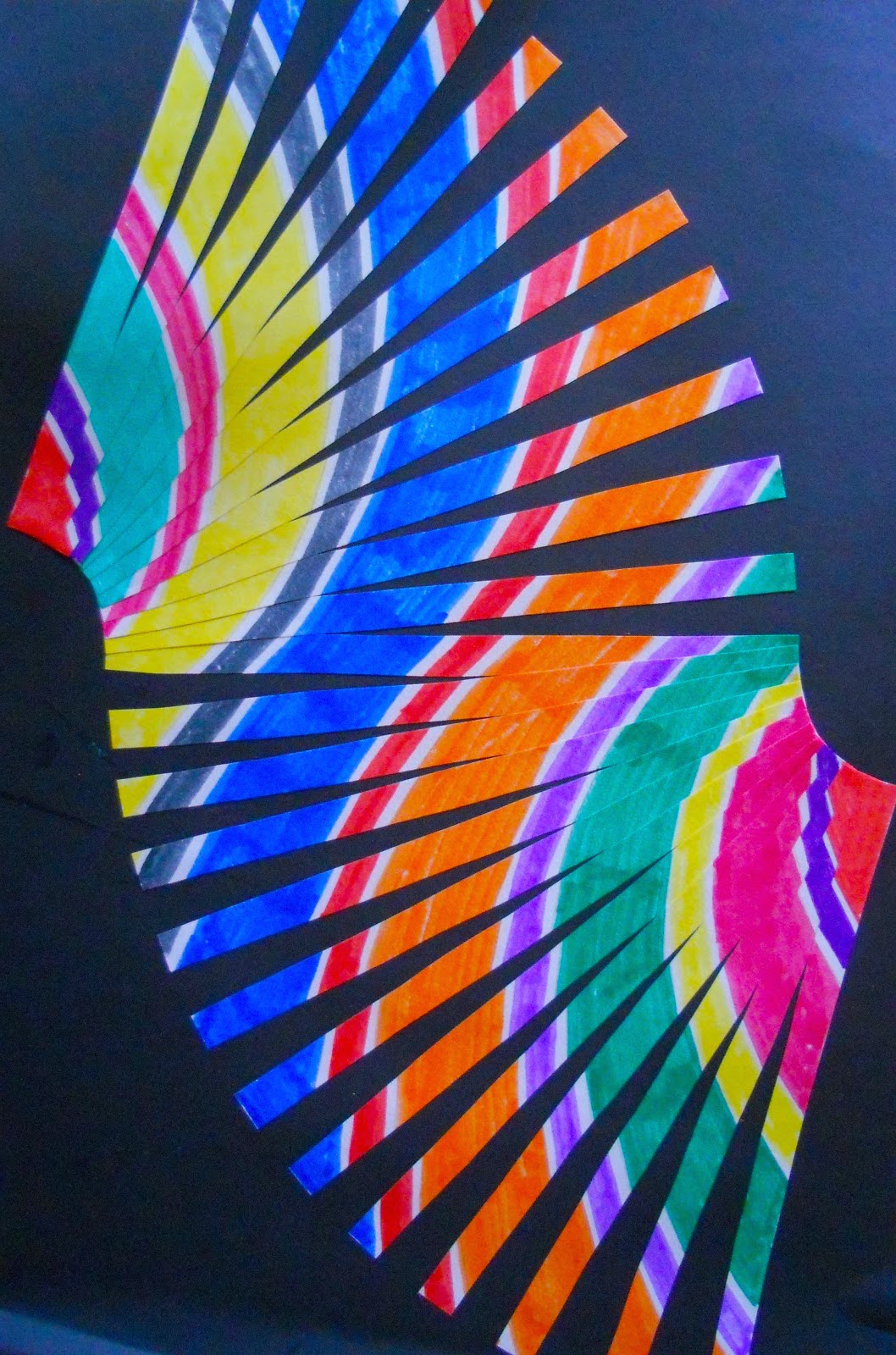
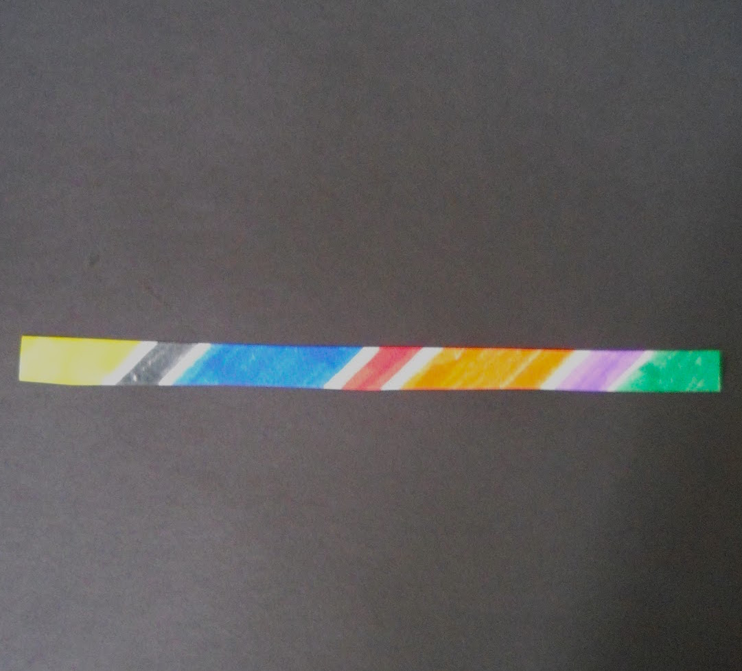
4. Cut out strip marked #12. With the black construction placed vertically, glue the strip in place in the middle horizontally, like this:
5. Now you can cut strip #11 out and put glue on the back of it. Overlap the left edge of the strip over the left edge of the previous strip (in this case, strip #12), fanning the right edge out slightly (about 1/2"). Repeat with strips 10-1 (working away from you) until you get through strip #1, forming a nice curve with the strips. Use the photo as a guide.
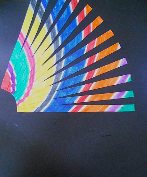
6. Once you have finished gluing down strip #1. Place glue on the back of strip #13 and overlap the right edge of the strip over the right edge of strip #12, fanning the left edge down slightly (about 1/2").

7. Repeat with strips 14-24 until you get through all the strips, forming a nice curve in the opposite direction with the strips. Use the picture as a guide.
It is OK if the ends of the strips continue off the edge of the page. You can leave them that way or trim them to the edge of the black construction paper
Click here for more topics related to The Art of Quilt Design program




.jpg)
