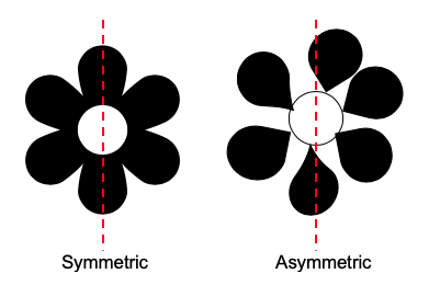
In this lesson we continue our focus on Balance, which is the visual arrangement of elements (color, texture, space, etc.) to create a sense of stability and calm. Let's look at the two basic flower examples on the left. An imaginary line has been drawn down the center of each. Notice that the flower on the left has mirroring images, while the flower on the right does not.
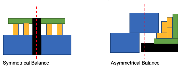
While symmetrical designs evoke harmony and stability, as an artist you can decide if you want to shake things up a bit to make them more interesting. The example below illustrates both a symmetrical design and asymmetrical design. Notice how the design on the left uses mirroring elements to create a sense of calm and stability. While the design on the right uses an asymmetrical layout of large blue blocks that balance the weight of the strip units on the right. The entire work is balanced, but with a more energetic and exciting feeling. As the artist, you decide what message or feeling your work should express.
Let's view some quilts that illustrate Symmetrical and Asymmetrical designs:
Symmetrical Designs
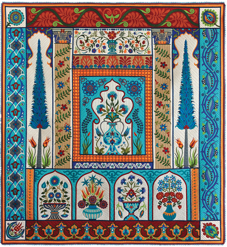
Turkish Treasures by Pat Holly (Show 608) [Image by AQS]
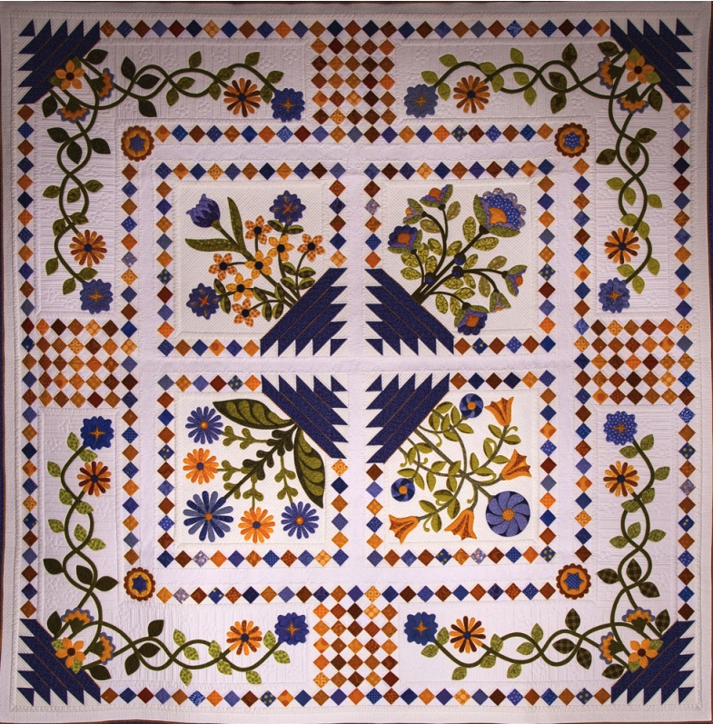
Blueberry Hill by Nancy Arseneault (Show 1907). [Image by Road2CA]
Asymmetrical Designs

Is She Ready Yet? by Heidi Proffetty (Show 2406) [Image by AQS]
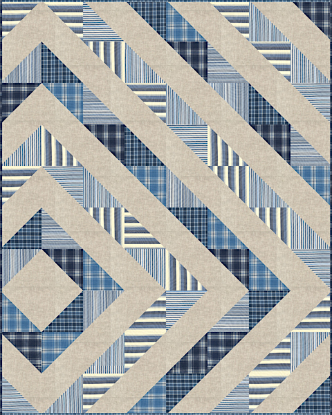
Asymmetrical Diamond. Designed by Lisa Roddy. (Pattern Available from Robert Kaufman)
Symmetrical or Asymmetrical Balance
by Deborah Boschert (Show 2108)
(All images by Deborah Boschert, unless otherwise noted)
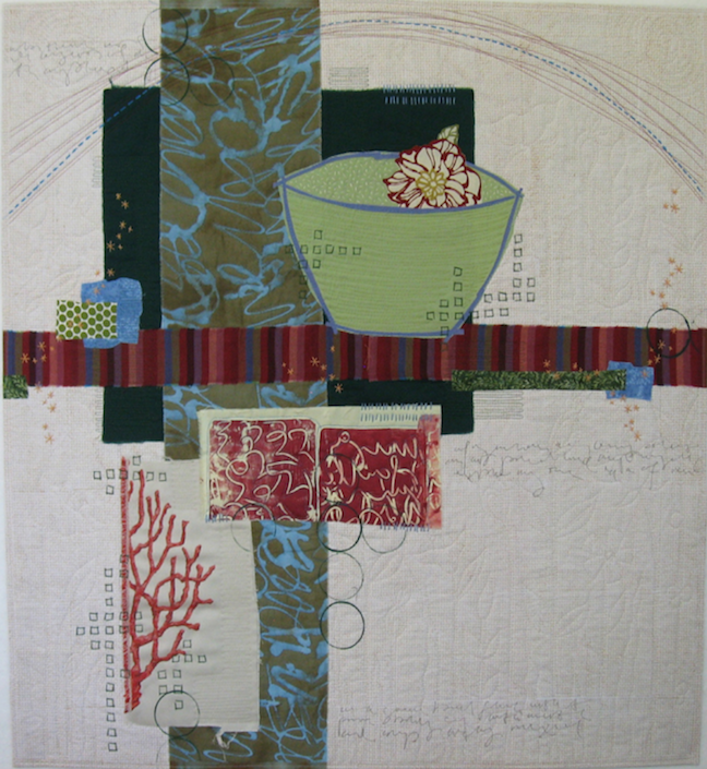
I’m constantly in search of balance… in my life and in my art! (I’m not sure where it’s easier to achieve.) In art, compositions can be balanced either symmetrically or asymmetrically.
Think of symmetrical designs as mirror images. They are the same on the left and the right (or the top and the bottom). There is often a focal point in the center of a symmetrical design.
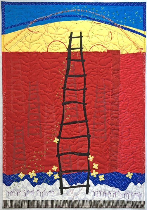
My art quilt, Uplifting, is a good example of a symmetrical design. The black ladder sits right in the middle of the space and the background fabrics frame it evenly on the left and right. Even the arch at the top is predictably even on each side.
In a symmetrical design, I think it’s important to add details that are not symmetrical. This is called near symmetry. (A design that is exactly the same on each side is called perfect symmetry.) In Uplifting, the yellow flowers are placed irregularly. There is also a swarm of green hand embroidered x’s that sweep from the bottom left to the top right. Even the blue arch dips down over the yellow on the right, but not on the left. These small asymmetrical details add interest and dynamic movement to the design. They keep a symmetrical design from being static or boring.
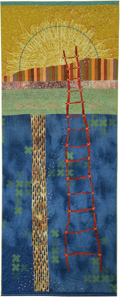
Rising and Setting is a good example of an asymmetrical design that still feels balanced. This is achieved by arranging elements that have similar visual weight in shape and color throughout the design. The red ladder, the radial sun, the vertical strip with the rain drops and the horizontal striped fabric all work together. The ladder fills much of the space, but because it’s made of thin lines in a color that doesn’t standout from the background, it doesn’t take over. The striped fabric stands out, but because it’s relatively narrow, it also doesn’t take over. It’s counter-balanced by the fabric with the raindrops.
As in Uplifting, the details in Rising and Setting compliment the balance of the overall composition.
I like both symmetrical and asymmetrical designs. Neither is easier, better or more pleasing than the other. Look for examples of symmetry and asymmetry art, architecture, graphic design and nature. You’ll find many inspiring examples that will help you think about how you can compose your own original designs.
See more ideas in the Design and Composition chapter of my new book, Art Quilt Collage: A Creative Journey in Fabric, Paint and Stitch.
Click here for more topics related to The Art of Quilt Design program.


.jpg)
