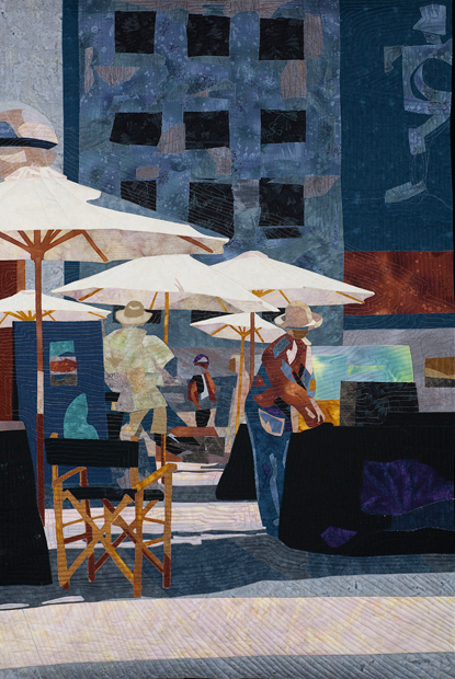
What is it about some quilts and their 'spot on' realism that just makes them stand out from the crowd? White Umbrellas by Joan Sowada (on the right) is an excellent example. The shadows on the pavement and one umbrella have been created using a number of fabrics, including darker shades within a color family.
Whether you are a traditional or art quilter, understanding how and where to add shadows and/or highlights can help you to create more realistic and dynamic quilts.
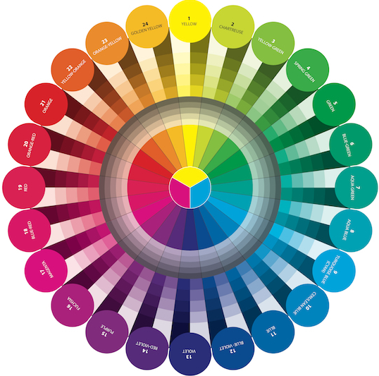
In her book Color Play, Joen Wolfrom (Show 2101) says that, "The secret to making shadows and highlights has everything to do with color, the color scales, and the color wheel...Shadows move down the color wheel toward violet, while highlights move up the color wheel toward yellow. The deepest shadows will be a violet hue (see image below). The brightest highlight will be either a golden yellow (the umbrellas) or a chartreuse hue, depending on the side of the color wheel your color is on."
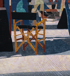
White Umbrellas by Joan Sowada - Detail (Image Courtesy of Joan Sowada).
Let's look at some examples of quilts where shadows and highlight play a big role in creating realism for the viewer:
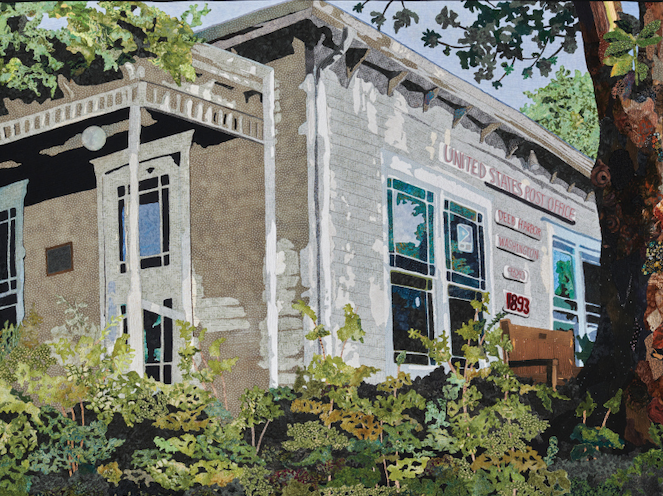
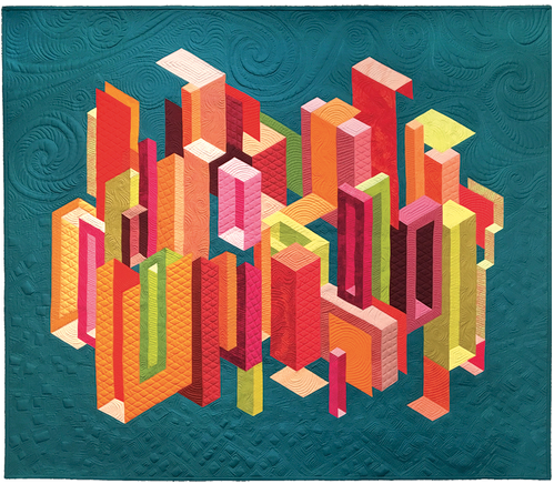
Signed, Sealed, and Delivered by Sheila Gaquin. (Image AQS.com). Cityscape by Claire Victor. (Image AQS.com)
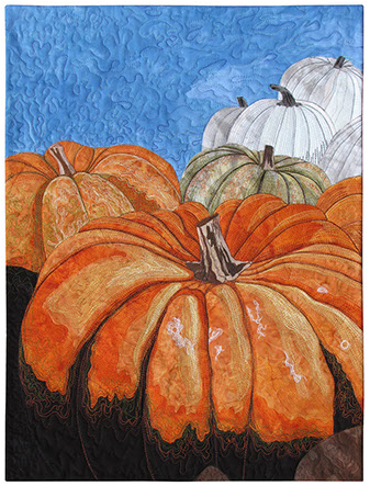
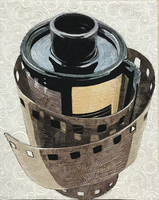
Heirloom Pumpkins by Susan B. Knapp (Show 901 and Show 1709). [Image courtesy of Susan B. Knapp]. Film Roll by Kate Themel. (Image courtesy of Kate Themel).
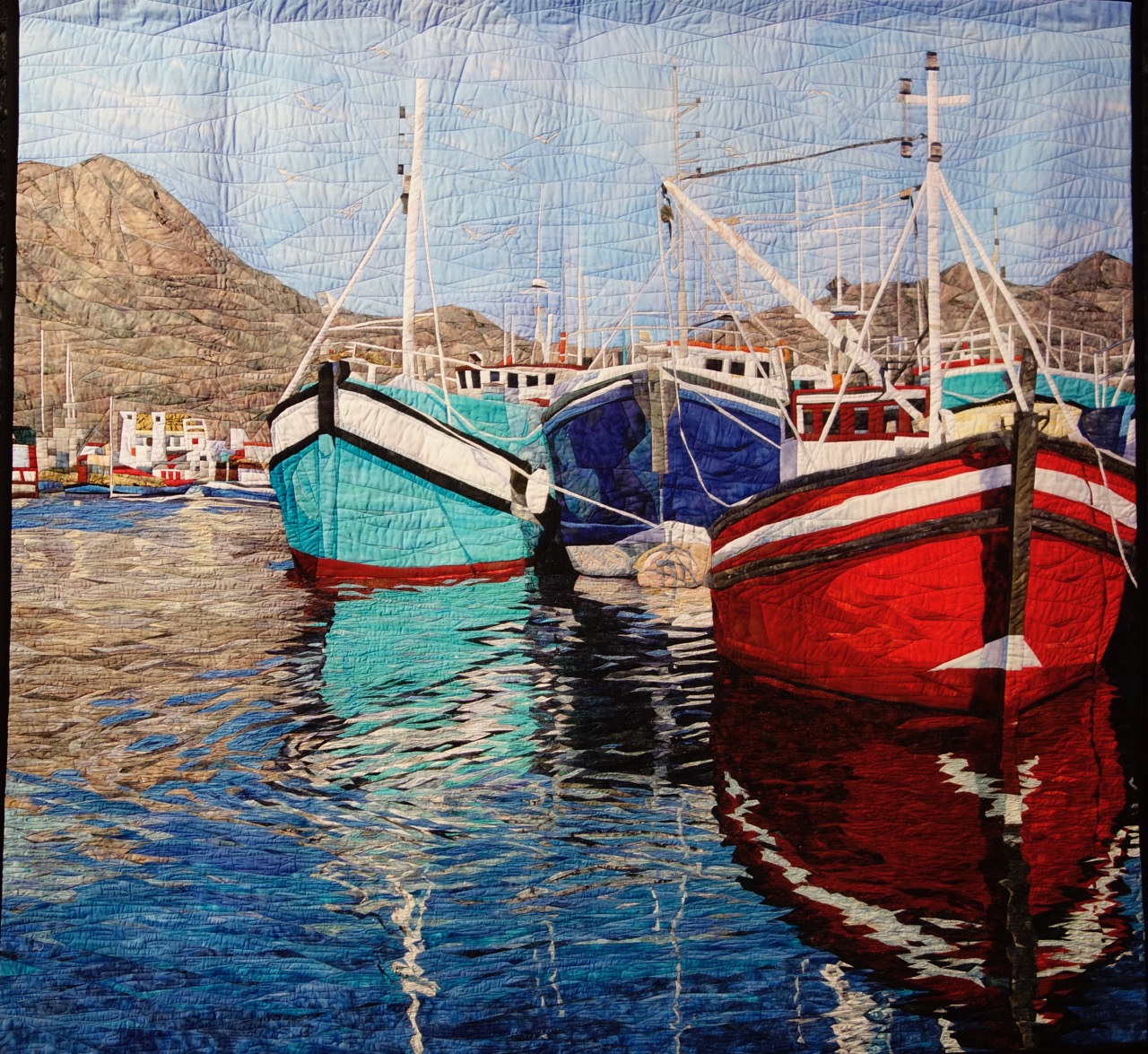
Reflections of Cape Town by Cynthia England (Show 610, Show 1412, and Show 2612). [Image by TheQuiltShow.com]
Joen Wolfrom is back to share the secrets of how to gain a better understanding of shadows and highlights. This knowledge is another valuable tool to add to your quilting toolbox of tricks.
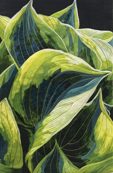
Secrets of a Shadow
by Joen Wolfrom
(Show 103 and Show 2101)
Shadows appear when something blocks light from landing on an object. The three important principles of shadows are:

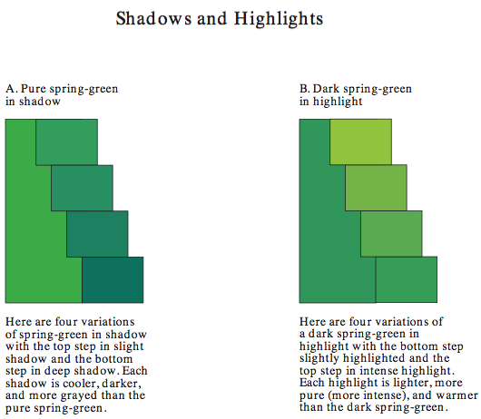
1. A shadow’s color is darker than the object. This darkness can range from slight to very pronounced. The amount of darkness depends on your design, your preferences, and the materials available.
2. A shadow’s color is more toned (Lesson 13) than the object. There is one exception: A shadow for a pure-colored or deeply-shaded object can be made from a darker shade rather than a tone.
3. A shadow’s color is always cooler than the object. This coolness can range from slight to pronounced. Use your color wheel as a reference. Cooler colors move down the color wheel toward violet. If you want to create a slight shadow on your object, select a cooler version of the object’s color. A prominent or deep shadow may come from the “downward” neighboring one or two colors. Rarely will a shadow be as deep as violet unless the object’s color lies near violet on the color wheel. (more information, see Let the Colors Flow. - below)
EXTRA, EXTRA----DON’T FORGET THE HIGHLIGHTS!
Highlights are the brightening of a color due to extreme light. Highlights are almost always present whenever there are shadows. Highlights work similarly to shadows, except their coloring moves in the opposite direction―upward toward yellow. Here are the three important principles for creating highlights:
1. A highlight is lighter than the object.
2. A highlight is warmer than the object.
3. A highlight is more pure (more intense) in its coloring than the object.

Let the Colors Flow
by Joen Wolfrom
Instead of thinking of the color wheel as only 24 separate colors, think of it as a circle of scores of continuous colors flowing from one tiny variation to another.
To begin, visualize pure warm yellow moving ever so slightly toward chartreuse in minute steps. As the yellow flows toward chartreuse, it becomes a cooler yellow. When yellow and chartreuse intersect, yellow is at its coolest temperature while chartreuse is at its warmest (the closer a hue is to yellow, the warmer it is; the farther away from yellow, the cooler it is). As chartreuse flows from its warm hues to its midpoint color, its temperature becomes neutral (neither warm nor cool). After passing its midpoint color, chartreuse moves to its cooler hues. When chartreuse meets the next color, yellow-green, it is at its coolest stage while yellow-green is at its warmest. This fluidity from color to color with the ebb and flow of temperature continues throughout the half circle until the movement stops at violet, the bottom color.
The colors on the opposite side of the color wheel are equally fluid, each color moving from warm variations to the midpoint neutral position and then to its cooler versions. They, too, head downward to the next neighboring color, eventually ending at violet.
The 24 colors we see on the color wheel are the 24 midpoint colors that represent their major color sections in this continuous flow of color. Understanding this fluidity of color will greatly enhance your ability to create shadows and highlights in your designs.
Illustrations of Shadows and Highlights:
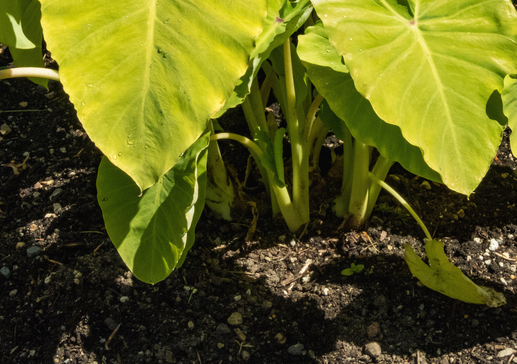
Notice the varying degrees of darkness, grayness, and coolness in the shadows on the hosta leaves and stems. The small shadow on the far right edge is the darkest of all. In contrast, the top two large leaves are in highlight. Their hues are lighter, more intense (more pure), and warmer than the leaf itself.

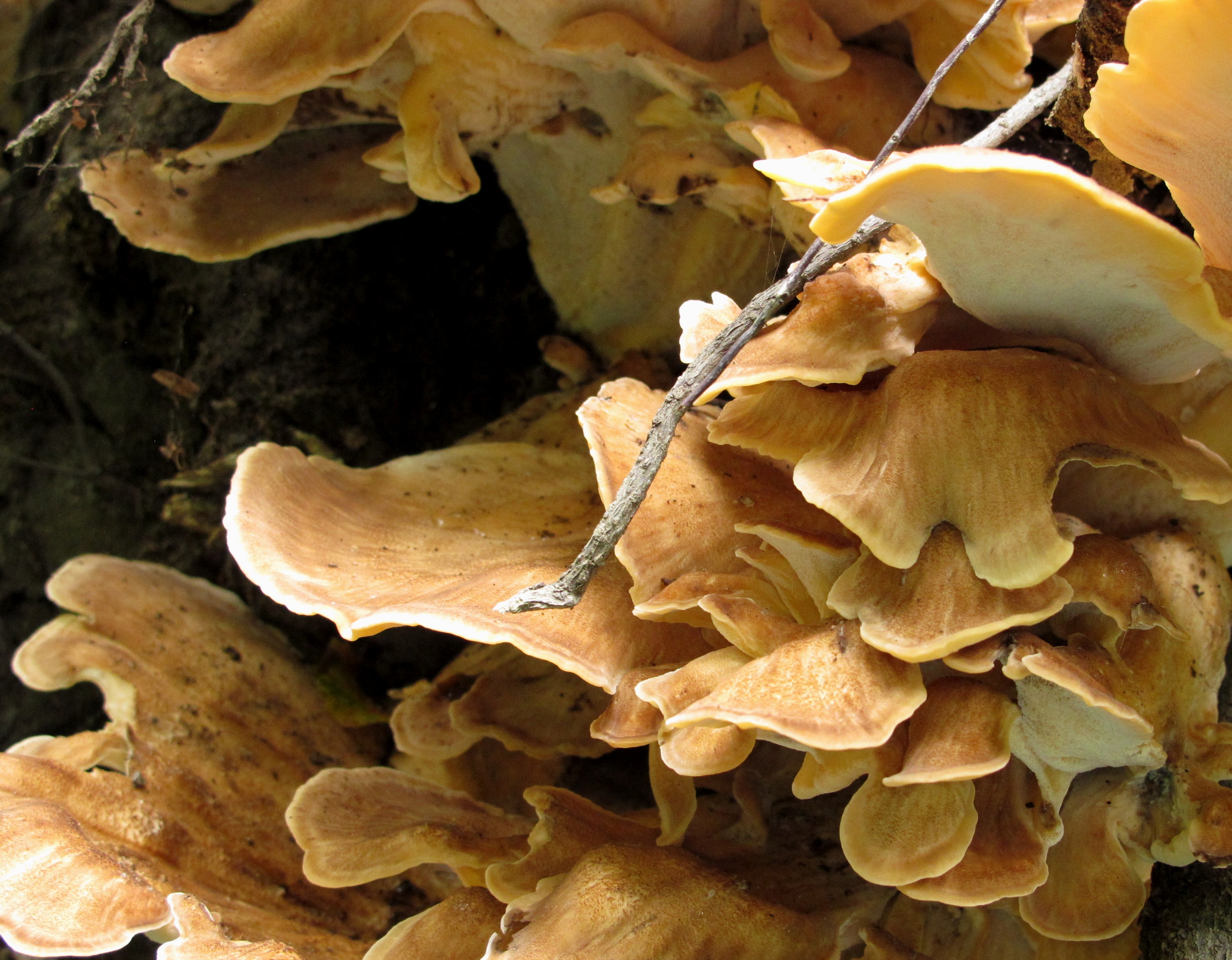
This park setting provides a great view of nature in both highlight and shadow. The spring-green trees in the park are contrasted with cooler spring-green leaves in light shade. Leaves more hidden from light are in cooler green hues. The tree in complete shade (left back) is filled with blue-green leaves. The grassy shadows vary in the amount of their coolness, darkness, and tonality. The grasses in intense light are in highlight. They are the warmest, purest grassy hues.
Practice Exercise: Finding Shadows and Highlights around You
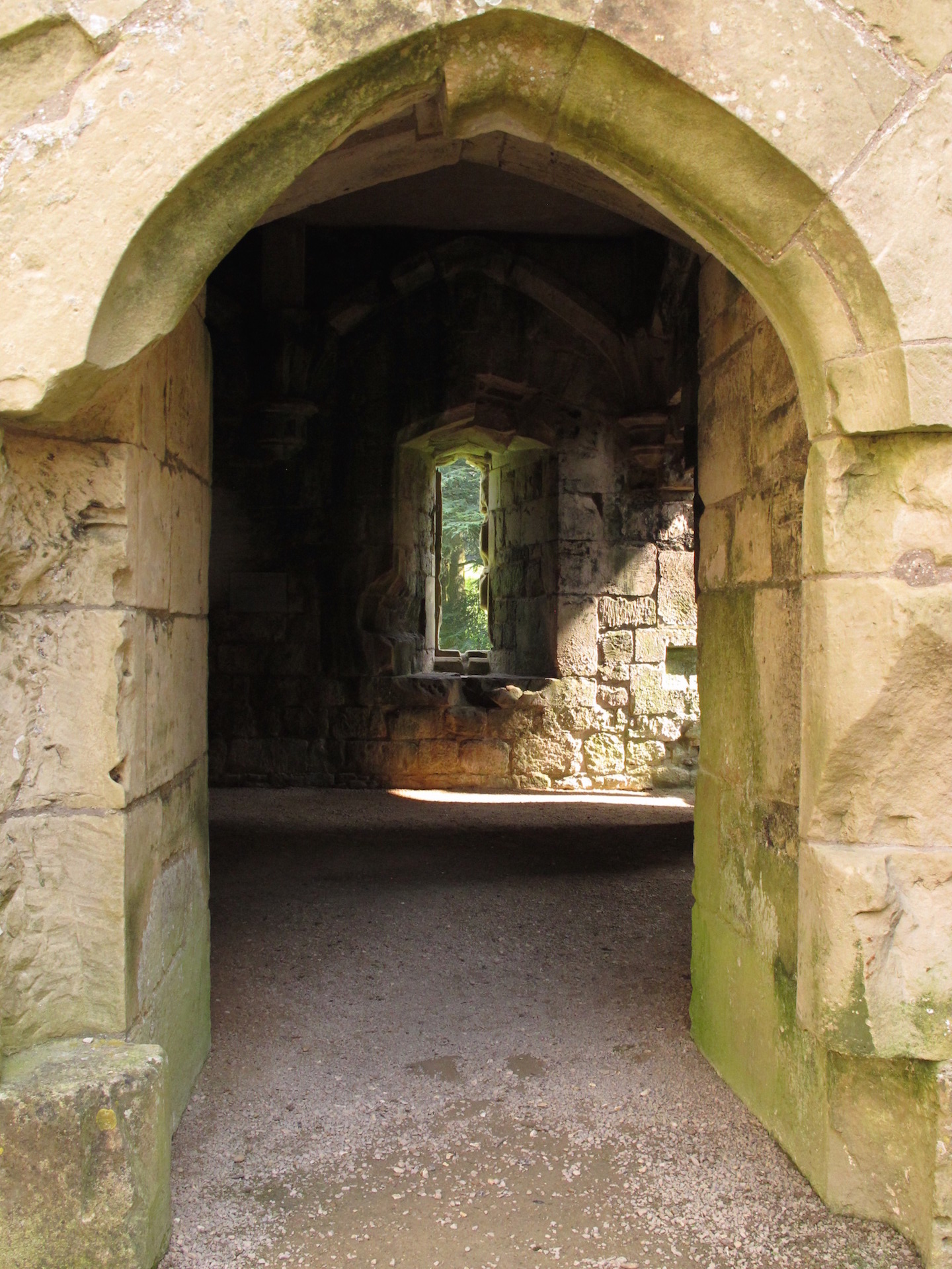
Go for a walk in the early morning or late afternoon, as this is the time when shadows and highlights will be most pronounced. The walk could be around your neigborhood, a local park, or a place of interest to you. Be sure to take a camera or cell phone with you. Don't hurry, take your time and look closely around. Remember, you are training yourself to be more observant. Take your photos and upload them to a file or print on a page for your notebook. These images can later be used for inspiration. Below are several examples of shadows and highlights to get you started.

Click here for more topics related to The Art of Quilt Design program.




.jpg)

Keep up the good work!
RSS feed for comments to this post