Three Easy Steps To Save This Lesson As A Pdf:
-Make sure you are logged in.
-Click on the small triangle next to the tool wheel in the upper right hand corner of the page (you'll find it above the Like button).
-Select the pdf. option. Wait a few minutes. It's a large file due to the number of images.
-Your file should appear with the title of the lesson.
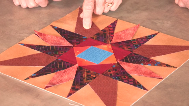
As a quiltmaker, you are the one who determines the color, fabrics, and design of a project. Then why is it that sometimes a group of fabrics you think look fantastic together on the work table, just don't work when the block is pieced? Let's say you were making the star block below. Did your selected fabrics for the points of the star read too similar in value, resulting in a star that appeared muddled?
Along with the subject, the color and fabrics we choose for a quilt can help to set a mood, tone, or emphasize a message. Like the layers of an interesting and delicious sandwich, layers of color help to play a role when it comes to creating a successful and interesting quilt. Whether the design is a landscape or a traditional block arrangement, Joen Wolfrom (Show 103 and Show 2101) shows how layers can help to create the illusion of depth.
Working in Layers
by Joen Wolfrom
I recommend working in layers when making traditional block quilts. Layers not only provide you with a logical way to work with color, but they give you the opportunity to create the illusion of depth in your blocks. I am using five variations of the historic traditional block Mexican Cross to illustrate the concept of layers. Look at each of these block variations to see how their subtle differences change the design.
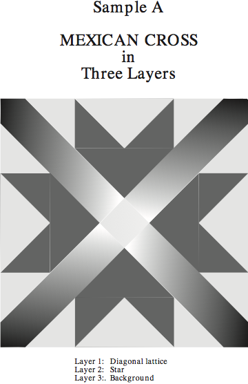
Sample A: In this example, the Mexican Cross block is shown in its basic three-layers: (1) the diagonal lattice; (2) the star; (3) and the background.
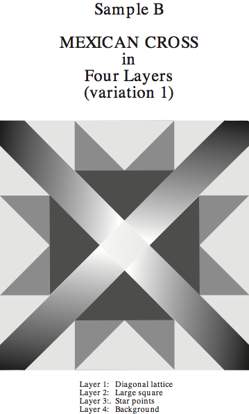
Sample B: By adding lines between the diagonal lattices that line-up at the star’s intersecting points, a large square is formed. This creates another layer. This variation’s four layers are (1) the diagonal lattice; (2) the large square; (3) the star points; and (4) the background.
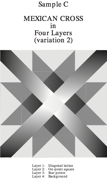
Sample C: A different four-layer variation can be made by taking a ruler and lining it up with the star’s intersecting points and then drawing lines that create an on-point square. This variation’s four layers are (1) the diagonal lattice; (2) the on-point square; (3) the star-points; and (4) the background.
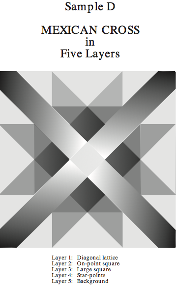
Sample D: If the large square and the on-point square are combined, the design changes once again. These two additions create a variation with five layers: (1) the diagonal lattice; (2) the on-point square; (3) the large square; (4) the star points; and (5) the background.
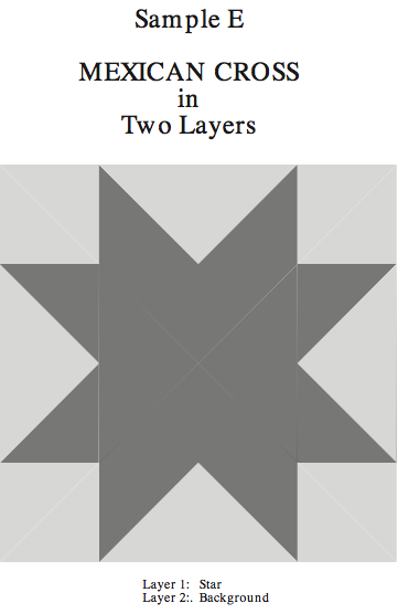
Sample E: Besides adding lines and shapes, you can also eliminate lines, shapes, and layers from the block. In this variation, the diagonal lattices have been removed. This results in a variation with only two layers: (1) the star and (2) the background.
Feel free to create or eliminate lines, shapes, and/or layers in your selected block. Once the block is arranged to your satisfaction, determine how you will work with your layers. But, don't just stop with the basics. How about creating depth using fabrics in your traditional block?
Creating the Illusion of Depth
by Joen Wolfrom (Show 103 and Show 2101)
(all images courtesy of Joen Wolfrom unless otherwise noted)
Let’s Be Realistic…..
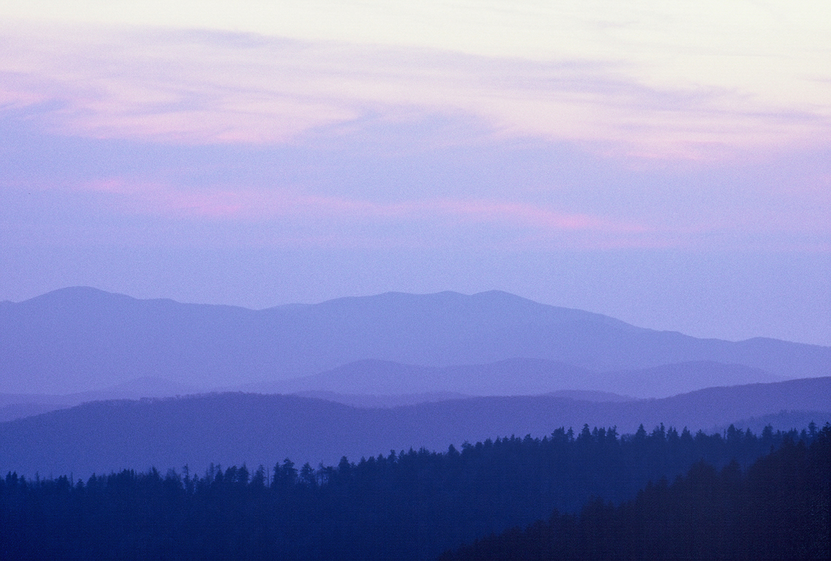
When you look at the hills in the distance, notice these phenomena: The front hill is the darkest in value; the strongest in coloring, and the most detailed and textured of all. As each hill recedes into the distance, it gets lighter in value, grayer in its coloring, and less distinct in its detail and texture. The less difference there is between value, clarity, and texture from one hill to the other in the landscape, the closer the two hills are. The greater the difference in value, clarity, and texture, the farther away they are from each other. This visual phenomena is called atmospheric perspective. It takes place from sunrise through sunset. You can see an example of atmospheric perspective in the mountain photo.
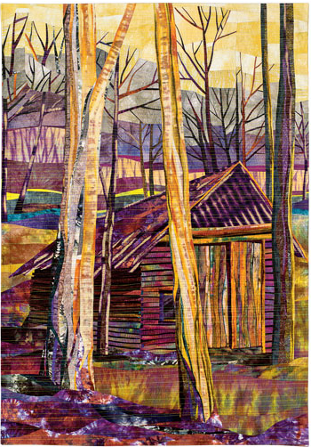
You can duplicate the illusion of depth in your own designs by following the guidelines for atmospheric perspective―Simply remember that as things recede into the distance they become lighter in value, more toned in their coloring, and less distinct in their detail. It’s like magic!
Roots and Branches by Christina McCann (image by AQS)
Putting Atmospheric Perspective to Work in Your Block Quilts
Using our Mexican Cross Block Sample D again as a reference for the following depth and layer hints.

Layer 1 (diagonal lattice): The fabric(s) will be the most pronounced and/or the most eye-catching of all. If you have a featured fabric, Layer 1 is usually where it resides.
Layer 2 (on-point square): The fabric(s) for this layer will be less pronounced than Layer 1’s fabric(s). The fabric(s) are lighter in value, grayer in coloring, and less distinct in detail than the top layer fabric(s).
Layer 3 (large square): The fabric(s) are lighter, grayer, and less distinct than the fabric(s) in Layer 2. If you want Layer 2 and 3 to appear close in distance, make the differences between the two fabric layers fairly slight. If you want these two layers to appear far apart, make Layer 3 fabrics pronouncedly lighter, grayer, and less distinct than Layer 2 fabrics.
Layer 4 (star-points): If you want the star-points to appear as if they are far in the distance, make sure the fabric differences are quite noticeable between Layers 3 and 4. (I often use backsides of fabrics in this fourth layer because a fabric’s back color is often lighter, more toned, and less distinct than its front (if it doesn’t look right, don’t use it).
Layer 5 (background): An atmospheric perspective background is the lightest of all layers. You can make it appear close to the previous layer by using fabrics that are close in value, tonality, and detail to it. If the background is to appear far in the distance, the fabrics will be considerably lighter, grayer, and less detailed than the layer before it. Again, I use a lot of backsides of fabrics for this layer. Blurred fabrics and other fabrics that have subtle textures work well in the background, as long as they are more toned and lighter than the layer above.
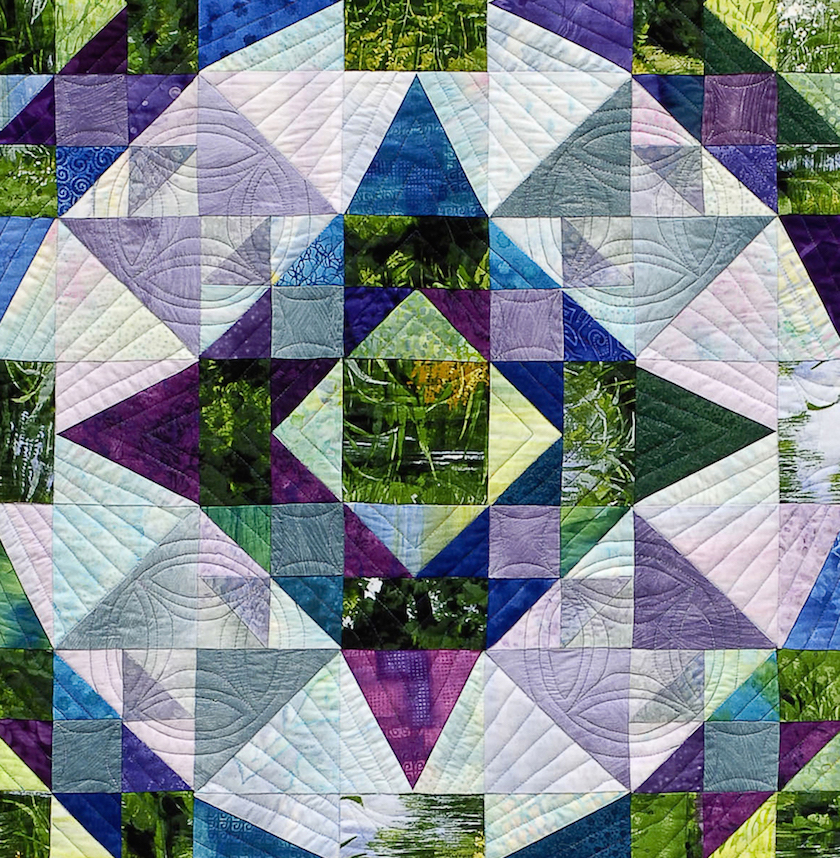
Memories of Monet (below) is an example of using atmospheric perspective to create the illusion of depth in a 3-layer block design. 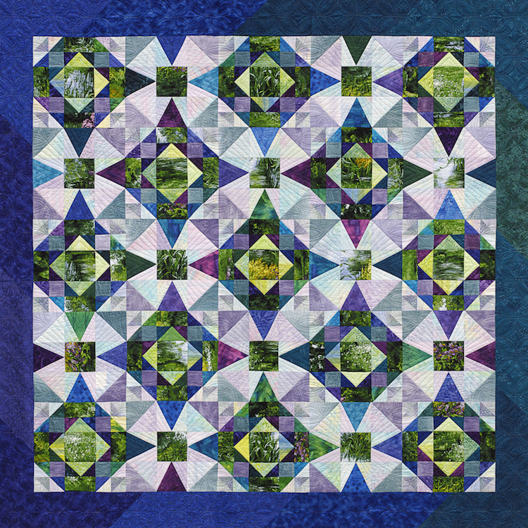
More Layer Hints
- If I have a featured fabric, I almost always use it in Layer 1. If I don’t have a featured fabric, I use as many fabrics as I have on hand for each layer. I like to have at least 5 fabrics for any one layer.
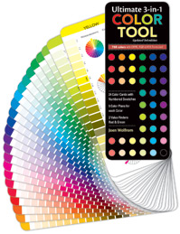
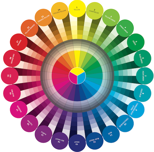
- I select a color plan for my quilt using my color tool or visual coloring. The color plan is used throughout all layers. Once I select the plan, I pull fabrics from my stash and then place them in layer piles. Some fabrics that are in the color plan won’t end up in the quilt. They are either too light or too dark, too bright or too toned, and/or too detailed or too textured to be in one of the layers. These fabrics go back to my stash. If I need more fabrics, I go on a fabric hunt.
- After I have sorted fabrics into layers, I begin cutting and piecing my blocks. I can’t really “see” the layers evolve while cutting and sewing, as I’m too close to the blocks. When I put the blocks on the wall and stand back 8-10 feet away, I see the layers bring about the makes of visual depth. The design becomes alive with dimensionality.
- I resist sewing the blocks together until I finish all blocks. This allows me to add new fabrics to the mix as I work and then blend the blocks seamlessly.
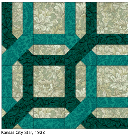
Practice Exercise: Creating Depth, Layers, and Perspective
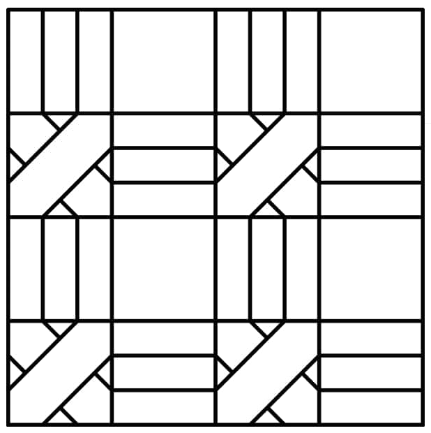
Click to Download the Garden Maze block from Jinny Beyer's website (Show 313 and Show 601)
- Print 4 (or more) Garden Maze blocks for the best results.
- Select 3 fabrics (1 background, 1 light, 1 medium or dark), colored pencils, crayons, or colored paper to build the block.
- Notice how the blocks, when placed together create an overlapping trellis design.



.jpg)

Thank you,
Margaret
Check out the tutorial on QuiltersCache.c om for the Garden Maze block.
Happy Stitching,
Lilo
Apologies for listing the wrong quilt with your name. We have changed the image/title to correctly reflect your work.
Lilo
RSS feed for comments to this post