Why is it that some quilts never leave the depths of the WIP (Work In Progress) pile? Did you lose interest, or did the fabrics and color choices just not play together well? For the next several lessons we will take a brief pause from our focus on the fundamentals of color, to look at how and what fabric choices you make can result in a flat or less dynamic quilt.
Scale, value, and pattern can make a huge difference when it comes to selecting fabrics for your quilt project. It's one thing to understand the principles of the terms, but another matter when it comes to actually putting a fabric group together.
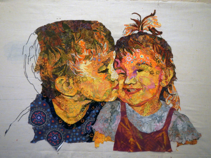
Let's look at Kissin' Cousins by Susan Carlson. This WIP illustrates the wide array of fabrics Susan has used in her collage work to create depth and realism on the faces of the two children. In the detail of the girl's face below, you will notice the masterful way she combined fabrics with prints of different sizes, themes, and colors to give depth and interest. Susan's skillful use with what many would consider fabrics that absolutely would not play well together, in fact, actually do make for a very harmonious grouping.
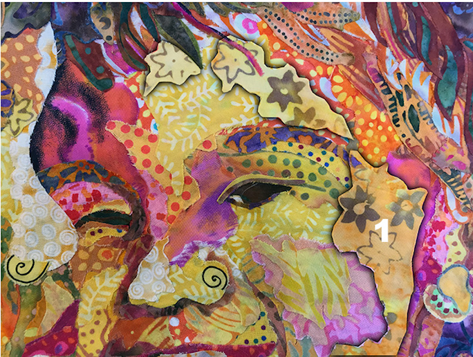
Kissin' Cousins by Susan Carlson (Show 801). (Detail)
Another master when it comes to gathering a very diverse fabric collection for quilt projects is Karen K. Stone (Show 1611). Two examples that showcase the vast array of fabrics, patterns, scale, and size she customarily uses in her work are Lilith and Clam Session.

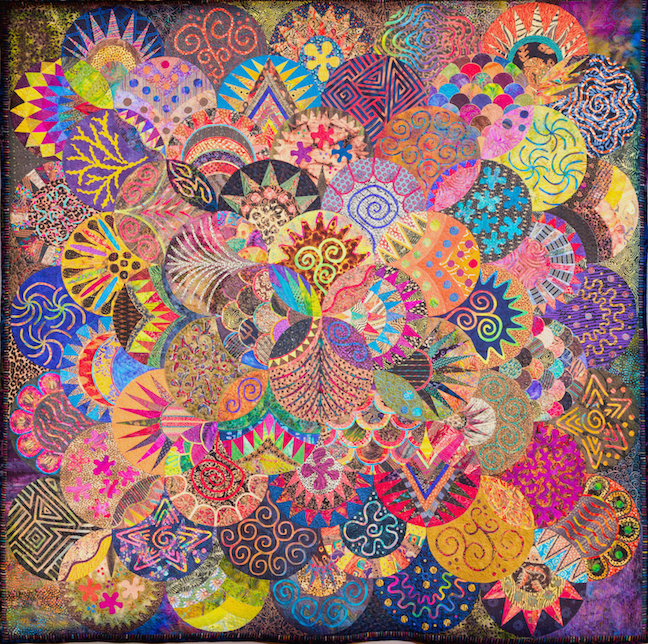
Lilith by Karen K. Stone. (Image by TheQuiltShow.com). Clam Session by Karen K. Stone (Image by TheQuiltShow.com)


But where does one start when it comes to deciding on what fabrics to cull or purchase? As a quilter, your local quilt shop is a great resource. Most shops offer pre-cut designer fabric collection bundles, such as charm squares (5" x 5"), jelly rolls (2 1/2" x 45"), layer cakes (10" x 10"), and fat quarter bundles (9" x 22"). These groupings, usually based on a theme, offer a nice array of fabric prints in one complete collection; or let a favorite fabric be the inspiration for your grouping. And don't forget to check out those colored dots along the selvedge of your inspirational fabric, as they are very useful for matching color.
What if the current collections at your local quilt shop don't make you swoon, or you want to build a fabric group from your own stash? Here are a few basic tips to keep you on track.
The basics for creating interest:
Scale / Size - Include a variety of small, medium, and large prints. By including a mix of the three, your work will have more depth and variety.
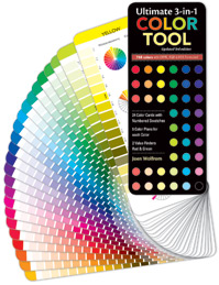
Value - Include a wide range of light, medium, and dark to avoid your work from reading flat. Are you not sure about relying on your instincts? Use the Ultimate 3-in-1 Color Tool to help solve the mystery. Each of the twenty-four pages illustrates the pure color, tints, shades, and tones of a family, allowing you the opportunity to select from a wide array of fabrics to make a quilt more interesting.

In Show 1307, Alex Anderson shares her method for gathering fabrics when beginning a scrap quilt. From selecting a wide range of fabrics, to the role value plays within a star block, diversity of fabric choice can make a huge difference.

In Show 1413, Leni Levenson Wiener shows what a difference 'zingers' make when selecting fabrics for her trees.
Becky Goldsmith (Show 611, Show 1704, and Show 2401) is an award-winning quilter who teaches both nationally and internationally. She says that, "quilters paint with fabric." And as such the need to understanding how fabric works can mean the difference between a quilt project that is forever doomed to the UFO dungeon or a loved and completed piece.
Working with Predictable vs. Unpredictable Fabrics
by Becky Goldsmith (Show 611, Show 1704, and Show 2401)
Fabric falls into two broad categories: predictable and unpredictable. Predictable fabrics are not ‘better’ than unpredictable fabrics—they just behave differently. When you can see at a glance which category a fabric falls into, it makes choosing fabric for a quilt much easier.
Predictable Fabrics
A predictable fabric can be cut into big or small pieces and it will look the same everywhere it shows up in the quilt. In pieced quilts, that is a very good thing.
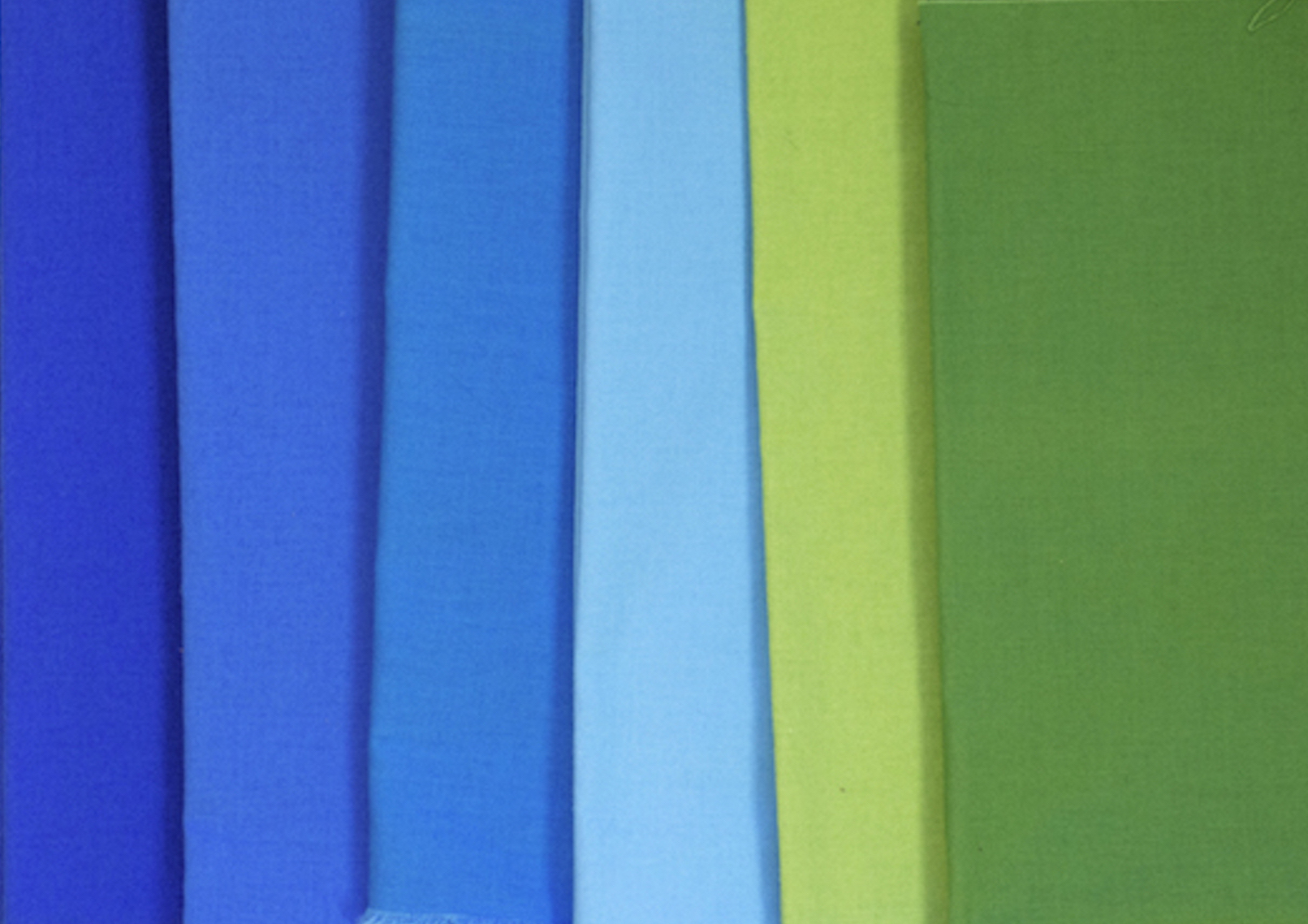
Solids
Solids are the most predictable fabric.
No matter how you cut them, they always look the same.
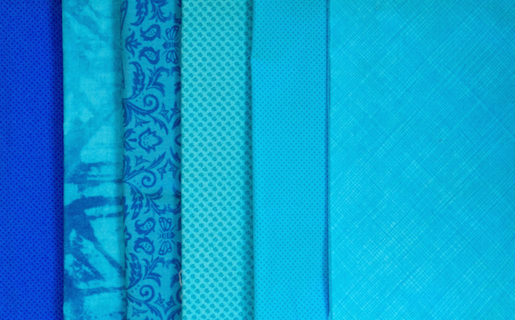
Tone-On-Tones
Tone-on-tone fabrics usually read as a solid at a distance. Tone-on-tone prints can be quiet or visually active. If the values in the print are close together, the fabric will read more as a solid and be ‘quieter’. The more contrast in the print, the more noticeable and visually active the fabric becomes.
Tone-on-tone prints come in all sizes: small-, medium-, and large-scale.
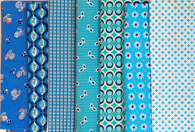
Small Prints
The motifs and colors in small prints are near enough to each other that when cut into small pieces, they look the same no matter what part of the fabric they are cut from.

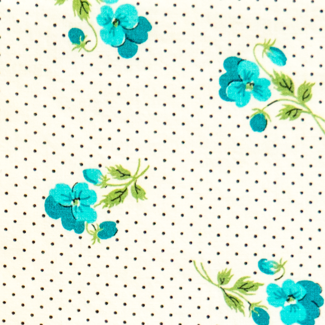
Some small prints have motifs that are more widely spaced. The designs in the print won’t be exactly the same in the pieces you cut from the fabric, but the print will retain its character. This antique fabric feels open and airy in both large and small sizes.

Medium Prints
Medium prints have obviously bigger motifs than those you find in small prints, but many are still predictable. Look for designs where the colors in the print are mixed together well across the face of the fabric.
Unpredictable Fabric
Unpredictable fabrics are ones where the motifs are often big and widely spaced. When you cut small pieces from unpredictable fabrics, you can’t predict which color will end up where and that can play havoc in repeating blocks.
Big Prints
Most quilters shy away from big prints because they look hard to use, but I encourage you to give them a try. Big prints have an expansive feeling that can add motion and depth to your quilt.

Big Prints
Most quilters shy away from big prints because they look hard to use, but I encourage you to give them a try. Big prints have an expansive feeling that can add motion and depth to your quilt.
When you cut big prints into small pieces, the design is fragmented.
If you bought the print because you liked it as a whole, this can be disconcerting.
These squares, from the big print above far left, are a good example of that.
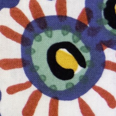
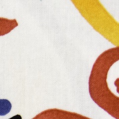
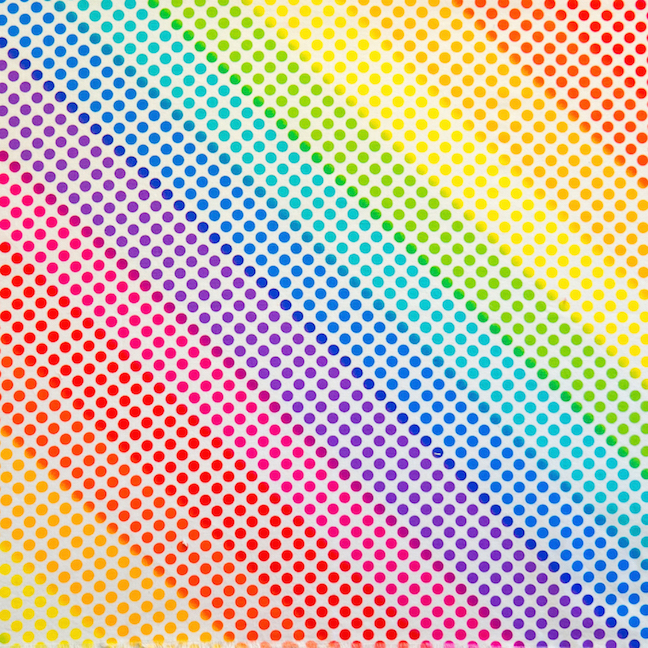
Sometimes colors are segregated into discrete areas. For example, if you cut 2” squares from the rainbow dot fabric (designed by Greta Lynn) you will end up with squares that are blue, or red, or yellow, etc. If your pattern calls for mostly blue squares, the others are not going to fit into your design.
That doesn’t mean that these are not good and useful fabrics! One simple example is to combine one of these prints with one solid or near-solid contrasting fabric. Imagine 9-patches made with the rainbow dot against white. You would have a happy and colorful quilt from just these two fabrics.
Predictable Big Prints
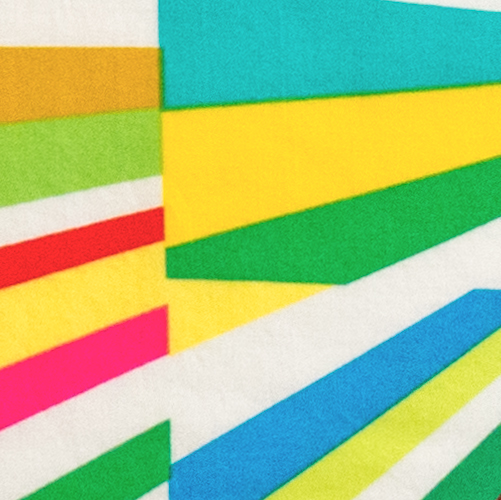

Big prints are not always unpredictable and they are well worth using.
This wonderful fabric (on the left) is based on a pieced quilt, Tara’s Fireworks Quilt (fabric from Michael Miller). This cut is roughly fat-quarter-size.
You could use it as is, but it is easier to use in small pieces than you might think. The overall flavor of the print remains the same.
Let’s Compare:

Whether a fabric is predictable or unpredictable, always remember that the color, value, and scale of any print can only be measured against the fabrics they are paired with. A medium-scale print will look big when compared with solids and small prints.
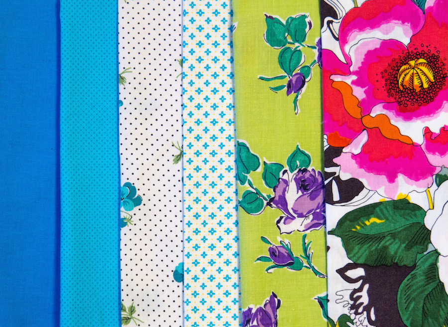
Add an even bigger print, and the relationships change.
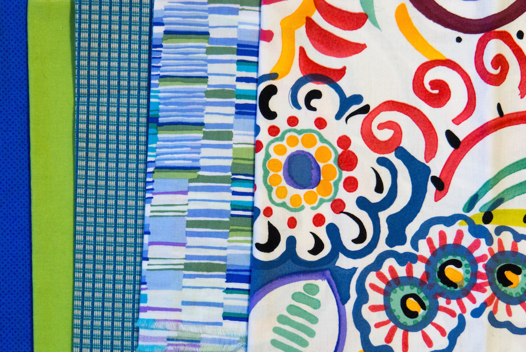
Adding prints with lines and stripes can help to visually control big and wild designs.
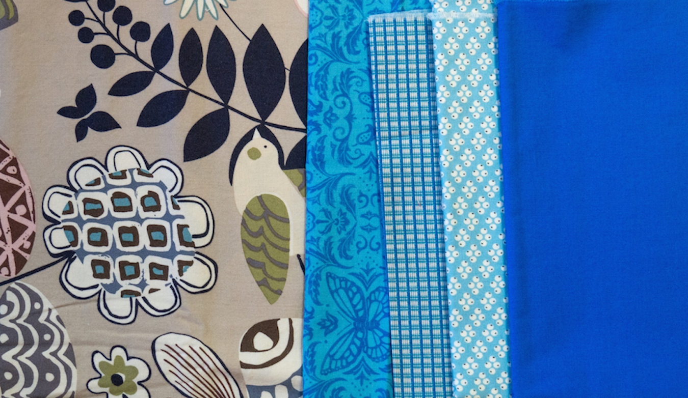
And, lastly, know that clear colors come forward and gray colors recede. So even though the big print, below, will be noticeable, the clear blues are more dominant.
Let's look at two completed quilts:
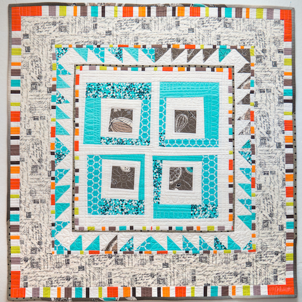
The only unpredictable fabric in this quilt is the dark gray/brown big print used in the log cabin centers and in the upper right hand triangles. You can’t see the big kitchen tools, but the shapes are cut big. I was careful to make the log cabin centers dark for continuity. I used a multi-colored stripe for the colorful inner and outer borders.
Improvisation by Becky Goldsmith

There’s a little bit of everything going on in Everyday Best. Many of the border backgrounds are cut from unpredictable fabrics that would not have cut up into consistent colors and/or values.
Everyday Best by Becky Goldsmith
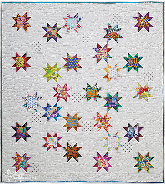

Seeing Stars by Alex Anderson (Image courtesy by C&T Publishing. Free pattern Click Here) Lilith by Karen K. Stone (Image by TheQuiltShow.com)
Practice Exercise: Scrappy Sawtooth Stars
- Gather a collection of fabrics together from your stash to include one as the background fabric. Your collection can be totally scrappy as in the case of Alex's quilt, Seeing Stars, on the left above or a more controlled color palate as Karen K. Stone's quilt, Lilith, on the right above.
- Using the principles you have learned today, see how dynamic a collection you can pull together by including various print scale/size, patterns, and values.
- Using your favorite Sawtooth Star Block pattern method, make at least six different blocks. With each succesive block, try to find a way to make the next block different than the one previous.
Click here for more topics related to The Art of Quilt Design program.


.jpg)
