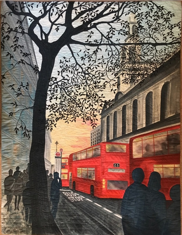
And Then Three Come Along At Once by Stephanie Crawford
When it comes to creating the illusion of space on a flat two-dimensional surface such as a quilt, the use of imaginary (or real) lines to create perspective trick the viewer into thinking that there is actual three-dimensional depth. Subjects appear less flat when you give them perspective. Last week we shared five of the six key ways an artist can create space on a two-dimensional surface. This week we will focus on the sixth element, perspective.
One Point Perspective:
Think of it this way. If it's large, it's closer. If it is small, it's further away.

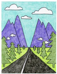
Let's use the drawing of a road leading out of town as an example. If you look closely, you will see a horizontal line that is in the center of the drawing. This line represents the horizon. The trees sit at the base of the horizon line, while the clouds hover above.
The road is drawn using two lines that meet at one point along the horizon line. The lines of the street are drawn at an angle to create the illusion of distance and depth. Notice how both the road, and buildings along it, seem to disappear into the horizon. At the point where everything seems to disappear is called the vanishing point.
Now look at the buildings along the road. In real life, the buildings would all be about the same size. But, in a drawing, the buildings along the road need to be smaller to give the impression that they are further away.
Two Point Perspective:
In two-point perspective there are two vanishing points. Think of standing at the intersection of a city road.
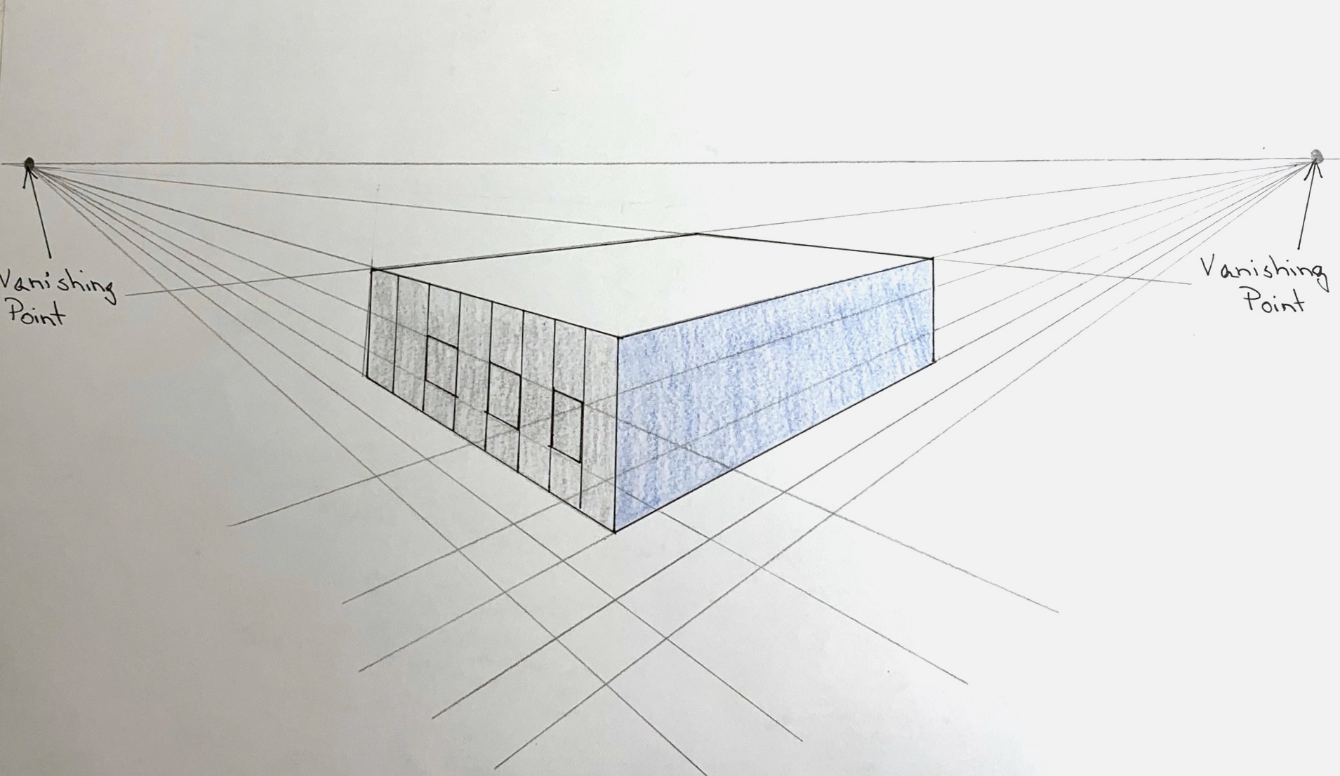
The building closest to you is the largest, while those on either side seem to vanish in two different directions.
Now that you have seen the graphic illustrations, let's look at examples in actual quilts:
One-Point Perspective
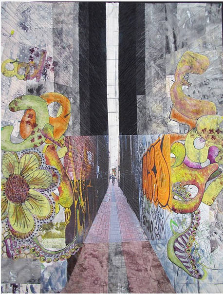
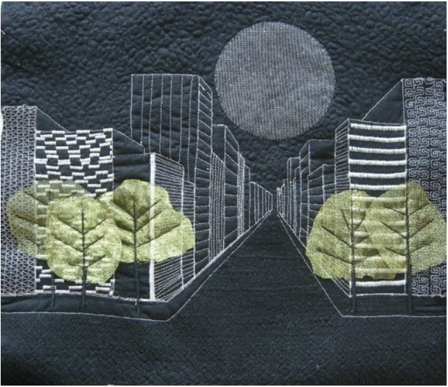
Amsterdam Alley: The Shortcut Between by Leslie T. Jenison (Left) ; Ciudad Fantasma by by Cecilia Koppmann (Right)
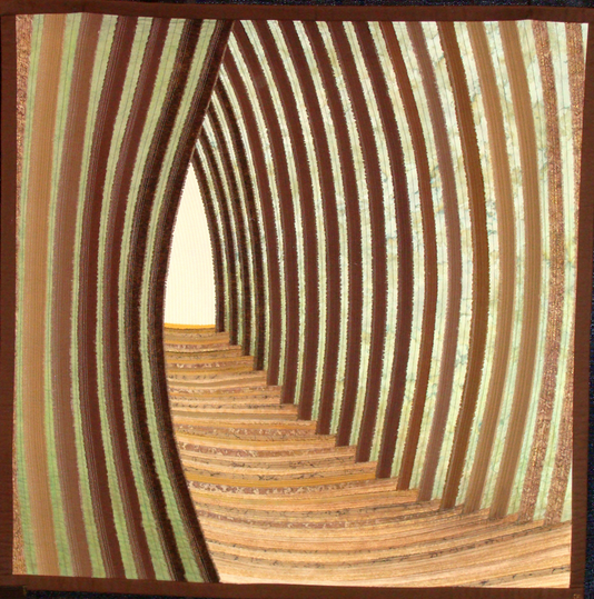
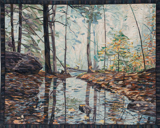
Pathway To A Secret Garden by Dianne Firth (Left) ; Piece and Quiet by Cynthia England (Right)
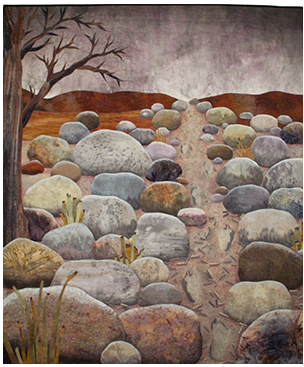
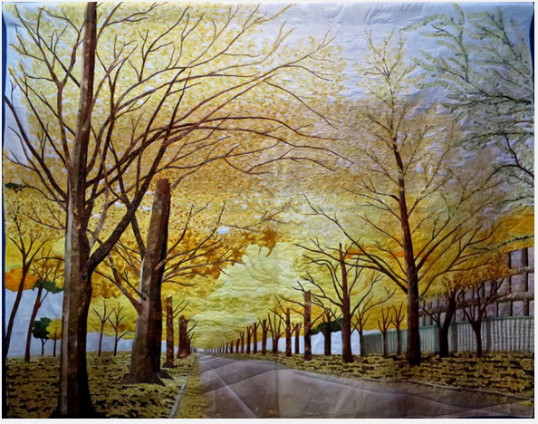
Space Refugee by Betty Busby (Left) ; The Street Of Golden Leaves by Keiko Kimura (Right)
Two-Point Perspective
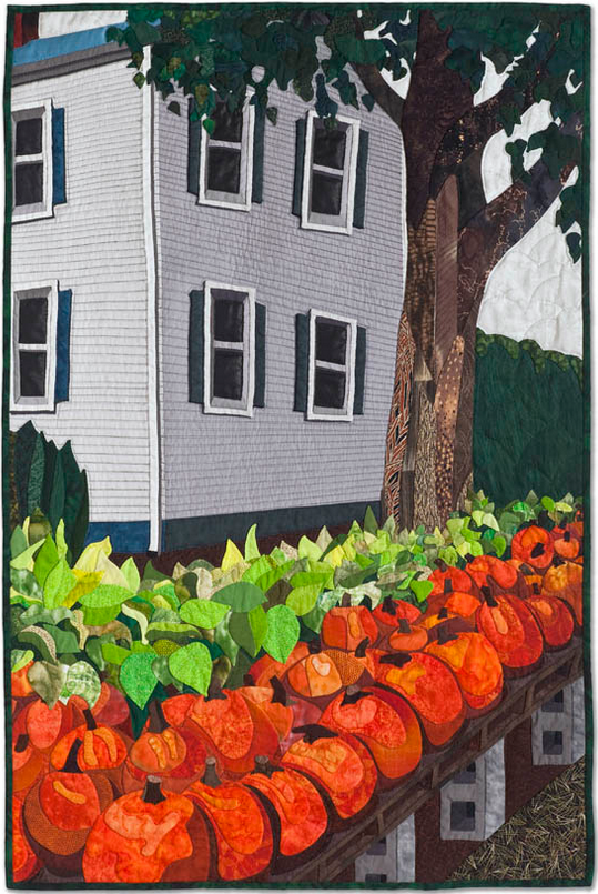
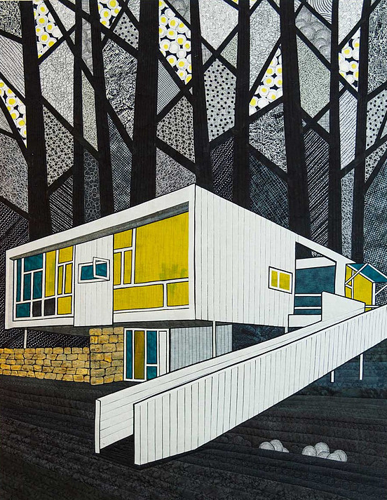
Hadley House by Sara Sherwin Roberts (Left) ; Rose Seidler by Gloria Loughman (Right)
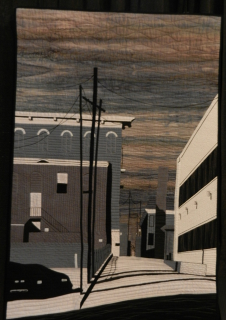
Alleyway by M. Bunte
Perspective in Quilts
by Allie Aller (Show 1906)
All images by Allie Aller unless otherwise noted
Landscape quilts that employ the basic concepts of perspective have richness and believability. We are drawn into the scene to our visual delight.
What is perspective? It can be defined as the rendering of three dimensional space on a two dimensional page (or in our case, the flat surface of a quilt.)
What are the basic concepts of perspective and how can we use them?
The first is depth. We want to see into a landscape. To "fool the eye" into perceiving elements in our landscape as being nearer to us or farther away, thus providing depth, there are some basic tricks we can employ.
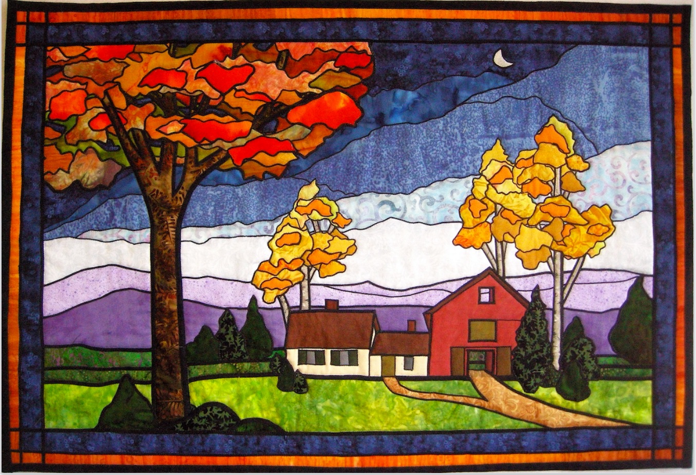
In the examples below, four tricks are used:
1) Objects in the foreground are heavier and more detailed. The orange autumn tree closest to us has thicker lines than the yellow trees in the middle ground. The hills in the background are made with thinner and thinner lines. This simple trick gives the illusion of distance.
2) Faraway objects get paler in color. In this first quilt, the hills in the background become a paler and paler purple, the farther away they are.
3) The same objects, farther away, are smaller. In the Lake Michigan scene below, the trees to the right of the picture, which are farther away, are rendered as shorter, but we "know" they are really the same size as the trees in the foreground. This concept is called "diminution".
4) The foreground shows lots of detail and texture; the farther into the background we go, we see less detail. Notice in this second picture that there is a lot of grassy detail in the foreground; then there is less in the middle ground, and none at all in the background.
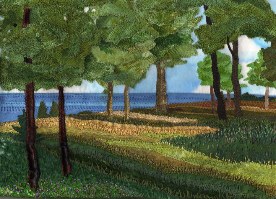
The second basic concept of perspective is convergence. Vertical lines that are parallel in real life appear to get smaller and closer together as they recede into the background. That is because they are all aimed at the vanishing point, that imaginary point at which parallel lines receding from an observer seem to converge in the distance to a common point on the eye level or horizon line. (More on the Horizon Line in a moment.)
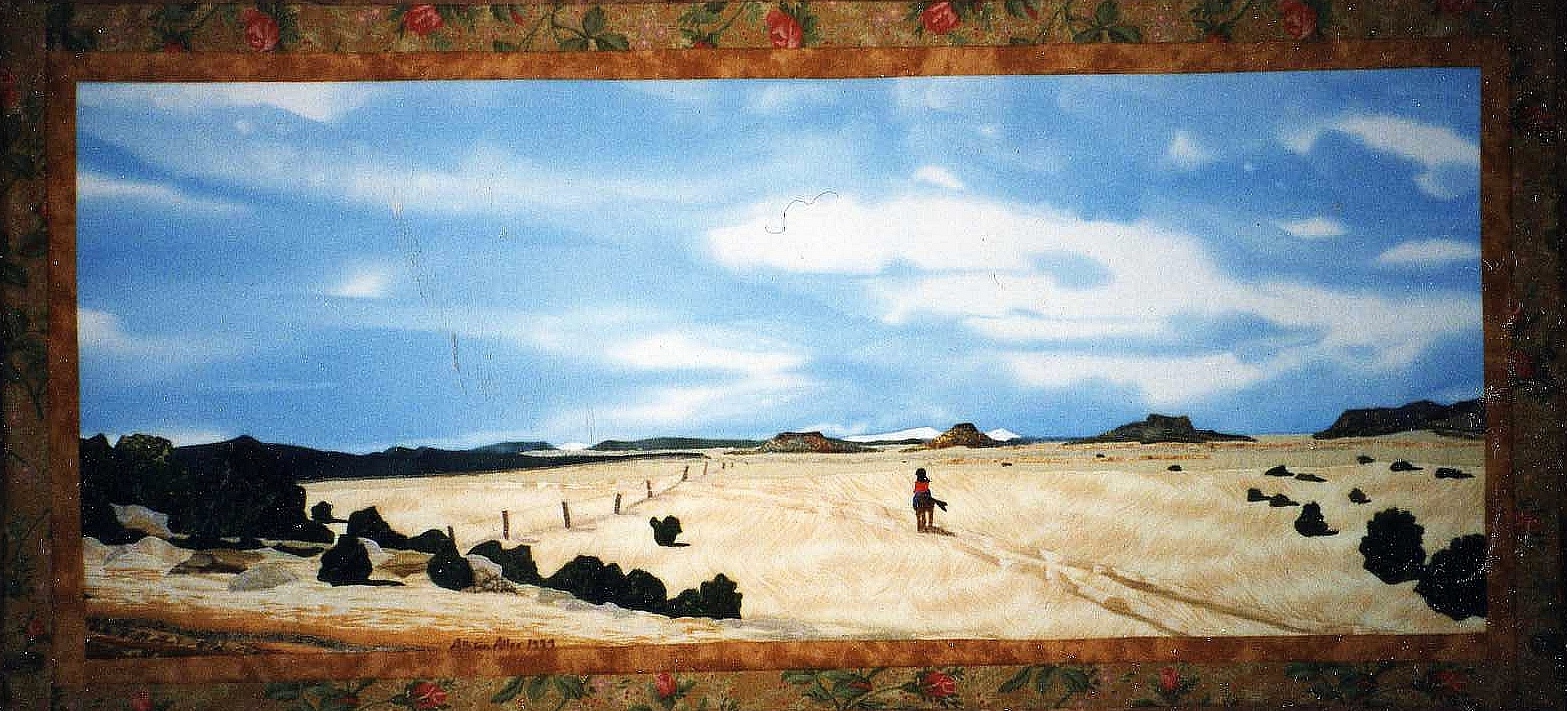
In the two pieces below, the fence lines illustrate this concept. In reality those fence posts are all the same size and spaced equally apart, but in perspective, they get smaller and closer together, the farther into the background they recede. This doesn't have to be perfectly accurate, just believable.
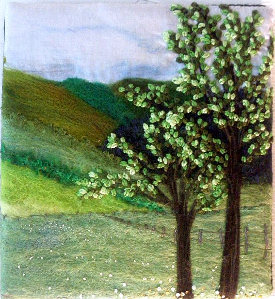
Besides the fence posts suggesting perspective, in this second felted and embroidered piece, even the little French knot flowers are larger and farther apart in the foreground, and tinier and closer together in the background. Both these tricks work together to create the illusion of depth.
The little house in the quilt detail below also just hints at perspective, the way the roof line and ground line, though parallel in real life, convey two converging lines, aimed toward the vanishing point on the horizon.
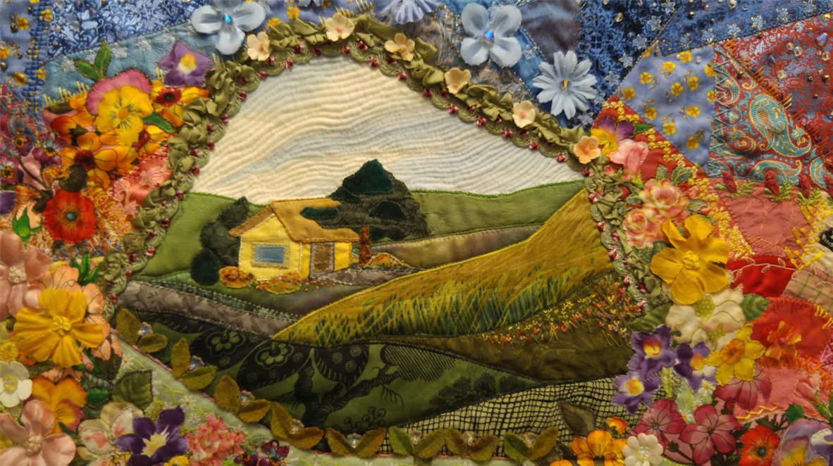
This leads us to the third basic concept in perspective, the horizon line. It is the actual height of the viewer’s eyes when looking at an object, interior scene, or an exterior scene. That eye level height determines how the viewer will see the scene.
From an aerial view, or bird's eye view, we are looking down on a scene, and the horizon line is very low. The eye level view shows an image or scene just as we would look straight out at it from a standing position, so the horizon line will be somewhere in the middle of the picture. From the worm's eye view we are looking up at our scene, so the horizon line will be very high.
So if we have an eye level view and are looking directly at a house, it will look like this, as in this embroidered printed photograph:
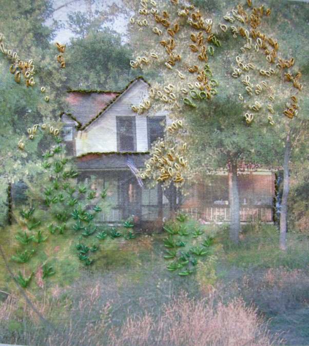
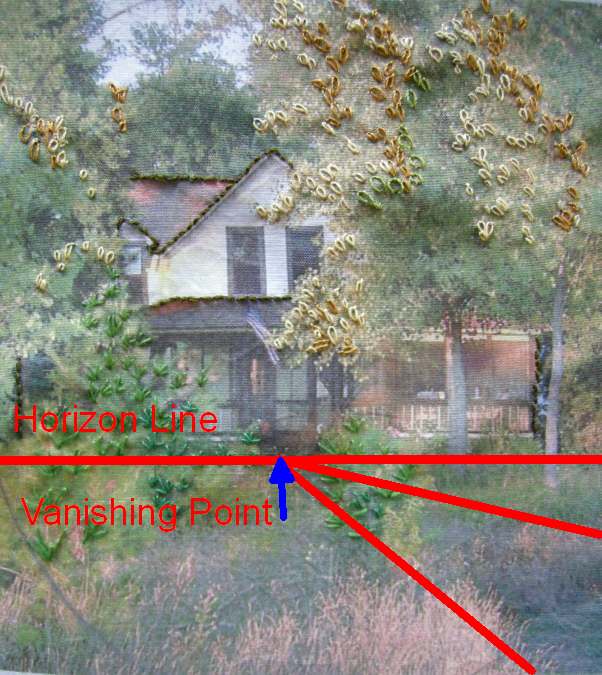
The horizon line, though we don't see it, is right about level with the steps of the porch, with its vanishing point right under the door. But look! Notice the shadow in grass in the lower left corner. That is actually a trodden path leading to the front door, and can you see how its lines converge towards the vanishing point? Even this subtle convergence gives depth and perspective to our scene.
Let's review these two basic rules for using perspective in quilting to gain depth in a scene:
1) Make the objects in your foreground with bigger heavier lines, more detailed shapes, and richer in color and texture than objects in the background. (This is why I always make my landscape skies very, very flat. I personally don't want texture in my sky because it brings it too much to the foreground, and really, what could be further away than the sky?)
2) Determine which view you want to show your quilt's picture from: aerial, eye level, or worm's eye. That will help you find your horizon line and vanishing point, where all lines in your scene converge.
Homework:
Look at several photographs of buildings or simple scenes, and determine where the horizon line and vanishing point is in each one. See how lines in the image--roof lines, window casements, etc, angle towards that vanishing point.
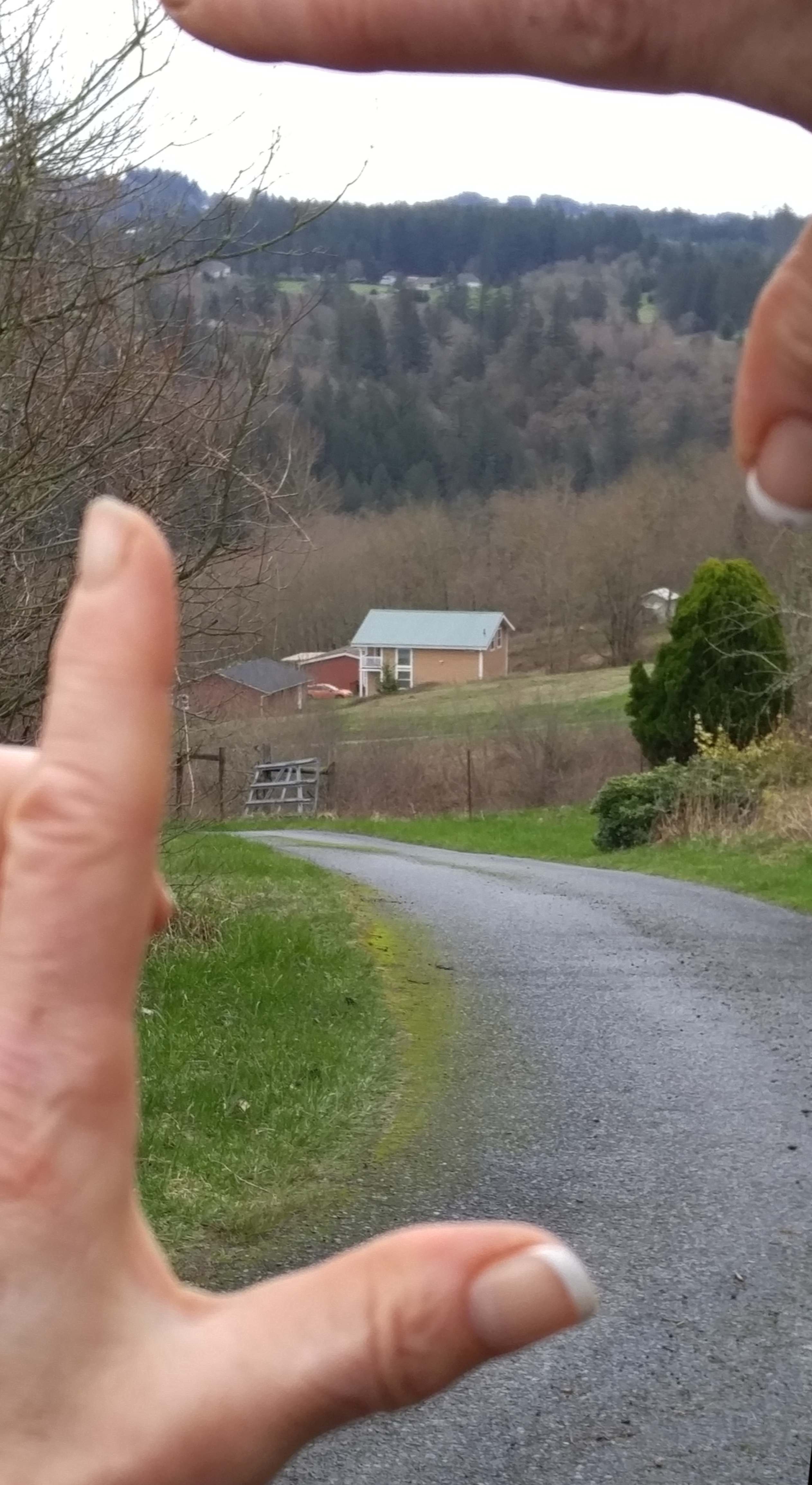
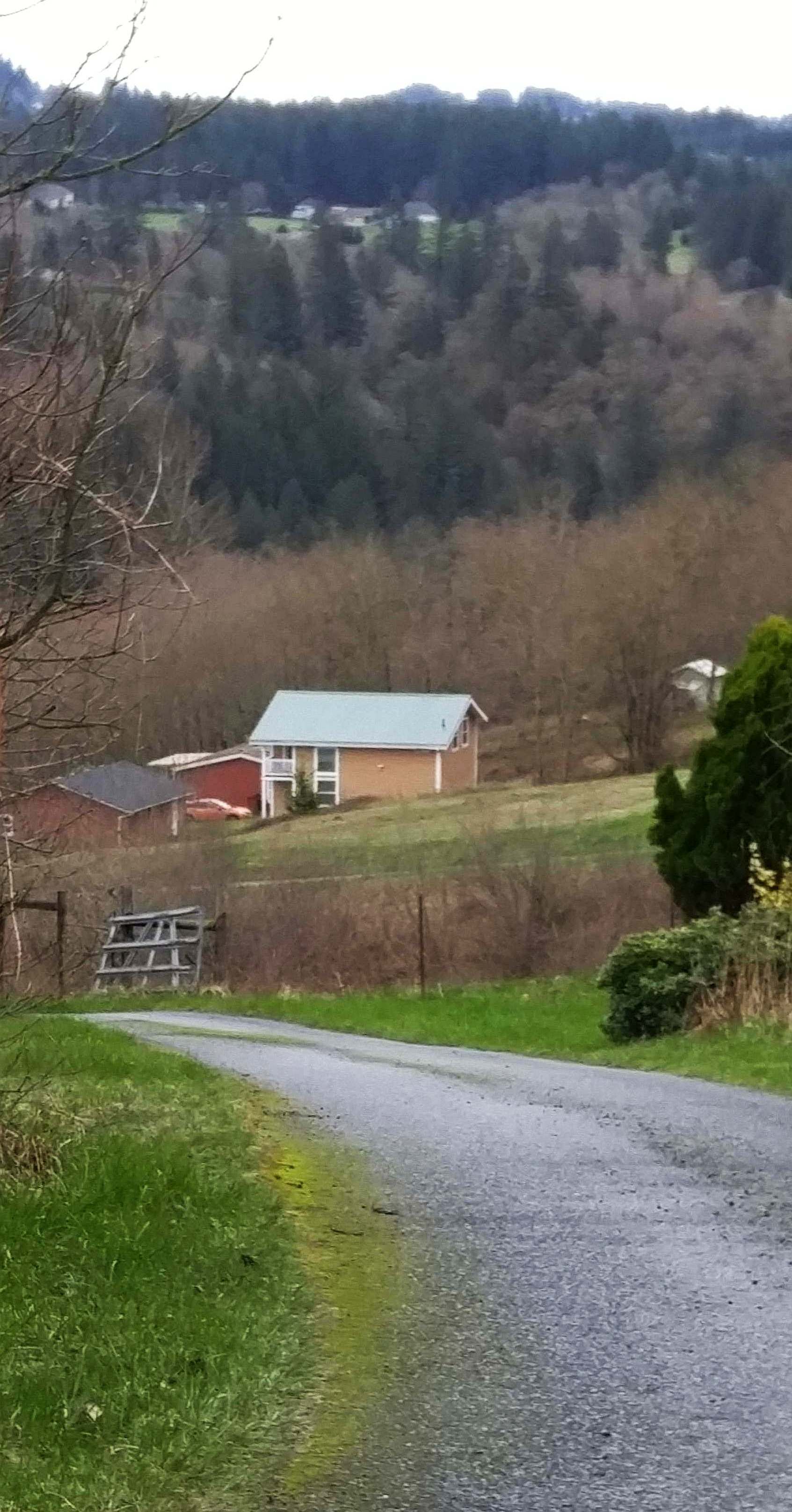
Then as you go about your day, occasionally frame a scene with your hands and try and determine the horizon line and vanishing point in the view you are seeing. The series of photos below are an example of an aerial view with a low horizon line, looking down my driveway.
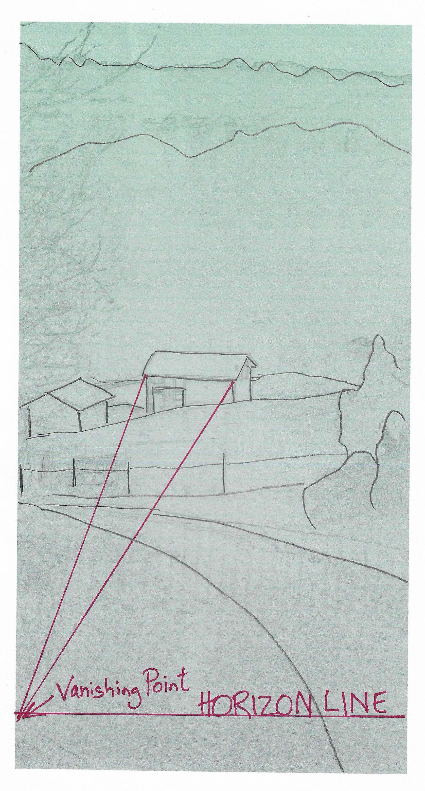
If you start thinking and seeing this way, it will come out in the quilts you make as well.
Copyright 2017 All quilts by Allie Aller
Work Exercise: The Vanishing Point Road
by Kathy Barbro
Here’s a simple landscape tutorial that illustrates how to draw perspective with a vanishing point. The drawings help show how much space can be implied in your art just by paying attention to lines and scale. And by keeping elements like the trees all the same type, it’s easy to see how they get smaller and smaller, the further away they get from you.
MATERIALS
• Drawing paper
• Fine tipped black marker such as Sharpie
• Crayons or colored pencils
View and download the landscape tutorial here.
DIRECTIONS
1. Lightly draw a center guideline on the drawing paper with a pencil.
2. Follow the Landscape Tutorial for drawing the landscape.
3. Trace the drawing with a black marker.
4. Color the landscape with crayons. Try using dramatic colors, as in a black road and colored mountains.
Click here for more topics related to The Art of Quilt Design program.


.jpg)

¿Puedes usar el traductor de google en el pdf?
RSS feed for comments to this post