9

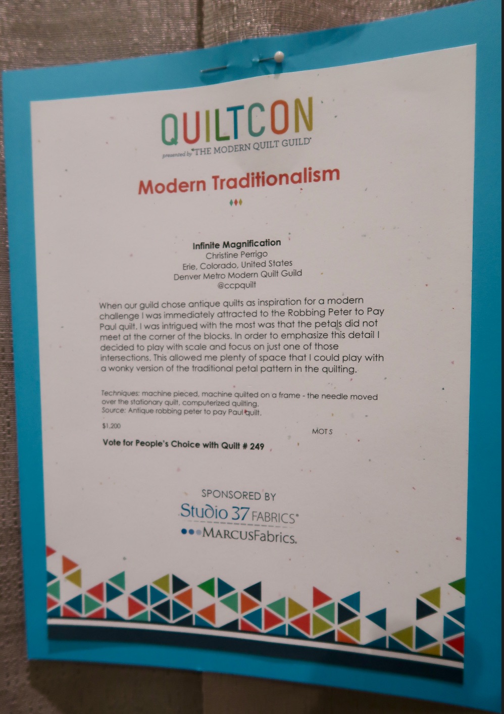
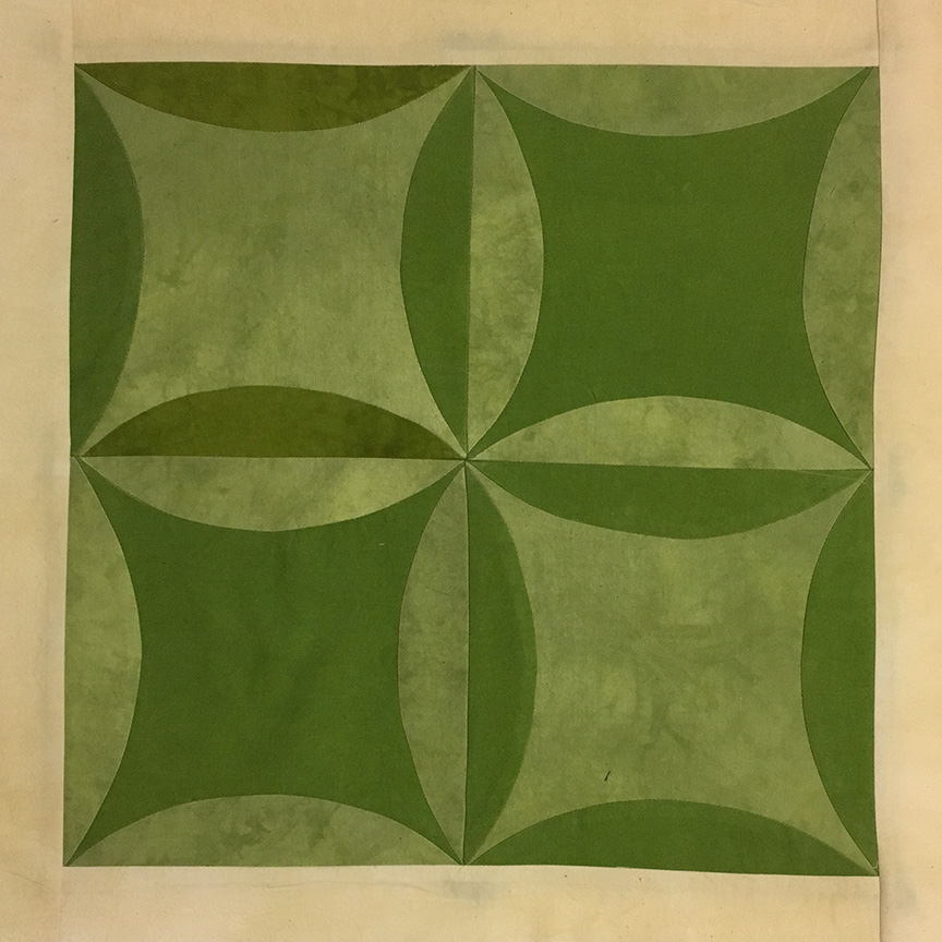
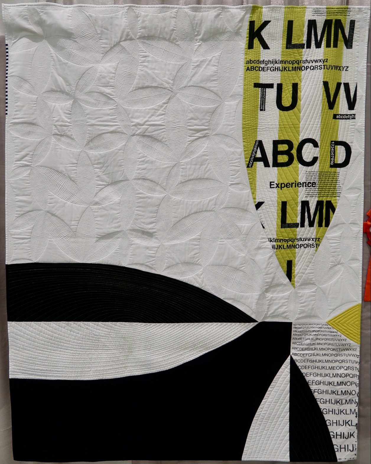
Sometimes it's the little things that count, and this is certainly the case with Infinite Magnification by Christine Perrigo. Based on the traditional Robbing Peter to Pay Paul quilt (example block at left), Christine focused on scale and detail and went a little wonky. The micro quilting really highlights the "block" and we love that little bit of black and white in the binding.

Infinite Magnification won Modern Traditionalism 1st Place at QuiltCon 2019.


Comments   
#13 Quayquilter 2019-03-04 10:37
The thing I like about the QuiltCon is that the usual US concept of a "show quilt" diesn't apply - not all singing all dancing but just very good at what it does. This quilt takes tradition - blocks, close quilting - and makes it modern, superbly.
The wavy border is just on the edge where the quilt is hanging. I think on a flat wall the effect would be different.
I think the binding is a feature - love the b/w stripy section.
#12 Shannon M 2019-03-04 09:31
It’s bound. Look at the corners
#11 aquilterib 2019-03-03 11:48
Apparently wavy borders doesn't cause a deduction in points for qualifying for a prize.
#10 Lorrainea 2019-03-03 10:54
This quilt is definitely bound. If you expand the picture of it you can clearly see the binding. She has done a beautiful job of matching it to the quilt top piece thing. Beautiful quilt.
#9 SueB 2019-03-03 10:24
The green striped alphabet panel is fabric by Kumiko Fujita and that makes the striped panel approximately 40 inches long. Not all that small a quilt! It's just completely fabulous!!!
#8 RosemaryBolton 2019-03-03 07:55
This quilt is very original and quite snazzy
#7 QuiltLiner 2019-03-03 06:38
50x63
#6 CeeCee47 2019-03-03 06:18
What are the dimensions of this quilt?
#5 Jmt 2019-03-03 05:24
I think it’s bound, not faced. It looks faced because the binding matches the body of the quilt (except for the little pop of black and white stripingnin the upper left.). Zoom in on the bottom right corner - from the yellow petal point on down - look at the small alphabet lettering on the binding - it doesn’t line up with the lettering next to it. (Not a criticism - just an observation.)
#4 Bg 2019-03-03 05:20
I love how the binding has been pieced to exactly match the fabrics in the quilt.
Add comment