Over the course of this year, we have covered a wide range of subjects in our Design to Quilt program that we hope have you found especially helpful. Don't forget, you can save each of the articles as a pdf for future reference by clicking on the tool icon in the upper right hand corner of the blog.
We would especially like to thank all of the TQS family of artists who so generously shared their knowledge and quilt images with us. Without them, this program would not have offered the same depth of understanding or value. We are tremendously grateful.
For Answers to last week's quiz, scroll to the bottom of the page!
AND, as this is Christmas Day, we have a special treat for you! Not one, but TWO articles to add to your already vast library of valuable information by the color guru herself, Christine Barnes (Show 1407). This being the season for creating special effects in our surroundings, Christine's articles on creating Luminosity and Transparency are quite appropriate.
For most of us, the past few week have been filled with bringing out the lights, sheer and gauzy fabrics, as well as sparkling and lustrous ornaments that are carefully place around our living spaces to offer the eyes a wonderful and visual treat. So it is with this in mind, that we let Christine show you how to add Luminosity and Transparency to your quilt work.
Luminosity & Luster
by Christine Barnes
I love creating special effects with color that "fool the eye" into seeing light, either from above or below the surface of a quilt. The illusions of luminosity and luster are two of my favorites, and they are surprisingly each to achieve once you understand three basic color concepts:
Value is about how light or dark a color is.
Temperature is about how warm or cool a color feels.
Intensity is about how bright or dull a color appears.
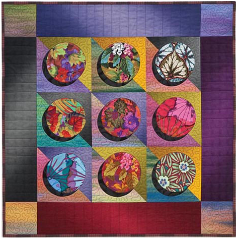
The terms value and intensity can be confusing at first. Value refers to the degree of lightness or darkness of color—for example, light, medium, or dark green. Intensity, on the other hand, is about how muted or brilliant a color is. Chartreuse is an intense green, while sage is a low-intensity green. Here's the catch: a green that is medium in value might be intense (brilliant) or low-intensity (dull.) If you're having trouble discerning the difference, first ask yourself, "Is it light or dark." Then, "Is it bright or dull."
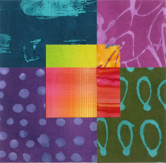
Let's look at ways to create these light effects. Luminosity is the illusion that light and warmth are coming from beneath the surface. I have a recipe for luminosity: When you surround a smaller area of medium-value, warm, intense color with a larger area of darker-value, cooler, less-intense color, the surface will appear to glow.
Like most recipes, you can play with the ingredients in a quilt or block. The medium, warm, intense fabrics can be a bit less intense. The darker, cooler, duller fabrics can be more medium in value, a little warmer, and a bit more intense. The result will be a soft glow.
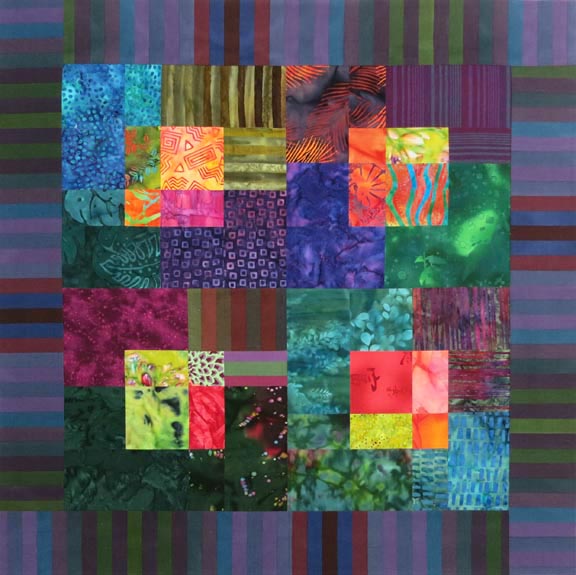
Here's a four-block example of luminosity. Note that several of the fabrics don't look that luminous. I think this example makes the point that slight variations keep a quilt from looking formulaic. Batiks, hand-dyes, and woven plaids are some of the most effective fabrics because they are dappled, or in the case of plaids, have shifts in color and value that make them look "alive."
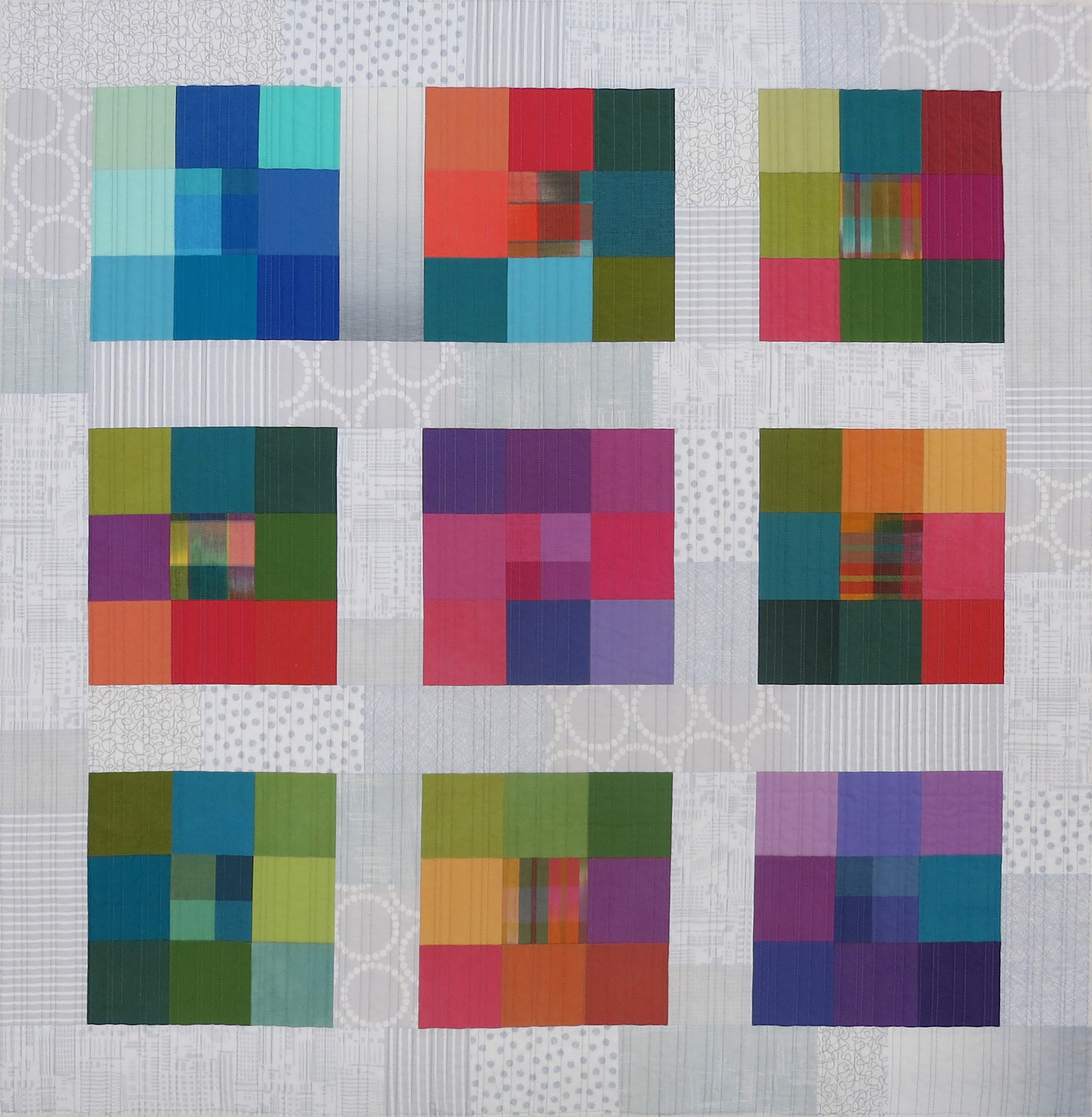
With luminosity, the glow comes from beneath the surface. With luster, the light source comes from above or from the side and appears to skip across the surface or give the surface a subtle sheen.
Value and intensity are at work in lustrous effects, too. The values must shift gradually, with no jarring jumps, and the intensities must be similar. In my "Color Modules" quilt (Modern Patchwork, Fall 2016) I used 12 different gray-and-white prints for the sashing to make it appear lustrous. The arrangement may look random, though in truth I only settled on the pieces after a lot of auditioning.
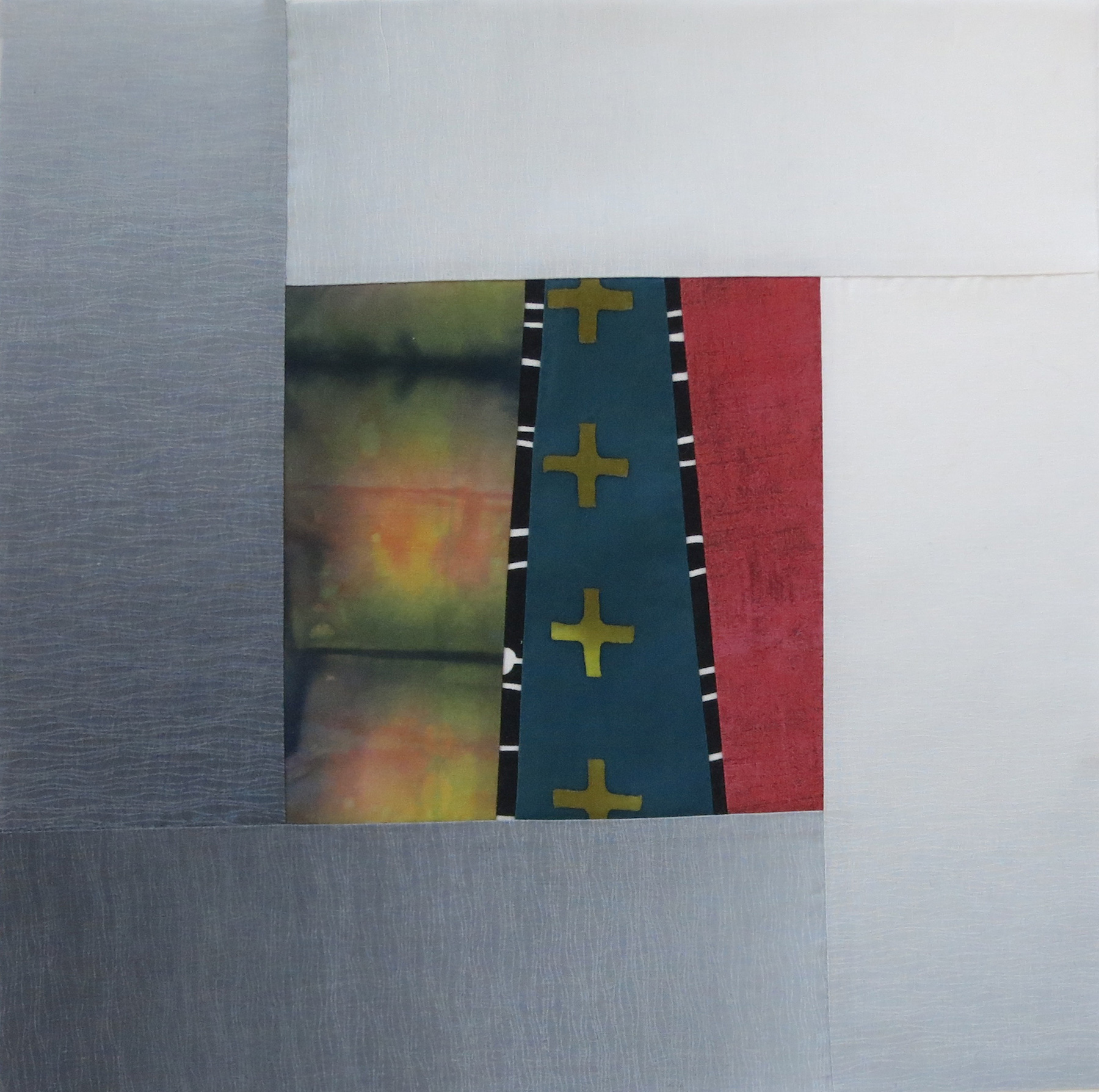
Ombré fabrics, with their gradual shifts in value and/or color, are a great cheat because they do the work for you. (Who doesn't love that?) In my "Urban Sunsets" quilt, the gray ombré strips surrounding the center units suggest a light source that starts in the upper right and flows to the lower left.
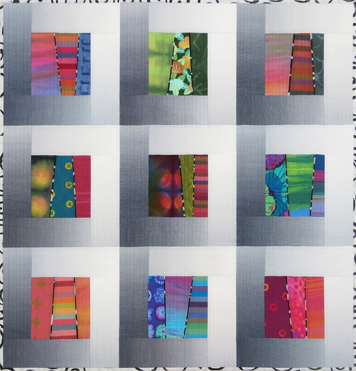
Take a look at this single block from the quilt: it has both luminosity in the center unit (from the hand-dyed fabric on the left) and luster in the ombré border. Two special effects in one block—that's a bargain!
Layered Transparency
by Christine Barnes
Of all the special effects possible with color, transparency is the one that intrigues everyone. Transparency assumes you can see through colors. One color may appear to lie on top of another, and where they cross, you see a mixture of the colors and their values. This effect is sometimes referred to as parent/child transparency.
There's another version of transparency, where a plane of transparent color seems to be suspended above or below another plane of color. I refer to that as layered transparency, as if there is an "overlay" of see-through color.
Here are a few tips for making layered transparency work:
• The values must vary enough so that the shapes separate. If the fabrics are too close in value, the pieces will blend into one flat surface, and you won't get a sense of layering.
• The colors must be roughly the same intensity. You can't create a convincing transparency with a mix of bright and dull colors—the contrast kills the illusion.
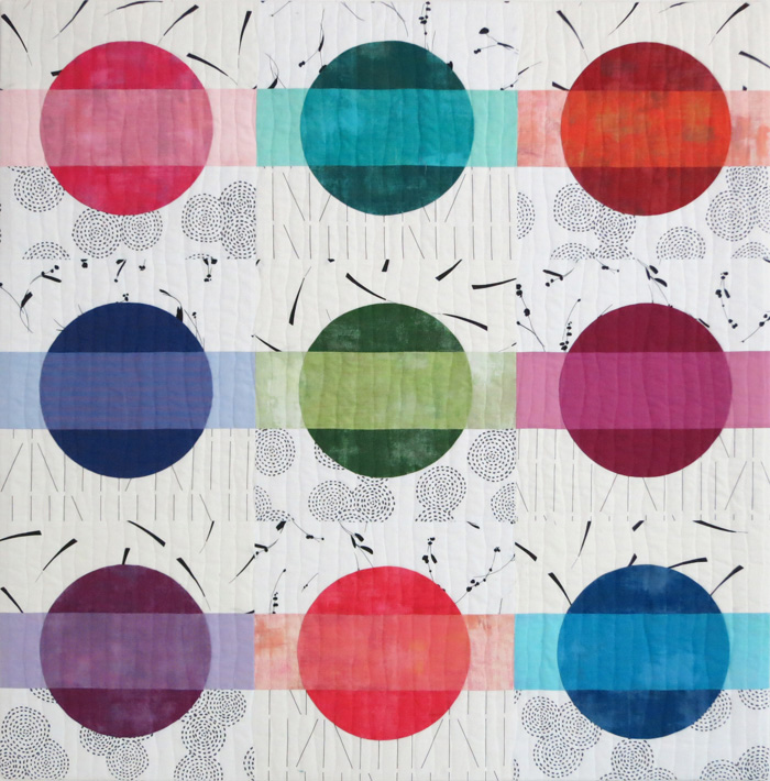
In "Pop Beads" (Modern Patchwork, Spring 2016) my goal was to suggest a horizontal band of light-value color above or below a large circle of dark-value color. Where the band intersects the circle, you see a medium-value version of the color.
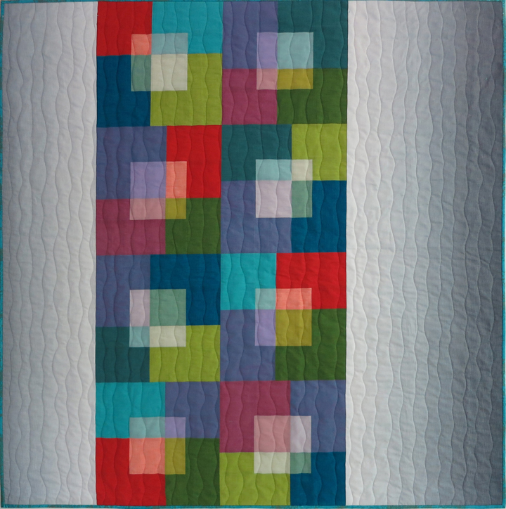
Layered transparency calls for two groups of fabrics: one lighter and one darker. The colors can vary a bit in value, as long as they look light overall as a group. The same is true of the darker colors; they can vary a bit in the degree of darkness. In my Transparent Squares" quilt (Modern Patchwork, Spring 2015), I used light and dark values of roughly the same colors. (However, in some blocks, the medium-light yellow-green functions as a light. In other blocks, the same fabric functions as the dark.)
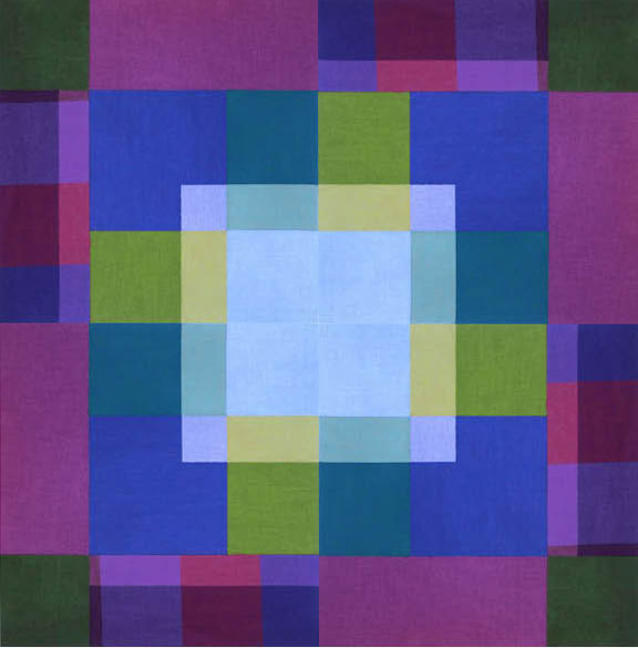
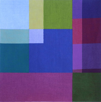
In this "Bit of Plaid" asymmetrical mock-block, the upper left corner appears to be on a different plane than the darker area. Note that the light colors are related to the dark colors they touch; that is, a lighter yellow-green is next to the darker yellow-green. When the light and dark colors are different values of the same or very similar color, the transparency is more convincing.
Asymmetrical block designs offer lots of opportunities for settings. Here, four of the blocks are set with the light-value areas toward the center. The result? A dramatic illusion of layered, transparent color.
Answers to last week's quiz:
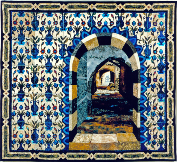
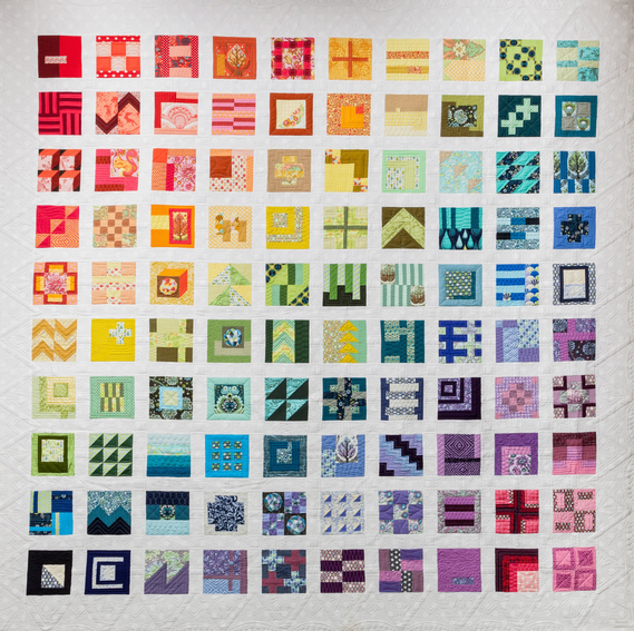
Emphasis - Week 38 Pattern/Repetition - Week 35
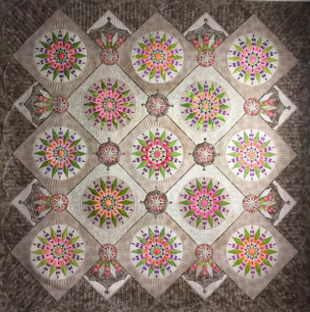
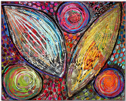
Symmetrical Balance - Week 32 Contrast - Week 43
Asymmetrical Balance - Week 33



.jpg)

RSS feed for comments to this post