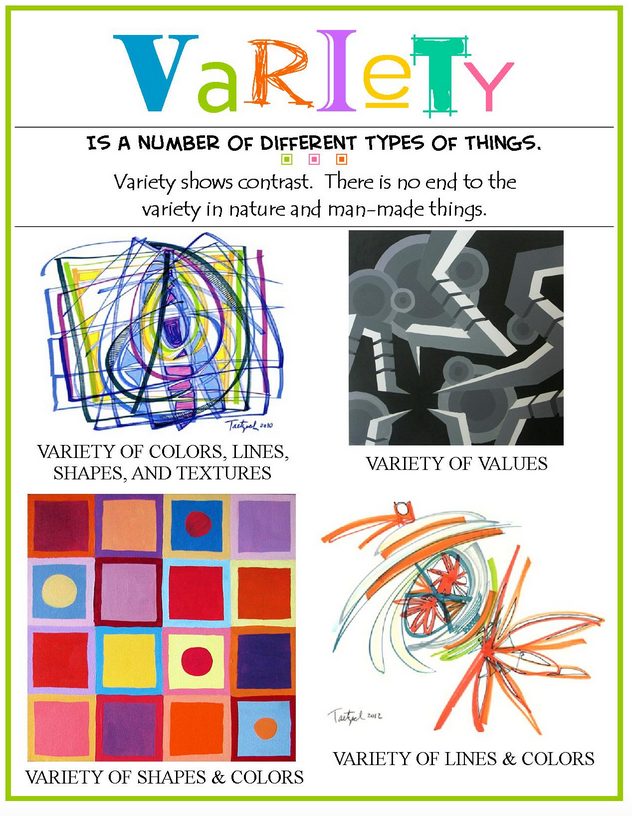
Last week in our Design to Quilt program, we focused on Unity. Unity can be thought of as everyone in a group working together. Unity represents calmness and order through repetition, either by shape or color. It can be achieved with pattern, color or theme. But, unity can also become somewhat boring if the elements, while being the same, are not different enough in some way. That is where variety helps to shake things up a bit for the viewer. Variety adds that bit of spice to a quilt without sacrificing the idea of the group working together as a whole.
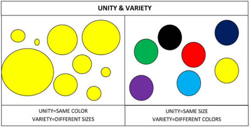
An easy way to remember is... Unity adds harmony; Variety adds interest.
In this example, notice how all of the circles on the left are the same color, but of different sizes, while in the area on the right, all of the circles are the same size, but a different color.
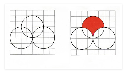
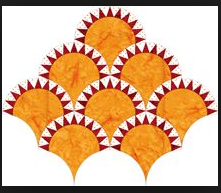
Not sure where to start? How about selecting a block that you'd love to see how far you can push the variety. Let's use the traditional clamshell block as the basis for a design to discover how much variety can be created from this element.
Group the clams into large units, creating a path around each set. How about adding a bit of edging or trim to each clam?
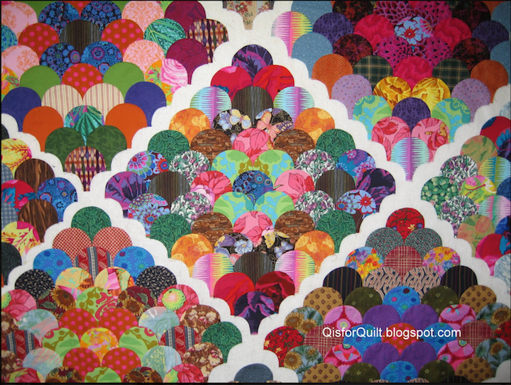

Build an entire landscape with only clams. Some clams serve as the background, while others the rolling hills.
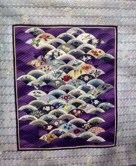
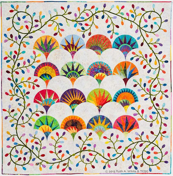
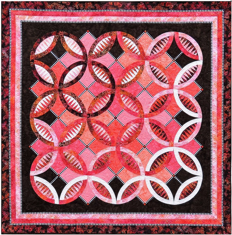
Add a pickle top to each clam for a bit of interest and a secondary pattern. Add a NY Beauty block to the mix.

Combine the two blocks with an appliqué border, or make an entire small art quilt with just four unique blocks.
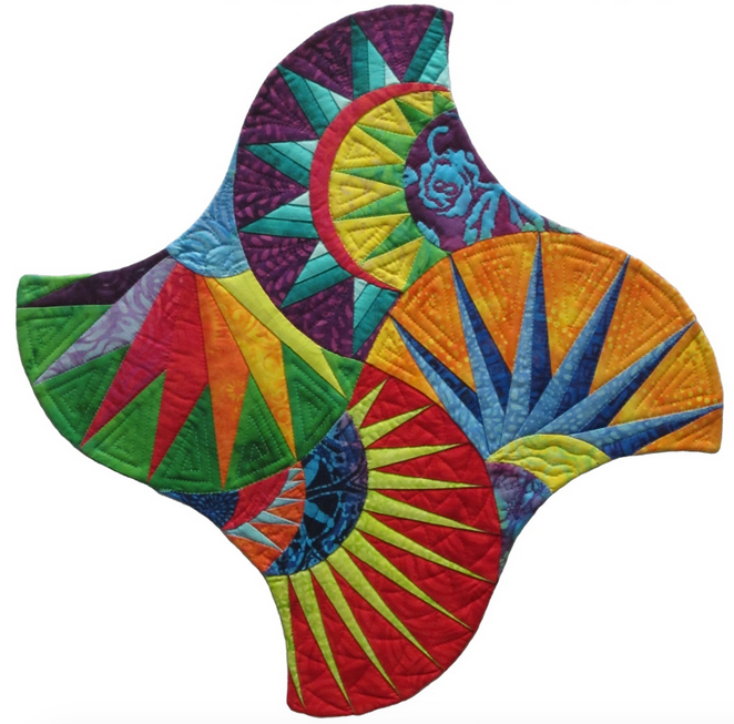
Make each and every clamshell unique. You get the idea, the possibilities are endless.
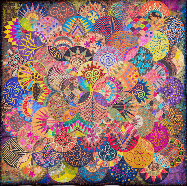

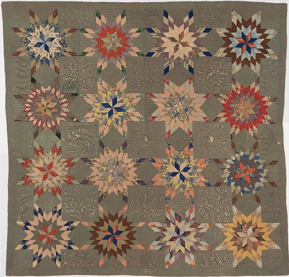
Now that you understand the ways that you can create interest using a group of elements, let's look at some excellent examples of quilts featuring Variety:
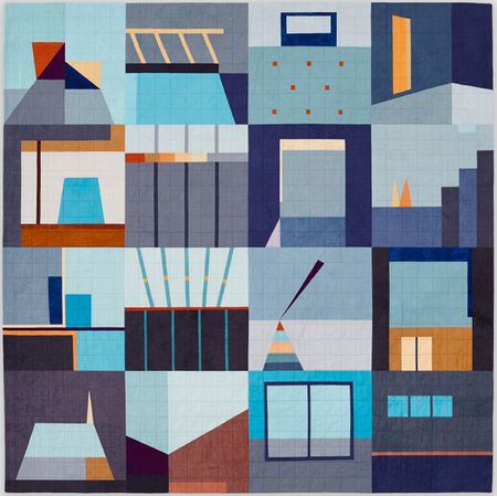

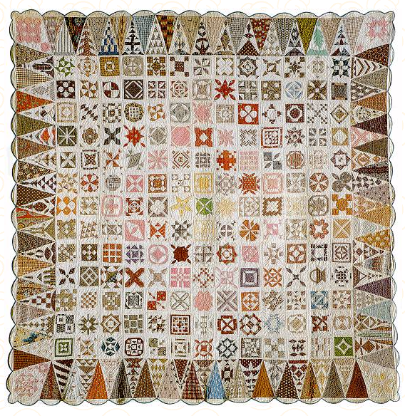
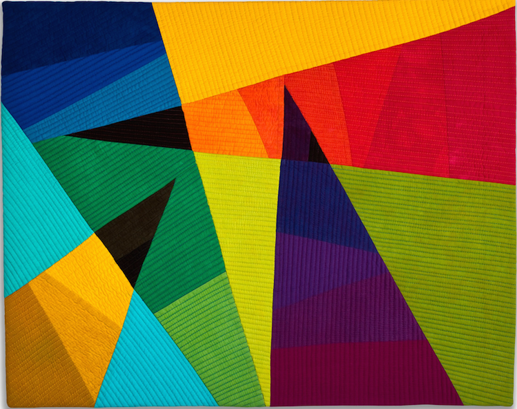
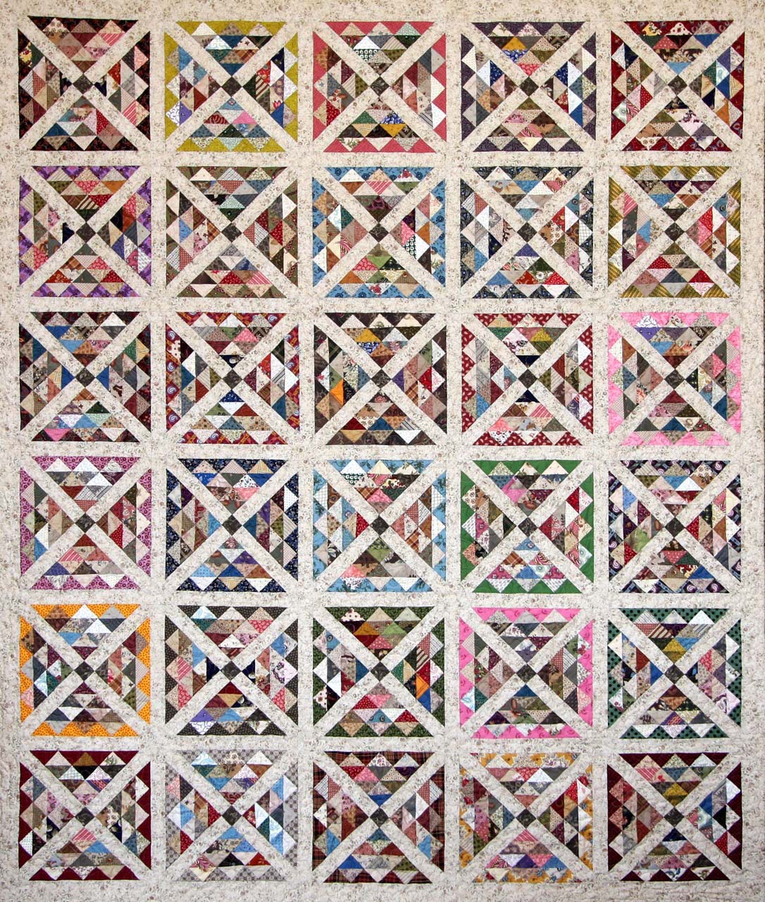

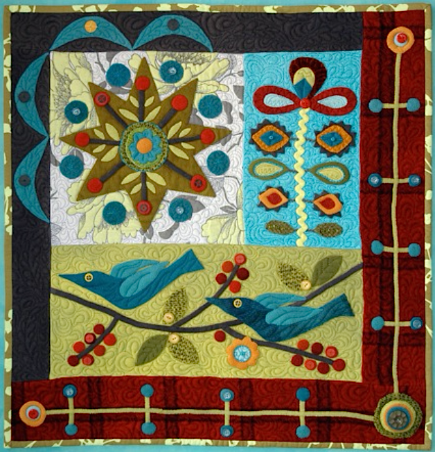
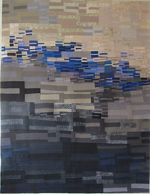

"Variety in Your Work"
by
Laura Wasilowski (Shows 303, 1009, and 2109)
If there is a recipe for creating artwork then there is an important ingredient to include. This ingredient spices up the design. It is variety. Variety takes a bland concoction and adds flavor using diverse motifs, colors, and pattern. By varying the shapes, colors, and placement of shapes in your artwork, you create lively and active designs.
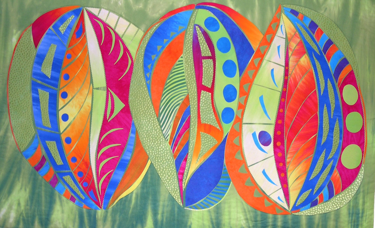
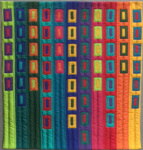
In Seedpods, the simple dot motif appears in various sizes. Large, medium, and small dots scatter across the surface carrying the eye from one side to the other. The stripped motifs also vary in size. Fine lines create narrowly striped fabrics and wide strips make bold stripes. By providing a mixture of motif sizes, energy is added to the piece.
Color also adds variety to artwork. Changing colors and color values in a composition keeps the eye active and searching for the next instance of that color. High contrast colors in Seedpods lift off the background while analogous colors recede into the background. This variety of colors choices push and pull the eye across the piece.
Another important ingredient of design is placement. Placement of shapes and colors adds a dynamic flow to a design. Placing shapes at different elevations is an effective way to lend action or movement to a piece. In Seedpods, dot shapes are placed at varying heights. Repeating colors at varying intervals across a piece also works the eye and gives energy to the artwork.
All this variety of size, color, and placement of shapes leads to unity. A variety of elements in a composition appeals to the eye but it achieves harmony or unity. Unity is a feeling that all the elements work together and form a whole piece of artwork.

In my quilt, Pretty Planet #10, the design principal of balance plays an important role. When elements in a design share equally in interest or visual weight, balance is achieved. The viewer’s eye travels the art work and senses the placement of the various design elements, giving the viewer a sense of harmony or balance within the artwork.
In the case of Pretty Planet #10, design elements like the houses and trees radiate evenly around a central point. This is radial balance. Radial balance is an easy design format to follow when making art work. By placing similar elements in a circular pattern the sense of a spinning wheel or rotating objects appears. In this case, the feeling of motion created by radial balance is also repeated in the circular shape of the quilt.
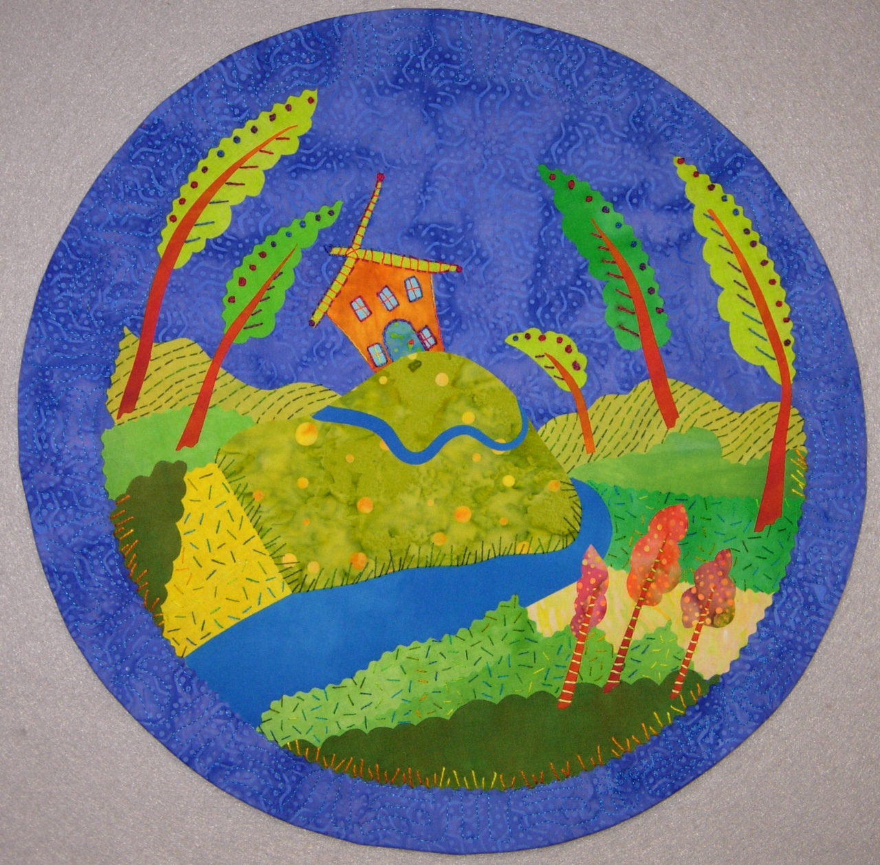
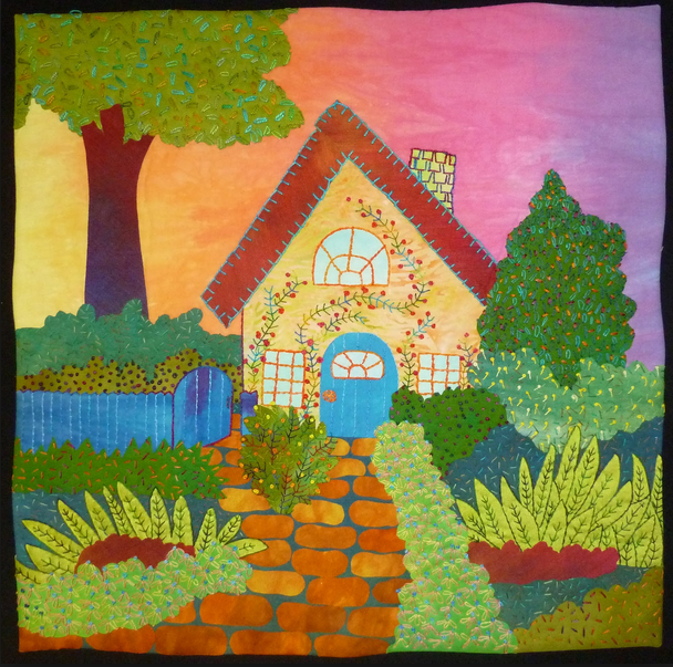
Pretty Planet # 3 is also a round quilt but there is no center point. Instead the disparate elements in this design are given equal visual weight or balance by their strategic placement on the background fabric. This is called asymmetric balance. Similar shapes, like the trees, are positioned at different angles to draw the viewer’s eye around the place. The darker green at the bottom of the quilt and orange trees add weight, balancing out the importance of the house shape.
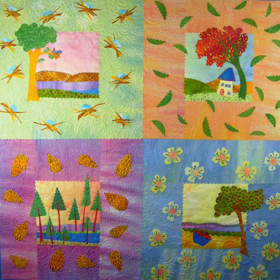
Arbor Day uses a traditional four-patch layout that reflects symmetrical balance. Symmetrical balance is also known as “formal” balance. When design elements are positioned on either side of a central axis or line, they have an equal visual weight. Even distribution of shapes and a layout of repeating horizontal and vertical lines are very common in traditional quilt compositions. This gives them a feeling of formality and calm balance.
Pay attention to balance while making a composition. The placement of elements, arrangement of shapes, and repetition of colors create balance. When making artwork, step back and look at the it with a critical eye. Do the elements share equally in visual weight? Is your eye continuously drawn around the piece? Does it feel in balance?
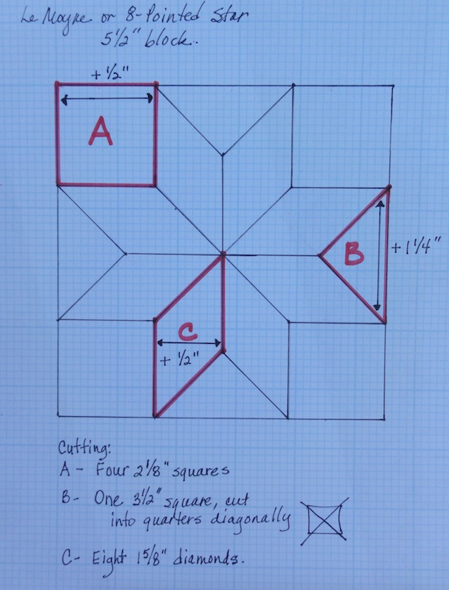
Practice Exercise: Using the 8 point star to create variety in a design
Using the 8 pointed star block, see how far you can push the variety. You can do this either by colored pencils, markers, etc. or with fabric.
Laura Nownes (Show 710) has a step by step approach for drafting the block yourself. Click here for the tutorial.


.jpg)

RSS feed for comments to this post