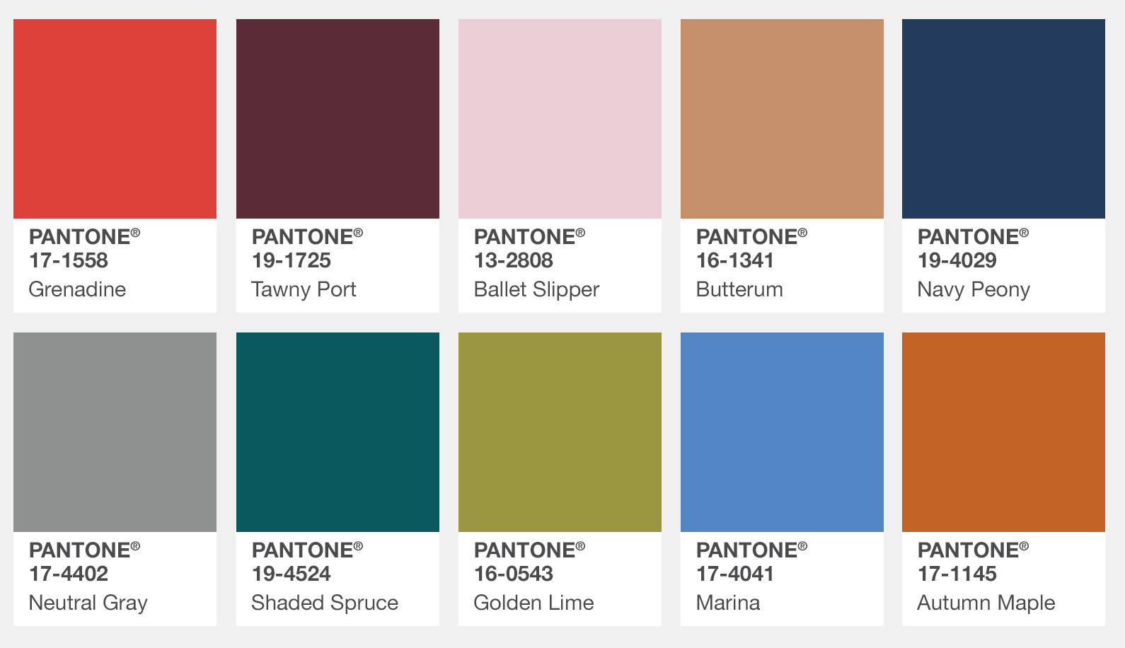
Did you know that every season PANTONE evaluates the colors shown by fashion designers in their shows during New York Fashion Week? They then use the information to create the PANTONE Fashion Color Report, where they highlight the top 10 colors in fashion for the upcoming season. Will you be wearing any of these colors this fall, or perhaps using them in your quilts?
Here's what they chose for fall 2017 for New York.
Click here to see what they say about the pallette and see what colors they choose for London.



.jpg)

I won't be using any of these. Too drab and lifeless!
I am starting to think that Pantone chooses the worst colors they can find and try to pass them off as the new "in" thing.
nope, nope, nope!
The ones chosen for London are more appealing to me. I tend to reach for cool tones, and happy tones.
"Golden Lime" should be renamed to Pea Soup
RSS feed for comments to this post