What is Form, and how does it differ from shape?
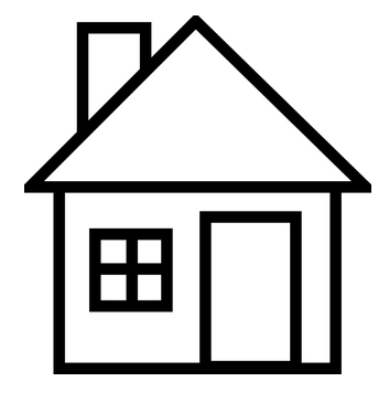
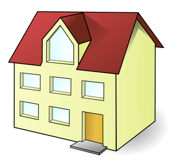
Form in the simplest terms is a three-dimensional figure (i.e. cube, sphere, cylinder, cone, etc.). Form has length, width, and height. Think of it as something you can pick up, set something on, or casts a shadow. Form can bear weight due to it being three-dimensional, while two-dimensional Shape cannot. Let's look at our basic house illustrations. The house on the left is the shape of a house, while the house on the right is the form of a house. The flat house on the left cannot be lifted, create a shadow, or have anything placed on it. The house on the right can be lifted, casts a shadow and, could support a chimney along the roof.
Let's look at a few excellent examples of form depicted in quilting:
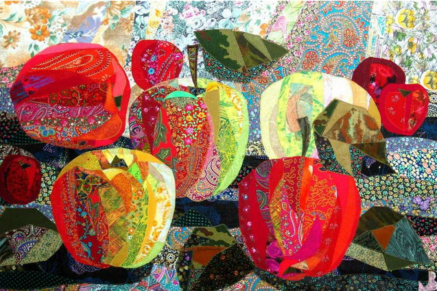
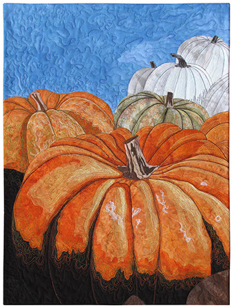
Notice the shadow created under each apple in Valentina's piece as if there is a light shining on them from the top right hand corner of the quilt. Susan Brubaker Knapp's (Show 1709) pumpkins seem to be pushing their way out of the quilt.

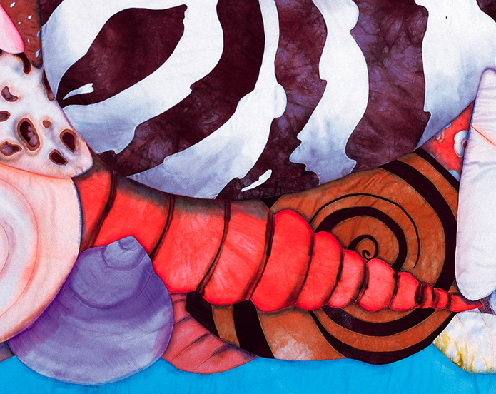
Velda Newman (Show 903), known for her oversized subject matter, expertly uses a combination of subtle hand painting and shading for this grouping of shells. But it is the machine stitching that emphasizes each shell's form and realistic hard edges.
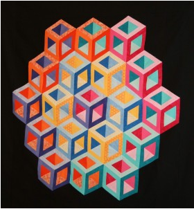
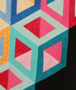
Upon closer inspection, each individual three-dimensional cube of Marci Baker's (Show 1810) Hollow Cube is actually constructed using a combination of diamonds and triangles.
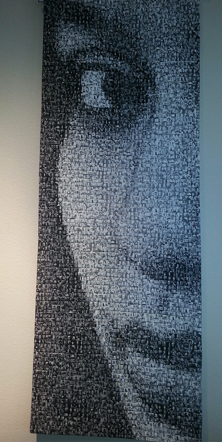
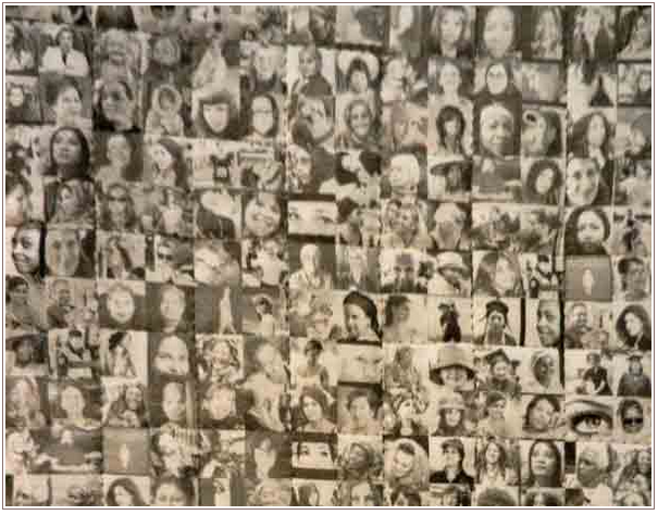 Using thousands of printed photos that finish at 1", fiber artist Deborah Langsam (Show 1710) creates a three-dimensional portrait entitled Every Woman.
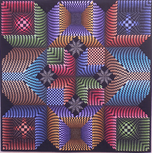
Understanding space and form allows the quilter to manipulate patterns to create stunning effects. British quilt artist Peter Hayward shares how his love of optical illusion led him to create a unique interwoven design that combines color, shape, and form using a traditional quilt pattern. The resulting Lone Star Explores Space is truly a fool-the-eye experience.
Creating Ilusion with color
By Peter Hayward
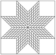
I began designing "Lone Star Explores Space" knowing that I wanted in some way to give the traditional lone star pattern a new 3D look. I am a big fan of the optical illusions that typified the Op-Art movement in general and the works of Victor Vasarely in particular. The key to success is the use of strongly contrasting lights and darks, that is what makes the shapes leap out at you.

I had already chosen the collection of ombre fabrics I knew I would need--it had to have a wide selection of pure colours with a slow and steady gradation. Though it might sound obvious, it is crucial for me to find fabrics I really like, to the point where I am actually prepared to modify my design a little to suit the requirements of the fabric if I have to. The collection was called "Pointillist Palette" by Debra Lunn and Michael Mrowka for Robert Kaufman
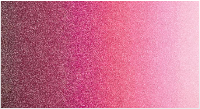
Though the next stage in the process is not one I am aware of anyone else doing it is the absolute key for my computer-free technique. I photocopy the fabrics and though the quality of these photocopies does not have to be great, it does incur a small expense. This is, however, a lot cheaper than cutting up your precious fabrics and then wishing you hadn´t!
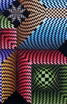
The basics behind the effect I am trying to create are relatively simple--the eye assumes that small and dark areas are further away than light and large ones. With this in mind I cut up the photocopies, stick the bits of paper back together and see what I think of the result. The early attempts almost always need several adjustments before I am happy that I am getting the maximum 3D effect in terms of the correct colour contrasts, both within an area and between neighboring areas. As a rule I like to place opposing colours next to each other to enhance the contrast.
At all times, however, it is important to bear in mind how you are actually going to make the quilt once it moves on from the design table. In my case, I had chosen to use interwoven strips of fabric, so there would be no point in coming up with some spectacular design that was incompatible with that technique of confection.
As well as contrast, my rather OCD mind enjoys symmetry and logic which means that once I find an effect I like, then I play around to achieve its opposite. Thus the orange and blue tubes that come out from the centre of the quilt are covered whilst the red and green ones are hollow. The left and right pyramids go up and up whilst the top and bottom ones start by coming up but then turn round and go back down. The spheres and crosses inside the corner boxes are actually made of identically shaped interwoven strips. The only difference is that the diagonal areas of the spheres are light whilst those of the crosses are dark.
The design process is actually my favourite so I don`t mind that it takes me a long time before I end up with a full size version in paper. In the case of Lone Star, out of the seven months, which the quilt took from start to finish, I spent a full two on design. But I think they were far and away the most important two.
Practice Exercises:
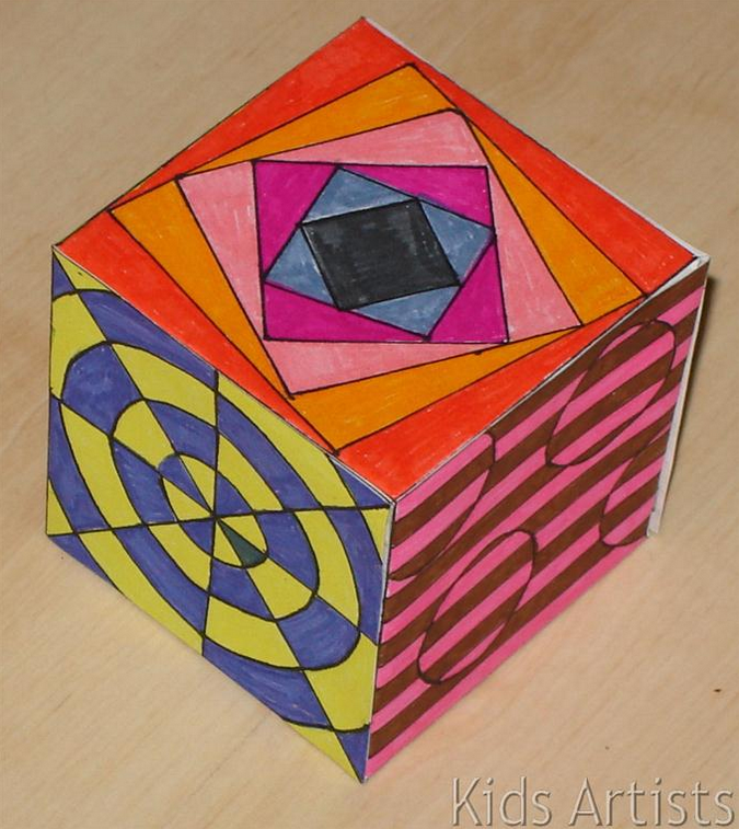
Op Art Cube:
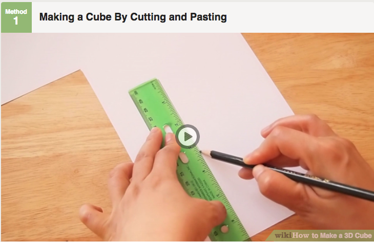
Print out a pdf template here or draw your own here.
Create a design for each area of the cube. Once completed, fold and glue together your cube. Make several to display.
Op Art Checkered Sphere:
Try your hand at making an optical illusion drawing following the instructions below.

Click here for more topics related to the Design to Quilt program.



.jpg)
