Cover 2 is ahead. Click on the button to see more of what people said.
Still need to vote? Just sign in and click below:
| Cover 1 or 2 | |
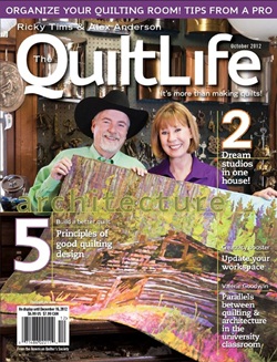
| 2 | I don't like the picture of Alex and Ricky as much, but I like how the articles inside are featured and I like the clearness of the quilt picture. |
| 2 | Much more eye-catching because of the brighter colors. |
| 2 | I like the fact that you can see the quilt and that all of the titles are on one side of the magazine cover. |
| 1 | Love number one, it's very Australian and that's what I am... |
| 2 | The 2nd cover is much more eye-catching! The top pix blends too much. I'd spot cover 2 a good ways away - it's striking. |
| 2 | has more "pop" and more eye catching- |
| 2 | 1 seems to just run, no definition. 2 is much clearer. |
| 1 | Love both covers it was a hard decision! |




.jpg)
