1. The blue quilt has more contrast.
2. Both great but the 2nd one highlights more info - love the magazine (it is cold here in Oz!)
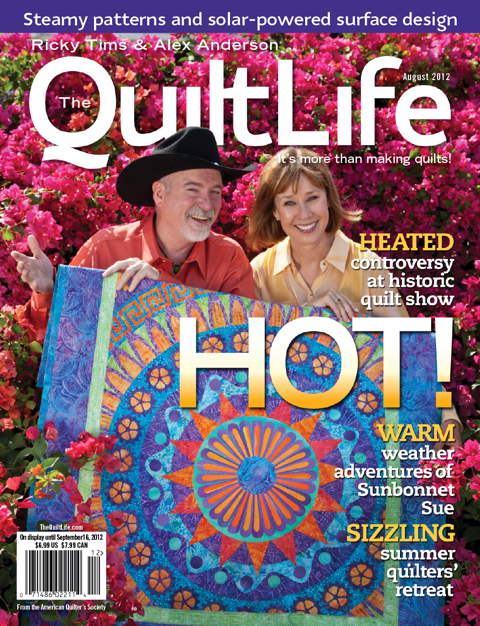
3. The quilt on Cover 2 is much more interesting and "HOT" looking than the top one.
4. I love them both, but for me the reds and pinks in the second cover clash a bit. The quilt on the first cover has an Africa feel to it, which also adds to the hot theme.
5. The second is much brighter and more inviting. The articles or features are much easier to read and therefore would make me want to buy it if I were interested in those articles!
6. I prefer the second one because it's very cheerful and colourful. It's simply more pleasant to look at too.
7. Though both quilts are beautiful, I like that cover 1 does not take up so much of the cover. Plus, I like the photos of Ricky and Alex better on cover 1 than on cover 2
8. I like the quilt in #2 better, but visually I like #1 better for the cover
9. #2 is much more colorful than cover #1--I think it would attract more readers
10. Love both of the quilts however cover 2 is more eye catching.
11. Are you kidding? The 1st photo looks like it was professionally staged, Alex's hair looks good and the location of the quilt doesn't look like they are pulling the covers up! The only thing I like better about the 2nd image is the type face and color of what's inside.





.jpg)
