 5
5
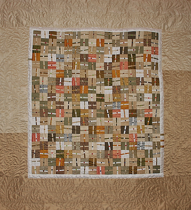
If you have been following along in our year-long design series, you know how important a role color AND value play, often key, to creating a successful quilt. Armed with that fundamental knowledge, YOU, as the artist can use color/value as a design tool to share an unwritten message with the viewer.
The use of color/value and the reaction one has to it is very personal. Ask five stangers at a quilt show how they feel about the colors selected for a particular quilt, and you will most likely receive five very different reactions. Color/value and the reaction it evokes in an individual is shaped by a person's experience, their own feelings, or cultural beliefs.
Take the color white for example. In Western countries it represents lightness, purity and innocence. Brides traditionally wear white for their wedding. However, in Eastern countries, such as Japan, it is the color traditionally worn for mourning.
What colors/values you select for a quilt is up to you and might not be of concern. But let's say you are planning to design a quilt for an auction or show in another country. The selection of colors/values might come into play with regard to the response you might receive from those viewing your work. Below are a few basic meanings associated with colors from Smashingmagazine:
-
Red: Passion, Love, Anger (mourning in South Africa, wedding color in China)
-
Orange: Energy, Happiness, Vitality
-
Yellow: Happiness, Hope, Deceit (mourning in Egypt, courage in Japan)
-
Green: New Beginnings, Abundance, Nature
-
Blue: Calm, Responsible, Sadness
-
Purple: Creativity, Royalty, Wealth (mourning in Thailand)
-
Black: Mystery, Elegance, Evil
-
Gray: Moody, Conservative, Formality (mourning in Western countries)
-
White: Purity, Cleanliness, Virtue
-
Brown: Nature, Wholesomeness, Dependability
-
Tan or Beige: Conservative, Piety, Dull
-
Cream or Ivory: Calm, Elegant, Purity
If your desire is to step outside your comfort zone to begin playing with color/value, by all means, do so. Begin with small, manageable pieces to help build confidence before jumping into larger work. But, as with any new skill, there is a formula to follow.

Let's look at the two adorable puppies by Nancy Brown (Show 701) for inspiration. The puppy on the right is blue-violet. Have you ever actually seen a blue-violet puppy? Probably not. But, you know it is a puppy because all of the required elements that make up the shape of the dog are correct (i.e. head, muzzle, ears).
It is the correct execution of the shape of the puppy on the right that makes your brain recognize it as a puppy, even though the color/value is not what is associated with actual puppies.
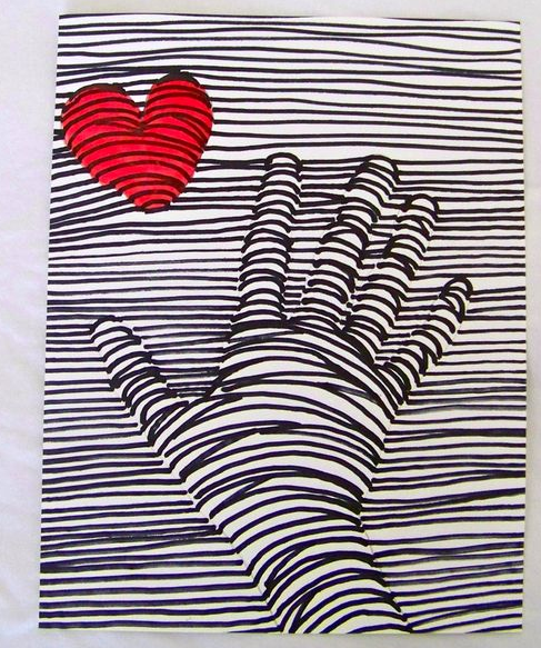
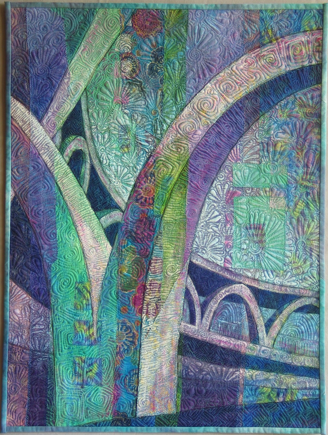
Remember the exercise Using Line to Create Form in the lesson on line? Did you opt to add more color to the drawing? Did your hand still look believable, even though it may have been colored in 'non-skin tone' colors. It is because the shape of the heart and hand is correct. The same is true for Hong Kong Arches by Linda Cline.
So, if the shape is correct and believable, it doesn't matter what color the object is. That's the key! As an artist pushing the envelope to play with color and value in unexpected ways, you are no longer bound by rules requiring that everything (including color/value) be realistic. You are in control. The world is your oyster!
Let's look at some examples of quilts featuring color/value used in effective and unexpected ways:
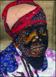
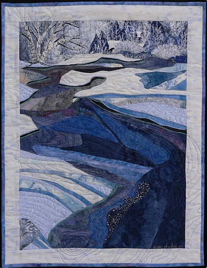


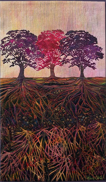
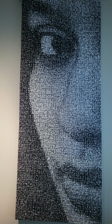
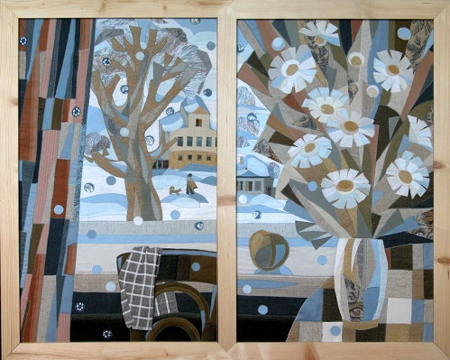
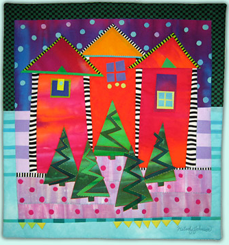
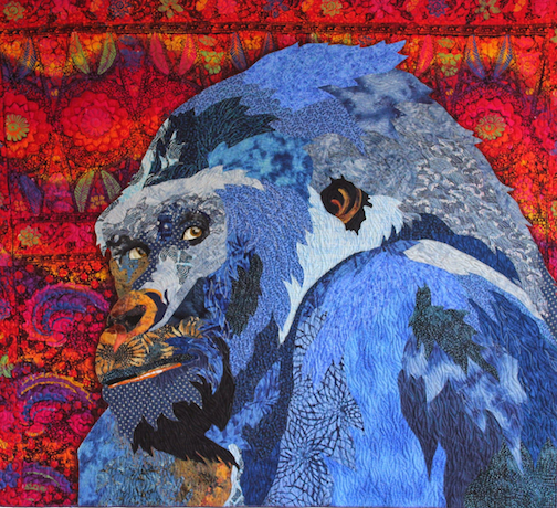
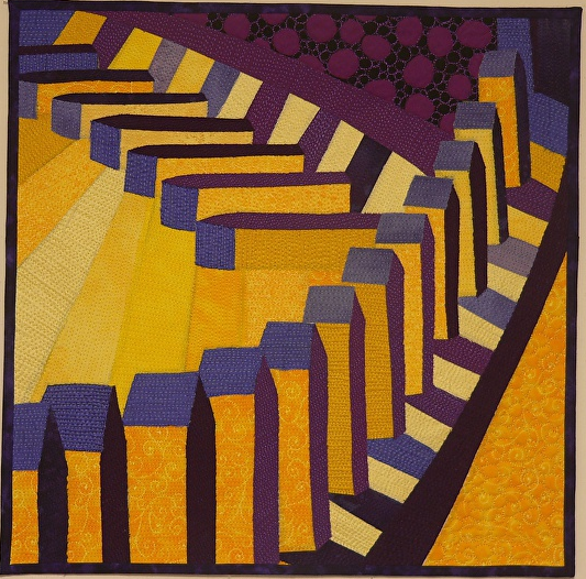

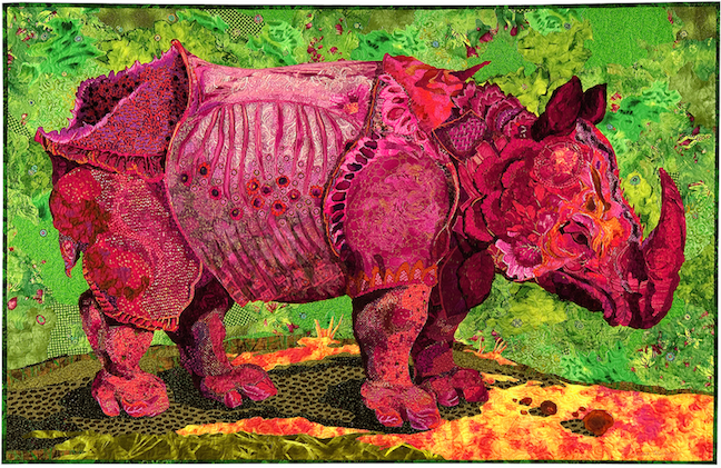
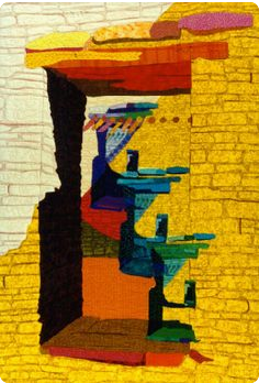
Michelle Jackson (Show 1002) considers herself to be an artist who uses fabric the way others use paint. "I have chosen fabric with its warm and tactile nature, already fashioned in color, pattern and texture. It’s my job as an artist to cut and position fabric pieces to capture a moment in time and experience that speaks to the viewer." Michelle shares her approach for manipulating color/value.
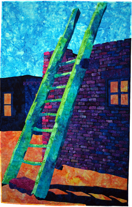
Value and Color Manipulation
By Michelle Jackson (Show 1002)
www.quiltfashions.com
Value is the salt and pepper of life. Without it, life would be very bland and uninteresting. When we learn as artists to use and manipulate it well, we can make pieces that sparkle with life and create moods that help our viewers not only see, but feel something that lasts beyond just viewing the piece. Have you ever seen a piece that you just can’t get out of your mind, or one that you aren’t satisfied with looking at only once; you must go back to see it again? For me, those are always pieces that successfully and dramatically use value.
Just What is Value?
Very simply value is the lightness or darkness of a particular color, but sometimes color gets in the way. Value can be easier understood if we take a color photo and make it black and white. This is very easily done these days with the photos taken with our cell phones. With all the color gone we can easily see lights, mediums and darks from white all the way though the greys to black. If we step back a bit you will see the places your eye is most drawn to are the places of highest contrast; where black meets white. These places or shapes will appear more defined. Now that we know this we can make this happen in areas of our piece to draw the eye there and perhaps lesson the contrast in other areas to minimize attention. See illustration 1.

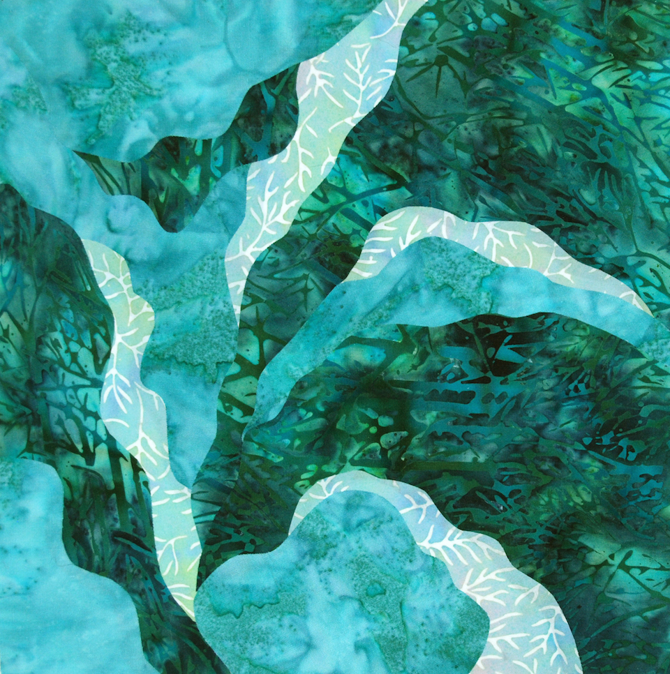
These are two small quilts with identical pieces. Each piece has a light, medium and dark. Notice the shapes of the pieces are much more predominant in the pieces of higher contrast or greatest light to dark.
Manipulating Value
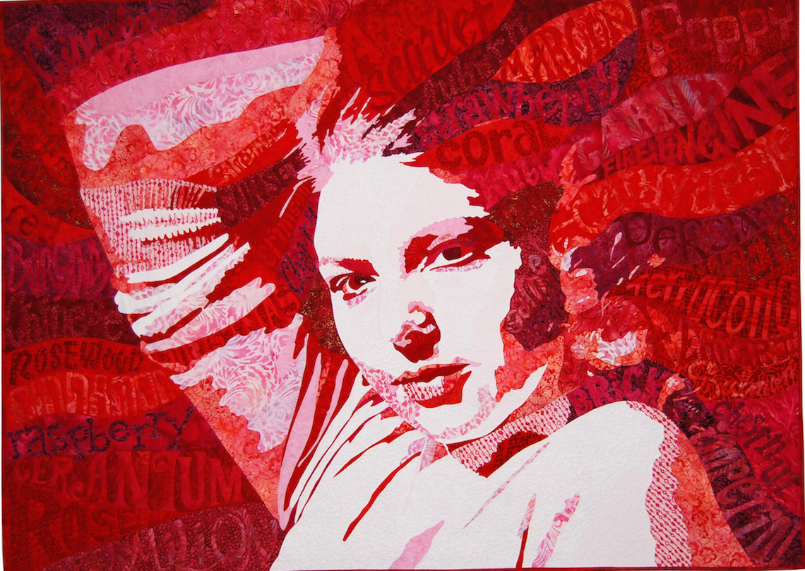

Always remember you are the artist. Things don’t have to stay exactly how they appear in your photo. For example: White doesn’t have to stay white, it can have color, but it needs to remain the lightest in relationship to your other value choices and black does not have to be black, but it should remain the darkest chosen value. All the medium values are up for grabs. You can shift everything to the lighter side or the darker side to help create the mood you want. Remember as you make these choices that the places of highest contrast will draw the eye to those parts of your piece. The more you manipulate and play with changing these medium values the better you will get at “seasoning” your pieces and making them more interesting to the viewer.
Let’s Manipulate Color
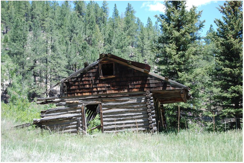

If you can see what is in your black and white photo, then you can change or add any color and you will still be able to see the image. Who said the sky needs to be blue or the grass green? A tree will still look like a tree if it is orange. A hand will always look like a hand even if it’s violet. Art is all about telling your story and revealing what isn’t seen; a feeling.

Colors have their own language. What does a red hand say that is different than a hand done in green or in blue? Red can mean anger or passion. Blue is calm and melancholy. Our money is green and we talk about a having a green thumb. Simply changing the color of a hand can give it a different meaning. The more you learn about color the easier it will be to tell your story in color.
www.quiltfashions.com
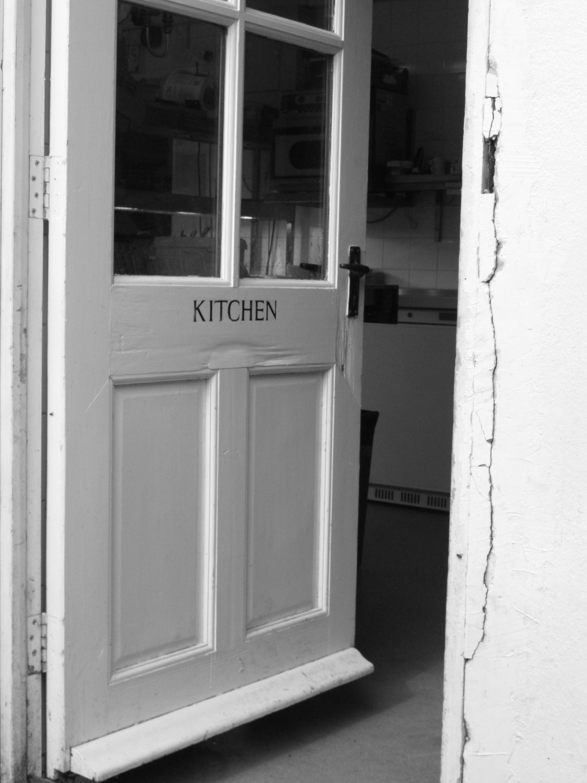
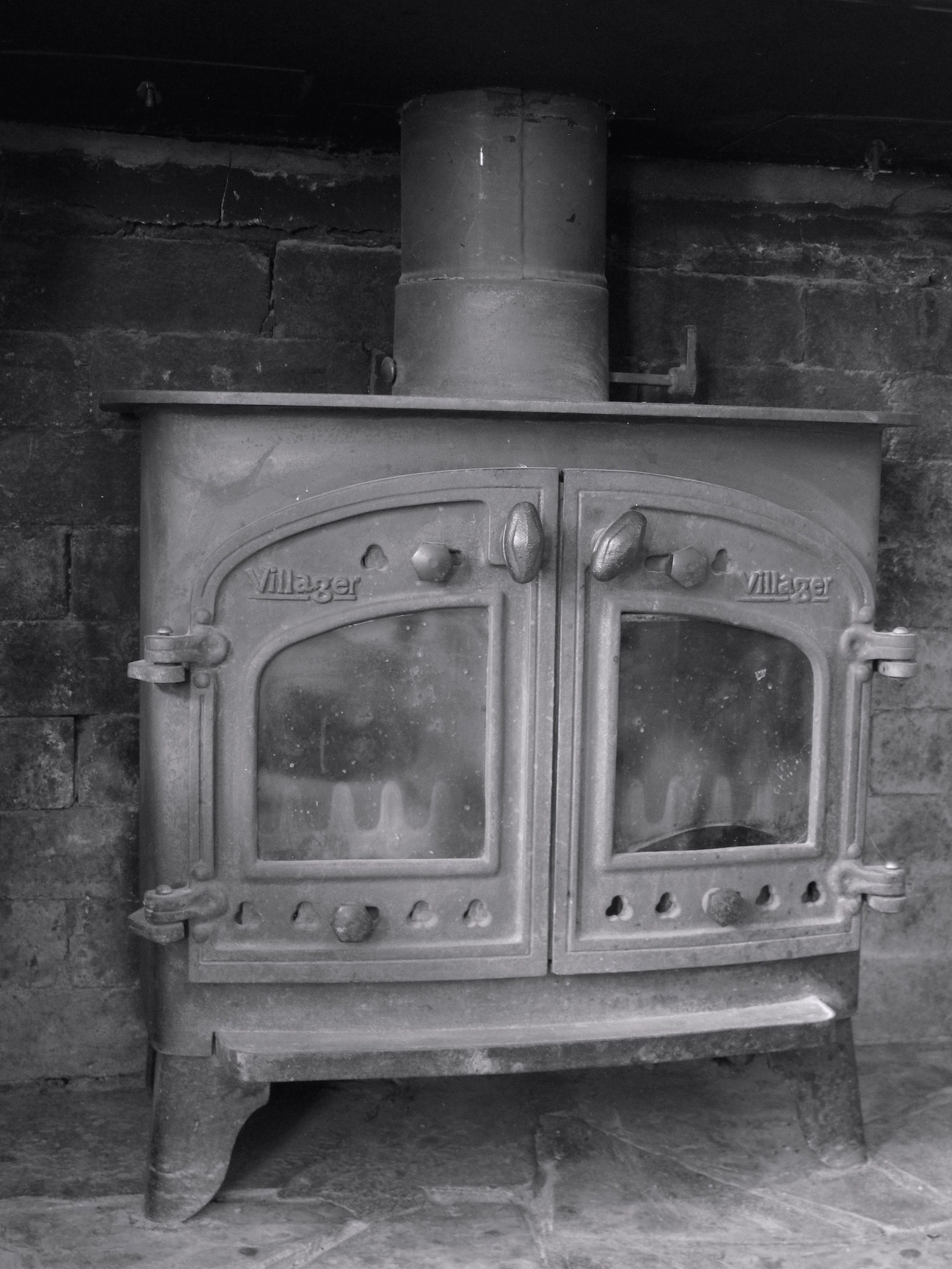

Practice Exercise: Manipulating Color/Value
Supplies:
Colored pencils in a wide range of colors/values
White copy paper
Clear Sheet protectors
Fine permanent marker (such as Sharpie)
1. Select any one of the three images above (Stove, Doorway, Sandals). Click here to download images.
2. Cover image with a clear sheet protector. Using a fine black permanent marker, trace major areas of the image. Star Members can see Michelle demo this step in Chapter 3 of her show (1002).
3. Insert a sheet of plain white paper inside the sheet protector to reveal your traced pattern more clearly. Keeping the white paper inside of the page protector, make several copies of your traced design. These copies become practice your worksheets.
4. Using colored pencils in a wide range of colors/values, markers, etc. try out various 'unusual' color/value combinations on each of the worksheets to see your results.


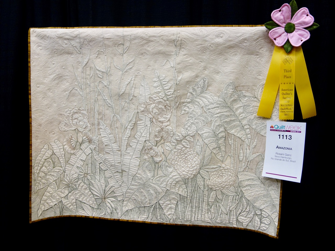
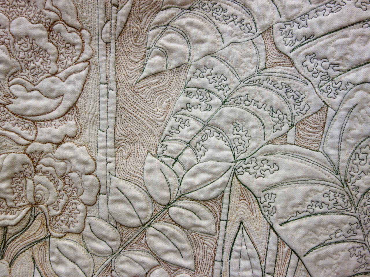







.jpg)
