 10
10


This week in our Design to Quilt Program, we begin our transition from Elements of Design to Principles of Design. Principles of Design include balance, contrast, movement, rhythm, emphasis, pattern/repetition as well as unity/variety.
Let's use the example of you have a special celebration coming up and would like to make a special dessert for the event. The cake you have selected is an Italian Lemon Olive Oil Cake with Berries and Marscapone. The Elements are the ingredients that you will need (i.e. flour, olive oil, eggs, marscapone, lemon curd) to make this decadent delight. This cake is quite involved as it requires that you do a number of additional steps before the cake is actually assembled (i.e. making blueberry sauce, the lemon curd and marscapone filling).
The Principles are the instructions that you will follow so that the resulting spectacular cake has depth, interesting flavor combinations which is something your guests will find attractive, tasty and very memorable. These same principle holds true for your quilt work. You as the designer should be striving to create a piece that holds the viewers interest by incorporating all, if not most, of the elements.
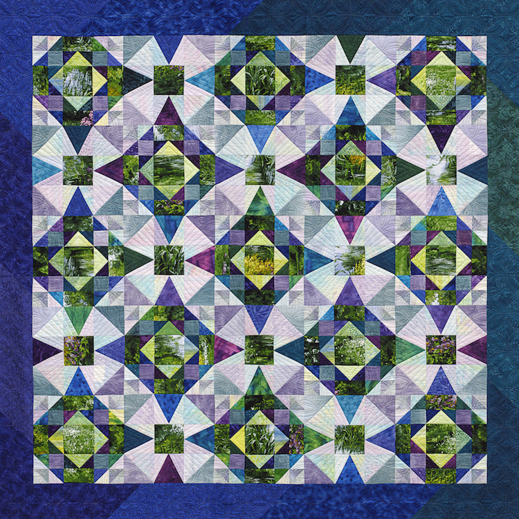
Let's begin with Balance, which is a visual arrangement of elements (color, texture, space, etc.) to create a sense of stability and calm. As in the example above balance can be horizontal, vertical, symmetrical, asymmetrical and radial. Let's look at some examples when it comes to quilts:
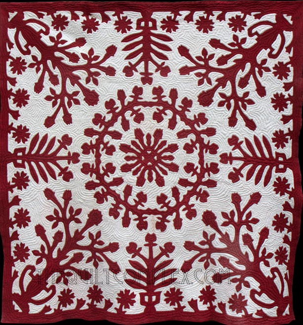
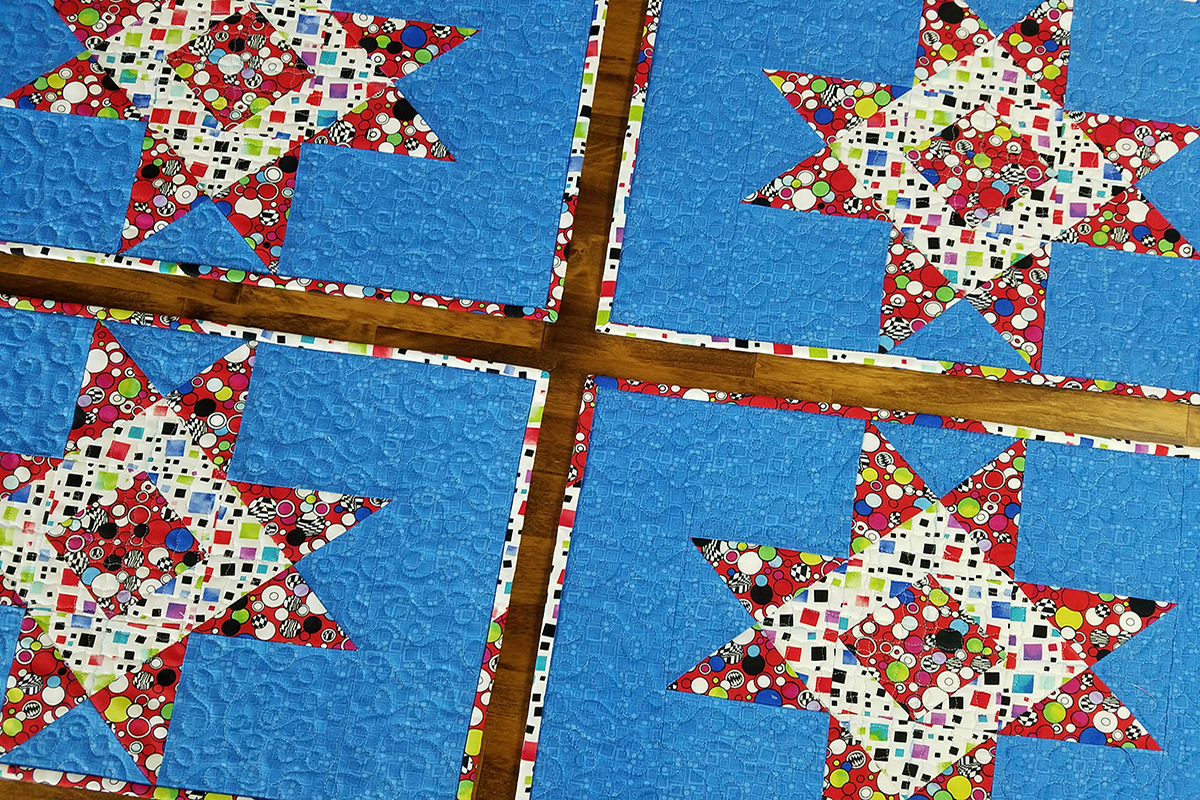
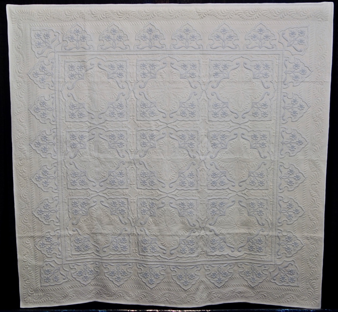
Symmetrical-
This formal arrangement creates a sense of calm and stability

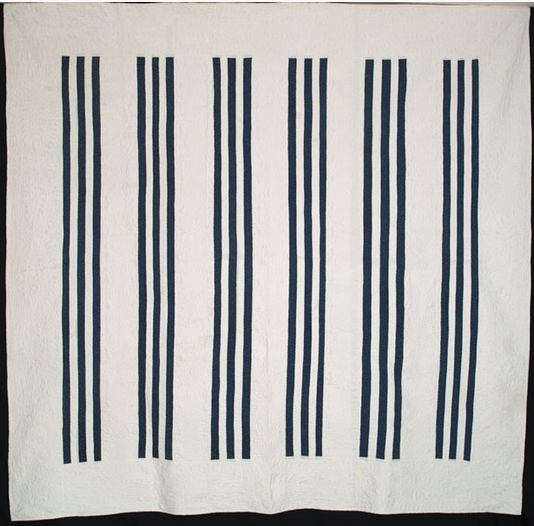
Vertical-
This arrangement creates a sense of strength power, dignity, grandeur, authority.
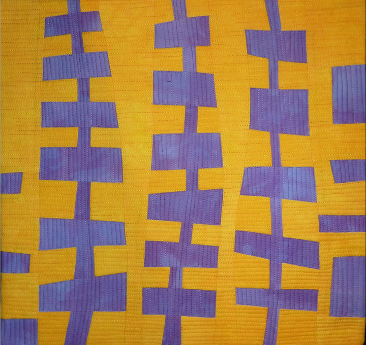
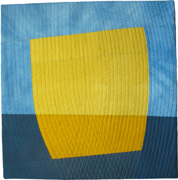
Horizontal-
This arrangement expresses a sense of calm, relaxed, balanced, stability and constancy.
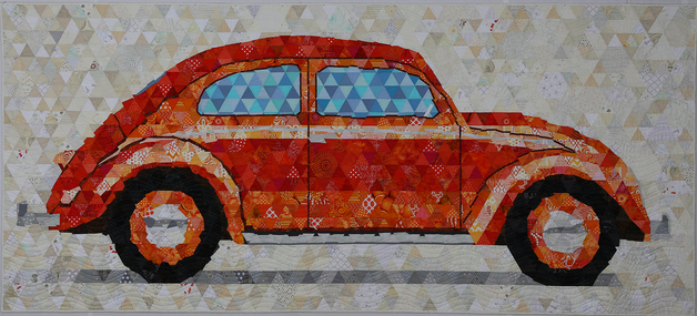
Radial-
Designs radiate out from the center. All of the elements lead your eye towards the center. The quilt on the right is a combination of radial and symmetrical.

Asymmetrical-
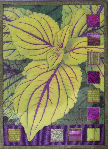
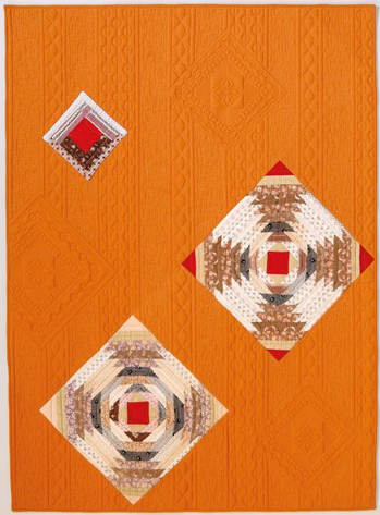
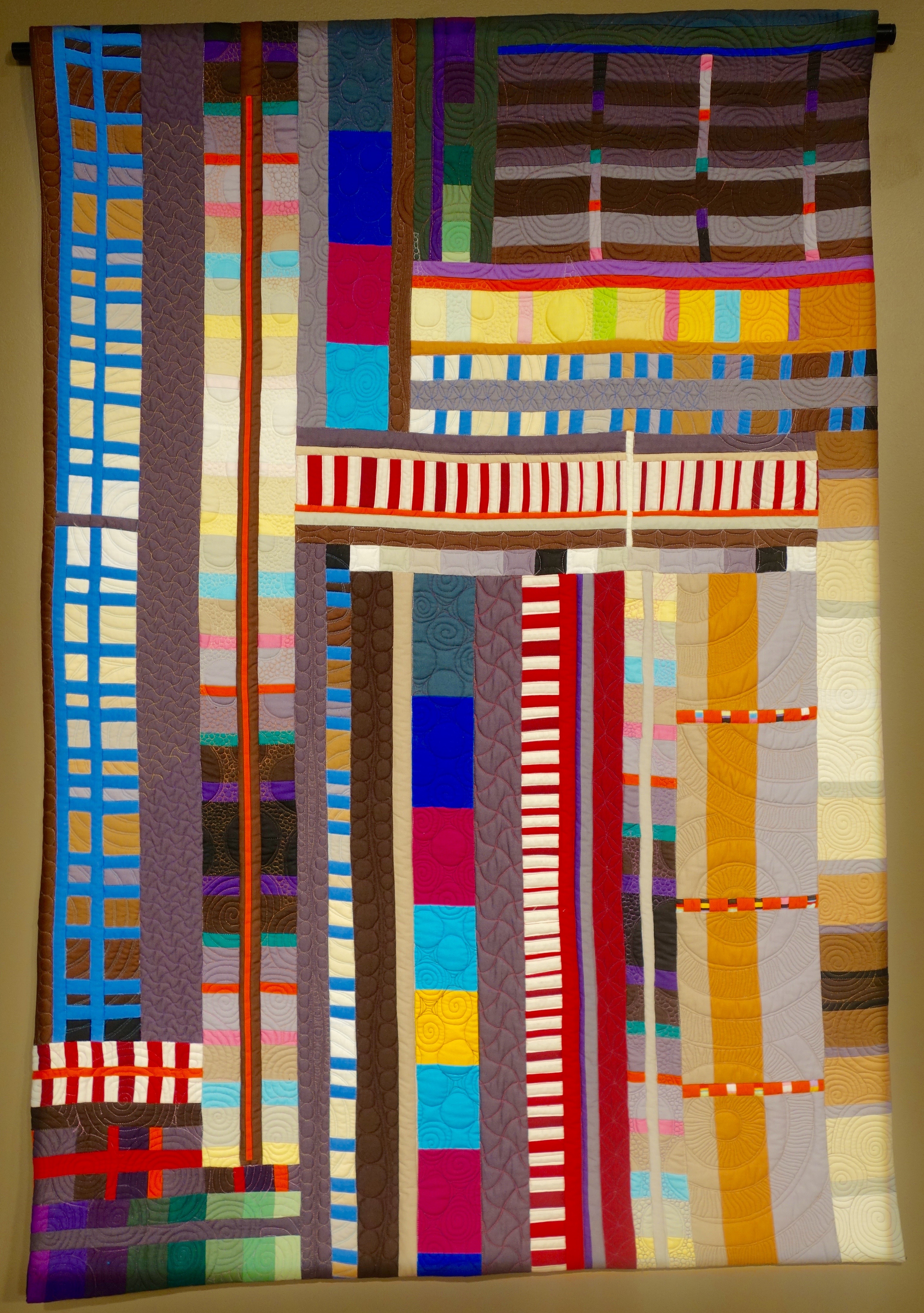
This informal arrangement involves the use of several smaller elements to balance out the one larger. While it may appear easy, it requires the artist pay close attention so that some elements don't look as though they are falling off the page. In Coleus 2 the small squares along the side and bottom balance out the large Coleus leaf. In Ojo de Dios quilt (on the right) notice how she included two sizes of quilted blocks to balance out the three actual pieced blocks.
Award winning quilt artist Susan Cleveland Shows (109 & 1001) shares her approach to balance when it comes to capturing a viewers interest in a quilt.
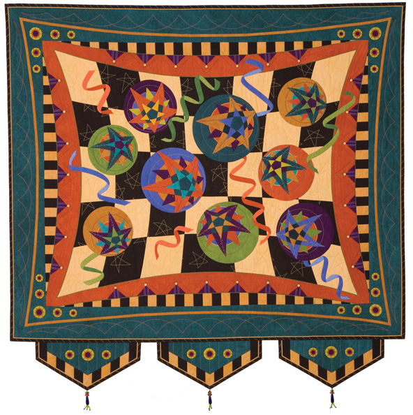
Balance
by Susan K Cleveland | www.PiecesBeWithYou.com
I might approach design a bit differently than others since my degree is not in art or design. I started with very little confidence and talent, but a great deal of passion. In grade school and high school, my grades in art classes were based on my enthusiasm and effort and I was fortunate that my little art ego wasn't squashed! My design knowledge has developed as my confidence in quilting has grown.
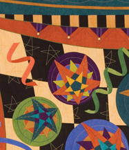
I like certain elements of my quilts to be noticed from a distance and other elements to be discovered from up close. As I design, I start with major elements (stars or flowers) and place them so that they are distributed somewhat evenly. I don't want one part of the quilt to be visually heavier than another. If a quilt has rows of blocks, I distribute color so the zinger(s) are sprinkled throughout the quilt … but not too evenly spaced. Elements do not need to be perfectly spaced or symmetrical to have balance. It’s all about appealing to the eye. Placing attention-getting pieces diagonally from one another adds movement to a design and causes the eye to travel. After major elements are in place, I scatter details that will only be noticed from up close.
I think it's wise to design with your talent and preferences in mind. Background quilting is my nemesis so I design with little background space. I’m particularly fond of borders, so I plan to have multiple. Mixing applique and piecing makes for an interesting design balance of curves and linear elements. Maybe that's why pieced blocks surrounded by curvy applique appeals to so many!
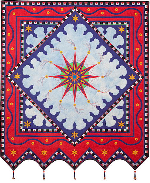
I like a balance of wacky and "buttoned up" so often if the center of my quilt is wackadoodle, I design a geometric border of stripes and/or triangles. The reverse is also true.

As my design sense grows, I'm finding I really love adding surprises after I think the base of my design is set. These surprises have helped balance areas where a little something is needed and have added a tremendous.






.jpg)
