 9
9
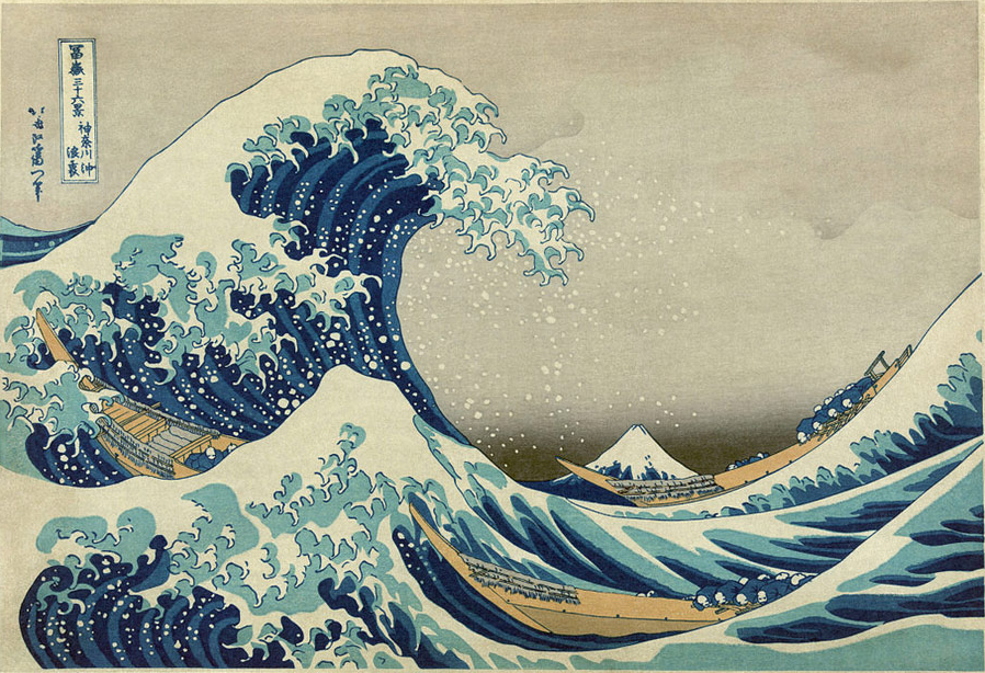
This week, we continue our focus on Asymmetrical Balance, where the visual arrangement of elements (color, texture, space, etc.) is balanced, but with a more energetic and exciting feeling.
Let's look at the example The Great Wave off Kanagawa by Katsushika Hokusai (1829-1832). Both the enormous waves on the left and the opposing undulating sea use almost the same amount of space in the image. This arrangement of two sides that are similiar, in this case water, but not exactly the same, creates a sense of balance and interest.
Asymmetrical balance can be achieved using a number of different methods
- Place objects directly opposite each other in a composition
- Place lighter colors higher than darker colors in a composition
- Emphasize motion to move the eye along across your composition
- Introduce a pop of color
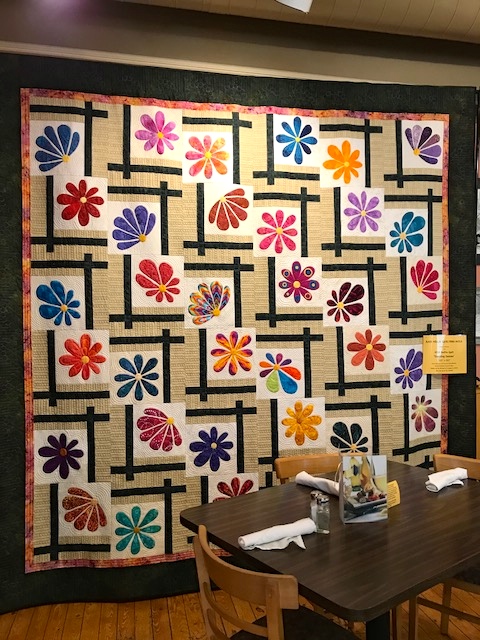
Let's look at some excellent quilt examples featuring these principles:
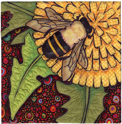
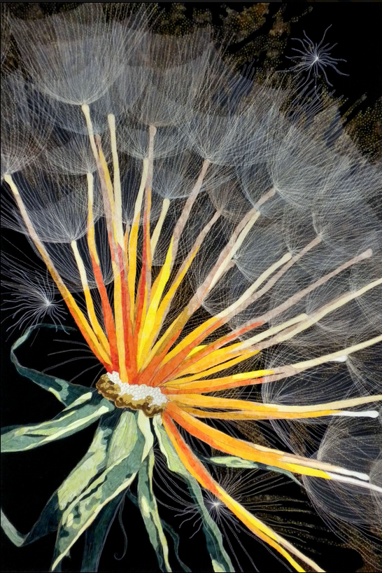
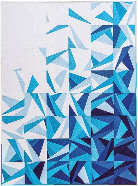
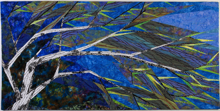
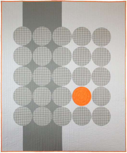
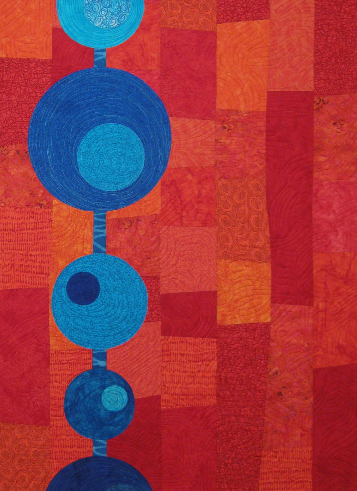
Fiber artist Linda Beach (Show 1409) is known for translating naturescapes into stunning quilted works of art. From sketch to finished work, Linda's works evoke feelings that transport you along her magical journey.
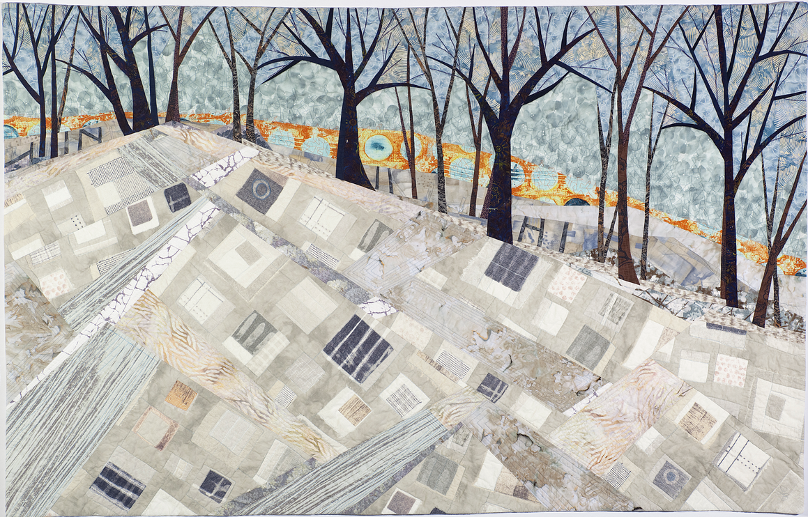
Asymmetrical Balance
by Linda Beach (Show 1409)
Asymmetrical balance can be defined as when elements on either side of a composition do not reflect one another, as opposed to symmetrical balance where elements on each side of a composition mirror each other or closely match. When you are using asymmetrical balance in a composition, you want to make sure that the visual weight of the work balances even though the actual elements do not mirror each other. While a composition with asymmetrical balance may not be as easy to design as a symmetrical one, it can often be much more visually interesting. Many times something more complex and dynamic is created as a result of the visual tension when asymmetrical balance is used.
So how do you achieve asymmetrical balance? Understanding visual weight is important. Which leads to the next question of what is visual weight? My favorite definition of visual weight is the ability of an area or element of art within a composition to draw attention to itself. Some of the ways to direct a viewers’ attention to an area include the use of color, value contrast, line or shape.

In my piece Marking Time I used asymmetrical balance in the composition because I wanted to convey the feel of the immense open space of the rolling hills or prairie as the setting for an old, abandoned farmhouse. The landscape needed to have a large presence to give that sense of endless space even though my focal point was going to be the farmhouse in the grove of trees. With that in mind, I needed to find a way to make the landscape compelling and interesting but not so that it overwhelmed the farmhouse.
Working within the parameters of my concept of a farmhouse and trees in a landscape, I decided that the house and trees would be of a dark value with the surrounding area in light to medium values. This eliminated the use of value to achieve asymmetrical balance as well as shape or color as I did not want any other objects on my imaginary landscape to distract from the farmhouse and trees. My decision was to use line to achieve the asymmetrical balance. When looking at Marking Time, all the lines or contours of the landscape run between the house and trees in the lower right to the opposite end of the piece in the upper left corner. Your eye, after taking in the focal point of the house and trees, is drawn into the rest of the landscape by following the lines upwards into the hills. The number of running lines and differing shades of yellows and golds create a compositional shape in of itself so that a counterweight is provided and asymmetrical balance is achieved between this area and the farmhouse and trees.







.jpg)


