 3
3
Three Easy Steps To Save This Lesson As A Pdf:
-Make sure you are logged in.
-Click on the small triangle next to the tool wheel in the upper right hand corner of the page (you'll find it above the Like button).
-Select the pdf. option. Wait a few minutes. It's a large file due to the number of images.
-Your file should appear with the title of the lesson.
In this lesson we continue our study of color (Lesson 13) as it relates to quilting with a focus on the Complementary color plan.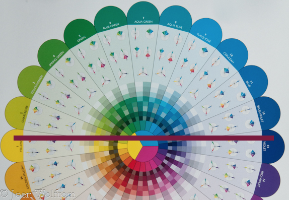
The complementary color plan features two colors directly opposite each other on the color wheel as seen in our Essential Color Wheel. Yellow is directly across from Violet. As opposites, these two colors together create visual excitement, vibrancy, intensity and high impact. But as direct opposites they compete for attention when placed together in their most saturated hue.

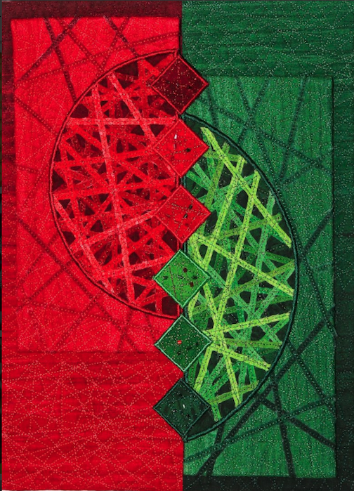
When placed together, the complementary colors in their most saturated form vibrate and can be jarring for the viewer. Think of complementary colors as two extroverts at a small dinner party. Both compete for attention with their enthusiastic talk, charm and laughter, but together, they are overwhelming for the rest of the guests at the table. The quilt Complementary Conversation (by Mari-Carmen Pujante) is an example of a saturated complementary plan featuring red and green that almost vibrate, making the quilt difficult to view for a long period of time.
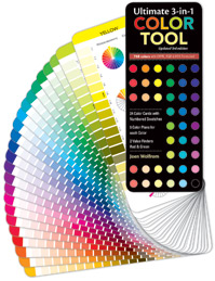
Used carefully, however, the complementary colors can create dynamic and very graphic quilts, when one color is the lead player, while the other takes a supporting role. In this case it is important to use a wide range of colors within the two to create the most effective results. And don't be tempted to stray over by including a neighboring color as it becomes immediately apparent to the viewer that this neighbor doesn't belong in the group. As a quilter, this is where your Ultimate 3-in-1 Color Tool can come in handy. Each of the twenty-four pages features not only the pure color, but also the tints, shades and tones of that pure family. Use it for delving into your stash or take it along when fabric shopping to determine if a fabric fits within your complementary color plan.
Complementary Conversation by Mari-Carmen Pujante (Image Quilts, Inc.)

In her book The Quilter's Color Club, Christine Barnes, says that, "lowering the intensity of complementary colors is the most effective way to soften the contrast. Brilliant blue-green and red-orange can overwhelm, but quieter versions of those colors, such as azure and terra cotta, are easier on the eye."
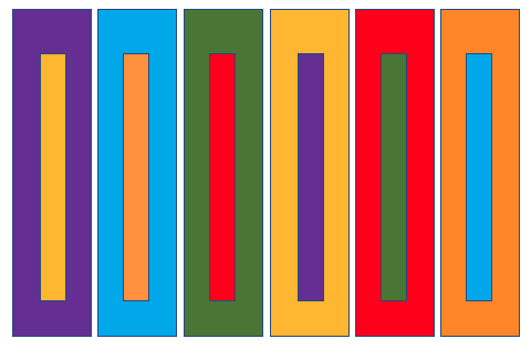
However, being opposites on the Essential Color Wheel can also be an advantage. Did you ever think about why life vests and life rafts are bright orange? As the opposite of Cyan (Turqouise) they contrast with the water and are visible for miles (see second bar from the left below). Understanding that these opposites can have a powerful effect means that you as a quilter can use them to make a statement.
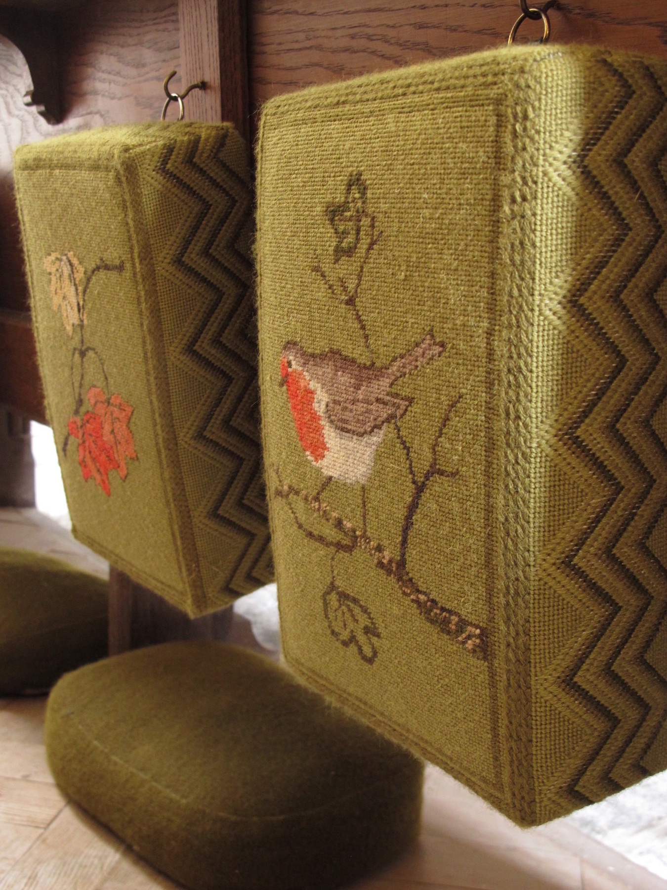
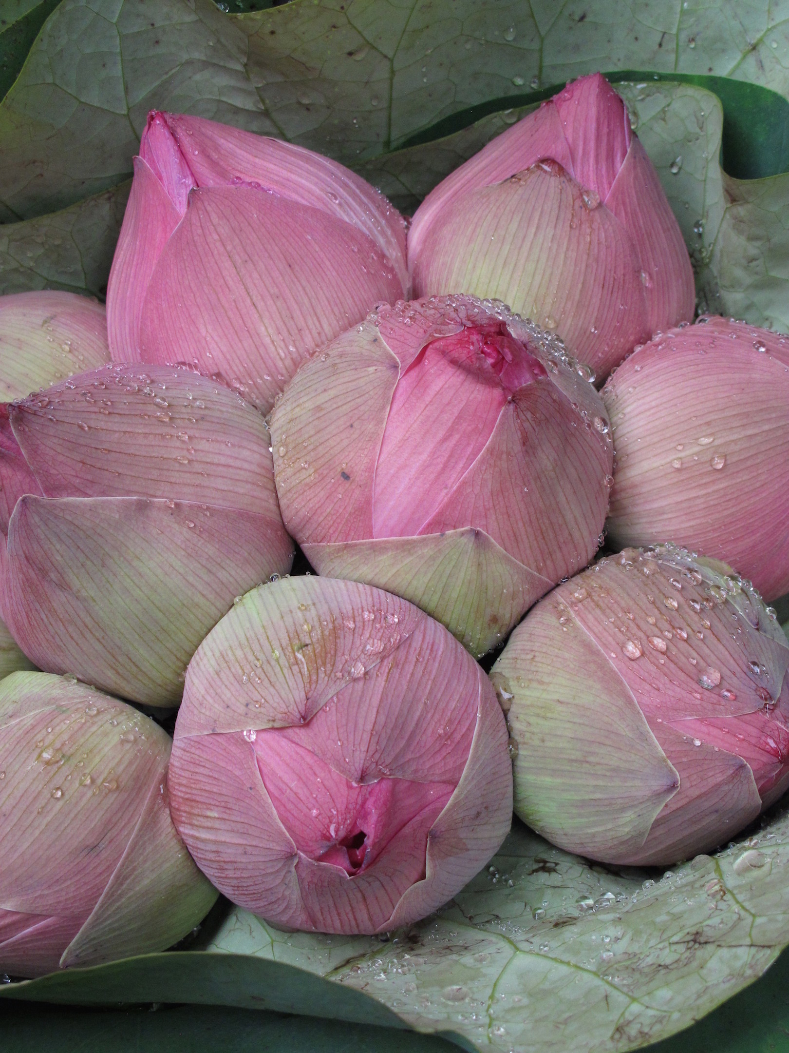
Need ideas? Anytime you are out and about with your camera or cell phone, take time to look around. Inspiration for complementary color combinations are everwhere. Here are just a few examples:


Now let's look at some quilts where in most cases one color is the lead and the other is secondary:
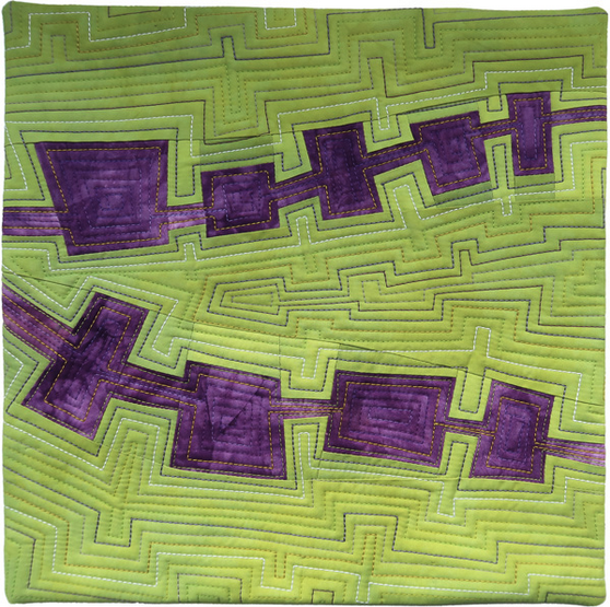

Paterson's Curse by Brenda Gael Smith. (Image courtesy of Brenda Gael Smith).
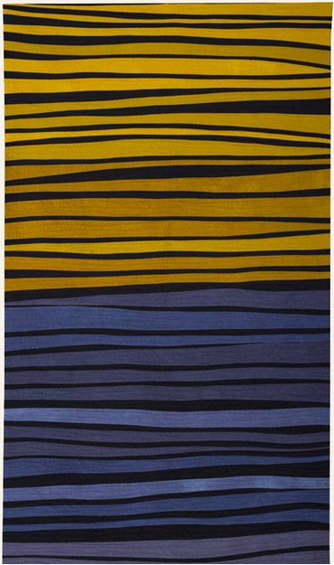
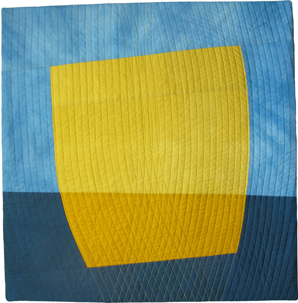
Color Study in Blue and Yellow by Janet Starr (Image courtesy of Janet Starr). Yellow on Blue by Kathleen Probst (Image courtesy of Kathleen Probst).
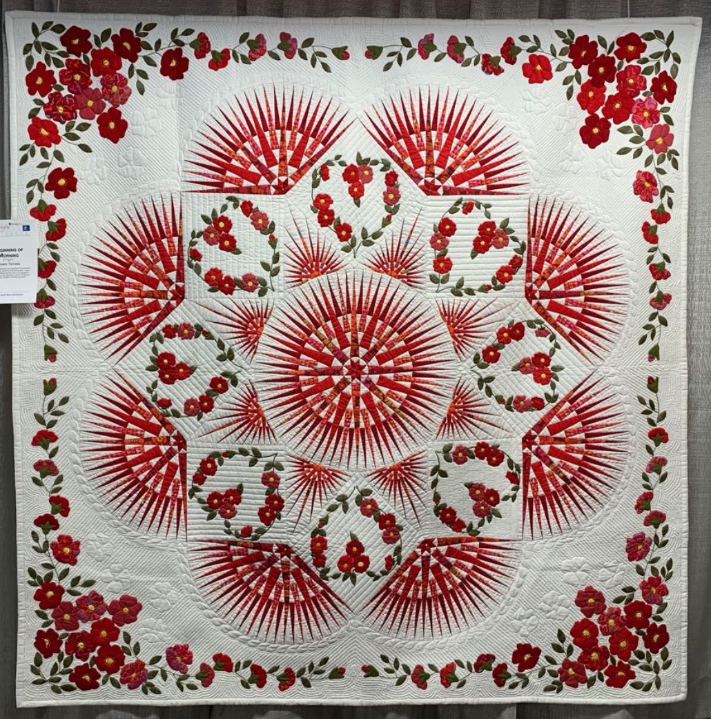
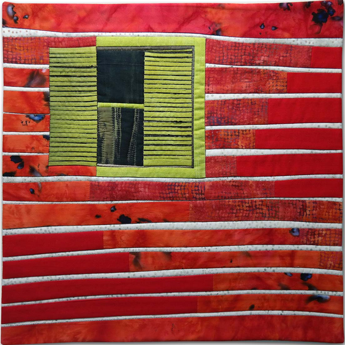
Beginning of Morning by Fusako Yamada. (Image by The Quilt Show). Extreme Colors by Hilde Morin (Image courtesy of Hilde Morin).
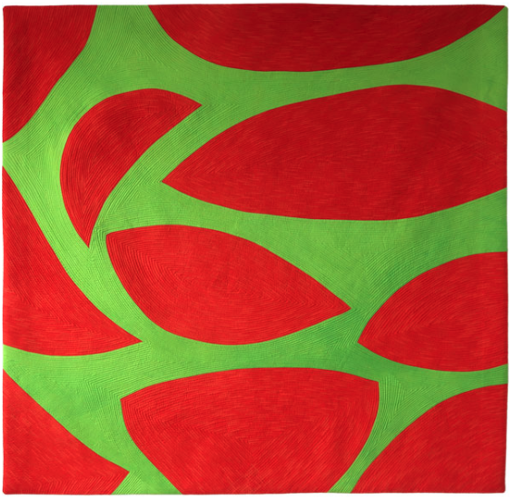
Integrifolia #3: Stops & Starts by Brenda Gael Smith (Image courtesy of Brenda Gael Smith)
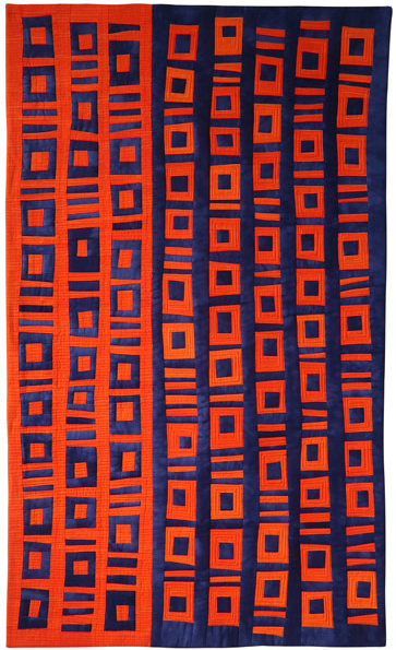
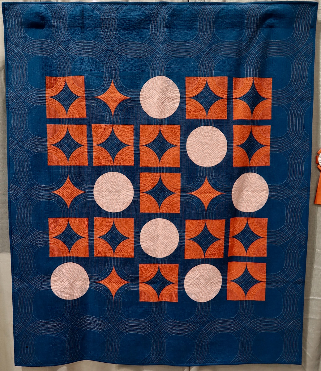
Dreamlines #9: Big Data: Contraflow by Brenda Gael Smith (Image courtesy of Brenda Gael Smith). Astronomer's Daughter by Brigit Dermot (Image by TheQuiltShow.com)
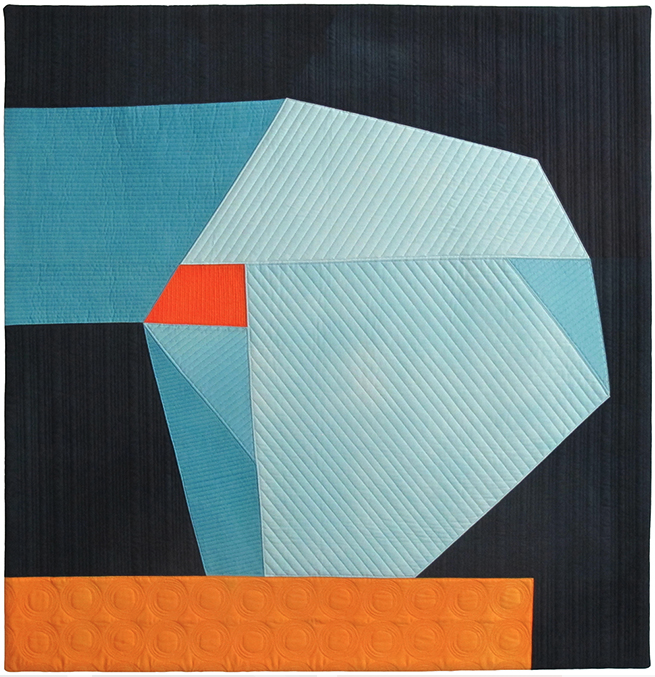
Anchored by Kathleen Probst (Image courtesy of Kathleen Probst).
Practice Exercise: Color Perception
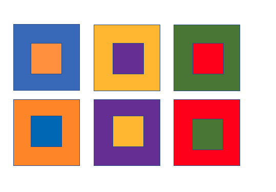
Supplies-
1 sheet of construction paper in six different saturated colors (Red, Yellow, Cyan-Turquoise, Blue, Green, Violet, Orange)
Ruler, pencil, scissors
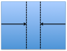
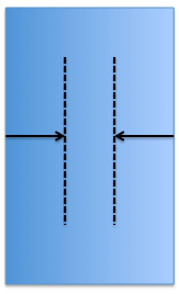
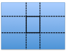
1. Cut two (4" x 6") rectangles from each color of construction paper. Divide the rectangles into groups (A & B) of six colors. Set group A aside for later.
2. You will now work with group B. Using one rectangle, measure and draw a line 2 1/2" from either side. Measure and draw a line 1 1/2" from top to bottom. The resulting drawn lines should be a 1" square in the center of your rectangle. Repeat for the remaining 5 colors in group B.
3. Carefully cut center square out from each of the rectangles.
4. Place a color from group A behind a group B as in the image above. Notice how the colors vibrate as well as move forward/recede.
Click here for more topics related to The Art of Quilt Design program.










.jpg)
