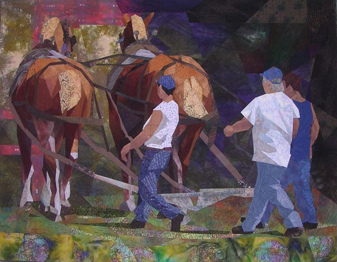
As we wrap up our topic of Space, in the words of Ann Harwell, (Show 1802) "creating depth with fabric can be a challenge," but, as you have learned over the last few weeks, there are a variety of key elements that can be incorporated in your work to engage and appeal to the viewer. Let's use Jan Poynter's easy to understand illustrations and explanations to review how to create depth of space in our quilt work.
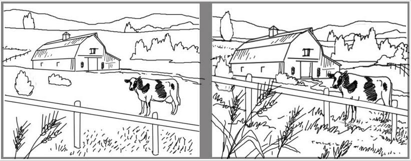
Create a relationship between the objects in your subject (i.e. cow, barn, grasses, trees, mountains) to create a sense of depth.
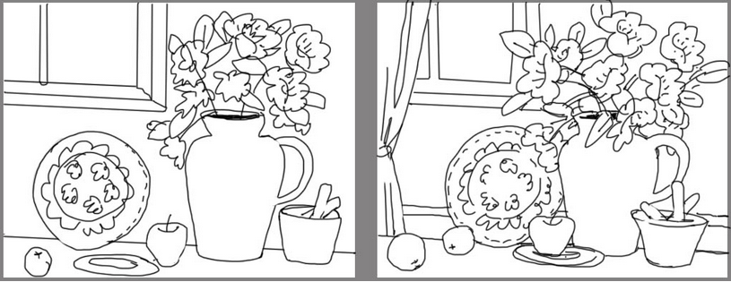
Objects should not float, but touch or overlap in still life or close-up subject matter. Continue the story in the negative or background space.

Structural elements such as horizon lines, walls, surfaces, roads, buildings must appear to be consistently continued. In the example of the water scene, notice how the wave lines (in the illustration on the right) seem to continue behind and to the right of the tree. This creates more realism and depth versus the random lines (in the illustration on the left) that may or may not appear to connect.
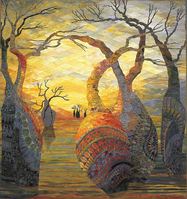
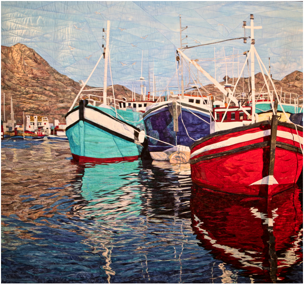
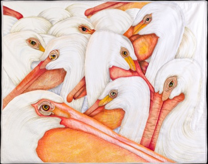
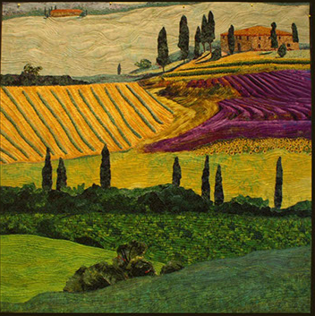
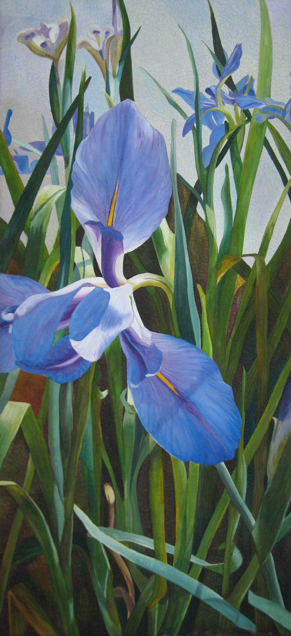
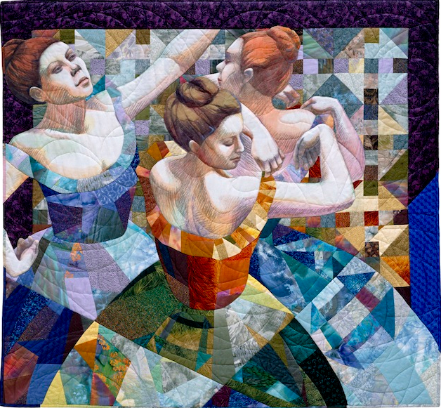
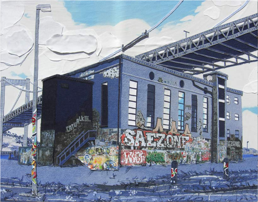
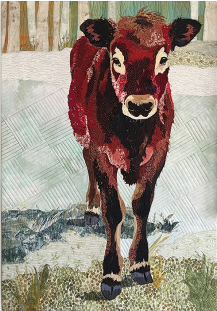
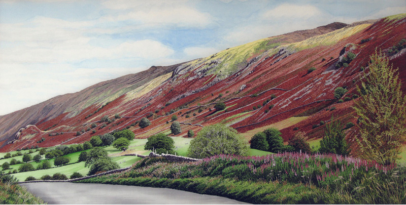
Now let's put what you have learned to the test. See how well you can spot the different types of space (Size, Placement, Overlapping, Detail, Color/Value, 1-point and 2-point perspective) in the nine quilts below. Pay attention, some quilts include more than one type of space concept. (To see the answers, scroll to the bottom of the page)
1. 2.
3. 4.
5. 6.
7. 8.
9.
Depth of Space
Denise Labadie (Show 106) makes interpretive contemporary art quilts of Celtic megalithic (Bronze Age – think Stonehenge) stones and monoliths, their landscapes, and more recent (primarily Irish) monastic ruins. These stone portraits reverently portray ancient stonescapes of immense timelessness and physical presence while evoking sacred and emotional remembrances of human pasts largely forgotten.
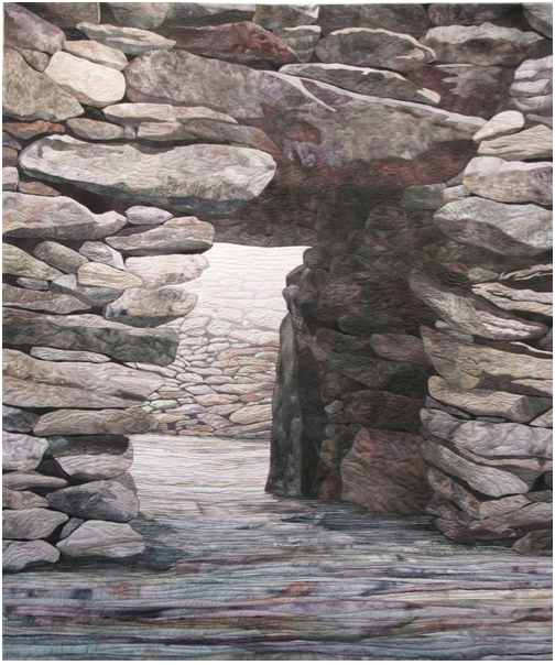
I quilt perspective-intense “stone portraits”. Depth and dimensionality are central to my work. In general, objects tend to become lighter in color and less detailed as they get further away (or recede in the distance). Irish Stone Fort Ruin very much takes advantage of these general rules.
To maximize depth and dimensionality, also note the importance of using sharply defined “clean edges”. Well-defined edges establish whether objects (like stones) are in front of, or behind, other objects (again, like stones), or whether one object meets and intersects with another (like two adjoining stone walls meeting, or a stone wall going into the ground).
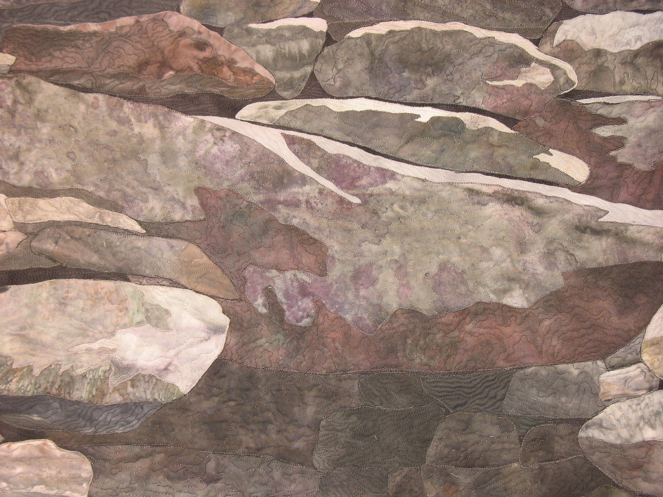
In contrast, “coloring book” outlines result in flatter, less dimensional results. In quilting, raw edge appliqué, in particular, can result in relatively thick outlines (edges) if overcast (or otherwise heavily stitched) with overly dark or visible color; this can be easily minimized, though, by using blending, invisible, or variegated thread. The use of fusible webbing underneath raw edge appliqué should also be minimized – if the objective is to maximize depth and dimensionality – as it hinders the build-up of any subsequent object-specific “volume creation” efforts.
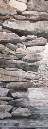
In contrast, turned edge appliqué – and insetting – have natively clean edges !!! I recently started increasingly using turned edge appliqué (once I finally found the right tools to make it quick and easy), and their clean edges dramatically and visually “pop” my stones in ways previously unachievable; I still use raw edge appliqué, however, for (smaller) stones located at some distance from the observer.
I also use reverse appliqué fairly extensively (see the entire front wall of Irish Stone Fort Ruin on the left). Reverse appliqué can be wonderful for “micro-shadowing” and creating rough and varying textures, such as dark crevices within stones. Recognize, however, that reverse appliqué also creates raw edges, so to keep textures as high as possible I make the cut seams extra thin and (as above) use thread that blends well with the background; any edge-based “flattening” is usually not a problem because of the compensating dimensionality generated by cutting through, and exposing, multiple embedded fabric layers.
Note that I also use my mortar to add even further dimensionality; heavy quilting within the mortar helps to both hide a percentage of exposed raw or overcast edges, and also helps to “pop” adjacent stones.
I actually now commonly combine and mix both reverse and turned edge appliqué on the same stones; turned edge appliqué gives me both the crispness of edge, and dimensionality, that my compositions need, and reverse appliqué gives me the additional detailed textures that my stones demand.
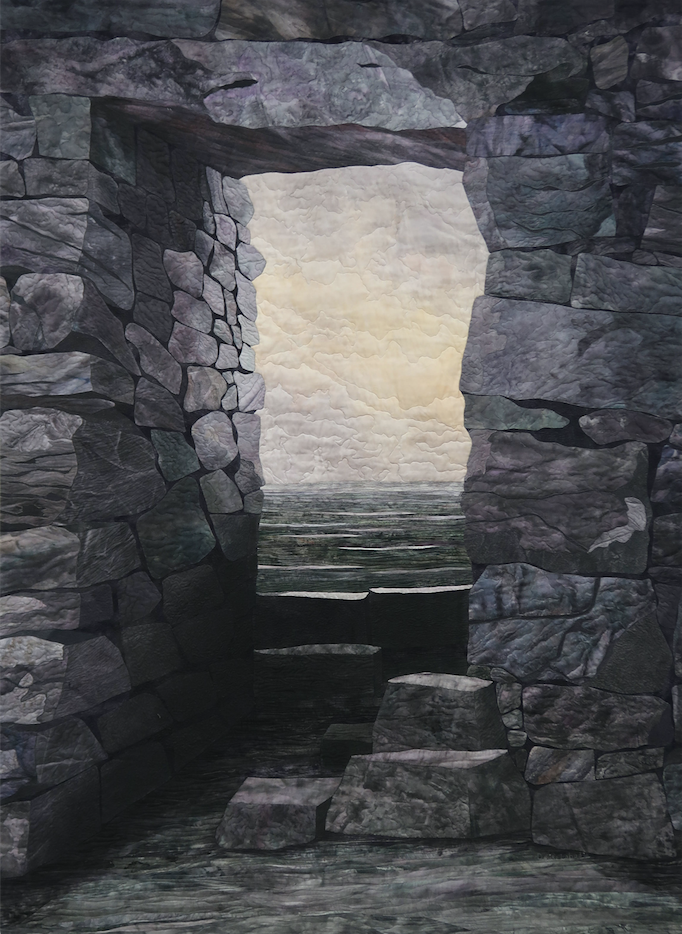
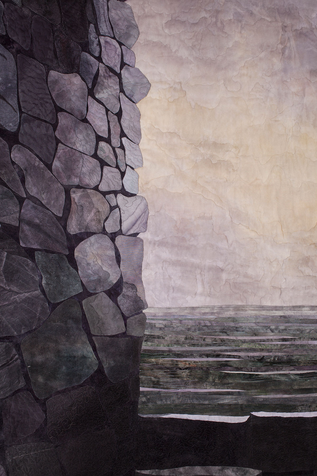
My final choice of texturing and appliqué technique (or techniques) is thus based on stone size, light source location and intensity, distance or “nearness” of stones to a perspective-based “vanishing point” or the viewer, or whether I’m dealing with a section of the quilt that I want (or do not want) to visually highlight. Whatever techniques are chosen, though, the takeaway is that quilters have exciting and unique textural and structural tools (e.g., appliqué) beyond color, tone, tints, shades, highlighting, etc., which can and should be used for augmenting perceived depth and dimensionality.
Answers to Quiz:
1. Kimberly Mystique by Gloria Loughman (Show 612) - One-point perspective and Color/Value change
2. Reflections of Cape Town by Cynthia England (Show 610 / Show 1412) - Placement
3. American White Pelican by Velda Newman (Show 903) - Overlapping
4. Tuscan Country by Lenore Crawford - Placement
5. For The Love Of Irises by Andrea Brokenshire (Show 1706) - Size and Color/Value change
6. Seams A Lot Like Dega by Lura Schwarz Smith (Show 702) - Overlapping
7. Under The Bridge by Ian Berry - Two-point perspective
8. Maddie Moo by Barbara Yates Beasley (Show 1905) - Color/Value change
9. Lake District by Alison Holt - Detail
Click here for more topics related to the Design to Quilt program.






.jpg)
